ra-enterprise
Preconfigured components replacing the default react-admin ones to quickly integrate the Enterprise Edition modules.
Test it live on the Enterprise Edition Storybook and in the e-commerce demo.
ra-enterprise exports the following "augmented" components: <Admin> and <Layout>. Use them instead of the react-admin versions to get additional features:
- import { Admin } from 'react-admin';
+ import { Admin } from '@react-admin/ra-enterprise';

const App = ()  => (
    <Admin dataProvider={dataProvider}>
        { /** Put your resources here */ }
    </Admin>
);
Installation
npm install --save @react-admin/ra-enterprise
# or
yarn add @react-admin/ra-enterprise
Tip: ra-enterprise is part of the React-Admin Enterprise Edition, and hosted in a private npm registry. You need to subscribe to one of the Enterprise Edition plans to access this package.
<Admin>
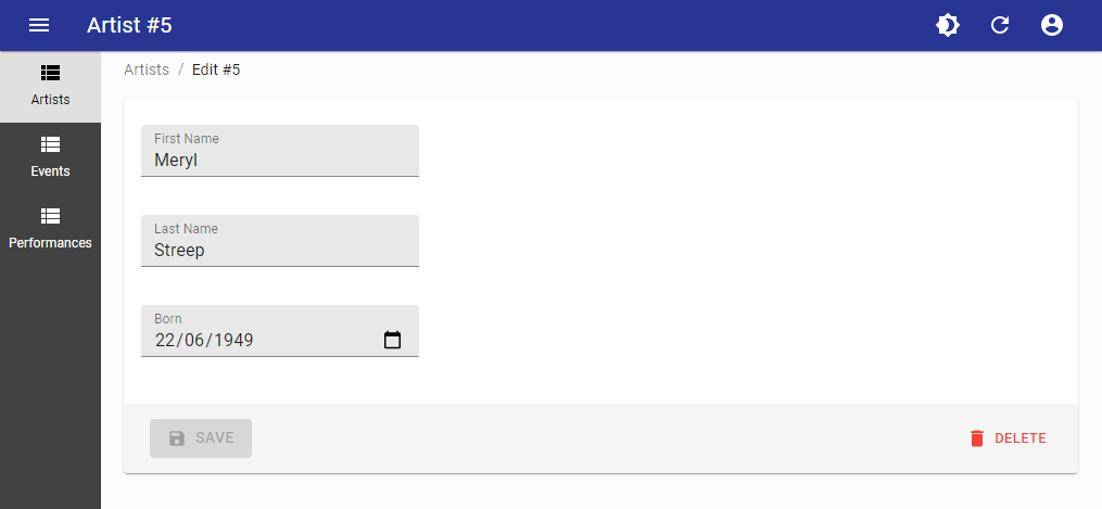
ra-enterprise exports a replacement for the <Admin> component, which pre-configures many of the enterprise edition modules. It comes with:
- A custom
<Layout>using the<SolarLayout>component, containing a<Breadcrumb>based on resources and a compact<SolarMenu>with submenus in sliding panels. - The
buildI18nProviderfunction, to help you build ani18nProvideralready including the additional messages required by ra-realtime, ra-relationships, ra-tree, ra-search, ra-audit-log, and ra-form-layout. - An
<AppLocationContext>, to allow the use of ra-navigation features.
This modifies the look and feel of react-admin:
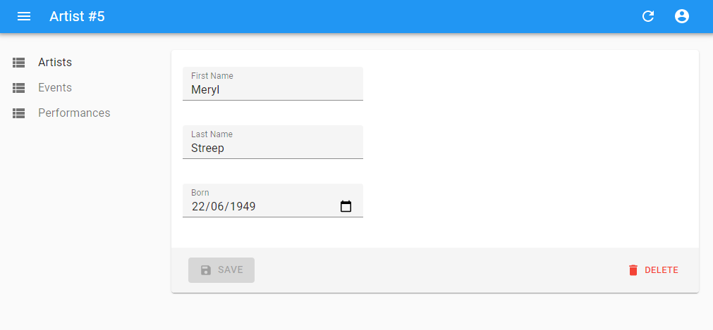
To be compared with the default look and feel:
Usage
Replace react-admin's <Admin> component the same component from ra-enterprise:
- import { Admin } from 'react-admin';
+ import { Admin } from '@react-admin/ra-enterprise';

const App = ()  => (
    <Admin dataProvider={dataProvider}>
        { /** Put your resources here */ }
    </Admin>
);
Props
The alternative <Admin> accepts the same properties as the default one. Please read the documentation about the react-admin <Admin> to see all the available properties.
In addition, you can pass the following properties to customize the ra-enterprise features:
| Prop | Required | Type | Default | Description |
|---|---|---|---|---|
i18nProvider |
Optional | object |
buildI18nProvider helper from ra-enterprise |
Replace the ra-enterprise default i18nProvider with your own |
layout |
Optional | LayoutComponent |
The <Layout> component from `ra-enterprise |
Replace the ra-enterprise default layou with your own |
Examples
- Basic usage
import { Admin } from '@react-admin/ra-enterprise';

const dataProvider = {
    // Connect to your API
};

const App = () => (
    <Admin dataProvider={dataProvider}>{/** Put your resources here */}</Admin>
);
import { Admin } from "@react-admin/ra-enterprise";

const dataProvider = {
    // Connect to your API
};

const App = () => <Admin dataProvider={dataProvider}>{/** Put your resources here */}</Admin>;
- Pass your own translations
import { Admin, buildI18nProvider } from '@react-admin/ra-enterprise';

const languages = [
    { locale: 'en', name: 'English' },
    { locale: 'fr', name: 'Français' },
];

const messages = {
    en: {
        // Put your english translations here
    },
    fr: {
        // Put your french translations here
    },
};

const dataProvider = {
    // Connect to your API
};

const i18nProvider = buildI18nProvider(messages, 'en', languages);

const App = () => (
    <Admin dataProvider={dataProvider} i18nProvider={i18nProvider}>
        {/** Put your resources here */}
    </Admin>
);
import { Admin, buildI18nProvider } from "@react-admin/ra-enterprise";

const languages = [
    { locale: "en", name: "English" },
    { locale: "fr", name: "Français" },
];

const messages = {
    en: {
        // Put your english translations here
    },
    fr: {
        // Put your french translations here
    },
};

const dataProvider = {
    // Connect to your API
};

const i18nProvider = buildI18nProvider(messages, "en", languages);

const App = () => (
    <Admin dataProvider={dataProvider} i18nProvider={i18nProvider}>
        {/** Put your resources here */}
    </Admin>
);
Theming
ra-enterprise uses the react-admin default light and dark themes adapted to ra-navigation components such as <SolarLayout> and <SolarMenu>.
Like react-admin <Admin> component, you can override the default themes by passing your custom themes to the theme and darkTheme props of the <Admin> component. Take a look at the App-Wide Theming documentation to learn more about theming in react-admin.
<Layout>
Alternative to react-admin's default <Layout>, which adds the following features:
- A compact menu with submenus in sliding panels (from ra-navigation)
- A breadcrumb based on resources and a compact menu with submenus in sliding panels (from ra-navigation)
- An
<AppLocationContext>, to allow the use of ra-navigation features.
Usage
If you use the <Admin> component from ra-enterprise, this layout is already used by default.
If you use the <Admin> component from react-admin, pass this component as the layout prop.
import { Admin } from 'react-admin';
+import { Layout } from '@react-admin/ra-enterprise';

const App = ()  => (
    <Admin
        dataProvider={dataProvider}
+       layout={Layout}
    >
        { /* Put your resources here */ }
    </Admin>
);
Props
The alternative <Layout> accepts the same properties as the <SolarLayout> components. Please read the documentation about react-admin <Layout> to discover all the available properties.
In addition, you can pass the following properties to customize the ra-enterprise features:
| Prop | Required | Type | Default | Description |
|---|---|---|---|---|
breadcrumb |
Optional | ComponentType or React.ReactNode |
<Breadcrumb> component from ra-enterprise |
Set your own <Breadcrumb> |
Examples
Customize the <Layout> main elements (the <AppBar>, the <Breadcrumb> and the <Menu>)
import { Breadcrumb, SolarAppBar, SolarMenu } from '@react-admin/ra-navigation';
import { Admin, Layout } from '@react-admin/ra-enterprise';

const CustomAppBar = () => (
    <SolarAppBar>
        {/* You custom SolarAppBar. See @react-admin/ra-navigation for more details about SolarAppBar. */}
    </SolarAppBar>
);

const CustomMenu = () => (
    <SolarMenu>
        {/* You custom SolarMenu. See @react-admin/ra-navigation for more details about SolarMenu. */}
    </SolarMenu>
);

const CustomBreadcrumb = () => (
    <Breadcrumb>
        {/* You custom beadcrumb. See @react-admin/ra-navigation for more details about breadcrumbs. */}
    </Breadcrumb>
);

const CustomLayout = ({ children }) => (
    <Layout
        appBar={CustomAppBar}
        breadcrumb={CustomBreadcrumb}
        menu={CustomMenu}
    >
        {children}
    </Layout>
);

const dataProvider = {
    // Connect to your API
};

const App = () => (
    <Admin dataProvider={dataProvider} layout={CustomLayout}>
        {/* Put your resources here */}
    </Admin>
);
import { Breadcrumb, SolarAppBar, SolarMenu } from "@react-admin/ra-navigation";
import { Admin, Layout } from "@react-admin/ra-enterprise";

const CustomAppBar = () => (
    <SolarAppBar>
        {/* You custom SolarAppBar. See @react-admin/ra-navigation for more details about SolarAppBar. */}
    </SolarAppBar>
);

const CustomMenu = () => (
    <SolarMenu>
        {/* You custom SolarMenu. See @react-admin/ra-navigation for more details about SolarMenu. */}
    </SolarMenu>
);

const CustomBreadcrumb = () => (
    <Breadcrumb>
        {/* You custom beadcrumb. See @react-admin/ra-navigation for more details about breadcrumbs. */}
    </Breadcrumb>
);

const CustomLayout = ({ children }) => (
    <Layout appBar={CustomAppBar} breadcrumb={CustomBreadcrumb} menu={CustomMenu}>
        {children}
    </Layout>
);

const dataProvider = {
    // Connect to your API
};

const App = () => (
    <Admin dataProvider={dataProvider} layout={CustomLayout}>
        {/* Put your resources here */}
    </Admin>
);
<LayoutWrapper>
The <LayoutWrapper> wraps the default layout and provides a pre-configured <AppLocationContext>. This component is useful when you want to use your own layout but still want to use the features provided by ra-enterprise.
Usage
Wrap your custom layout with the <LayoutWrapper> component to benefit from the <AppLocationContext> features:
import { Breadcrumb, SolarLayout } from '@react-admin/ra-navigation';
import { Admin, LayoutWrapper } from '@react-admin/ra-enterprise';
import { Dashboard } from './Dashboard';
import { Logo } from './Logo';

const CustomLayout = ({ children }) => (
    <LayoutWrapper>
        <SolarLayout dashboard={Dashboard} logo={<Logo />}>
            <>
                <Breadcrumb />
                {children}
            </>
        </SolarLayout>
    </LayoutWrapper>
);

export const App = () => (
    <Admin layout={CustomLayout}>{/* Put your resources here */}</Admin>
);
import { Breadcrumb, SolarLayout } from "@react-admin/ra-navigation";
import { Admin, LayoutWrapper } from "@react-admin/ra-enterprise";
import { Dashboard } from "./Dashboard";
import { Logo } from "./Logo";

const CustomLayout = ({ children }) => (
    <LayoutWrapper>
        <SolarLayout dashboard={Dashboard} logo={<Logo />}>
            <>
                <Breadcrumb />
                {children}
            </>
        </SolarLayout>
    </LayoutWrapper>
);

export const App = () => <Admin layout={CustomLayout}>{/* Put your resources here */}</Admin>;
Props
The <LayoutWrapper> component accepts the following properties:
| Prop | Required | Type | Default | Description |
|---|---|---|---|---|
children |
Required | ReactNode |
- | The content of the layout |
Examples
- Customize the layout:
import { Breadcrumb, SolarLayout } from '@react-admin/ra-navigation';
import { Admin, LayoutWrapper } from '@react-admin/ra-enterprise';
import { Dashboard } from './Dashboard';
import { Logo } from './Logo';

const Layout = ({ children }) => (
    <LayoutWrapper>
        <SolarLayout dashboard={Dashboard} logo={<Logo />}>
            <>
                <Breadcrumb separator=">" />
                {children}
            </>
        </SolarLayout>
    </LayoutWrapper>
);

export const App = () => (
    <Admin layout={Layout}>{/* Put your resources here */}</Admin>
);
import { Breadcrumb, SolarLayout } from "@react-admin/ra-navigation";
import { Admin, LayoutWrapper } from "@react-admin/ra-enterprise";
import { Dashboard } from "./Dashboard";
import { Logo } from "./Logo";

const Layout = ({ children }) => (
    <LayoutWrapper>
        <SolarLayout dashboard={Dashboard} logo={<Logo />}>
            <>
                <Breadcrumb separator=">" />
                {children}
            </>
        </SolarLayout>
    </LayoutWrapper>
);

export const App = () => <Admin layout={Layout}>{/* Put your resources here */}</Admin>;
- Use the
<IconMenuResources>and the react-admin<AppBar>component:
import { Admin, LayoutWrapper } from '@react-admin/ra-enterprise';
import { IconMenuResources } from '@react-admin/ra-navigation';
import { AppBar, Layout } from 'react-admin';

const CustomLayout = ({ children }) => (
    <LayoutWrapper>
        <Layout menu={IconMenuResources} appBar={AppBar}>
            {children}
        </Layout>
    </LayoutWrapper>
);

export const App = () => (
    <Admin layout={CustomLayout}>{/* Put your resources here */}</Admin>
);
import { Admin, LayoutWrapper } from "@react-admin/ra-enterprise";
import { IconMenuResources } from "@react-admin/ra-navigation";
import { AppBar, Layout } from "react-admin";

const CustomLayout = ({ children }) => (
    <LayoutWrapper>
        <Layout menu={IconMenuResources} appBar={AppBar}>
            {children}
        </Layout>
    </LayoutWrapper>
);

export const App = () => <Admin layout={CustomLayout}>{/* Put your resources here */}</Admin>;
buildI18nProvider
The buildI18nProvider function can help you build an i18nProvider. Indeed, it will automatically merge the passed messages object with the default english messages from react-admin and from all the Enterprise packages.
It accepts the following arguments:
- The
messagesobject containing your translations - The default locale (e.g.
'en') - The list of available locales. It defaults to
[{ locale: 'en', name: 'English' }] - An object with additional options to pass to polyglot. Check the Polyglot documentation for a list of options you can pass to Polyglot at startup. Defaults to
{}.
Examples
- Use
buildI18nProviderwith no arguments to get ani18nProviderwith the default english messages for both react-admin and the Enterprise packages:
import { Resource } from 'react-admin';
import { Admin, buildI18nProvider } from '@react-admin/ra-enterprise';
import { dataProvider } from './dataProvider';
import { ArtistList } from './artists';

export const DefaultTranslations = () => (
    <Admin dataProvider={dataProvider} i18nProvider={buildI18nProvider()}>
        <Resource name="artists" list={ArtistList} />
    </Admin>
);
import { Resource } from "react-admin";
import { Admin, buildI18nProvider } from "@react-admin/ra-enterprise";
import { dataProvider } from "./dataProvider";
import { ArtistList } from "./artists";

export const DefaultTranslations = () => (
    <Admin dataProvider={dataProvider} i18nProvider={buildI18nProvider()}>
        <Resource name="artists" list={ArtistList} />
    </Admin>
);
- Use
buildI18nProviderwith custommessagesto merge your translations with the default ones:
import { Resource } from 'react-admin';
import { Admin, buildI18nProvider } from '@react-admin/ra-enterprise';
import { dataProvider } from './dataProvider';
import { ArtistList } from './artists';

const customMessages = {
    en: {
        resources: {
            artists: {
                name: 'Painter |||| Painters',
            },
        },
    },
};

export const DefaultTranslations = () => (
    <Admin
        dataProvider={dataProvider}
        i18nProvider={buildI18nProvider(customMessages)}
    >
        <Resource name="artists" list={ArtistList} />
    </Admin>
);
import { Resource } from "react-admin";
import { Admin, buildI18nProvider } from "@react-admin/ra-enterprise";
import { dataProvider } from "./dataProvider";
import { ArtistList } from "./artists";

const customMessages = {
    en: {
        resources: {
            artists: {
                name: "Painter |||| Painters",
            },
        },
    },
};

export const DefaultTranslations = () => (
    <Admin dataProvider={dataProvider} i18nProvider={buildI18nProvider(customMessages)}>
        <Resource name="artists" list={ArtistList} />
    </Admin>
);
- Use
buildI18nProviderto build ani18nProvidersupporting both english and french, which will also make the<LocalesMenuButton>appear in the<AppBar>:
import { Resource, mergeTranslations } from 'react-admin';
import frenchTranslations from 'ra-language-french';
import { Admin, buildI18nProvider } from '@react-admin/ra-enterprise';
import { dataProvider } from './dataProvider';
import { ArtistList } from './artists';

const languages = [
    { locale: 'en', name: 'English' },
    { locale: 'fr', name: 'Français' },
];

const customMessages = {
    en: {
        resources: {
            artists: {
                name: 'Painter |||| Painters',
            },
        },
    },
    fr: mergeTranslations(frenchTranslations, {
        resources: {
            artists: {
                name: 'Peintre |||| Peintres',
            },
        },
    }),
};

export const DefaultTranslations = () => (
    <Admin
        dataProvider={dataProvider}
        i18nProvider={buildI18nProvider(customMessages, 'fr', languages)}
    >
        <Resource name="artists" list={ArtistList} />
    </Admin>
);
import { Resource, mergeTranslations } from "react-admin";
import frenchTranslations from "ra-language-french";
import { Admin, buildI18nProvider } from "@react-admin/ra-enterprise";
import { dataProvider } from "./dataProvider";
import { ArtistList } from "./artists";

const languages = [
    { locale: "en", name: "English" },
    { locale: "fr", name: "Français" },
];

const customMessages = {
    en: {
        resources: {
            artists: {
                name: "Painter |||| Painters",
            },
        },
    },
    fr: mergeTranslations(frenchTranslations, {
        resources: {
            artists: {
                name: "Peintre |||| Peintres",
            },
        },
    }),
};

export const DefaultTranslations = () => (
    <Admin dataProvider={dataProvider} i18nProvider={buildI18nProvider(customMessages, "fr", languages)}>
        <Resource name="artists" list={ArtistList} />
    </Admin>
);
CHANGELOG
v14.0.0
2025-12-11
- Upgrade
@react-admin/ra-form-layoutto v6
v13.0.0
2025-10-07
- Upgrade to
@react-admin/ra-navigationv7 - Upgrade
@react-admin/ra-searchto v6
v12.1.0
2025-06-24
- Upgrade to react-admin v5.9.0
v12.0.0
2025-04-16
- Remove
@react-admin/ra-touras it does not work with React 19.
v11.0.0
2025-04-14
- Upgrade to
@react-admin/ra-navigationv6
v10.0.0
2025-02-21
- Upgrade to
@react-admin/ra-treev6
v9.0.0
2024-12-09
- Upgrade to react-admin v5.4
- Upgrade to
@react-admin/ra-rbacv6 - Upgrade to
@react-admin/ra-form-layoutv5.4
Breaking Changes
AccordionForm,AccordionFormPanel,AccordionFormSection,LongForm,LongFormSection,WizardFormandWizardFormStepare no longer exported from@react-admin/ra-enterprise. Import them from@react-admin/ra-form-layoutinstead. If you relied on their integration with@react-admin/ra-enterprise, you can set theenableAccessControlprop on all the form components to activate access control. Refer to@react-admin/ra-form-layoutdocumentation for more details.
In src/authProvider.ts
+ import { canAccessWithPermissions } from '@react-admin/ra-rbac';

const authProvider = {
    checkAuth: () => Promise.resolve(),
    login: () => Promise.resolve(),
    logout: () => Promise.resolve(),
    checkError: () => Promise.resolve(),
-    getPermissions: () => Promise.resolve([
+    canAccess: ({ action, resource, record }) => Promise.resolve(canAccessWithPermissions({
        permissions: [
        // 'delete' is missing
        { action: ['list', 'edit'], resource: 'products' },
        { action: 'write', resource: 'products.reference' },
        { action: 'write', resource: 'products.width' },
        { action: 'write', resource: 'products.height' },
        // 'products.description' is missing
        { action: 'write', resource: 'products.thumbnail' },
        // 'products.image' is missing
        { action: 'write', resource: 'products.panel.description' },
        { action: 'write', resource: 'products.panel.images' },
        // 'products.panel.stock' is missing
-    ]),
+    ],
+    action,
+    resource,
+    record,
+   })
};

// In src/products/ProductEdit.tsx
-import { AccordionForm } from '@react-admin/ra-enterprise';
+import { AccordionForm } from '@react-admin/ra-form-layout';

const ProductEdit = () => (
    <Edit>
-        <AccordionForm>
+        <AccordionForm enableAccessControl>
-            <AccordionForm.Panel label="Description">
+            <AccordionForm.Panel id="description" label="Description">
                <TextInput source="reference" />
                <TextInput source="width" />
                <TextInput source="height" />
                <TextInput source="description" />
            </AccordionForm.Panel>
-            <AccordionForm.Panel label="Images">
+            <AccordionForm.Panel id="images" label="Images">
                <TextInput source="image" />
                <TextInput source="thumbnail" />
            </AccordionForm.Panel>
-            <AccordionForm.Panel label="Stock">
+            <AccordionForm.Panel id="stock" label="Stock">
                <TextInput source="stock" />
            </AccordionForm.Panel>
            // delete button not displayed
        </AccordionForm>
    </Edit>
);
v8.0.0
2024-07-25
- Upgrade to react-admin v5
Breaking Changes
-
We don't provide custom themes anymore. The themes are now provided by
react-adminOSS. You can always set your custom theme by using the dedicated props in the<Admin>component. See the theming documentation for more information. -
ra-enterprise's<Layout>is no longer based onreact-admin's default<Layout>. Instead, it uses the<SolarLayout>fromra-navigation. -
<IconMenuResources>component from@react-admin/ra-navigationis no longer ne default menu. Now, the default menu is the<SolarMenu>component from@react-admin/ra-navigation. If you want to override these components, you can use your own app bar and/or menu by passing a custom layout component to<Admin>:
import { LoadingIndicator } from 'react-admin';
import { Admin, Layout } from '@react-admin/ra-enterprise';
import {
    SolarAppBar,
    SolarMenu,
} from '@react-admin/ra-navigation';
import { Search } from '@react-admin/ra-search';

const CustomAppBar = () => (
    <SolarAppBar>
        <Search />
        <LoadingIndicator />
    </SolarAppBar>
);

const CustomMenu = () => (
    <SolarMenu dense />
);

const CustomLayout = () => (
    <Layout menu={CustomMenu} appBar={CustomAppBar} />
);

export const MyAdmin = () => <Admin layout={CustomLayout}>{/*...*/}</Admin>;
import { LoadingIndicator } from "react-admin";
import { Admin, Layout } from "@react-admin/ra-enterprise";
import { SolarAppBar, SolarMenu } from "@react-admin/ra-navigation";
import { Search } from "@react-admin/ra-search";

const CustomAppBar = () => (
    <SolarAppBar>
        <Search />
        <LoadingIndicator />
    </SolarAppBar>
);

const CustomMenu = () => <SolarMenu dense />;

const CustomLayout = () => <Layout menu={CustomMenu} appBar={CustomAppBar} />;

export const MyAdmin = () => <Admin layout={CustomLayout}>{/*...*/}</Admin>;
If you want to get back the previous layout, you can use the <LayoutWrapper> from @react-admin/ra-enterprise which contains pre-configured <AppLocationContext>, and <TourContext>:
import { Admin, LayoutWrapper } from '@react-admin/ra-enterprise';
import { IconMenuResources } from '@react-admin/ra-navigation';
import { AppBar, Layout, LayoutProps } from 'react-admin';

const CustomLayout = (props: LayoutProps) => (
    <LayoutWrapper>
        <Layout {...props} menu={IconMenuResources} appBar={AppBar} />
    </LayoutWrapper>
);

export const MyAdmin = () => <Admin layout={CustomLayout}>{/*...*/}</Admin>;
import { Admin, LayoutWrapper } from "@react-admin/ra-enterprise";
import { IconMenuResources } from "@react-admin/ra-navigation";
import { AppBar, Layout } from "react-admin";

const CustomLayout = (props) => (
    <LayoutWrapper>
        <Layout {...props} menu={IconMenuResources} appBar={AppBar} />
    </LayoutWrapper>
);

export const MyAdmin = () => <Admin layout={CustomLayout}>{/*...*/}</Admin>;
v7.1.0
2023-09-18
- Fix default theme adds top margin to page toolbar. This minor visual change may impact your page layouts. Use component overrides in a custom theme to re-add the top margin in
RaListToolbarandRaTopToolbarif needed.
v7.0.0
2023-06-16
- [Breaking Change] The
ThemesContextwas removed. We now forward thelightThemeanddarkThemedirectly to react-admin's<Admin>, which will create its ownThemesContextand add a<ToggleThemeButton>to the<AppBar>automatically. - [Breaking Change] The
AppBarwas removed. We can now use react-admin's<AppBar>instead, as it will automatically add the<LocalesMenuButton>based on thei18nProvider. buildI18nProvidernow supportsavailableLocalesas 3rd parameter, andpolyglotOptionsas 4th parameter.<Admin>now uses the<ToggleThemeButton>from react-admin, which allows to automatically choose the light or dark theme based on the user's OS preferences.- The documentation about the following theming props has been improved:
theme,lightTheme,darkThemeanddefaultTheme - Upgraded to react-admin
4.11.2
Breaking Changes
If you were using the ThemesContext from ra-enterprise, you will now need to use the one from react-admin with useThemesContext instead:
-import { useContext } from 'react';
-import { ThemesContext } from '@react-admin/ra-enterprise';
-import { useTheme } from 'react-admin';
+import { useTheme, useThemesContext } from 'react-admin';

const MyCustomThemeButtons = () => {
-   const { lightTheme, darkTheme } = useContext(ThemesContext);
+   const { lightTheme, darkTheme } = useThemesContext();
    const [theme, setTheme] = useTheme();

    return (
        <button onClick={() => setTheme(lightTheme)}>Light Theme</button>
        <button onClick={() => setTheme(darkTheme)}>Dark Theme</button>
    );
};
If you used a custom <AppBar>, you no longer need to pass it the <ToggleThemeButton>, as it will be added automatically by react-admin.
-import { AppBar, ToggleThemeButton } from 'react-admin';
+import { AppBar } from 'react-admin';

const MyCustomAppBar = props => (
    <AppBar {...props}>
-       <ToggleThemeButton />
    </AppBar>
);
If you used a custom <AppBar> to set the available locales, you no longer need a custom <AppBar> to do that, and instead, can simply provide them to buildI18nProvider:
 import englishTranslations from 'ra-language-english';
 import frenchTranslations from 'ra-language-french';
 import React from 'react';
-import { LayoutProps, Resource, mergeTranslations } from 'react-admin';
+import { Resource, mergeTranslations } from 'react-admin';
 import {
     Admin,
-    AppBar,
-    AppBarProps,
     Layout,
     RaEnterpriseTranslationMessages,
     buildI18nProvider,
} from '@react-admin/ra-enterprise';
import { ArtistEdit, ArtistList } from './artists';
import dataProvider from './dataProvider';

const languages = [
    { locale: 'en', name: 'English 🇬🇧' },
    { locale: 'fr', name: 'Français 🇫🇷' },
];

const messages = {
    en: mergeTranslations(englishTranslations, {
        resources: {
            artists: {
                name: 'Painter |||| Painters',
            },
        },
    }),
    fr: mergeTranslations(frenchTranslations, {
        resources: {
            artists: {
                name: 'Peintre |||| Peintres',
            },
        },
    }),
};

-const CustomAppBar = (props: AppBarProps) => (
-    <AppBar languages={languages} {...props} />
-);
-
-const CustomLayout = (props: LayoutProps) => (
-    <Layout appBar={CustomAppBar} {...props} />
-);

 export const WithCustomizedTranslations = () => (
     <Admin
         dataProvider={dataProvider}
-        layout={CustomLayout}
+        layout={Layout}
         i18nProvider={buildI18nProvider<RaEnterpriseTranslationMessages>(
             messages,
-            'fr'
+            'fr',
+            languages
         )}
     >
         <Resource name="artists" list={ArtistList} edit={ArtistEdit} />
    </Admin>
);
If you used a custom AppBar based on ra-enterprise's <AppBar>, you can simply replace it with react-admin's <AppBar>, without forgetting to add the <TitlePortal>:
import { Button } from '@mui/material';
import { useTour } from '@react-admin/ra-tour';
-import { AppBar, AppBarProps } from '@react-admin/ra-enterprise';
+import { AppBar, AppBarProps, TitlePortal } from 'react-admin';

const CustomAppBarWithTour = (props: AppBarProps) => {
    const [_, { start }] = useTour();

    const handleStart = (): void => {
        start('example');
    };

    return (
        <AppBar {...props}>
+           <TitlePortal />
            <Button onClick={handleStart} variant="contained">
                Start Tour
            </Button>
        </AppBar>
    );
};
v6.2.0
2023-05-24
- Upgraded to react-admin
4.10.6
v6.1.0
2023-05-23
- Added
ra-form-layoutforms alternatives that leveragera-rbac(<AccordionForm>,<AccordionFormPanel>,<AccordionFormSection>,<LongForm>,<LongFormSection>,<WizardForm>and<WizardFormStep>)
v6.0.5
2023-05-22
- (fix) Fix
<AppBar>title style for react-admin v4.9.0 and greater
v6.0.4
2022-06-29
- (fix) Fix
<FilterForm>and<ListActions>width inRaTopToolbar
v6.0.3
2022-06-10
- (fix) Bump enterprise packages versions (specifically including ra-navigation v4.0.4)
v6.0.2
2022-06-08
- (fix) Update peer dependencies ranges (support React 18)
v6.0.1
2022-06-07
- Pass queryClient as a tool to the TourProvider
v6.0.0
2022-06-07
- Upgrade to react-admin v4
Breaking changes
- Removed
<List>,<Create>,<Edit>and<Show>components. You can simply import them fromreact-admin:
-import { Datagrid, TextField } from 'react-admin';
-import { List } from '@react-admin/ra-enterprise';
+import { Datagrid, List, TextField } from 'react-admin';

const ArtistList = () => (
    <List>
        <Datagrid rowClick="edit">
            <TextField source="id" />
            <TextField source="firstname" />
            <TextField source="name" />
        </Datagrid>
    </List>
);
- Removed
<EventList>and<RealTimeList>components. You can simply import them from their package:
// In App.js
import { Admin, Resource } from 'react-admin';
-import { EventList } from '@react-admin/ra-enterprise';
+import { EventList } from '@react-admin/ra-audit-log';

export const App = () => (
    <Admin>
        <Resource name="events" list={EventList} />
    </Admin>
);
import React from 'react';
import { ListProps, Datagrid, TextField } from 'react-admin';
-import { RealTimeList } from '@react-admin/ra-enterprise';
+import { RealTimeList } from '@react-admin/ra-realtime';

const PostList = () => (
    <RealTimeList>
        <Datagrid>
            <TextField source="title" />
        </Datagrid>
    </RealTimeList>
);
- The breadcrumb is now inside the
<Layout>instead of individual views.
We used to include the breadcrumb in the actions bar for each view. However, this had limitations as the breadcrumb often need a lot of horizontal space. Hence, we moved it back to the layout.
If you used to pass your custom layout to each view through the actions component we provided, you can now pass it to the <Layout> component.
// in ./src/MyBreadcrumb.js
import { Breadcrumb, BreadcrumbItem } from '@react-admin/ra-navigation';

export const MyBreadcrumb = props => (
    <Breadcrumb {...props}>
        <BreadcrumbItem name="dashboard" label="My Home">
            <ResourceBreadcrumbItems resources={['songs', 'artists']} />
        </BreadcrumbItem>
    </Breadcrumb>
);

// in ./src/MyLayout.js
import { Layout } from '@react-admin/ra-enterprise';
+import { MyBreadcrumb } from './MyBreadcrumb';

export const MyLayout = props => (
-   <Layout {...props} />
+   <Layout {...props} breadcrumb={<MyBreadcrumb />} />
);

// in ./src/App.js
import { Admin } from '@react-admin/ra-enterprise';
import { MyLayout } from './MyLayout';

export const MyAdmin = () => (
    <Admin layout={MyLayout}>
        // ...
    </Admin>
)

// in ./src/ArtistList.js
-import { Datagrid, TextField } from 'react-admin';
-import { List, ListActions } from '@react-admin/ra-enterprise';
-import { MyBreadcrumb } from './MyBreadcrumb';
+import { Datagrid, List, TextField } from 'react-admin';

-const ArtistListActions = props => (
-    <ListActions {...props} breadcrumb={<MyBreadcrumb variant="actions" />} />
-);

const ArtistList = () => (
    <List
-        actions={<ArtistListActions />}
    >
        <Datagrid rowClick="edit">
            <TextField source="id" />
            <TextField source="firstname" />
            <TextField source="name" />
        </Datagrid>
    </List>
);
- Removed the
<Menu>component. Use the<MenuItemCategoryResources>component fromra-navigationinstead:
import { Layout } from 'react-admin';
-import { Menu } from '@react-admin/ra-enterprise';
+import { MenuItemCategoryResources } from '@react-admin/ra-navigation';

-const MyLayout = props => <Layout menu={<Menu />} />
+const MyLayout = props => <Layout menu={<MenuItemCategoryResources />} />
v5.1.3
2021-12-23
- (fix) Fix
<AppBar>logs a warning when overriding styles via theclassesprop.
v5.1.2
2021-12-02
- (chore) Upgrade react-admin to 3.19.2
- (fix) Fix i18nProvider jsDoc
v5.1.1
2021-09-16
- (fix) Fix
<List>toolbar styles
v5.1.0
2021-09-14
- (feat) Include
ra-audit-log
v5.0.0
2021-09-08
- (chore) Upgrade react-admin to 3.18
- (fix) Breaking change: Following the upgrade to react-admin 3.18, we now have to specify the width of the sidebar with an arbitrary default value. You might have to adjust it with a custom theme.
import { defaultTheme } from 'react-admin';
import { ThemeOptions } from '@react-admin/ra-navigation';

export const theme: ThemeOptions = {
    ...defaultTheme,
    overrides: {
        RaSidebar: {
            drawerPaper: {
                width: 96,
            },
            fixed: {
                zIndex: 1200,
            },
        },
    },
};
import { defaultTheme } from "react-admin";

export const theme = {
    ...defaultTheme,
    overrides: {
        RaSidebar: {
            drawerPaper: {
                width: 96,
            },
            fixed: {
                zIndex: 1200,
            },
        },
    },
};
v4.2.1
2021-08-03
- (fix) Merge user provided themes with the default ones.
v4.2.0
2021-07-21
-
(feat) Introduce a customized version of react-admin
<Filter>component which fixes the issue where too much space was taken by an empty filter form. To use it, you must update your imports:- import { Filter } from 'react-admin'; + import { Filter } from '@react-admin/ra-enterprise';
v4.1.5
2021-07-21
- (fix) Fix build by upgrading it to 3.17.0
v4.1.4
2021-06-29
- (fix) Fix imports from react-admin by upgrading it to 3.16.6
- (fix) Export all prop interfaces
v4.1.3
2021-06-29
- (fix) Update peer dependencies ranges (support react 17)
v4.1.2
2021-04-22
- (fix) Avoid spreading react-admin props on html elements
v4.1.1
2021-04-29
- (fix) Setup translations for all existing modules.
v4.1.0
2021-04-08
- (feat) Automatically set up the breadcrumb correctly when a dashboard has been specified.
v4.0.0
2021-04-01
Breaking change
- (feat) Remove
<BreadcrumbForActions>in favor of<Breadcrumb variant="actions">
v3.2.0
2021-03-23
- (feat) Provide Custom RealTimeList With Breadcrumb
- (fix) Fix and Simplify Props Interfaces
- (fix) Ensure Breadcrumb is Well Integrated in Views
v3.1.0
2021-03-19
- (feat) Allow to customize breadcrumb in views and actions
v3.0.0
2021-02-19
BREAKING CHANGE
Layoutdoes not accept abreadcrumbprop and does not include a defaultBreadcrumbanymore.
Instead, we recommend to includes the Breacrumb inside the views directly. This was motivated by the fact that the breadcrumb was taking too much space above the views. In order to keep the breadcrumb in the default react-admin views, we recommend using the alternative versions provided by this package. See below.
- (feat) Add preconfigured
ShowandListwhich includes a Breacrumb in their actions toolbar. - (feat) Update
CreateandEditto includes a Breacrumb in their actions toolbar. - (feat) Provide
CreateActions,EditAction,ListActionsandShowActionswhich includes a Breacrumb.
v2.0.1
2021-02-16
- (fix) Remove dependency to ra-language-french
v2.0.0
2020-11-19
- Upgrade ra-relationships to
2.0.0 - Provide
<Create>and<Edit>components which wraps their children with a<ManyToManyReferenceContextProvider>
v1.1.0
2021-01-08
- Update to react-admin 3.11
v1.0.5
2020-12-10
- (fix) Fix custom menu cannot be collapsed by upgrading react-admin
v1.0.4
2020-12-04
- Clarify documentation about exported components
v1.0.3
2020-11-18
- Upgrade to react-admin
3.10
v1.0.2
2020-11-04
- (fix) Fix default messages export
v1.0.1
2020-10-31
- (fix) Fix theme switcher works on some elements only
v1.0.0
2020-10-14
- First release ✨
- (deps) Add
@react-admin/ra-searchto dependencies
v0.1.2
2020-10-13
- (fix) Fix the Messages type
- (deps) Upgrade react-admin to v3.9.3
v0.1.1
2020-10-08
- (feat) Enable
<MultiLevelMenu>by default
v0.1.0
2020-10-05
- (deps) Upgrade to react-admin v3.9.0
v0.0.5
2020-10-01
- (fix) Remove the create button in the list view of the
AdminandLayoutstories - (deps) Upgrade
@react-admin/ra-treetov1.2.6to fix issues with custom reducers
v0.0.4
2020-09-29
- (fix) Dashboard is not detected
v0.0.3
2020-09-25
- (fix) Fix an error that makes the theme unchangeable
- (fix) Fix the background color of the default dark
theme
v0.0.2
2020-09-24
- (fix) Fix TypeScript types for the
theme - (fix) Allow passing an empty theme to the
<Admin> - (deps) Add
@react-admin/ra-form-layoutto dependencies
v0.0.1
2020-09-18
- (feat) Add a pre-configured
<Admin>component - (feat) Add pre-configured layout components (
<Layout>,<AppBar>,<Breadcrumb>,<Sidebar>) - (feat) Add
i18nProvidermethods - (feat) Add
thememethods