ra-form-layout
New form layouts for complex data entry tasks (accordion, wizard, etc.).
Test it live on the Enterprise Edition Storybook and in the e-commerce demo (Accordion Form, WizardForm).
Installation
npm install --save @react-admin/ra-form-layout
# or
yarn add @react-admin/ra-form-layout
Tip: ra-form-layout is part of the React-Admin Enterprise Edition, and hosted in a private npm registry. You need to subscribe to one of the Enterprise Edition plans to access this package.
The package contains new translation messages (in English and French). You should add them to your i18nProvider:
import { Admin } from 'react-admin';
import polyglotI18nProvider from 'ra-i18n-polyglot';
import englishMessages from 'ra-language-english';
import frenchMessages from 'ra-language-french';

import {
    raFormLayoutLanguageEnglish,
    raFormLayoutLanguageFrench,
} from '@react-admin/ra-form-layout';

const messages = {
    en: { ...englishMessages, ...raFormLayoutLanguageEnglish },
    fr: { ...frenchMessages, ...raFormLayoutLanguageFrench },
};

const i18nProvider = polyglotI18nProvider(locale => messages[locale], 'en');

const App = () => <Admin i18nProvider={is18nProvider}>{/* ... */}</Admin>;
import { Admin } from "react-admin";
import polyglotI18nProvider from "ra-i18n-polyglot";
import englishMessages from "ra-language-english";
import frenchMessages from "ra-language-french";

import { raFormLayoutLanguageEnglish, raFormLayoutLanguageFrench } from "@react-admin/ra-form-layout";

const messages = {
    en: { ...englishMessages, ...raFormLayoutLanguageEnglish },
    fr: { ...frenchMessages, ...raFormLayoutLanguageFrench },
};

const i18nProvider = polyglotI18nProvider((locale) => messages[locale], "en");

const App = () => <Admin i18nProvider={is18nProvider}>{/* ... */}</Admin>;
Access Control
You can enable access control by setting the enableAccessControl prop to true on the following components:
<AccordionForm><AccordionForm.Panel><AccordionSection><WizardForm><WizardForm.Step><LongForm><LongForm.Section>
<AccordionForm>
Alternative to <SimpleForm>, to be used as child of <Create> or <Edit>. Expects <AccordionForm.Panel> elements as children.
Test it live in the e-commerce demo.
By default, each child accordion element handles its expanded state independently.
import {
    Edit,
    TextField,
    TextInput,
    DateInput,
    SelectInput,
    ArrayInput,
    SimpleFormIterator,
    BooleanInput,
} from 'react-admin';
import { AccordionForm, AccordionForm.Panel } from '@react-admin/ra-form-layout';

// don't forget the component="div" prop on the main component to disable the main Card
const CustomerEdit = () => (
    <Edit component="div">
        <AccordionForm autoClose>
            <AccordionForm.Panel label="Identity">
                <TextField source="id" />
                <TextInput source="first_name" validate={required()} />
                <TextInput source="last_name" validate={required()} />
                <DateInput source="dob" label="born" validate={required()} />
                <SelectInput source="sex" choices={sexChoices} />
            </AccordionForm.Panel>
            <AccordionForm.Panel label="Occupations">
                <ArrayInput source="occupations" label="">
                    <SimpleFormIterator>
                        <TextInput source="name" validate={required()} />
                        <DateInput source="from" validate={required()} />
                        <DateInput source="to" />
                    </SimpleFormIterator>
                </ArrayInput>
            </AccordionForm.Panel>
            <AccordionForm.Panel label="Preferences">
                <SelectInput
                    source="language"
                    choices={languageChoices}
                    defaultValue="en"
                />
                <BooleanInput source="dark_theme" />
                <BooleanInput source="accepts_emails_from_partners" />
            </AccordionForm.Panel>
        </AccordionForm>
    </Edit>
);
import {
    Edit,
    TextField,
    TextInput,
    DateInput,
    SelectInput,
    ArrayInput,
    SimpleFormIterator,
    BooleanInput,
} from "react-admin";
import { AccordionForm } from "@react-admin/ra-form-layout";

// don't forget the component="div" prop on the main component to disable the main Card
const CustomerEdit = () => (
    <Edit component="div">
        <AccordionForm autoClose>
            <AccordionForm.Panel label="Identity">
                <TextField source="id" />
                <TextInput source="first_name" validate={required()} />
                <TextInput source="last_name" validate={required()} />
                <DateInput source="dob" label="born" validate={required()} />
                <SelectInput source="sex" choices={sexChoices} />
            </AccordionForm.Panel>
            <AccordionForm.Panel label="Occupations">
                <ArrayInput source="occupations" label="">
                    <SimpleFormIterator>
                        <TextInput source="name" validate={required()} />
                        <DateInput source="from" validate={required()} />
                        <DateInput source="to" />
                    </SimpleFormIterator>
                </ArrayInput>
            </AccordionForm.Panel>
            <AccordionForm.Panel label="Preferences">
                <SelectInput source="language" choices={languageChoices} defaultValue="en" />
                <BooleanInput source="dark_theme" />
                <BooleanInput source="accepts_emails_from_partners" />
            </AccordionForm.Panel>
        </AccordionForm>
    </Edit>
);
Props
This component accepts the following props in addition to the <Form> props:
| Prop | Required | Type | Default | Description |
|---|---|---|---|---|
authorizationError |
Optional | ReactNode |
null |
The content to display when authorization checks fail |
autoClose |
Optional | boolean |
false |
Enable auto-closing currently opened panel when another is opened |
enableAccessControl |
Optional | boolean |
false |
Enable checking authorization rights for each panel and input |
loading |
Optional | ReactNode |
The content to display when checking authorizations | |
toolbar |
Optional | ReactNode |
The toolbar element | |
sx |
Optional | object |
Custom styles |
authorizationError
Content displayed when enableAccessControl is set to true and an error occurs while checking for users permissions. Defaults to null:
import { ArrayInput, Edit, DateInput, SimpleFormIterator, TextInput } from 'react-admin';
import { AccordionForm } from '@react-admin/ra-form-layout';
import { Alert } from '@mui/material';

const CustomerEdit = () => (
    <Edit>
        <AccordionForm
            enableAccessControl
            authorizationError={
                <Alert
                    severity="error"
                    sx={{ px: 2.5, py: 1, mt: 1, width: '100%' }}
                >
                    An error occurred while loading your permissions
                </Alert>
            }
        >
            <AccordionForm.Panel id="identity" defaultExpanded>
                <TextInput source="first_name" validate={required()} />
                <TextInput source="last_name" validate={required()} />
            </AccordionForm.Panel>
            <AccordionForm.Panel id="occupations">
                <ArrayInput source="occupations" label="">
                    <SimpleFormIterator>
                        <TextInput source="name" validate={required()} />
                        <DateInput source="from" validate={required()} />
                        <DateInput source="to" />
                    </SimpleFormIterator>
                </ArrayInput>
            </AccordionForm.Panel>
        </AccordionForm>
    </Edit>
);
import { ArrayInput, Edit, DateInput, SimpleFormIterator, TextInput } from "react-admin";
import { AccordionForm } from "@react-admin/ra-form-layout";
import { Alert } from "@mui/material";

const CustomerEdit = () => (
    <Edit>
        <AccordionForm
            enableAccessControl
            authorizationError={
                <Alert severity="error" sx={{ px: 2.5, py: 1, mt: 1, width: "100%" }}>
                    An error occurred while loading your permissions
                </Alert>
            }
        >
            <AccordionForm.Panel id="identity" defaultExpanded>
                <TextInput source="first_name" validate={required()} />
                <TextInput source="last_name" validate={required()} />
            </AccordionForm.Panel>
            <AccordionForm.Panel id="occupations">
                <ArrayInput source="occupations" label="">
                    <SimpleFormIterator>
                        <TextInput source="name" validate={required()} />
                        <DateInput source="from" validate={required()} />
                        <DateInput source="to" />
                    </SimpleFormIterator>
                </ArrayInput>
            </AccordionForm.Panel>
        </AccordionForm>
    </Edit>
);
autoClose
When setting autoClose in the <AccordionForm>, only one accordion remains open at a time. The first accordion is open by default, and when a user opens another one, the current open accordion closes.
import { Edit, TextField, TextInput, DateInput, SelectInput, ArrayInput, SimpleFormIterator, BooleanInput } from 'react-admin';
import { AccordionForm, AccordionForm.Panel } from '@react-admin/ra-form-layout';

// don't forget the component="div" prop on the main component to disable the main Card
const CustomerEdit = (props: EditProps) => (
    <Edit {...props} component="div">
-       <AccordionForm>
+       <AccordionForm autoClose>
            <AccordionForm.Panel label="Identity" defaultExpanded>
                <TextField source="id" />
                ...
enableAccessControl
When set to true, React-admin will call the authProvider.canAccess method for each panel with the following parameters:
action:writeresource:RESOURCE_NAME.panel.PANEL_ID_OR_LABEL. For instance:customers.panel.identityrecord: The current record
For each panel, react-admin will also call the authProvider.canAccess method for each input with the following parameters:
action:writeresource:RESOURCE_NAME.INPUT_SOURCE. For instance:customers.first_namerecord: The current record
Tip: <AccordionForm.Panel> direct children that don't have a source will always be displayed.
import { ArrayInput, Edit, DateInput, SimpleFormIterator, TextInput } from 'react-admin';
import { AccordionForm } from '@react-admin/ra-form-layout';

const CustomerEdit = () => (
    <Edit>
        <AccordionForm enableAccessControl>
            <AccordionForm.Panel id="identity" defaultExpanded>
                <TextInput source="first_name" validate={required()} />
                <TextInput source="last_name" validate={required()} />
            </AccordionForm.Panel>
            <AccordionForm.Panel id="occupations">
                <ArrayInput source="occupations" label="">
                    <SimpleFormIterator>
                        <TextInput source="name" validate={required()} />
                        <DateInput source="from" validate={required()} />
                        <DateInput source="to" />
                    </SimpleFormIterator>
                </ArrayInput>
            </AccordionForm.Panel>
        </AccordionForm>
    </Edit>
);
import { ArrayInput, Edit, DateInput, SimpleFormIterator, TextInput } from "react-admin";
import { AccordionForm } from "@react-admin/ra-form-layout";

const CustomerEdit = () => (
    <Edit>
        <AccordionForm enableAccessControl>
            <AccordionForm.Panel id="identity" defaultExpanded>
                <TextInput source="first_name" validate={required()} />
                <TextInput source="last_name" validate={required()} />
            </AccordionForm.Panel>
            <AccordionForm.Panel id="occupations">
                <ArrayInput source="occupations" label="">
                    <SimpleFormIterator>
                        <TextInput source="name" validate={required()} />
                        <DateInput source="from" validate={required()} />
                        <DateInput source="to" />
                    </SimpleFormIterator>
                </ArrayInput>
            </AccordionForm.Panel>
        </AccordionForm>
    </Edit>
);
Tip: If you only want access control for the panels but not for the inputs, set the enableAccessControl prop to false on the <AccordionForm.Panel>.
loading
Content displayed when enableAccessControl is set to true while checking for users permissions. Defaults to Loading from react-admin:
import { ArrayInput, Edit, DateInput, SimpleFormIterator, TextInput } from 'react-admin';
import { AccordionForm } from '@react-admin/ra-form-layout';
import { Typography } from '@mui/material';

const CustomerEdit = () => (
    <Edit>
        <AccordionForm
            enableAccessControl
            loading={
                <Typography>
                    Loading your permissions...
                </Typography>
            }
        >
            <AccordionForm.Panel id="identity" defaultExpanded>
                <TextInput source="first_name" validate={required()} />
                <TextInput source="last_name" validate={required()} />
            </AccordionForm.Panel>
            <AccordionForm.Panel id="occupations">
                <ArrayInput source="occupations" label="">
                    <SimpleFormIterator>
                        <TextInput source="name" validate={required()} />
                        <DateInput source="from" validate={required()} />
                        <DateInput source="to" />
                    </SimpleFormIterator>
                </ArrayInput>
            </AccordionForm.Panel>
        </AccordionForm>
    </Edit>
);
import { ArrayInput, Edit, DateInput, SimpleFormIterator, TextInput } from "react-admin";
import { AccordionForm } from "@react-admin/ra-form-layout";
import { Typography } from "@mui/material";

const CustomerEdit = () => (
    <Edit>
        <AccordionForm enableAccessControl loading={<Typography>Loading your permissions...</Typography>}>
            <AccordionForm.Panel id="identity" defaultExpanded>
                <TextInput source="first_name" validate={required()} />
                <TextInput source="last_name" validate={required()} />
            </AccordionForm.Panel>
            <AccordionForm.Panel id="occupations">
                <ArrayInput source="occupations" label="">
                    <SimpleFormIterator>
                        <TextInput source="name" validate={required()} />
                        <DateInput source="from" validate={required()} />
                        <DateInput source="to" />
                    </SimpleFormIterator>
                </ArrayInput>
            </AccordionForm.Panel>
        </AccordionForm>
    </Edit>
);
toolbar
You can customize the form Toolbar by passing a custom element in the toolbar prop. The form expects the same type of element as <SimpleForm>, see the <SimpleForm toolbar> prop documentation in the react-admin docs.
import { Edit, SaveButton, Toolbar as RaToolbar } from 'react-admin';
import { AccordionForm } from '@react-admin/ra-form-layout';

const CustomerCustomToolbar = props => (
    <RaToolbar {...props}>
        <SaveButton label="Save and return" type="button" variant="outlined" />
    </RaToolbar>
);

const CustomerEditWithToolbar = () => (
    <Edit component="div">
        <AccordionForm toolbar={<CustomerCustomToolbar />}>
            <AccordionForm.Panel label="Identity">{/* ... */}</AccordionForm.Panel>
            <AccordionForm.Panel label="Occupations">{/* ... */}</AccordionForm.Panel>
            <AccordionForm.Panel label="Preferences">{/* ... */}</AccordionForm.Panel>
        </AccordionForm>
    </Edit>
);
import { Edit, SaveButton, Toolbar as RaToolbar } from "react-admin";
import { AccordionForm } from "@react-admin/ra-form-layout";

const CustomerCustomToolbar = (props) => (
    <RaToolbar {...props}>
        <SaveButton label="Save and return" type="button" variant="outlined" />
    </RaToolbar>
);

const CustomerEditWithToolbar = () => (
    <Edit component="div">
        <AccordionForm toolbar={<CustomerCustomToolbar />}>
            <AccordionForm.Panel label="Identity">{/* ... */}</AccordionForm.Panel>
            <AccordionForm.Panel label="Occupations">{/* ... */}</AccordionForm.Panel>
            <AccordionForm.Panel label="Preferences">{/* ... */}</AccordionForm.Panel>
        </AccordionForm>
    </Edit>
);
sx: CSS API
The <AccordionForm> component accepts the usual className prop. You can also override the styles of the inner components thanks to the sx property. This property accepts the following subclasses:
| Rule name | Description |
|---|---|
&.MuiBox-root |
Applied to the root component |
&.MuiAccordion-root |
Applied to all the Accordions |
&.Mui-expanded |
Applied to the expanded Accordions |
&.MuiAccordionSummary-root |
Applied to the Accordion's title |
&.MuiCollapse-root |
Applied to the Accordion's content |
<AccordionForm.Panel>
The children of <AccordionForm> must be <AccordionForm.Panel> elements.
This component renders a MUI <Accordion> component. In the <AccordionDetails>, renders each child inside a <FormInput> (the same layout as in <SimpleForm>). |
import {
    Edit,
    TextField,
    TextInput,
    DateInput,
    SelectInput,
    ArrayInput,
    SimpleFormIterator,
    BooleanInput,
} from 'react-admin';

import { AccordionForm } from '@react-admin/ra-form-layout';

const CustomerEdit = () => (
    <Edit component="div">
        <AccordionForm>
            <AccordionForm.Panel label="Identity" defaultExpanded>
                <TextField source="id" />
                <TextInput source="first_name" validate={required()} />
                <TextInput source="last_name" validate={required()} />
                <DateInput source="dob" label="born" validate={required()} />
                <SelectInput source="sex" choices={sexChoices} />
            </AccordionForm.Panel>
        </AccordionForm>
    </Edit>
);
import { Edit, TextField, TextInput, DateInput, SelectInput } from "react-admin";

import { AccordionForm } from "@react-admin/ra-form-layout";

const CustomerEdit = () => (
    <Edit component="div">
        <AccordionForm>
            <AccordionForm.Panel label="Identity" defaultExpanded>
                <TextField source="id" />
                <TextInput source="first_name" validate={required()} />
                <TextInput source="last_name" validate={required()} />
                <DateInput source="dob" label="born" validate={required()} />
                <SelectInput source="sex" choices={sexChoices} />
            </AccordionForm.Panel>
        </AccordionForm>
    </Edit>
);
Warning: To use an <AccordionForm.Panel> with the autoClose prop and a React node element as a label, you must specify an id.
Props
| Prop | Required | Type | Default | Description |
|---|---|---|---|---|
children |
Required | ReactNode |
- | A list of <Input> elements |
defaultExpanded |
Optional | boolean |
false |
Set to true to have the accordion expanded by default (except if autoClose = true on the parent) |
disabled |
Optional | boolean |
false |
If true, the accordion will be displayed in a disabled state. |
count |
Optional | ReactNode |
- | A number to be displayed next to the summary, to quantify it |
enableAccessControl |
Optional | boolean |
false |
Enable checking authorization rights for each panel and input |
id |
Optional | string |
- | An id for this Accordion to be used in the useFormGroup hook and for CSS classes. |
label |
Required | string or ReactNode |
- | The main label used as the accordion summary. Appears in red when the accordion has errors |
secondary |
Optional | string or ReactNode |
- | The secondary label used as the accordion summary |
square |
Optional | boolean |
false |
If true, rounded corners are disabled. |
sx |
Optional | Object |
- | An object containing the MUI style overrides to apply to the root component. |
<AccordionSection>
Renders children (Inputs) inside a MUI <Accordion> element without a Card style. To be used as child of a <SimpleForm> or a <TabbedForm> element.
Prefer <AccordionSection> to <AccordionForm> to always display a list of important inputs, then offer accordions for secondary inputs.
Props
| Prop | Required | Type | Default | Description |
|---|---|---|---|---|
authorizationError |
Optional | Component |
- | The component to use when an error occurs while checking permissions. |
Accordion |
Optional | Component |
- | The component to use as the accordion. |
AccordionDetails |
Optional | Component |
- | The component to use as the accordion details. |
AccordionSummary |
Optional | Component |
- | The component to use as the accordion summary. |
count |
Optional | ReactNode |
- | A number to be displayed next to the summary, to quantify it |
enableAccessControl |
Optional | boolean |
- | Enable access control to the section and its inputs |
label |
Required | string or ReactNode |
- | The main label used as the accordion summary. |
loading |
Optional | Component |
- | The component to use while checking permissions. |
id |
Optional | string |
- | An id for this Accordion to be used for CSS classes. |
children |
Required | ReactNode |
- | A list of <Input> elements |
fullWidth |
Optional | boolean |
- | Set to false to disable the Accordion taking the entire form width. |
className |
Optional | string |
- | A class name to style the underlying <Accordion> |
secondary |
Optional | string or ReactNode |
- | The secondary label used as the accordion summary |
defaultExpanded |
Optional | boolean |
false |
Set to true to have the accordion expanded by default |
disabled |
Optional | boolean |
false |
If true, the accordion will be displayed in a disabled state. |
square |
Optional | boolean |
false |
If true, rounded corners are disabled. |
import {
    Edit,
    TextField,
    TextInput,
    DateInput,
    SelectInput,
    ArrayInput,
    SimpleForm,
    SimpleFormIterator,
    BooleanInput,
} from 'react-admin';

import { AccordionForm, AccordionForm.Panel } from '@react-admin/ra-form-layout';

const CustomerEdit = () => (
    <Edit component="div">
        <SimpleForm>
            <TextField source="id" />
            <TextInput source="first_name" validate={required()} />
            <TextInput source="last_name" validate={required()} />
            <DateInput source="dob" label="born" validate={required()} />
            <SelectInput source="sex" choices={sexChoices} />
            <AccordionSection label="Occupations">
                <ArrayInput source="occupations" label="">
                    <SimpleFormIterator>
                        <TextInput source="name" validate={required()} />
                        <DateInput source="from" validate={required()} />
                        <DateInput source="to" />
                    </SimpleFormIterator>
                </ArrayInput>
            </AccordionSection>
            <AccordionSection label="Preferences">
                <SelectInput
                    source="language"
                    choices={languageChoices}
                    defaultValue="en"
                />
                <BooleanInput source="dark_theme" />
                <BooleanInput source="accepts_emails_from_partners" />
            </AccordionSection>
        </SimpleForm>
    </Edit>
);
import {
    Edit,
    TextField,
    TextInput,
    DateInput,
    SelectInput,
    ArrayInput,
    SimpleForm,
    SimpleFormIterator,
    BooleanInput,
} from "react-admin";

const CustomerEdit = () => (
    <Edit component="div">
        <SimpleForm>
            <TextField source="id" />
            <TextInput source="first_name" validate={required()} />
            <TextInput source="last_name" validate={required()} />
            <DateInput source="dob" label="born" validate={required()} />
            <SelectInput source="sex" choices={sexChoices} />
            <AccordionSection label="Occupations">
                <ArrayInput source="occupations" label="">
                    <SimpleFormIterator>
                        <TextInput source="name" validate={required()} />
                        <DateInput source="from" validate={required()} />
                        <DateInput source="to" />
                    </SimpleFormIterator>
                </ArrayInput>
            </AccordionSection>
            <AccordionSection label="Preferences">
                <SelectInput source="language" choices={languageChoices} defaultValue="en" />
                <BooleanInput source="dark_theme" />
                <BooleanInput source="accepts_emails_from_partners" />
            </AccordionSection>
        </SimpleForm>
    </Edit>
);
accessDenied
Content displayed when enableAccessControl is set to true and users don't have access to the section. Defaults to null:
import { ReactNode } from 'react';
import { ArrayInput, BooleanInput, Edit, DateInput, SimpleFormIterator, TextInput } from 'react-admin';
import { AccordionSection } from '@react-admin/ra-form-layout';
import { Alert } from '@mui/material';
const AccessDenied = ({ children }: { children: ReactNode }) => (
<Alert
severity="info"
sx={{ px: 2.5, py: 1, mt: 1, width: '100%' }}
action={
<Button color="inherit" size="small">
Upgrade to Premium
</Button>
}
>
{children}
</Alert>
)
const CustomerEdit = () => (
<Edit component="div">
<SimpleForm>
<TextInput source="first_name" validate={required()} />
<TextInput source="last_name" validate={required()} />
<AccordionSection
label="Preferences"
enableAccessControl
accessDenied={<AccessDenied>You don't have access to the preferences section</AccessDenied>}
>
<SelectInput
source="language"
choices={languageChoices}
defaultValue="en"
/>
<BooleanInput source="dark_theme" />
<BooleanInput source="accepts_emails_from_partners" />
</AccordionSection>
</SimpleForm>
</Edit>
);
import { BooleanInput, Edit, TextInput } from "react-admin";
import { AccordionSection } from "@react-admin/ra-form-layout";
import { Alert } from "@mui/material";
const AccessDenied = ({ children }) => (
<Alert
severity="info"
sx={{ px: 2.5, py: 1, mt: 1, width: "100%" }}
action={
<Button color="inherit" size="small">
Upgrade to Premium
</Button>
}
>
{children}
</Alert>
);
const CustomerEdit = () => (
<Edit component="div">
<SimpleForm>
<TextInput source="first_name" validate={required()} />
<TextInput source="last_name" validate={required()} />
<AccordionSection
label="Preferences"
enableAccessControl
accessDenied={<AccessDenied>You don't have access to the preferences section</AccessDenied>}
>
<SelectInput source="language" choices={languageChoices} defaultValue="en" />
<BooleanInput source="dark_theme" />
<BooleanInput source="accepts_emails_from_partners" />
</AccordionSection>
</SimpleForm>
</Edit>
);
authorizationError
Content displayed when enableAccessControl is set to true and an error occurs while checking for users permissions. Defaults to null:
import { ArrayInput, BooleanInput, Edit, DateInput, SimpleFormIterator, TextInput } from 'react-admin';
import { AccordionSection } from '@react-admin/ra-form-layout';
import { Alert } from '@mui/material';

const AuthorizationError = () => (
    <Alert
        severity="error"
        sx={{ px: 2.5, py: 1, mt: 1, width: '100%' }}
    >
        An error occurred while loading your permissions
    </Alert>
);

const CustomerEdit = () => (
    <Edit component="div">
        <SimpleForm>
            <TextInput source="first_name" validate={required()} />
            <TextInput source="last_name" validate={required()} />
            <AccordionSection label="Preferences" enableAccessControl authorizationError={<AuthorizationError />}>
                <SelectInput
                    source="language"
                    choices={languageChoices}
                    defaultValue="en"
                />
                <BooleanInput source="dark_theme" />
                <BooleanInput source="accepts_emails_from_partners" />
            </AccordionSection>
        </SimpleForm>
    </Edit>
);
import { BooleanInput, Edit, TextInput } from "react-admin";
import { AccordionSection } from "@react-admin/ra-form-layout";
import { Alert } from "@mui/material";

const AuthorizationError = () => (
    <Alert severity="error" sx={{ px: 2.5, py: 1, mt: 1, width: "100%" }}>
        An error occurred while loading your permissions
    </Alert>
);

const CustomerEdit = () => (
    <Edit component="div">
        <SimpleForm>
            <TextInput source="first_name" validate={required()} />
            <TextInput source="last_name" validate={required()} />
            <AccordionSection label="Preferences" enableAccessControl authorizationError={<AuthorizationError />}>
                <SelectInput source="language" choices={languageChoices} defaultValue="en" />
                <BooleanInput source="dark_theme" />
                <BooleanInput source="accepts_emails_from_partners" />
            </AccordionSection>
        </SimpleForm>
    </Edit>
);
enableAccessControl
When set to true, React-admin will call the authProvider.canAccess method the following parameters:
action:writeresource:RESOURCE_NAME.section.PANEL_ID_OR_LABEL. For instance:customers.section.identityrecord: The current record
React-admin will also call the authProvider.canAccess method for each input with the following parameters:
action:writeresource:RESOURCE_NAME.INPUT_SOURCE. For instance:customers.first_namerecord: The current record
import { ArrayInput, BooleanInput, Edit, DateInput, SimpleFormIterator, TextInput } from 'react-admin';
import { AccordionSection } from '@react-admin/ra-form-layout';

const CustomerEdit = () => (
    <Edit component="div">
        <SimpleForm>
            <TextField source="id" />
            <TextInput source="first_name" validate={required()} />
            <TextInput source="last_name" validate={required()} />
            <DateInput source="dob" label="born" validate={required()} />
            <SelectInput source="sex" choices={sexChoices} />
            <AccordionSection label="Preferences" enableAccessControl>
                <SelectInput
                    source="language"
                    choices={languageChoices}
                    defaultValue="en"
                />
                <BooleanInput source="dark_theme" />
                <BooleanInput source="accepts_emails_from_partners" />
            </AccordionSection>
        </SimpleForm>
    </Edit>
);
import { BooleanInput, Edit, DateInput, TextInput } from "react-admin";
import { AccordionSection } from "@react-admin/ra-form-layout";

const CustomerEdit = () => (
    <Edit component="div">
        <SimpleForm>
            <TextField source="id" />
            <TextInput source="first_name" validate={required()} />
            <TextInput source="last_name" validate={required()} />
            <DateInput source="dob" label="born" validate={required()} />
            <SelectInput source="sex" choices={sexChoices} />
            <AccordionSection label="Preferences" enableAccessControl>
                <SelectInput source="language" choices={languageChoices} defaultValue="en" />
                <BooleanInput source="dark_theme" />
                <BooleanInput source="accepts_emails_from_partners" />
            </AccordionSection>
        </SimpleForm>
    </Edit>
);
Tip: <AccordionSection> direct children that don't have a source will always be displayed.
loading
Content displayed when enableAccessControl is set to true while checking for users permissions. Defaults to Loading from react-admin:
import { ArrayInput, BooleanInput, Edit, DateInput, SimpleFormIterator, TextInput } from 'react-admin';
import { AccordionSection } from '@react-admin/ra-form-layout';
import { Typography } from '@mui/material';

const AuthorizationLoading = () => (
    <Typography>
        Loading your permissions...
    </Typography>
);

const CustomerEdit = () => (
    <Edit component="div">
        <SimpleForm>
            <TextField source="id" />
            <TextInput source="first_name" validate={required()} />
            <TextInput source="last_name" validate={required()} />
            <DateInput source="dob" label="born" validate={required()} />
            <SelectInput source="sex" choices={sexChoices} />
            <AccordionSection label="Preferences" enableAccessControl loading={<AuthorizationLoading />}>
                <SelectInput
                    source="language"
                    choices={languageChoices}
                    defaultValue="en"
                />
                <BooleanInput source="dark_theme" />
                <BooleanInput source="accepts_emails_from_partners" />
            </AccordionSection>
        </SimpleForm>
    </Edit>
);
import { BooleanInput, Edit, DateInput, TextInput } from "react-admin";
import { AccordionSection } from "@react-admin/ra-form-layout";
import { Typography } from "@mui/material";

const AuthorizationLoading = () => <Typography>Loading your permissions...</Typography>;

const CustomerEdit = () => (
    <Edit component="div">
        <SimpleForm>
            <TextField source="id" />
            <TextInput source="first_name" validate={required()} />
            <TextInput source="last_name" validate={required()} />
            <DateInput source="dob" label="born" validate={required()} />
            <SelectInput source="sex" choices={sexChoices} />
            <AccordionSection label="Preferences" enableAccessControl loading={<AuthorizationLoading />}>
                <SelectInput source="language" choices={languageChoices} defaultValue="en" />
                <BooleanInput source="dark_theme" />
                <BooleanInput source="accepts_emails_from_partners" />
            </AccordionSection>
        </SimpleForm>
    </Edit>
);
<AutoPersistInStore>
A component that saves a form data in the store on change and reapplies it on mount. It's ideal to ensure users don't loose their already filled data in an edit or a create form when they navigate to another page.
This component prevents data loss in forms by automatically saving the form data in the store when users update it. When users return to the page, it reapplies the saved data to the form.
The temporary form data is saved as soon as the user makes a change, and it is removed when the user submits the form. Users can opt out of the prefilling by clicking the "Cancel" button in the notification.
Saved data is not sent to the server. It is only persisted using the store and is removed when the user logs out.
Usage
Add <AutoPersistInStore> inside a react-admin form (<SimpleForm>, <TabbedForm>, <LongForm>, etc.):
import { AutoPersistInStore } from '@react-admin/ra-form-layout';
import { Edit, SimpleForm, TextInput } from 'react-admin';

const PostEdit = () => (
    <Edit>
        <SimpleForm>
            <TextInput source="title" />
            <TextInput source="teaser" />
            <AutoPersistInStore />
        </SimpleForm>
    </Edit>
);
import { AutoPersistInStore } from "@react-admin/ra-form-layout";
import { Edit, SimpleForm, TextInput } from "react-admin";

const PostEdit = () => (
    <Edit>
        <SimpleForm>
            <TextInput source="title" />
            <TextInput source="teaser" />
            <AutoPersistInStore />
        </SimpleForm>
    </Edit>
);
The component will automatically save the form data in the store on change and reapply it when the form is mounted again.
It works both on create and edit forms.
Props
| Prop | Required | Type | Default | Description |
|---|---|---|---|---|
getStoreKey |
- | function |
- | Function to use your own store key. |
maxAge |
- | number |
- | The age in seconds before a stored value is removed from the store |
notification |
- | ReactNode |
<AutoPersistNotification> |
The element used to show the notification, that allows users to reset the form. |
notificationMessage |
- | string |
"Applied previous unsaved changes" |
Notification message to inform users that their previously saved changes have been applied. |
getStoreKey
To save the current form data in the store, <AutoPersistInStore> uses the following store key:
ra-persist-[RESOURCE_NAME]-[RECORD_ID]
For example, if you are editing a posts resource with the ID 123, the store key will be: ra-persist-posts-123. In case of a create form, the record ID is replaced by "create"
You can override this key by passing a custom function as the getStoreKey prop. It expects two parameters:
resource: The current resource.record: The current record if you are in an edit context.
<AutoPersistInStore
    getStoreKey={
        (resource: ResourceContextValue, record: RaRecord<Identifier> | undefined) =>
            `my-custom-persist-key-${resource}-${record && record.hasOwnProperty('id') ? record.id : 'create'}`
    }
/>
<AutoPersistInStore
    getStoreKey={(resource, record) =>
        `my-custom-persist-key-${resource}-${record && record.hasOwnProperty("id") ? record.id : "create"}`
    }
/>;
maxAge
Storing many values in the store (especially with localStorage) may consume all the allowed space depending on the browser. You can provide a number of seconds to the maxAge prop so that older values are automatically removed whenever new values are stored.
Note: This feature requires a Store that implements the listItems function (both localStorageStore and memoryStore do).
Note: This feature is disabled when providing the getStoreKey prop.
<AutoPersistInStore
    maxAge={10 * 60} // 10 minutes
/>
<AutoPersistInStore
    maxAge={10 * 60} // 10 minutes
/>;
notification
When <AutoPersistInStore> component applies the changes from the store to a form, react-admin informs users with a notification.
This notification also provides them a way to revert the changes from the store.
You can make your own element and pass it using the notification prop:
import { Translate, useCloseNotification, useEvent } from 'react-admin';
import { AutoPersistInStore, useAutoPersistInStoreContext } from '@react-admin/ra-form-layout';
import { Alert } from '@mui/material';

const MyAutoPersistInStore = () => (
    <AutoPersistInStore notification={<AutoPersistNotification />} />
);

const AutoPersistNotification = () => {
    const closeNotification = useCloseNotification();
    const { reset } = useAutoPersistInStoreContext();

    const cancel = useEvent((event: React.MouseEvent) => {
        event.preventDefault();
        reset();
        closeNotification();
    });

    return (
        <Alert
            severity="info"
            action={<Button label="ra.action.cancel" onClick={cancel} />}
        >
          <Translate i18nKey="ra-form-layout.auto_persist_in_store.applied_changes" />
        </Alert>
    );
};
import { Translate, useCloseNotification, useEvent } from "react-admin";
import { AutoPersistInStore, useAutoPersistInStoreContext } from "@react-admin/ra-form-layout";
import { Alert } from "@mui/material";

const MyAutoPersistInStore = () => <AutoPersistInStore notification={<AutoPersistNotification />} />;

const AutoPersistNotification = () => {
    const closeNotification = useCloseNotification();
    const { reset } = useAutoPersistInStoreContext();

    const cancel = useEvent((event) => {
        event.preventDefault();
        reset();
        closeNotification();
    });

    return (
        <Alert severity="info" action={<Button label="ra.action.cancel" onClick={cancel} />}>
            <Translate i18nKey="ra-form-layout.auto_persist_in_store.applied_changes" />
        </Alert>
    );
};
notificationMessage
When <AutoPersistInStore> component applies the changes from the store to a form, react-admin informs users with a notification.
The default notification message is ra-form-layout.auto_persist_in_store.applied_changes, which is translated using the i18n provider (the default English translation is Applied previous unsaved changes).
You can customize it with the notificationMessage prop:
<AutoPersistInStore notificationMessage="Modifications applied" />
<AutoPersistInStore notificationMessage="Modifications applied" />;
Tip: You can pass a translation key as well:
<AutoPersistInStore notificationMessage="myroot.message.auto_persist_applied" />
<AutoPersistInStore notificationMessage="myroot.message.auto_persist_applied" />;
<AutoSave>
A component that enables autosaving of the form. It's ideal for long data entry tasks, and reduces the risk of data loss.
Usage
Put <AutoSave> inside a react-admin form (<SimpleForm>, <TabbedForm>, <LongForm>, etc.), for instance in a custom toolbar.
import { AutoSave } from '@react-admin/ra-form-layout';
import { Edit, SaveButton, SimpleForm, TextInput, Toolbar } from 'react-admin';

const AutoSaveToolbar = () => (
    <Toolbar>
        <SaveButton />
        <AutoSave />
    </Toolbar>
);

const PostEdit = () => (
    <Edit mutationMode="optimistic">
        <SimpleForm
            resetOptions={{ keepDirtyValues: true }}
            toolbar={<AutoSaveToolbar />}
        >
            <TextInput source="title" />
            <TextInput source="teaser" />
        </SimpleForm>
    </Edit>
);
import { AutoSave } from "@react-admin/ra-form-layout";
import { Edit, SaveButton, SimpleForm, TextInput, Toolbar } from "react-admin";

const AutoSaveToolbar = () => (
    <Toolbar>
        <SaveButton />
        <AutoSave />
    </Toolbar>
);

const PostEdit = () => (
    <Edit mutationMode="optimistic">
        <SimpleForm resetOptions={{ keepDirtyValues: true }} toolbar={<AutoSaveToolbar />}>
            <TextInput source="title" />
            <TextInput source="teaser" />
        </SimpleForm>
    </Edit>
);
The app will save the current form values after 3 seconds of inactivity.
<AutoSave> imposes a few limitations:
- You must set the
<Form resetOptions>prop to{ keepDirtyValues: true }. If you forget that prop, any change entered by the end user after the autosave but before its acknowledgement by the server will be lost. - In an
<Edit>page, you must setmutationModetopessimisticoroptimistic(<AutoSave>doesn't work with the defaultmutationMode="undoable"). - You can't use
<Form warnWhenUnsavedChanges>with this component.<AutoSave>implements its own similar mechanism, and it's enabled by default. You can disable it with thedisableWarnWhenUnsavedChangesprop. - It requires that you use a Data Router. This is the default for react-admin apps, but if you're using a custom router, you may need to adjust your configuration. Check the react-router documentation about Using a Data Router with react-router v6 or Using a Data Router with react-router v7.
- When used in forms that have child routes (e.g.,
<TabbedForm>), you must set thesyncWithLocationprop tofalse. - If you want to support navigation between Edit pages of the same resource, for instance using
<PrevNextButtons>, you must ensure that the<Edit key>changes whenever the record changes:
import { AutoSave } from '@react-admin/ra-form-layout';
import { Edit, PrevNextButton, SaveButton, SimpleForm, TextInput, Toolbar } from 'react-admin';
import { useParams } from 'react-router';

const AutoSaveToolbar = () => (
    <Toolbar>
        <PrevNextButton />
        <SaveButton />
        <AutoSave />
    </Toolbar>
);

const PostEdit = () => {
    const { id } = useParams<'id'>();
    return (
        <Edit key={id} mutationMode="optimistic">
            <SimpleForm
                resetOptions={{ keepDirtyValues: true }}
                toolbar={<AutoSaveToolbar />}
            >
                <TextInput source="title" />
                <TextInput source="teaser" />
            </SimpleForm>
        </Edit>
    );
};
import { AutoSave } from "@react-admin/ra-form-layout";
import { Edit, PrevNextButton, SaveButton, SimpleForm, TextInput, Toolbar } from "react-admin";
import { useParams } from "react-router";

const AutoSaveToolbar = () => (
    <Toolbar>
        <PrevNextButton />
        <SaveButton />
        <AutoSave />
    </Toolbar>
);

const PostEdit = () => {
    const { id } = useParams();
    return (
        <Edit key={id} mutationMode="optimistic">
            <SimpleForm resetOptions={{ keepDirtyValues: true }} toolbar={<AutoSaveToolbar />}>
                <TextInput source="title" />
                <TextInput source="teaser" />
            </SimpleForm>
        </Edit>
    );
};
Props
| Prop | Required | Type | Default | Description |
|---|---|---|---|---|
debounce |
- | number | 3000 (3s) | The interval in milliseconds between two autosaves. |
confirmationDuration |
- | number | false | 3000 (3s) | The delay in milliseconds before the save confirmation message disappears. |
onSuccess |
- | function | A callback to call when the save request succeeds. | |
onError |
- | function | A callback to call when the save request fails. | |
transform |
- | function | A function to transform the data before saving. | |
typographyProps |
- | object | Additional props to pass to the <Typography> component that displays the confirmation and error messages. |
|
disableWarnWhenUnsavedChanges |
- | boolean | false | A boolean indicating whether users should be warned when they close the browser tab or navigate away from the application if they have unsaved changes. |
debounce
The interval in milliseconds between two autosaves. Defaults to 3000 (3s).
<AutoSave debounce={5000} />
<AutoSave debounce={5000} />;
confirmationDuration
The delay in milliseconds before save confirmation message disappears. Defaults to 3000 (3s). When set to false, the confirmation message will not disappear.
<AutoSave confirmationDuration={5000} />
<AutoSave confirmationDuration={false} />
(<AutoSave confirmationDuration={5000} />), (<AutoSave confirmationDuration={false} />);
onSuccess
A callback to call when the save request succeeds.
const [lastSave, setLastSave] = useState();

<AutoSave
    onSuccess={() => setLastSave(new Date())}
/>
const [lastSave, setLastSave] = useState();

<AutoSave onSuccess={() => setLastSave(new Date())} />;
onError
A callback to call when the save request fails.
const [error, setError] = useState();

<AutoSave
    onError={error => setError(error)}
/>
const [error, setError] = useState();

<AutoSave onError={(error) => setError(error)} />;
transform
A function to transform the data before saving.
<AutoSave
    transform={data => ({
        ...data,
        fullName: `${data.firstName} ${data.lastName}`
    })}
/>
<AutoSave
    transform={(data) => ({
        ...data,
        fullName: `${data.firstName} ${data.lastName}`,
    })}
/>;
typographyProps
Additional props to pass to the <Typography> component that displays the confirmation and error messages.
<AutoSave typographyProps={{ sx: { color: 'textSecondary' }}} />
<AutoSave typographyProps={{ sx: { color: "textSecondary" } }} />;
disableWarnWhenUnsavedChanges
A boolean indicating whether users should be warned when they close the browser tab or navigate away from the application if they have unsaved changes.
<AutoSave disableWarnWhenUnsavedChanges />
<AutoSave disableWarnWhenUnsavedChanges />;
<BulkUpdateFormButton>
This component renders a button allowing to edit multiple records at once.
The button opens a dialog containing the form passed as children. When the form is submitted, it will call the dataProvider's updateMany method with the ids of the selected records.
Usage
<BulkUpdateFormButton> can be used inside <DataTable>'s bulkActionButtons.
import * as React from 'react';
import {
    Admin,
    BooleanField,
    BooleanInput,
    DataTable,
    DateField,
    DateInput,
    List,
    Resource,
    SimpleForm,
} from 'react-admin';
import { BulkUpdateFormButton } from '@react-admin/ra-form-layout';

import { dataProvider } from './dataProvider';
import { i18nProvider } from './i18nProvider';

export const App = () => (
    <Admin dataProvider={dataProvider} i18nProvider={i18nProvider}>
        <Resource name="posts" list={PostList} />
    </Admin>
);

const PostBulkUpdateButton = () => (
    <BulkUpdateFormButton>
        <SimpleForm>
            <DateInput source="published_at" />
            <BooleanInput source="is_public" />
        </SimpleForm>
    </BulkUpdateFormButton>
);

const PostList = () => (
    <List>
        <DataTable bulkActionButtons={<PostBulkUpdateButton />}>
            <DataTable.Col source="id" />
            <DataTable.Col source="title" />
            <DataTable.Col source="published_at" field={DateField} />
            <DataTable.Col source="is_public" field={BooleanField} />
        </DataTable>
    </List>
);
import * as React from "react";
import {
    Admin,
    BooleanField,
    BooleanInput,
    DataTable,
    DateField,
    DateInput,
    List,
    Resource,
    SimpleForm,
} from "react-admin";
import { BulkUpdateFormButton } from "@react-admin/ra-form-layout";

import { dataProvider } from "./dataProvider";
import { i18nProvider } from "./i18nProvider";

export const App = () => (
    <Admin dataProvider={dataProvider} i18nProvider={i18nProvider}>
        <Resource name="posts" list={PostList} />
    </Admin>
);

const PostBulkUpdateButton = () => (
    <BulkUpdateFormButton>
        <SimpleForm>
            <DateInput source="published_at" />
            <BooleanInput source="is_public" />
        </SimpleForm>
    </BulkUpdateFormButton>
);

const PostList = () => (
    <List>
        <DataTable bulkActionButtons={<PostBulkUpdateButton />}>
            <DataTable.Col source="id" />
            <DataTable.Col source="title" />
            <DataTable.Col source="published_at" field={DateField} />
            <DataTable.Col source="is_public" field={BooleanField} />
        </DataTable>
    </List>
);
Tip: You are not limited to using a <SimpleForm> as children. You can for instance use an <InputSelectorForm>, which allows to select the fields to update.
import {
    BulkUpdateFormButton,
    InputSelectorForm,
} from '@react-admin/ra-form-layout';
import * as React from 'react';
import { BooleanInput, DateInput } from 'react-admin';

const PostBulkUpdateButton = () => (
    <BulkUpdateFormButton>
        <InputSelectorForm
            inputs={[
                {
                    label: 'Published at',
                    element: <DateInput source="published_at" />,
                },
                {
                    label: 'Is public',
                    element: <BooleanInput source="is_public" />,
                },
            ]}
        />
    </BulkUpdateFormButton>
);
import { BulkUpdateFormButton, InputSelectorForm } from "@react-admin/ra-form-layout";
import * as React from "react";
import { BooleanInput, DateInput } from "react-admin";

const PostBulkUpdateButton = () => (
    <BulkUpdateFormButton>
        <InputSelectorForm
            inputs={[
                {
                    label: "Published at",
                    element: <DateInput source="published_at" />,
                },
                {
                    label: "Is public",
                    element: <BooleanInput source="is_public" />,
                },
            ]}
        />
    </BulkUpdateFormButton>
);
Check out the <InputSelectorForm> documentation for more information.
Props
| Prop | Required | Type | Default | Description |
|---|---|---|---|---|
children |
Required (*) | Element | - | A form component to render inside the Dialog |
DialogProps |
- | Object | - | Additional props to pass to the MUI Dialog |
mutationMode |
- | string |
'pessimistic' |
The mutation mode ('undoable', 'pessimistic' or 'optimistic') |
mutationOptions |
- | Object | - | Mutation options passed to react-query when calling updateMany |
children
<BulkUpdateFormButton> expects a form component as children, such as <SimpleForm> or <InputSelectorForm>.
import { BulkUpdateFormButton } from '@react-admin/ra-form-layout';
import * as React from 'react';
import { BooleanInput, DateInput, SimpleForm } from 'react-admin';

const PostBulkUpdateButton = () => (
    <BulkUpdateFormButton>
        <SimpleForm>
            <DateInput source="published_at" />
            <BooleanInput source="is_public" />
        </SimpleForm>
    </BulkUpdateFormButton>
);
import { BulkUpdateFormButton } from "@react-admin/ra-form-layout";
import * as React from "react";
import { BooleanInput, DateInput, SimpleForm } from "react-admin";

const PostBulkUpdateButton = () => (
    <BulkUpdateFormButton>
        <SimpleForm>
            <DateInput source="published_at" />
            <BooleanInput source="is_public" />
        </SimpleForm>
    </BulkUpdateFormButton>
);
DialogProps
The DialogProps prop can be used to pass additional props to the MUI Dialog.
import { Slide } from '@mui/material';
import { TransitionProps } from '@mui/material/transitions';
import { BulkUpdateFormButton } from '@react-admin/ra-form-layout';
import * as React from 'react';
import { BooleanInput, DateInput, SimpleForm } from 'react-admin';

const Transition = React.forwardRef(function Transition(
    props: TransitionProps & {
        children: React.ReactElement<any, any>;
    },
    ref: React.Ref<unknown>
) {
    return <Slide direction="left" ref={ref} {...props} />;
});

const PostBulkUpdateButtonWithTransition = () => (
    <BulkUpdateFormButton DialogProps={{ TransitionComponent: Transition }}>
        <SimpleForm>
            <DateInput source="published_at" />
            <BooleanInput source="is_public" />
        </SimpleForm>
    </BulkUpdateFormButton>
);
import { Slide } from "@mui/material";
import { BulkUpdateFormButton } from "@react-admin/ra-form-layout";
import * as React from "react";
import { BooleanInput, DateInput, SimpleForm } from "react-admin";

const Transition = React.forwardRef(function Transition(props, ref) {
    return <Slide direction="left" ref={ref} {...props} />;
});

const PostBulkUpdateButtonWithTransition = () => (
    <BulkUpdateFormButton DialogProps={{ TransitionComponent: Transition }}>
        <SimpleForm>
            <DateInput source="published_at" />
            <BooleanInput source="is_public" />
        </SimpleForm>
    </BulkUpdateFormButton>
);
mutationMode
Use the mutationMode prop to specify the mutation mode.
import { BulkUpdateFormButton } from '@react-admin/ra-form-layout';
import * as React from 'react';
import { BooleanInput, DateInput, SimpleForm } from 'react-admin';

const PostBulkUpdateButton = () => (
    <BulkUpdateFormButton mutationMode="undoable">
        <SimpleForm>
            <DateInput source="published_at" />
            <BooleanInput source="is_public" />
        </SimpleForm>
    </BulkUpdateFormButton>
);
import { BulkUpdateFormButton } from "@react-admin/ra-form-layout";
import * as React from "react";
import { BooleanInput, DateInput, SimpleForm } from "react-admin";

const PostBulkUpdateButton = () => (
    <BulkUpdateFormButton mutationMode="undoable">
        <SimpleForm>
            <DateInput source="published_at" />
            <BooleanInput source="is_public" />
        </SimpleForm>
    </BulkUpdateFormButton>
);
mutationOptions and meta
The mutationOptions prop can be used to pass options to the react-query mutation used to call the dataProvider's updateMany method.
import { BulkUpdateFormButton } from '@react-admin/ra-form-layout';
import * as React from 'react';
import { BooleanInput, DateInput, SimpleForm } from 'react-admin';

const PostBulkUpdateButton = () => (
    <BulkUpdateFormButton mutationOptions={{ retry: false }}>
        <SimpleForm>
            <DateInput source="published_at" />
            <BooleanInput source="is_public" />
        </SimpleForm>
    </BulkUpdateFormButton>
);
import { BulkUpdateFormButton } from "@react-admin/ra-form-layout";
import * as React from "react";
import { BooleanInput, DateInput, SimpleForm } from "react-admin";

const PostBulkUpdateButton = () => (
    <BulkUpdateFormButton mutationOptions={{ retry: false }}>
        <SimpleForm>
            <DateInput source="published_at" />
            <BooleanInput source="is_public" />
        </SimpleForm>
    </BulkUpdateFormButton>
);
You can also use this prop to pass a meta object, that will be passed to the dataProvider when calling updateMany.
import { BulkUpdateFormButton } from '@react-admin/ra-form-layout';
import * as React from 'react';
import { BooleanInput, DateInput, SimpleForm } from 'react-admin';

const PostBulkUpdateButton = () => (
    <BulkUpdateFormButton mutationOptions={{ meta: { foo: 'bar' } }}>
        <SimpleForm>
            <DateInput source="published_at" />
            <BooleanInput source="is_public" />
        </SimpleForm>
    </BulkUpdateFormButton>
);
import { BulkUpdateFormButton } from "@react-admin/ra-form-layout";
import * as React from "react";
import { BooleanInput, DateInput, SimpleForm } from "react-admin";

const PostBulkUpdateButton = () => (
    <BulkUpdateFormButton mutationOptions={{ meta: { foo: "bar" } }}>
        <SimpleForm>
            <DateInput source="published_at" />
            <BooleanInput source="is_public" />
        </SimpleForm>
    </BulkUpdateFormButton>
);
Usage with <TabbedForm> or other location based form layouts
<BulkUpdateFormButton> can be used with any form layout. However, for form layouts that are based on location by default, such as <TabbedForm>, you will need to disable the location syncing feature, as it may conflict with the Edit route declared by React Admin (/<resource>/<id>).
For instance, with <TabbedForm>, you can use the syncWithLocation prop to disable it:
import { BulkUpdateFormButton } from '@react-admin/ra-form-layout';
import * as React from 'react';
import { BooleanInput, DateInput, TabbedForm } from 'react-admin';

const PostBulkUpdateButton = () => (
    <BulkUpdateFormButton>
        <TabbedForm syncWithLocation={false}>
            <TabbedForm.Tab label="Publication">
                <DateInput source="published_at" />
            </TabbedForm.Tab>
            <TabbedForm.Tab label="Visibility">
                <BooleanInput source="is_public" />
            </TabbedForm.Tab>
        </TabbedForm>
    </BulkUpdateFormButton>
);
import { BulkUpdateFormButton } from "@react-admin/ra-form-layout";
import * as React from "react";
import { BooleanInput, DateInput, TabbedForm } from "react-admin";

const PostBulkUpdateButton = () => (
    <BulkUpdateFormButton>
        <TabbedForm syncWithLocation={false}>
            <TabbedForm.Tab label="Publication">
                <DateInput source="published_at" />
            </TabbedForm.Tab>
            <TabbedForm.Tab label="Visibility">
                <BooleanInput source="is_public" />
            </TabbedForm.Tab>
        </TabbedForm>
    </BulkUpdateFormButton>
);
Limitations
If you look under the hood, you will see that <BulkUpdateFormButton> provides a <SaveContext> to its children, which allows them to call updateMany with the ids of the selected records.
However since we are in the context of a list, there is no <RecordContext> available. Hence, the following inputs cannot work inside a <BulkUpdateFormButton>:
<ReferenceOneInput><ReferenceManyInput><ReferenceManyToManyInput>
Also, please note that it is not possible to use a transform function with <BulkUpdateFormButton>.
<CreateDialog>, <EditDialog> & <ShowDialog>
Sometimes it makes sense to edit or create a resource without leaving the context of the list page.
For those cases, you can use the <CreateDialog>, <EditDialog> and <ShowDialog> components.
They accept a single child which is the form of:
- either a
<SimpleForm>, a<TabbedForm>or a custom one (just like the<Create>and<Edit>components) for<CreateDialog>and<EditDialog> - either a
<SimpleShowLayout>, a<TabbedShowLayout>or a custom one (just like the<Show>component) for<ShowDialog>
Basic Usage, Based On Routing
By default, the Dialog components will use the Router's location to manage their state (open or closed).
This is the easiest way to integrate them in your React-Admin app, because you don't need to manage their state manually. You only need to add them inside your List component.
Here is an example:
// In src/customers.tsx
import {
    List,
    DataTable,
    SimpleForm,
    SimpleShowLayout,
    TextField,
    TextInput,
    DateInput,
    DateField,
    required,
    ShowButton,
} from 'react-admin';
import {
    EditDialog,
    CreateDialog,
    ShowDialog,
} from '@react-admin/ra-form-layout';

export const CustomerList = () => (
    <>
        <List>
            <DataTable rowClick="edit">
                ...
                <DataTable.Col>
                    <ShowButton />
                </DataTable.Col>
            </DataTable>
        </List>
        <EditDialog>
            <SimpleForm>
                <TextField source="id" />
                <TextInput source="first_name" validate={required()} />
                <TextInput source="last_name" validate={required()} />
                <DateInput
                    source="date_of_birth"
                    label="born"
                    validate={required()}
                />
            </SimpleForm>
        </EditDialog>
        <CreateDialog>
            <SimpleForm>
                <TextField source="id" />
                <TextInput source="first_name" validate={required()} />
                <TextInput source="last_name" validate={required()} />
                <DateInput
                    source="date_of_birth"
                    label="born"
                    validate={required()}
                />
            </SimpleForm>
        </CreateDialog>
        <ShowDialog>
            <SimpleShowLayout>
                <TextField source="id" />
                <TextField source="first_name" />
                <TextField source="last_name" />
                <DateField source="date_of_birth" label="born" />
            </SimpleShowLayout>
        </ShowDialog>
    </>
);

// in src/App.tsx
import { Admin, Resource } from 'react-admin';
import dataProvider from './dataProvider';
import { CustomerList } from './customers';

const App = () => (
    <Admin dataProvider={dataProvider}>
        <Resource name="customers" list={CustomerList} hasCreate />
    </Admin>
);

export default App;
// In src/customers.tsx
import {
    List,
    DataTable,
    SimpleForm,
    SimpleShowLayout,
    TextField,
    TextInput,
    DateInput,
    DateField,
    required,
    ShowButton,
} from "react-admin";
import { EditDialog, CreateDialog, ShowDialog } from "@react-admin/ra-form-layout";

export const CustomerList = () => (
    <>
        <List>
            <DataTable rowClick="edit">
                ...
                <DataTable.Col>
                    <ShowButton />
                </DataTable.Col>
            </DataTable>
        </List>
        <EditDialog>
            <SimpleForm>
                <TextField source="id" />
                <TextInput source="first_name" validate={required()} />
                <TextInput source="last_name" validate={required()} />
                <DateInput source="date_of_birth" label="born" validate={required()} />
            </SimpleForm>
        </EditDialog>
        <CreateDialog>
            <SimpleForm>
                <TextField source="id" />
                <TextInput source="first_name" validate={required()} />
                <TextInput source="last_name" validate={required()} />
                <DateInput source="date_of_birth" label="born" validate={required()} />
            </SimpleForm>
        </CreateDialog>
        <ShowDialog>
            <SimpleShowLayout>
                <TextField source="id" />
                <TextField source="first_name" />
                <TextField source="last_name" />
                <DateField source="date_of_birth" label="born" />
            </SimpleShowLayout>
        </ShowDialog>
    </>
);

// in src/App.tsx
import { Admin, Resource } from "react-admin";
import dataProvider from "./dataProvider";
import { CustomerList } from "./customers";

const App = () => (
    <Admin dataProvider={dataProvider}>
        <Resource name="customers" list={CustomerList} hasCreate />
    </Admin>
);

export default App;
Tip: In the example above, we added the hasCreate prop to the <Resource> declaration. This is necessary in order to display the "Create" button, because react-admin has no way to know that there exists a creation form for the "customer" resource otherwise.
Note: You can't use the <CreateDialog> and have a standard <Edit> specified on your <Resource>, because the <Routes> declarations would conflict. If you need this, use the <CreateInDialogButton> instead.
<CreateInDialogButton>, <EditInDialogButton> and <ShowInDialogButton>
In some cases, you might want to use these dialog components outside the List component. For instance, you might want to have an <Edit> view, including a <DataTable>, for which you would like the ability to view, edit or add records using dialog components.
For this purpose, we also provide <CreateInDialogButton>, <EditInDialogButton> and <ShowInDialogButton>.
These components will create a dialog component (<CreateDialog>, <EditDialog> or <ShowDialog> respectively), along with a <Button> to open them.
These components are also responsible for creating a <FormDialogContext>, used to manage the dialog's state (open or closed), inside which the dialog component will render.
Here is an implementation example:
import React, { ReactNode } from 'react';
import {
    DataTable,
    DateField,
    DateInput,
    Edit,
    ReferenceManyField,
    required,
    SelectField,
    SelectInput,
    SimpleForm,
    SimpleShowLayout,
    TextField,
    TextInput,
    useRecordContext,
} from 'react-admin';
import {
    CreateInDialogButton,
    EditInDialogButton,
    ShowInDialogButton,
} from '@react-admin/ra-form-layout';

const sexChoices = [
    { id: 'male', name: 'Male' },
    { id: 'female', name: 'Female' },
];

const CustomerForm = (props: any) => (
    <SimpleForm defaultValues={{ firstname: 'John', name: 'Doe' }} {...props}>
        <TextInput source="first_name" validate={required()} />
        <TextInput source="last_name" validate={required()} />
        <DateInput source="dob" label="born" validate={required()} />
        <SelectInput source="sex" choices={sexChoices} />
    </SimpleForm>
);

const CustomerLayout = (props: any) => (
    <SimpleShowLayout {...props}>
        <TextField source="first_name" />
        <TextField source="last_name" />
        <DateField source="dob" label="born" />
        <SelectField source="sex" choices={sexChoices} />
    </SimpleShowLayout>
);

const NestedCustomersDataTable = () => {
    const record = useRecordContext();

    const createButton = (
        <CreateInDialogButton
            inline
            fullWidth
            maxWidth="md"
            record={{ employer_id: record?.id }} // pre-populates the employer_id to link the new customer to the current employer
        >
            <CustomerForm />
        </CreateInDialogButton>
    );

    const editButton = (
        <EditInDialogButton fullWidth maxWidth="md">
            <CustomerForm />
        </EditInDialogButton>
    );

    const showButton = (
        <ShowInDialogButton fullWidth maxWidth="md">
            <CustomerLayout />
        </ShowInDialogButton>
    );

    return (
        <ReferenceManyField
            label="Customers"
            reference="customers"
            target="employer_id"
        >
            <DataTable>
                <DataTable.Col source="id" />
                <DataTable.Col source="first_name" />
                <DataTable.Col source="last_name" />
                <DataTable.Col source="dob" label="born" field={DateField} />
                <DataTable.Col source="sex">
                    <SelectField source="sex" choices={sexChoices} />
                </DataTable.Col>
                <DataTable.Col label={createButton}>
                    {editButton}
                    {showButton}
                </DataTable.Col>
            </DataTable>
        </ReferenceManyField>
    );
};

const EmployerEdit = () => (
    <Edit>
        <SimpleForm>
            <TextInput source="name" validate={required()} />
            <TextInput source="address" validate={required()} />
            <TextInput source="city" validate={required()} />
            <NestedCustomersDataTable />
        </SimpleForm>
    </Edit>
);
import React from "react";
import {
    DataTable,
    DateField,
    DateInput,
    Edit,
    ReferenceManyField,
    required,
    SelectField,
    SelectInput,
    SimpleForm,
    SimpleShowLayout,
    TextField,
    TextInput,
    useRecordContext,
} from "react-admin";
import { CreateInDialogButton, EditInDialogButton, ShowInDialogButton } from "@react-admin/ra-form-layout";

const sexChoices = [
    { id: "male", name: "Male" },
    { id: "female", name: "Female" },
];

const CustomerForm = (props) => (
    <SimpleForm defaultValues={{ firstname: "John", name: "Doe" }} {...props}>
        <TextInput source="first_name" validate={required()} />
        <TextInput source="last_name" validate={required()} />
        <DateInput source="dob" label="born" validate={required()} />
        <SelectInput source="sex" choices={sexChoices} />
    </SimpleForm>
);

const CustomerLayout = (props) => (
    <SimpleShowLayout {...props}>
        <TextField source="first_name" />
        <TextField source="last_name" />
        <DateField source="dob" label="born" />
        <SelectField source="sex" choices={sexChoices} />
    </SimpleShowLayout>
);

const NestedCustomersDataTable = () => {
    const record = useRecordContext();

    const createButton = (
        <CreateInDialogButton
            inline
            fullWidth
            maxWidth="md"
            record={{ employer_id: record?.id }} // pre-populates the employer_id to link the new customer to the current employer
        >
            <CustomerForm />
        </CreateInDialogButton>
    );

    const editButton = (
        <EditInDialogButton fullWidth maxWidth="md">
            <CustomerForm />
        </EditInDialogButton>
    );

    const showButton = (
        <ShowInDialogButton fullWidth maxWidth="md">
            <CustomerLayout />
        </ShowInDialogButton>
    );

    return (
        <ReferenceManyField label="Customers" reference="customers" target="employer_id">
            <DataTable>
                <DataTable.Col source="id" />
                <DataTable.Col source="first_name" />
                <DataTable.Col source="last_name" />
                <DataTable.Col source="dob" label="born" field={DateField} />
                <DataTable.Col source="sex">
                    <SelectField source="sex" choices={sexChoices} />
                </DataTable.Col>
                <DataTable.Col label={createButton}>
                    {editButton}
                    {showButton}
                </DataTable.Col>
            </DataTable>
        </ReferenceManyField>
    );
};

const EmployerEdit = () => (
    <Edit>
        <SimpleForm>
            <TextInput source="name" validate={required()} />
            <TextInput source="address" validate={required()} />
            <TextInput source="city" validate={required()} />
            <NestedCustomersDataTable />
        </SimpleForm>
    </Edit>
);
These components accept the following props:
inline: set totrueto display only an MUI<IconButton>instead of the full<Button>. The label will still be available as a<Tooltip>though.icon: allows to override the default icon.label: allows to override the default button label. I18N is supported.ButtonProps: object containing props to pass to MUI's<Button>.emptyWhileLoading: set totrueto rendernullwhile the dialog is loading. This is useful when the dialog content is heavy and takes time to load to avoid having a flickering effect. (only for<ShowInDialogButton>and<EditInDialogButton>)- remaining props will be passed to the corresponding dialog component (
<CreateDialog>,<EditDialog>or<ShowDialog>).
Access Control
If your authProvider implements Access Control, <CreateInDialogButton>, <EditInDialogButton> and <ShowInDialogButton> will only render if the user has the “edit” access to the related resource.
<CreateInDialogButton> will call authProvider.canAccess() using the following parameters:
{ action: "create", resource: [current resource], record: [current record] }
<EditInDialogButton> will call authProvider.canAccess() using the following parameters:
{ action: "edit", resource: [current resource], record: [current record] }
<ShowInDialogButton> will call authProvider.canAccess() using the following parameters:
{ action: "show", resource: [current resource], record: [current record] }
Standalone Usage
<CreateDialog>, <EditDialog> and <ShowDialog> also offer the ability to work standalone, without using the Router's location.
To allow for standalone usage, they require the following props:
isOpen: a boolean holding the open/close stateopen: a function that will be called when a component needs to open the dialog (e.g. a button)close: a function that will be called when a component needs to close the dialog (e.g. the dialog's close button)
Tip: These props are exactly the same as what is stored inside a FormDialogContext. This means that you can also rather provide your own FormDialogContext with these values, and render your dialog component inside it, to activate standalone mode.
Below is an example of an <Edit> page, including a 'create a new customer' button, that opens a fully controlled <CreateDialog>.
import React, { useCallback, useState } from 'react';
import {
    Button,
    DataTable,
    DateField,
    DateInput,
    Edit,
    ReferenceManyField,
    required,
    SelectField,
    SelectInput,
    SimpleForm,
    TextField,
    TextInput,
    useRecordContext,
} from 'react-admin';
import { CreateDialog } from '@react-admin/ra-form-layout';

const sexChoices = [
    { id: 'male', name: 'Male' },
    { id: 'female', name: 'Female' },
];

const CustomerForm = (props: any) => (
    <SimpleForm defaultValues={{ firstname: 'John', name: 'Doe' }} {...props}>
        <TextInput source="first_name" validate={required()} />
        <TextInput source="last_name" validate={required()} />
        <DateInput source="dob" label="born" validate={required()} />
        <SelectInput source="sex" choices={sexChoices} />
    </SimpleForm>
);

const EmployerSimpleFormWithFullyControlledDialogs = () => {
    const record = useRecordContext();

    const [isCreateDialogOpen, setIsCreateDialogOpen] = useState(false);
    const openCreateDialog = useCallback(() => {
        setIsCreateDialogOpen(true);
    }, []);
    const closeCreateDialog = useCallback(() => {
        setIsCreateDialogOpen(false);
    }, []);

    return (
        <SimpleForm>
            <TextInput source="name" validate={required()} />
            <TextInput source="address" validate={required()} />
            <TextInput source="city" validate={required()} />
            <Button
                label="Create a new customer"
                onClick={() => openCreateDialog()}
                size="medium"
                variant="contained"
                sx={{ mb: 4 }}
            />
            <CreateDialog
                fullWidth
                maxWidth="md"
                record={{ employer_id: record?.id }} // pre-populates the employer_id to link the new customer to the current employer
                isOpen={isCreateDialogOpen}
                open={openCreateDialog}
                close={closeCreateDialog}
                resource="customers"
            >
                <CustomerForm />
            </CreateDialog>
            <ReferenceManyField
                label="Customers"
                reference="customers"
                target="employer_id"
            >
                <DataTable>
                    <DataTable.Col source="id" />
                    <DataTable.Col source="first_name" />
                    <DataTable.Col source="last_name" />
                    <DataTable.Col source="dob" label="born" field={DateField} />
                    <DataTable.Col source="sex">
                        <SelectField source="sex" choices={sexChoices} />
                    </DataTable.Col>
                </DataTable>
            </ReferenceManyField>
        </SimpleForm>
    );
};

const EmployerEdit = () => (
    <Edit>
        <EmployerSimpleFormWithFullyControlledDialogs />
    </Edit>
);
import React, { useCallback, useState } from "react";
import {
    Button,
    DataTable,
    DateField,
    DateInput,
    Edit,
    ReferenceManyField,
    required,
    SelectField,
    SelectInput,
    SimpleForm,
    TextInput,
    useRecordContext,
} from "react-admin";
import { CreateDialog } from "@react-admin/ra-form-layout";

const sexChoices = [
    { id: "male", name: "Male" },
    { id: "female", name: "Female" },
];

const CustomerForm = (props) => (
    <SimpleForm defaultValues={{ firstname: "John", name: "Doe" }} {...props}>
        <TextInput source="first_name" validate={required()} />
        <TextInput source="last_name" validate={required()} />
        <DateInput source="dob" label="born" validate={required()} />
        <SelectInput source="sex" choices={sexChoices} />
    </SimpleForm>
);

const EmployerSimpleFormWithFullyControlledDialogs = () => {
    const record = useRecordContext();

    const [isCreateDialogOpen, setIsCreateDialogOpen] = useState(false);
    const openCreateDialog = useCallback(() => {
        setIsCreateDialogOpen(true);
    }, []);
    const closeCreateDialog = useCallback(() => {
        setIsCreateDialogOpen(false);
    }, []);

    return (
        <SimpleForm>
            <TextInput source="name" validate={required()} />
            <TextInput source="address" validate={required()} />
            <TextInput source="city" validate={required()} />
            <Button
                label="Create a new customer"
                onClick={() => openCreateDialog()}
                size="medium"
                variant="contained"
                sx={{ mb: 4 }}
            />
            <CreateDialog
                fullWidth
                maxWidth="md"
                record={{ employer_id: record?.id }} // pre-populates the employer_id to link the new customer to the current employer
                isOpen={isCreateDialogOpen}
                open={openCreateDialog}
                close={closeCreateDialog}
                resource="customers"
            >
                <CustomerForm />
            </CreateDialog>
            <ReferenceManyField label="Customers" reference="customers" target="employer_id">
                <DataTable>
                    <DataTable.Col source="id" />
                    <DataTable.Col source="first_name" />
                    <DataTable.Col source="last_name" />
                    <DataTable.Col source="dob" label="born" field={DateField} />
                    <DataTable.Col source="sex">
                        <SelectField source="sex" choices={sexChoices} />
                    </DataTable.Col>
                </DataTable>
            </ReferenceManyField>
        </SimpleForm>
    );
};

const EmployerEdit = () => (
    <Edit>
        <EmployerSimpleFormWithFullyControlledDialogs />
    </Edit>
);
title
Unlike the <Create>, <Edit> and <Show> components, with Dialog components the title will be displayed in the <Dialog>, not in the <AppBar>.
Still, for <EditDialog> and <ShowDialog>, if you pass a custom title component, it will render in the same RecordContext as the dialog's child component. That means you can display non-editable details of the current record in the title component.
Here is an example:
// In src/customers.tsx
import {
    List,
    DataTable,
    SimpleForm,
    SimpleShowLayout,
    TextField,
    TextInput,
    DateInput,
    DateField,
    required,
    ShowButton,
    useRecordContext,
} from 'react-admin';
import {
    EditDialog,
    CreateDialog,
    ShowDialog,
} from '@react-admin/ra-form-layout';

const CustomerEditTitle = () => {
    const record = useRecordContext();
    return record ? (
        <span>
            Edit {record?.last_name} {record?.first_name}
        </span>
    ) : null;
};

const CustomerShowTitle = () => {
    const record = useRecordContext();
    return record ? (
        <span>
            Show {record?.last_name} {record?.first_name}
        </span>
    ) : null;
};

export const CustomerList = () => (
    <>
        <List>
            <DataTable rowClick="edit">
                ...
                <DataTable.Col>
                    <ShowButton />
                </DataTable.Col>
            </DataTable>
        </List>
        <EditDialog title={<CustomerEditTitle />}>
            <SimpleForm>
                <TextField source="id" />
                <TextInput source="first_name" validate={required()} />
                <TextInput source="last_name" validate={required()} />
                <DateInput
                    source="date_of_birth"
                    label="born"
                    validate={required()}
                />
            </SimpleForm>
        </EditDialog>
        <CreateDialog title="Create a new customer">
            <SimpleForm>
                <TextField source="id" />
                <TextInput source="first_name" validate={required()} />
                <TextInput source="last_name" validate={required()} />
                <DateInput
                    source="date_of_birth"
                    label="born"
                    validate={required()}
                />
            </SimpleForm>
        </CreateDialog>
        <ShowDialog title={<CustomerShowTitle />}>
            <SimpleShowLayout>
                <TextField source="id" />
                <TextField source="first_name" />
                <TextField source="last_name" />
                <DateField source="date_of_birth" label="born" />
            </SimpleShowLayout>
        </ShowDialog>
    </>
);

// in src/App.tsx
import { Admin, Resource } from 'react-admin';
import dataProvider from './dataProvider';
import { CustomerList } from './customers';

const App = () => (
    <Admin dataProvider={dataProvider}>
        <Resource name="customers" list={CustomerList} hasCreate />
    </Admin>
);

export default App;
// In src/customers.tsx
import {
    List,
    DataTable,
    SimpleForm,
    SimpleShowLayout,
    TextField,
    TextInput,
    DateInput,
    DateField,
    required,
    ShowButton,
    useRecordContext,
} from "react-admin";
import { EditDialog, CreateDialog, ShowDialog } from "@react-admin/ra-form-layout";

const CustomerEditTitle = () => {
    const record = useRecordContext();
    return record ? (
        <span>
            Edit {record?.last_name} {record?.first_name}
        </span>
    ) : null;
};

const CustomerShowTitle = () => {
    const record = useRecordContext();
    return record ? (
        <span>
            Show {record?.last_name} {record?.first_name}
        </span>
    ) : null;
};

export const CustomerList = () => (
    <>
        <List>
            <DataTable rowClick="edit">
                ...
                <DataTable.Col>
                    <ShowButton />
                </DataTable.Col>
            </DataTable>
        </List>
        <EditDialog title={<CustomerEditTitle />}>
            <SimpleForm>
                <TextField source="id" />
                <TextInput source="first_name" validate={required()} />
                <TextInput source="last_name" validate={required()} />
                <DateInput source="date_of_birth" label="born" validate={required()} />
            </SimpleForm>
        </EditDialog>
        <CreateDialog title="Create a new customer">
            <SimpleForm>
                <TextField source="id" />
                <TextInput source="first_name" validate={required()} />
                <TextInput source="last_name" validate={required()} />
                <DateInput source="date_of_birth" label="born" validate={required()} />
            </SimpleForm>
        </CreateDialog>
        <ShowDialog title={<CustomerShowTitle />}>
            <SimpleShowLayout>
                <TextField source="id" />
                <TextField source="first_name" />
                <TextField source="last_name" />
                <DateField source="date_of_birth" label="born" />
            </SimpleShowLayout>
        </ShowDialog>
    </>
);

// in src/App.tsx
import { Admin, Resource } from "react-admin";
import dataProvider from "./dataProvider";
import { CustomerList } from "./customers";

const App = () => (
    <Admin dataProvider={dataProvider}>
        <Resource name="customers" list={CustomerList} hasCreate />
    </Admin>
);

export default App;
You can also hide the title by passing null:
<EditDialog title={null}>
    <SimpleForm>
        ...
    </SimpleForm>
</EditDialog>
<EditDialog title={null}>
    <SimpleForm>...</SimpleForm>
</EditDialog>;
Customizing The Dialog
You can also pass the props accepted by the MUI <Dialog> component, like fullWidth or maxWidth, directly to <CreateDialog>, <EditDialog> or <ShowDialog>.
// in src/customers.tsx
import {
    List,
    DataTable,
    SimpleForm,
    SimpleShowLayout,
    TextField,
    TextInput,
    DateInput,
    DateField,
    required,
    ShowButton,
} from 'react-admin';
import {
    EditDialog,
    CreateDialog,
    ShowDialog,
} from '@react-admin/ra-form-layout';

export const CustomerList = () => (
    <>
        <List>
            <DataTable rowClick="edit">
                ...
                <DataTable.Col>
                    <ShowButton />
                </DataTable.Col>
            </DataTable>
        </List>
        <EditDialog fullWidth maxWidth="md">
            <SimpleForm>
                <TextField source="id" />
                <TextInput source="first_name" validate={required()} />
                <TextInput source="last_name" validate={required()} />
                <DateInput
                    source="date_of_birth"
                    label="born"
                    validate={required()}
                />
            </SimpleForm>
        </EditDialog>
        <CreateDialog fullWidth maxWidth="md">
            <SimpleForm>
                <TextField source="id" />
                <TextInput source="first_name" validate={required()} />
                <TextInput source="last_name" validate={required()} />
                <DateInput
                    source="date_of_birth"
                    label="born"
                    validate={required()}
                />
            </SimpleForm>
        </CreateDialog>
        <ShowDialog fullWidth maxWidth="md">
            <SimpleShowLayout>
                <TextField source="id" />
                <TextField source="first_name" />
                <TextField source="last_name" />
                <DateField source="date_of_birth" label="born" />
            </SimpleShowLayout>
        </ShowDialog>
    </>
);

// in src/App.tsx
import { Admin, Resource } from 'react-admin';
import dataProvider from './dataProvider';
import { CustomerList } from './customers';

const App = () => (
    <Admin dataProvider={dataProvider}>
        <Resource name="customers" list={CustomerList} hasCreate />
    </Admin>
);

export default App;
// in src/customers.tsx
import {
    List,
    DataTable,
    SimpleForm,
    SimpleShowLayout,
    TextField,
    TextInput,
    DateInput,
    DateField,
    required,
    ShowButton,
} from "react-admin";
import { EditDialog, CreateDialog, ShowDialog } from "@react-admin/ra-form-layout";

export const CustomerList = () => (
    <>
        <List>
            <DataTable rowClick="edit">
                ...
                <DataTable.Col>
                    <ShowButton />
                </DataTable.Col>
            </DataTable>
        </List>
        <EditDialog fullWidth maxWidth="md">
            <SimpleForm>
                <TextField source="id" />
                <TextInput source="first_name" validate={required()} />
                <TextInput source="last_name" validate={required()} />
                <DateInput source="date_of_birth" label="born" validate={required()} />
            </SimpleForm>
        </EditDialog>
        <CreateDialog fullWidth maxWidth="md">
            <SimpleForm>
                <TextField source="id" />
                <TextInput source="first_name" validate={required()} />
                <TextInput source="last_name" validate={required()} />
                <DateInput source="date_of_birth" label="born" validate={required()} />
            </SimpleForm>
        </CreateDialog>
        <ShowDialog fullWidth maxWidth="md">
            <SimpleShowLayout>
                <TextField source="id" />
                <TextField source="first_name" />
                <TextField source="last_name" />
                <DateField source="date_of_birth" label="born" />
            </SimpleShowLayout>
        </ShowDialog>
    </>
);

// in src/App.tsx
import { Admin, Resource } from "react-admin";
import dataProvider from "./dataProvider";
import { CustomerList } from "./customers";

const App = () => (
    <Admin dataProvider={dataProvider}>
        <Resource name="customers" list={CustomerList} hasCreate />
    </Admin>
);

export default App;
Redirection After Deletion
If you use <SimpleForm> as child of <EditDialog> or <EditInDialogButton>, the default form toolbar includes a <DeleteButton>. And upon deletion, this button redirects to the current resource list. This is probably not what you want, so it's common to customize the form toolbar to disable the redirection after deletion:
// src/CustomToolbar.tsx
import { Toolbar, SaveButton, DeleteButton } from 'react-admin';

export const CustomToolbar = () => (
    <Toolbar sx={{ justifyContent: 'space-between' }}>
        <SaveButton />
        <DeleteButton redirect={false} />
    </Toolbar>
);

// src/EmployerEdit.tsx
import { Edit, SimpleForm, DataTable, TextInput, ReferenceManyField } from 'react-admin';
import { EditInDialogButton } from '@react-admin/ra-form-layout';
import { CustomToolbar } from './CustomToolbar';

const EmployerEdit = () => (
    <Edit>
        <SimpleForm>
            ...
            <ReferenceManyField target="employer_id" reference="customers">
                <DataTable>
                    ...
                    <DataTable.Col>
                        <EditInDialogButton fullWidth maxWidth="sm">
                            <SimpleForm toolbar={<CustomToolbar />}>
                                <TextInput source="first_name" />
                                <TextInput source="last_name" />
                            </SimpleForm>
                        </EditInDialogButton>
                    </DataTable.Col>
                </DataTable>
            </ReferenceManyField>
        </SimpleForm>
    </Edit>
);
// src/CustomToolbar.tsx
import { Toolbar, SaveButton, DeleteButton } from "react-admin";

export const CustomToolbar = () => (
    <Toolbar sx={{ justifyContent: "space-between" }}>
        <SaveButton />
        <DeleteButton redirect={false} />
    </Toolbar>
);

// src/EmployerEdit.tsx
import { Edit, SimpleForm, DataTable, TextInput, ReferenceManyField } from "react-admin";
import { EditInDialogButton } from "@react-admin/ra-form-layout";
import { CustomToolbar } from "./CustomToolbar";

const EmployerEdit = () => (
    <Edit>
        <SimpleForm>
            ...
            <ReferenceManyField target="employer_id" reference="customers">
                <DataTable>
                    ...
                    <DataTable.Col>
                        <EditInDialogButton fullWidth maxWidth="sm">
                            <SimpleForm toolbar={<CustomToolbar />}>
                                <TextInput source="first_name" />
                                <TextInput source="last_name" />
                            </SimpleForm>
                        </EditInDialogButton>
                    </DataTable.Col>
                </DataTable>
            </ReferenceManyField>
        </SimpleForm>
    </Edit>
);
Warn When Unsaved Changes
If you'd like to trigger a warning when the user tries to close the dialog with unsaved changes, there are two cases to consider.
Case 1: You are using <EditDialog> or <CreateDialog>
In that case, you can leverage the warnWhenUnsavedChanges feature provided by React Admin forms.
Add the warnWhenUnsavedChanges prop to your Form like so:
// in src/customers.tsx
import {
    List,
    DataTable,
    SimpleForm,
} from 'react-admin';
import { EditDialog } from '@react-admin/ra-form-layout';

export const CustomerList = () => (
    <>
        <List>
            <DataTable rowClick="edit">
                ...
            </DataTable>
        </List>
        <EditDialog>
            <SimpleForm warnWhenUnsavedChanges>
                ...
            </SimpleForm>
        </EditDialog>
    </>
);

// in src/App.tsx
import { Admin, Resource } from 'react-admin';
import dataProvider from './dataProvider';
import { CustomerList } from './customers';

const App = () => (
    <Admin dataProvider={dataProvider}>
        <Resource name="customers" list={CustomerList} hasCreate />
    </Admin>
);

export default App;
// in src/customers.tsx
import { List, DataTable, SimpleForm } from "react-admin";
import { EditDialog } from "@react-admin/ra-form-layout";

export const CustomerList = () => (
    <>
        <List>
            <DataTable rowClick="edit">...</DataTable>
        </List>
        <EditDialog>
            <SimpleForm warnWhenUnsavedChanges>...</SimpleForm>
        </EditDialog>
    </>
);

// in src/App.tsx
import { Admin, Resource } from "react-admin";
import dataProvider from "./dataProvider";
import { CustomerList } from "./customers";

const App = () => (
    <Admin dataProvider={dataProvider}>
        <Resource name="customers" list={CustomerList} hasCreate />
    </Admin>
);

export default App;
Case 2: You are using <EditInDialogButton> or <CreateInDialogButton>
In that case, using the warnWhenUnsavedChanges prop directly on the form won't work, because this feature relies on the router's location, but both components do not use routing.
Instead, you can use the <WarnWhenUnsavedChangesInDialog> component provided by ra-form-layout.
You can add this component to your form like so:
import { TextInput, SimpleForm } from 'react-admin';
import { EditInDialogButton, WarnWhenUnsavedChangesInDialog } from '@react-admin/ra-form-layout';

const EmployerEditButton = () => (
    <EditInDialogButton>
        <SimpleForm>
            <TextInput source="name" />
            <TextInput source="address" />
            <TextInput source="city" />
            <WarnWhenUnsavedChangesInDialog />
        </SimpleForm>
    </EditInDialogButton>
);
import { TextInput, SimpleForm } from "react-admin";
import { EditInDialogButton, WarnWhenUnsavedChangesInDialog } from "@react-admin/ra-form-layout";

const EmployerEditButton = () => (
    <EditInDialogButton>
        <SimpleForm>
            <TextInput source="name" />
            <TextInput source="address" />
            <TextInput source="city" />
            <WarnWhenUnsavedChangesInDialog />
        </SimpleForm>
    </EditInDialogButton>
);
<DataTableInput>
<DataTableInput> is a selection input that lets users select one or many choices using a data table inside a dialog.
It combines a classic selection input to display the currently selected choice(s):
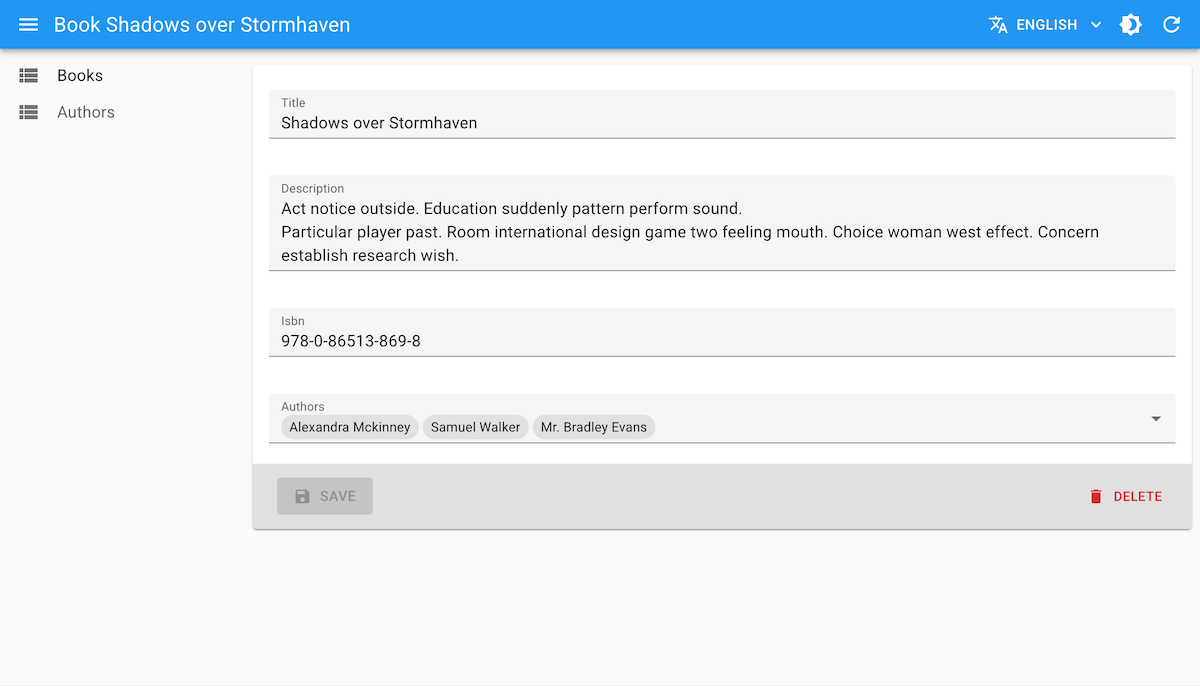
And when the user clicks on it, a dialog opens with a <DataTable> allowing them to sort, filter and finally select one or many choices:
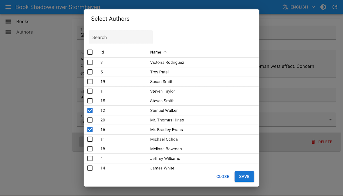
<DataTableInput> is a great alternative to <SelectInput> or <AutocompleteArrayInput> when you have a lot of choices, or when the choice label is not enough to identify the choice and you need to display more details about each choice.
Usage
Just like <SelectInput>, <DataTableInput> expects a choices prop, which should be an array of objects, each with an id and a name property (or whatever you specify in the optionText prop).
The Dialog displays a <DataTable> and uses row selection to let users select one or many choices. You can specify the columns to display in the table by passing <DataTable.Col> as children of <DataTableInput>, with the source of the field to display in each column. To make the dialog title more descriptive, you can also specify a resource prop, which will be used to display the resource name in the title (e.g. "Select author" if resource="authors").
import { Edit, SimpleForm, DataTable, TextInput } from 'react-admin';
import { DataTableInput } from '@react-admin/ra-form-layout';

const choices = [
    { id: 'tech', name: 'Tech', description: 'Computers, gadgets, and all things tech' },
    { id: 'lifestyle', name: 'Lifestyle', description: 'Health, travel, fashion, and lifestyle' },
    { id: 'people', name: 'People', description: 'Interviews, biographies, and stories about people' },
];

export const PostEdit = () => (
    <Edit>
        <SimpleForm>
            <TextInput source="title" />
            <DataTableInput
                source="category_id"
                choices={choices}
                resource="categories"
            >
                <DataTable.Col source="name" />
                <DataTable.Col source="description" />
            </DataTableInput>
        </SimpleForm>
    </Edit>
);
import { Edit, SimpleForm, DataTable, TextInput } from "react-admin";
import { DataTableInput } from "@react-admin/ra-form-layout";

const choices = [
    { id: "tech", name: "Tech", description: "Computers, gadgets, and all things tech" },
    { id: "lifestyle", name: "Lifestyle", description: "Health, travel, fashion, and lifestyle" },
    { id: "people", name: "People", description: "Interviews, biographies, and stories about people" },
];

export const PostEdit = () => (
    <Edit>
        <SimpleForm>
            <TextInput source="title" />
            <DataTableInput source="category_id" choices={choices} resource="categories">
                <DataTable.Col source="name" />
                <DataTable.Col source="description" />
            </DataTableInput>
        </SimpleForm>
    </Edit>
);
<DataTableInput> allows multiple selection when the multiple prop is set to true. In that case, the value should be an array of ids instead of a single id, and <DataTableInput> is then an alternative to <SelectArrayInput> or <AutocompleteArrayInput>.
import { Edit, SimpleForm, DataTable, TextInput } from 'react-admin';
import { DataTableInput } from '@react-admin/ra-form-layout';

const choices = [
    { id: 'admin', name: 'Admin', credentials: 'All access' },
    { id: 'u001', name: 'Editor', credentials: 'Can view and edit posts' },
    { id: 'u002', name: 'Moderator', credentials: 'Can view posts and moderate comments' },
    { id: 'u003', name: 'Reviewer', credentials: 'Can review post submissions' },
];

export const UserEdit = () => (
    <Edit>
        <SimpleForm>
            <TextInput source="name" />
            <DataTableInput
                source="roles"
                choices={choices}
                resource="roles"
                multiple
            >
                <DataTable.Col source="name" />
                <DataTable.Col source="credentials" />
            </DataTableInput>
        </SimpleForm>
    </Edit>
);
import { Edit, SimpleForm, DataTable, TextInput } from "react-admin";
import { DataTableInput } from "@react-admin/ra-form-layout";

const choices = [
    { id: "admin", name: "Admin", credentials: "All access" },
    { id: "u001", name: "Editor", credentials: "Can view and edit posts" },
    { id: "u002", name: "Moderator", credentials: "Can view posts and moderate comments" },
    { id: "u003", name: "Reviewer", credentials: "Can review post submissions" },
];

export const UserEdit = () => (
    <Edit>
        <SimpleForm>
            <TextInput source="name" />
            <DataTableInput source="roles" choices={choices} resource="roles" multiple>
                <DataTable.Col source="name" />
                <DataTable.Col source="credentials" />
            </DataTableInput>
        </SimpleForm>
    </Edit>
);
You can also use <DataTableInput> to select a related record, as a child of <ReferenceInput>, <ReferenceArrayInput> or <ReferenceManyToManyInput>. In that case, the choices will be fetched automatically based on the reference prop of the parent input, and the resource prop of <DataTableInput> will be inherited from the parent input, so you don't need to specify it.
import { Edit, SimpleForm, ReferenceInput, TextInput, DataTable } from 'react-admin';
import { DataTableInput } from '@react-admin/ra-form-layout';

export const PostEdit = () => (
    <Edit>
        <SimpleForm>
            <TextInput source="title" />
            <ReferenceInput source="author_id" reference="authors">
                <DataTableInput>
                    <DataTable.Col source="id" />
                    <DataTable.Col source="name" />
                </DataTableInput>
            </ReferenceInput>
        </SimpleForm>
    </Edit>
);
import { Edit, SimpleForm, ReferenceInput, TextInput, DataTable } from "react-admin";
import { DataTableInput } from "@react-admin/ra-form-layout";

export const PostEdit = () => (
    <Edit>
        <SimpleForm>
            <TextInput source="title" />
            <ReferenceInput source="author_id" reference="authors">
                <DataTableInput>
                    <DataTable.Col source="id" />
                    <DataTable.Col source="name" />
                </DataTableInput>
            </ReferenceInput>
        </SimpleForm>
    </Edit>
);
Props
This component accepts the following props in addition to the <Input> props:
| Prop | Required | Type | Default | Description |
|---|---|---|---|---|
actions |
Optional | ReactElement | false |
false |
Toolbar actions displayed in the dialog |
dataTableProps |
Optional | DataTableProps |
Props passed to the inner <DataTable> |
|
dialogProps |
Optional | DialogProps |
Props passed to the selection <Dialog> |
|
filters |
Optional | ReactElement | ReactElement[] | false |
Filters displayed in the dialog toolbar | |
multiple |
Optional | boolean |
false |
Enable multiple selection |
pagination |
Optional | ReactNode |
<Pagination /> |
Pagination component for the dialog list |
title |
Optional | string |
ra-form-layout.inputs.datatable_input... |
Dialog title (i18n key or string) |
dialogProps
You can use dialogProps to customize the dialog, e.g. its size:
<ReferenceInput source="author_id" reference="authors">
    <DataTableInput
        dialogProps={{ maxWidth: 'md', fullWidth: false }}
    >
        <DataTable.Col source="id" />
        <DataTable.Col source="name" />
    </DataTableInput>
</ReferenceInput>
<ReferenceInput source="author_id" reference="authors">
    <DataTableInput dialogProps={{ maxWidth: "md", fullWidth: false }}>
        <DataTable.Col source="id" />
        <DataTable.Col source="name" />
    </DataTableInput>
</ReferenceInput>;
filters
Just like filters in the <List> component, the filters prop of <DataTableInput> allows you to display filters in the dialog toolbar. You can use any input as a filter.
import { Edit, SimpleForm, ReferenceInput, DataTable, TextInput } from 'react-admin';
import { DataTableInput } from '@react-admin/ra-form-layout';

const filters = [
    <TextInput source="q" label="Search" alwaysOn />,
    <TextInput source="name" label="Name" />,
];

const PostEdit = () => (
    <Edit>
        <SimpleForm>
            <TextInput source="title" />
            <ReferenceInput source="author_id" reference="authors">
                <DataTableInput filters={filters}>
                    <DataTable.Col source="id" />
                    <DataTable.Col source="name" />
                </DataTableInput>
            </ReferenceInput>
        </SimpleForm>
    </Edit>
);
import { Edit, SimpleForm, ReferenceInput, DataTable, TextInput } from "react-admin";
import { DataTableInput } from "@react-admin/ra-form-layout";

const filters = [<TextInput source="q" label="Search" alwaysOn />, <TextInput source="name" label="Name" />];

const PostEdit = () => (
    <Edit>
        <SimpleForm>
            <TextInput source="title" />
            <ReferenceInput source="author_id" reference="authors">
                <DataTableInput filters={filters}>
                    <DataTable.Col source="id" />
                    <DataTable.Col source="name" />
                </DataTableInput>
            </ReferenceInput>
        </SimpleForm>
    </Edit>
);
<DateInput>, <DateTimeInput> and <TimeInput>
<DateInput>, <DateTimeInput> and <TimeInput> are wrappers around the MUI X Date/Time pickers. They allow for more customization of the UI than the default browser pickers. They also make it easier to work with specific locale and date formats.
Usage
Use <DateInput>, <DateTimeInput> or <TimeInput> inside a form component (<SimpleForm>, <TabbedForm>, <LongForm>, etc.) to allow users to pick a date, a time or both.
import {
    DateInput,
    DateTimeInput,
    TimeInput,
} from '@react-admin/ra-form-layout';
import { Edit, SimpleForm } from 'react-admin';

export const EventEdit = () => (
    <Edit>
        <SimpleForm>
            <DateInput source="event_date" />
            <TimeInput source="event_start_time" />
            <DateTimeInput source="published_at" />
        </SimpleForm>
    </Edit>
);
import { DateInput, DateTimeInput, TimeInput } from "@react-admin/ra-form-layout";
import { Edit, SimpleForm } from "react-admin";

export const EventEdit = () => (
    <Edit>
        <SimpleForm>
            <DateInput source="event_date" />
            <TimeInput source="event_start_time" />
            <DateTimeInput source="published_at" />
        </SimpleForm>
    </Edit>
);
<DateInput>, <DateTimeInput> or <TimeInput> will accept either a Date object or any string that can be parsed into a Date as value. It will return a Date object, or null if the date is invalid.
Tip: You can use the parse prop to change the format of the returned value. See Parsing the date/time as an ISO string for an example.
Props
| Prop | Required | Type | Default | Description |
|---|---|---|---|---|
fullWidth |
- | boolean | - | If false, the input will not expand to fill the form width |
helperText |
- | string | - | Text to be displayed under the input |
mask |
- | string | - | Alias for the MUI format prop. Format of the date/time when rendered in the input. Defaults to localized format. |
parse |
- | Function | value => value === '' ? null : value |
Callback taking the input value, and returning the value you want stored in the form state. |
validate |
- | Function or Array | - | Validation rules for the input. See the Validation Documentation for details. |
Except for the format prop (renamed mask), <DateInput>, <DateTimeInput> and <TimeInput> accept the same props as the MUI X Date/Time pickers. They also accept the common input props.
Providing your own LocalizationProvider
MUI X Pickers need to be wrapped in a LocalizationProvider to work properly. <DateInput>, <DateTimeInput> and <TimeInput> already include a default <LocalizationProvider> using the date-fns adapter and the enUS locale.
You can change the locale and the date format globally by wrapping the <Admin> with your own <LocalizationProvider>.
Here is how to set up the pickers to use the fr locale:
import { Admin, Resource } from 'react-admin';
import { fr } from 'date-fns/locale/fr'
import { EventEdit } from './events';

import { LocalizationProvider } from '@mui/x-date-pickers';
import { AdapterDateFns } from '@mui/x-date-pickers/AdapterDateFns';

export const App = () => (
    <LocalizationProvider dateAdapter={AdapterDateFns} adapterLocale={fr}>
        <Admin>
            <Resource name="events" edit={EventEdit} />
        </Admin>
    </LocalizationProvider>
);
import { Admin, Resource } from "react-admin";
import { fr } from "date-fns/locale/fr";
import { EventEdit } from "./events";

import { LocalizationProvider } from "@mui/x-date-pickers";
import { AdapterDateFns } from "@mui/x-date-pickers/AdapterDateFns";

export const App = () => (
    <LocalizationProvider dateAdapter={AdapterDateFns} adapterLocale={fr}>
        <Admin>
            <Resource name="events" edit={EventEdit} />
        </Admin>
    </LocalizationProvider>
);
Note: React Admin only supports the date-fns adapter for now.
Tip: React Admin already depends on date-fns v3 but your package manager may require you to add it to your dependencies.
Parsing the date/time as an ISO string
By default, <DateInput>, <DateTimeInput> and <TimeInput> store the date/time as a Date object in the form state. If you wish to store the date/time as an ISO string instead (or any other format), you can use the parse prop.
<DateInput
    source="published"
    parse={(date: Date) => (date ? date.toISOString() : null)}
/>
<DateInput source="published" parse={(date) => (date ? date.toISOString() : null)} />;
<DateRangeInput>
<DateRangeInput> is a date range picker, allowing users to pick an interval by selecting a start and an end date. It is ideal for filtering records based on a date range. It is designed to work with various locales and date formats.
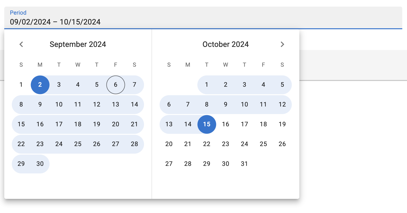
Note: <DateRangeInput> is a wrapper around the Material UI X Date Range Picker, which is a MUI X Pro package. This means that you need to own a MUI X Pro license to use it and install the package:
npm install --save @mui/x-date-pickers-pro
# or
yarn add @mui/x-date-pickers-pro
Usage
Use <DateRangeInput> inside a form component (<SimpleForm>, <TabbedForm>, <LongForm>, etc.) to allow users to pick a start and an end date.
import { DateRangeInput } from '@react-admin/ra-form-layout/DateRangeInput';
import { Edit, SimpleForm } from 'react-admin';

export const EventEdit = () => (
    <Edit>
        <SimpleForm>
            <DateRangeInput source="subscription_period" />
        </SimpleForm>
    </Edit>
);
import { DateRangeInput } from "@react-admin/ra-form-layout/DateRangeInput";
import { Edit, SimpleForm } from "react-admin";

export const EventEdit = () => (
    <Edit>
        <SimpleForm>
            <DateRangeInput source="subscription_period" />
        </SimpleForm>
    </Edit>
);
<DateRangeInput> reads and writes date ranges as arrays of Date objects. It also accepts arrays of strings that can be parsed into Date values. It will return null if any of the dates is invalid.
// example valid date range values
['2024-01-01', '2024-01-31']
['2024-01-01T00:00:00.000Z', '2024-01-31T23:59:59.999Z']
[new Date('2024-01-01T00:00:00.000Z'), new Date('2024-01-31T23:59:59.999Z')]
Tip: You can use the parse prop to change the format of the returned value. See Parsing the date/time as an ISO string for an example.
Props
| Prop | Required | Type | Default | Description |
|---|---|---|---|---|
source |
Required | string | - | The name of the field in the record. |
defaultValue |
- | Array | - | The default value of the input. |
disabled |
- | boolean | - | If true, the input will be disabled. |
format |
- | function | - | Callback taking the value from the form state, and returning the input value. |
fullWidth |
- | boolean | - | If false, the input will not expand to fill the form width |
helperText |
- | string | - | Text to be displayed under the input |
label |
- | string | - | Input label. In i18n apps, the label is passed to the translate function. When omitted, the source property is humanized and used as a label. Set label={false} to hide the label. |
mask |
- | string | - | Alias for the MUI format prop. Format of the date/time when rendered in the input. Defaults to localized format. |
parse |
- | Function | - | Callback taking the input values, and returning the values you want stored in the form state. |
readOnly |
- | boolean | - | If true, the input will be read-only. |
sx |
- | SxProps |
- | The style to apply to the component. |
validate |
- | `function | Array` | - |
<DateRangeInput> also accept the same props as MUI X's <DateRangePicker>, except for the format prop (renamed mask),
Tip: Since <DateRangeInput> stores its value as a date array, react-admin's validators like minValue or maxValue won't work out of the box.
parse and format
By default, <DateRangeInput> stores the dates as an array of Date objects in the form state. When sent to the API, these dates will be stringified using the ISO 8601 format via Date.prototype.toISOString().
If you wish to store the dates in any other format, you can use the parse prop to change the Date objects into the desired format.
<DateRangeInput
    source="subscription_period"
    parse={(dates: Date[]) => (
        dates
            ? dates.map(date => (date ? date.toUTCString()() : null))
            : null
    )}
/>
<DateRangeInput
    source="subscription_period"
    parse={(dates) => (dates ? dates.map((date) => (date ? date.toUTCString()() : null)) : null)}
/>;
Similarly, if your database stores your dates in a format that can't be interpreted by Date.parse(), you can use the format prop.
import { parse } from 'date-fns';
// ...
<DateRangeInput
    source="subscription_period"
    format={(dates: Date[]) => (
        dates
            ? dates.map(date => date ? parse(date, 'dd/MM/yyyy', new Date()) : null)
            : null
    )}
/>
import { parse } from "date-fns";
// ...
<DateRangeInput
    source="subscription_period"
    format={(dates) => (dates ? dates.map((date) => (date ? parse(date, "dd/MM/yyyy", new Date()) : null)) : null)}
/>;
validate
The value of the validate prop must be a function taking the record as input, and returning an object with error messages indexed by fields. The record could be null or an array of objects that could be null or a Date object. So the react-admin's built-in field validators will not be useful for <DateRageInput>, you will need to build your own.
Here is an example of custom validators for a <DateRangeInput>:
import {
    Edit,
    isEmpty,
    required,
    SimpleForm,
    TextInput,
} from "react-admin";
import { DateRangeInput } from '@react-admin/ra-form-layout/DateRangeInput';

const requiredValues = dates =>
    !dates || isEmpty(dates[0]) || isEmpty(dates[1])
        ? 'ra.validation.required'
        : null;

const thisMonth = dates => {
    if (!dates || !dates[0] || !dates[1]) {
        return
    }
    const firstOfTheMonth = new Date();
    firstOfTheMonth.setDate(1);
    firstOfTheMonth.setHours(0, 0, 0, 0);
    const lastOfTheMonth = new Date();
    lastOfTheMonth.setMonth(lastOfTheMonth.getMonth() + 1);
    lastOfTheMonth.setDate(0);
    lastOfTheMonth.setHours(23, 59, 59, 999);
    return dates[0] < firstOfTheMonth || dates[1] > lastOfTheMonth
        ? 'ra.validation.dateRange.invalid'
        : null;
}

const EventEdit = () => {
    return (
        <Edit>
            <SimpleForm>
                <TextInput source="title" validate={required} />
                <DateRangeInput source="communication_period" validate={requiredValues} />
                <DateRangeInput source="subscription_period" validate={[requiredValues(), tothisMonthay()]} />
            </SimpleForm>
        </Edit>
    );
};
import { Edit, isEmpty, required, SimpleForm, TextInput } from "react-admin";
import { DateRangeInput } from "@react-admin/ra-form-layout/DateRangeInput";

const requiredValues = (dates) => (!dates || isEmpty(dates[0]) || isEmpty(dates[1]) ? "ra.validation.required" : null);

const thisMonth = (dates) => {
    if (!dates || !dates[0] || !dates[1]) {
        return;
    }
    const firstOfTheMonth = new Date();
    firstOfTheMonth.setDate(1);
    firstOfTheMonth.setHours(0, 0, 0, 0);
    const lastOfTheMonth = new Date();
    lastOfTheMonth.setMonth(lastOfTheMonth.getMonth() + 1);
    lastOfTheMonth.setDate(0);
    lastOfTheMonth.setHours(23, 59, 59, 999);
    return dates[0] < firstOfTheMonth || dates[1] > lastOfTheMonth ? "ra.validation.dateRange.invalid" : null;
};

const EventEdit = () => {
    return (
        <Edit>
            <SimpleForm>
                <TextInput source="title" validate={required} />
                <DateRangeInput source="communication_period" validate={requiredValues} />
                <DateRangeInput source="subscription_period" validate={[requiredValues(), tothisMonthay()]} />
            </SimpleForm>
        </Edit>
    );
};
Using <DateRangeInput> as a Filter
<DateRangeInput> can also be used to filter a <List>.
However, by default, <DateRangeInput> returns Date objects with their time set to 00:00:00, which makes the upper bound exclusive. Usually, users will expect the upper bound to be inclusive.
This can be achieved by providing a parse function that sets the time of the upper bound to 23:59:59.
Here is an example:
import { DateRangeInput } from '@react-admin/ra-form-layout/DateRangeInput';
import { List, DataTable, DateField } from 'react-admin';
import { endOfDay } from 'date-fns';

const dateRangeFilterParse = (dates: (Date | null)[]) => {
    return [dates[0], dates[1] ? endOfDay(dates[1]) : dates[1]];
};

const eventsFilters = [
    <DateRangeInput
        source="date_between"
        key="date_filter"
        parse={dateRangeFilterParse}
    />,
];

export const EventsList = () => (
    <List filters={eventsFilters}>
        <DataTable>
            <DataTable.NumberCol source="id" />
            <DataTable.Col source="name" />
            <DataTable.Col source="date" field={DateField} />
        </DataTable>
    </List>
);
import { DateRangeInput } from "@react-admin/ra-form-layout/DateRangeInput";
import { List, DataTable, DateField } from "react-admin";
import { endOfDay } from "date-fns";

const dateRangeFilterParse = (dates) => {
    return [dates[0], dates[1] ? endOfDay(dates[1]) : dates[1]];
};

const eventsFilters = [<DateRangeInput source="date_between" key="date_filter" parse={dateRangeFilterParse} />];

export const EventsList = () => (
    <List filters={eventsFilters}>
        <DataTable>
            <DataTable.NumberCol source="id" />
            <DataTable.Col source="name" />
            <DataTable.Col source="date" field={DateField} />
        </DataTable>
    </List>
);
Providing your own LocalizationProvider
MUI X Pickers need to be wrapped in a LocalizationProvider to work properly. <DateRangeInput> already includes a default <LocalizationProvider> using the date-fns adapter and the enUS locale.
You can change the locale and the date format for the entire app by wrapping the <Admin> with your own <LocalizationProvider>.
Here is how to set up the pickers to use the fr locale:
import { Admin, Resource } from 'react-admin';
import { fr } from 'date-fns/locale/fr'
import { EventEdit } from './events';

import { LocalizationProvider } from '@mui/x-date-pickers-pro';
import { AdapterDateFns } from '@mui/x-date-pickers-pro/AdapterDateFns';

export const App = () => (
    <LocalizationProvider dateAdapter={AdapterDateFns} adapterLocale={fr}>
        <Admin>
            <Resource name="events" edit={EventEdit} />
        </Admin>
    </LocalizationProvider>
);
import { Admin, Resource } from "react-admin";
import { fr } from "date-fns/locale/fr";
import { EventEdit } from "./events";

import { LocalizationProvider } from "@mui/x-date-pickers-pro";
import { AdapterDateFns } from "@mui/x-date-pickers-pro/AdapterDateFns";

export const App = () => (
    <LocalizationProvider dateAdapter={AdapterDateFns} adapterLocale={fr}>
        <Admin>
            <Resource name="events" edit={EventEdit} />
        </Admin>
    </LocalizationProvider>
);
Note: To wrap your admin using a <DateInput>, a <DateTimeInput> or a <TimeInput>, you need to import LocalizationProvider from @mui/x-date-pickers and AdapterDateFns from @mui/x-date-pickers/AdapterDateFns. But, to wrap your admin using a <DateRangeInput>, you need to import LocalizationProvider from @mui/x-date-pickers-pro and AdapterDateFns from @mui/x-date-pickers-pro/AdapterDateFns. If you use both components, please use @mui/x-date-pickers-pro imports.
Note: React-admin only supports the date-fns adapter for now.
Tip: React-admin already depends on date-fns v3 but your package manager may require you to add it to your dependencies.
<FilterValue>
A component that displays the active filters as MUI Chips. Usually combined with <StackedFilters>. It must be used inside a react-admin <List>.
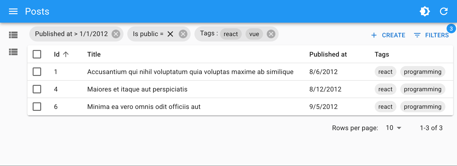
Usage
Put <FilterValue> inside the <List> actions, for instance in a custom toolbar. Define how each filter should be displayed by adding <FilterValue.Field> children.
import {
    BooleanField,
    CreateButton,
    DataTable,
    List,
    ReferenceArrayField,
    TopToolbar,
} from 'react-admin';
import {
    FilterValue,
    StackedFilters,
    FiltersConfig,
    booleanFilter,
    choicesArrayFilter,
    dateFilter,
    numberFilter,
    referenceFilter,
    textFilter,
} from '@react-admin/ra-form-layout';

const postListFilters: FiltersConfig = {
    id: textFilter({ operators: ['eq', 'neq'] }),
    title: textFilter(),
    published_at: dateFilter(),
    is_public: booleanFilter(),
    tags: choicesArrayFilter({
        choices: [
            { id: 'solid', name: 'Solid' },
            { id: 'react', name: 'React' },
            { id: 'vue', name: 'Vue' },
            { id: 'programming', name: 'Programming' },
        ],
    }),
};

const PostListToolbar = () => (
    <TopToolbar sx={{ flex: 1 }}>
        <FilterValue sx={{ flex: 1 }}>
            <FilterValue.Field source="id" />
            <FilterValue.Field source="title" />
            <FilterValue.Field source="published_at" field={DateField} />
            <FilterValue.Field source="is_public" field={BooleanField} />
            <FilterValue.Field source="tags" field={TextArrayField} />
        </FilterValue>
        <CreateButton />
        <StackedFilters config={PostListFilters} />
    </TopToolbar>
);

const PostList = () => (
    <List actions={<PostListToolbar />}>
        <DataTable>
            <DataTable.Col source="title" />
            <DataTable.NumberCol source="views" />
            <DataTable.Col source="tag_ids">
                <ReferenceArrayField tags="tags" source="tag_ids" />
            </DataTable.Col>
            <DataTable.Col source="published" field={BooleanField} />
        </DataTable>
    </List>
);
import { BooleanField, CreateButton, DataTable, List, ReferenceArrayField, TopToolbar } from "react-admin";
import {
    FilterValue,
    StackedFilters,
    booleanFilter,
    choicesArrayFilter,
    dateFilter,
    textFilter,
} from "@react-admin/ra-form-layout";

const postListFilters = {
    id: textFilter({ operators: ["eq", "neq"] }),
    title: textFilter(),
    published_at: dateFilter(),
    is_public: booleanFilter(),
    tags: choicesArrayFilter({
        choices: [
            { id: "solid", name: "Solid" },
            { id: "react", name: "React" },
            { id: "vue", name: "Vue" },
            { id: "programming", name: "Programming" },
        ],
    }),
};

const PostListToolbar = () => (
    <TopToolbar sx={{ flex: 1 }}>
        <FilterValue sx={{ flex: 1 }}>
            <FilterValue.Field source="id" />
            <FilterValue.Field source="title" />
            <FilterValue.Field source="published_at" field={DateField} />
            <FilterValue.Field source="is_public" field={BooleanField} />
            <FilterValue.Field source="tags" field={TextArrayField} />
        </FilterValue>
        <CreateButton />
        <StackedFilters config={PostListFilters} />
    </TopToolbar>
);

const PostList = () => (
    <List actions={<PostListToolbar />}>
        <DataTable>
            <DataTable.Col source="title" />
            <DataTable.NumberCol source="views" />
            <DataTable.Col source="tag_ids">
                <ReferenceArrayField tags="tags" source="tag_ids" />
            </DataTable.Col>
            <DataTable.Col source="published" field={BooleanField} />
        </DataTable>
    </List>
);
Props
| Prop | Required | Type | Default | Description |
|---|---|---|---|---|
children |
Required | ReactNode | - | The <FilterValue.Field> children defining how each filter should be displayed. |
operators |
Optional | string[] | All | The list of accepted operators. |
Additional props are passed to the underlying MUI <Stack> component.
children
By default, <FilterValue> does not display any filter. You must pass <FilterValue.Field> children to define how each filter should be displayed.
Foe instance, to display filters on the firstName and age fields:
<FilterValue direction="row" spacing={2}>
    <FilterValue.Field source="firstName" />
    <FilterValue.Field source="age" />
</FilterValue>
<FilterValue direction="row" spacing={2}>
    <FilterValue.Field source="firstName" />
    <FilterValue.Field source="age" />
</FilterValue>;
<FilterValue.Field> must be given a source prop, which is the name of the field to display. One <FilterValue.Field> may render multiple chips, for instance when the user has applied two filters on the same field with different operators (e.g. age_gt=18 and age_lt=60).
As for the filter value, it renders as text by default, but you can customize its formatting by using one of the following props:
-
field: A react-admin field component (e.g.DateField,NumberField, etc.) to use to display the filter value.<FilterValue.Field source="age" field={NumberField} /><FilterValue.Field source="age" field={NumberField} />; -
children: The field element to use to display the filter value, passed as a child.<FilterValue.Field source="userId" label="User"> <ReferenceField source="userId" reference="users" /> </FilterValue.Field><FilterValue.Field source="userId" label="User"> <ReferenceField source="userId" reference="users" /> </FilterValue.Field>; -
render: A function to render the filter. It receives an object withsource,operator, andvalueproperties.<FilterValue.Field source="age" render={({ record, operator, label }) => { if (operator === 'gte') return <>{label}: {record.age} or older</>; if (operator === 'lte') return <>{label}: {record.age} or younger</>; return <>{label} = {record.age}</>; }} /><FilterValue.Field source="age" render={({ record, operator, label }) => { if (operator === "gte") return ( <> {label}: {record.age} or older </> ); if (operator === "lte") return ( <> {label}: {record.age} or younger </> ); return ( <> {label} = {record.age} </> ); }} />;
Check the <FilterValue.Field> section below for more details.
operators
<FilterValue> needs to distinguish operators from field names containing the _ symbol. By default, it handles all the operators added by the <StackedFilters> Filter Configuration Builders: eq, neq, eq_any, neq_any, gt, gte, lt, lte, q, inc, inc_any, ninc_any.
If your filters use other operators, or if you want to restrict the list of accepted operators, you can pass an operators prop to customize the list of accepted operators.
<FilterValue direction="row" spacing={2} operators={['eq', 'neq', 'lt', 'gt']} />
<FilterValue direction="row" spacing={2} operators={["eq", "neq", "lt", "gt"]} />;
<FilterValue.Field>
Children of <FilterValue>, these components define how each filter should be displayed.
Usage
Pass a source prop, and optionally a field component if you want to customize the display of the filter value. You can also pass the desired component as children or via a render prop.
<FilterValue>
<FilterValue.Field source="firstName" />
<FilterValue.Field source="age" field={NumberField} />
<FilterValue.Field source="userId" label="User">
  <ReferenceField source="userId" reference="users" />
</FilterValue.Field>
<FilterValue.Field source="sex">
<SelectField source="sex" choices={choices} />
</FilterValue.Field>
<FilterValue.Field source="age" render={({ record, operator, label }) => {
  if (operator === 'gte') return <>{label}: {record.age} or older</>;
  if (operator === 'lte') return <>{label}: {record.age} or younger</>;
  return <>{label} = {record.age}</>;
}} />
</FilterValue>
<FilterValue>
    <FilterValue.Field source="firstName" />
    <FilterValue.Field source="age" field={NumberField} />
    <FilterValue.Field source="userId" label="User">
        <ReferenceField source="userId" reference="users" />
    </FilterValue.Field>
    <FilterValue.Field source="sex">
        <SelectField source="sex" choices={choices} />
    </FilterValue.Field>
    <FilterValue.Field
        source="age"
        render={({ record, operator, label }) => {
            if (operator === "gte")
                return (
                    <>
                        {label}: {record.age} or older
                    </>
                );
            if (operator === "lte")
                return (
                    <>
                        {label}: {record.age} or younger
                    </>
                );
            return (
                <>
                    {label} = {record.age}
                </>
            );
        }}
    />
</FilterValue>;
Props
| Prop | Required | Type | Default | Description |
|---|---|---|---|---|
source |
Required | string | - | The source of the filter to display. |
children |
Optional | ReactNode | - | The field component to use to display the filter value. |
disableDelete |
Optional | boolean | false | If true, the user won't be able to remove this filter. |
field |
Optional | ReactElement | TextField |
The field component to use to display the filter value. |
label |
Optional | string | - | The label to display for the filter. If not provided, it will be inferred from the source. |
render |
Optional | function | - | A function to render the filter. It receives an object with source, operator, and value properties. |
sx |
Optional | Object | - | An object containing the MUI style overrides to apply to the Chip component |
Additional props are passed to the underlying MUI <Chip> component.
I18n
<FilterValue.Field> uses translation messages for fields and operators, so you can leverage react-admin's i18nProvider to translate them.
The following filter values:
{
    age_gt: 18,
    price_lt: 100,
    status_neq: 'draft',
}
Will render differently depending on the locale:

Use the resources.[resource].fields.[field] key to translate field names, and the ra-form-layout.filters.operators_shorthand.[operator] key to translate operators.
const i18nProvider = polyglotI18NProvider(() =>
    ({
        resources: {
            posts: {
                fields: {
                    age: 'Âge',
                    price: 'Prix',
                    status: 'Statut',
                },
            },
        },
        'ra-form-layout': {
            filters: {
                operators_shorthand: {
                    gt: 'plus grand que',
                    lt: 'inférieur à',
                    neq: 'autre que',
                },
            },
        },
    }),
    'fr'
);

<Admin i18nProvider={i18nProvider} ... />
const i18nProvider = polyglotI18NProvider(
    () => ({
        resources: {
            posts: {
                fields: {
                    age: "Âge",
                    price: "Prix",
                    status: "Statut",
                },
            },
        },
        "ra-form-layout": {
            filters: {
                operators_shorthand: {
                    gt: "plus grand que",
                    lt: "inférieur à",
                    neq: "autre que",
                },
            },
        },
    }),
    "fr"
);

<Admin i18nProvider={i18nProvider} />;
<InputSelectorForm>
This component renders a form allowing to select the fields to update in a record.
Usage
<InputSelectorForm> expects a list of inputs passed in the inputs prop. Each input must have a label and an element.
import { InputSelectorForm } from '@react-admin/ra-form-layout';
import * as React from 'react';
import {
    BooleanInput,
    DateInput,
    SelectArrayInput,
    TextInput,
} from 'react-admin';

const PostEdit = () => (
    <InputSelectorForm
        inputs={[
            {
                label: 'Title',
                element: <TextInput source="title" />,
            },
            {
                label: 'Body',
                element: <TextInput source="body" multiline />,
            },
            {
                label: 'Published at',
                element: <DateInput source="published_at" />,
            },
            {
                label: 'Is public',
                element: <BooleanInput source="is_public" />,
            },
            {
                label: 'Tags',
                element: (
                    <SelectArrayInput
                        source="tags"
                        choices={[
                            { id: 'react', name: 'React' },
                            { id: 'vue', name: 'Vue' },
                            { id: 'solid', name: 'Solid' },
                            { id: 'programming', name: 'Programming' },
                        ]}
                    />
                ),
            },
        ]}
    />
);
import { InputSelectorForm } from "@react-admin/ra-form-layout";
import * as React from "react";
import { BooleanInput, DateInput, SelectArrayInput, TextInput } from "react-admin";

const PostEdit = () => (
    <InputSelectorForm
        inputs={[
            {
                label: "Title",
                element: <TextInput source="title" />,
            },
            {
                label: "Body",
                element: <TextInput source="body" multiline />,
            },
            {
                label: "Published at",
                element: <DateInput source="published_at" />,
            },
            {
                label: "Is public",
                element: <BooleanInput source="is_public" />,
            },
            {
                label: "Tags",
                element: (
                    <SelectArrayInput
                        source="tags"
                        choices={[
                            { id: "react", name: "React" },
                            { id: "vue", name: "Vue" },
                            { id: "solid", name: "Solid" },
                            { id: "programming", name: "Programming" },
                        ]}
                    />
                ),
            },
        ]}
    />
);
<InputSelectorForm> also expects to be used inside a <SaveContext>. When the form is submitted, it will call the save method from the <SaveContext>, with the value of the selected inputs.
Tip: <InputSelectorForm> is particularily useful when used with <BulkUpdateFormButton>, as it allows to select the fields to update.
import {
    BulkUpdateFormButton,
    InputSelectorForm,
} from '@react-admin/ra-form-layout';
import * as React from 'react';
import { BooleanInput, DateInput } from 'react-admin';

const PostBulkUpdateButton = () => (
    <BulkUpdateFormButton>
        <InputSelectorForm
            inputs={[
                {
                    label: 'Published at',
                    element: <DateInput source="published_at" />,
                },
                {
                    label: 'Is public',
                    element: <BooleanInput source="is_public" />,
                },
            ]}
        />
    </BulkUpdateFormButton>
);
import { BulkUpdateFormButton, InputSelectorForm } from "@react-admin/ra-form-layout";
import * as React from "react";
import { BooleanInput, DateInput } from "react-admin";

const PostBulkUpdateButton = () => (
    <BulkUpdateFormButton>
        <InputSelectorForm
            inputs={[
                {
                    label: "Published at",
                    element: <DateInput source="published_at" />,
                },
                {
                    label: "Is public",
                    element: <BooleanInput source="is_public" />,
                },
            ]}
        />
    </BulkUpdateFormButton>
);
Check out the <BulkUpdateFormButton> documentation for more information.
Props
| Prop | Required | Type | Default | Description |
|---|---|---|---|---|
inputs |
Required (*) | Array | - | The list of inputs from which the user can pick |
<InputSelectorForm> also accepts the same props as <WizardForm>, except the onSubmit and children props.
inputs
Use the inputs prop to specify the list of inputs from which the user can pick. Each input must have a label and an element.
import { InputSelectorForm } from '@react-admin/ra-form-layout';
import * as React from 'react';
import {
    BooleanInput,
    DateInput,
    SelectArrayInput,
    TextInput,
} from 'react-admin';

const PostEdit = () => (
    <InputSelectorForm
        inputs={[
            {
                label: 'Title',
                element: <TextInput source="title" />,
            },
            {
                label: 'Body',
                element: <TextInput source="body" multiline />,
            },
            {
                label: 'Published at',
                element: <DateInput source="published_at" />,
            },
            {
                label: 'Is public',
                element: <BooleanInput source="is_public" />,
            },
            {
                label: 'Tags',
                element: (
                    <SelectArrayInput
                        source="tags"
                        choices={[
                            { id: 'react', name: 'React' },
                            { id: 'vue', name: 'Vue' },
                            { id: 'solid', name: 'Solid' },
                            { id: 'programming', name: 'Programming' },
                        ]}
                    />
                ),
            },
        ]}
    />
);
import { InputSelectorForm } from "@react-admin/ra-form-layout";
import * as React from "react";
import { BooleanInput, DateInput, SelectArrayInput, TextInput } from "react-admin";

const PostEdit = () => (
    <InputSelectorForm
        inputs={[
            {
                label: "Title",
                element: <TextInput source="title" />,
            },
            {
                label: "Body",
                element: <TextInput source="body" multiline />,
            },
            {
                label: "Published at",
                element: <DateInput source="published_at" />,
            },
            {
                label: "Is public",
                element: <BooleanInput source="is_public" />,
            },
            {
                label: "Tags",
                element: (
                    <SelectArrayInput
                        source="tags"
                        choices={[
                            { id: "react", name: "React" },
                            { id: "vue", name: "Vue" },
                            { id: "solid", name: "Solid" },
                            { id: "programming", name: "Programming" },
                        ]}
                    />
                ),
            },
        ]}
    />
);
Internationalization
You can use translation keys as input labels.
// in i18n/fr.ts

const customFrenchMessages = {
    resources: {
        posts: {
            name: 'Article |||| Articles',
            fields: {
                published_at: 'Publié le',
                is_public: 'Public',
            },
        },
    },
};

// in posts/postEdit.tsx

import { InputSelectorForm } from '@react-admin/ra-form-layout';
import * as React from 'react';
import { BooleanInput, DateInput } from 'react-admin';

const PostEdit = () => (
    <InputSelectorForm
        inputs={[
            {
                label: 'resources.posts.fields.published_at',
                element: <DateInput source="published_at" />,
            },
            {
                label: 'resources.posts.fields.is_public',
                element: <BooleanInput source="is_public" />,
            },
        ]}
    />
);
// in i18n/fr.ts

const customFrenchMessages = {
    resources: {
        posts: {
            name: "Article |||| Articles",
            fields: {
                published_at: "Publié le",
                is_public: "Public",
            },
        },
    },
};

// in posts/postEdit.tsx

import { InputSelectorForm } from "@react-admin/ra-form-layout";
import * as React from "react";
import { BooleanInput, DateInput } from "react-admin";

const PostEdit = () => (
    <InputSelectorForm
        inputs={[
            {
                label: "resources.posts.fields.published_at",
                element: <DateInput source="published_at" />,
            },
            {
                label: "resources.posts.fields.is_public",
                element: <BooleanInput source="is_public" />,
            },
        ]}
    />
);
<LongForm>
Alternative to <SimpleForm>, to be used as child of <Create> or <Edit>. Expects <LongForm.Section> elements as children.
Test it live on the Enterprise Edition Storybook.
This component will come in handy if you need to create a long form, with many input fields divided into several sections. It makes navigation easier, by providing a TOC (Table Of Contents) and by keeping the toolbar fixed at the bottom position.
import {
    ArrayInput,
    BooleanInput,
    DateInput,
    Edit,
    required,
    SelectInput,
    SimpleFormIterator,
    TextField,
    TextInput,
    Labeled,
} from 'react-admin';
import { LongForm } from '@react-admin/ra-form-layout';

const sexChoices = [
    { id: 'male', name: 'Male' },
    { id: 'female', name: 'Female' },
];

const languageChoices = [
    { id: 'en', name: 'English' },
    { id: 'fr', name: 'French' },
];

const CustomerEdit = () => (
    <Edit component="div">
        <LongForm>
            <LongForm.Section label="Identity">
                <Labeled label="id">
                    <TextField source="id" />
                </Labeled>
                <TextInput source="first_name" validate={required()} />
                <TextInput source="last_name" validate={required()} />
                <DateInput source="dob" label="born" validate={required()} />
                <SelectInput source="sex" choices={sexChoices} />
            </LongForm.Section>
            <LongForm.Section label="Occupations">
                <ArrayInput source="occupations" label="">
                    <SimpleFormIterator>
                        <TextInput source="name" validate={required()} />
                        <DateInput source="from" validate={required()} />
                        <DateInput source="to" />
                    </SimpleFormIterator>
                </ArrayInput>
            </LongForm.Section>
            <LongForm.Section label="Preferences">
                <SelectInput
                    source="language"
                    choices={languageChoices}
                    defaultValue="en"
                />
                <BooleanInput source="dark_theme" />
                <BooleanInput source="accepts_emails_from_partners" />
            </LongForm.Section>
        </LongForm>
    </Edit>
);
import {
    ArrayInput,
    BooleanInput,
    DateInput,
    Edit,
    required,
    SelectInput,
    SimpleFormIterator,
    TextField,
    TextInput,
    Labeled,
} from "react-admin";
import { LongForm } from "@react-admin/ra-form-layout";

const sexChoices = [
    { id: "male", name: "Male" },
    { id: "female", name: "Female" },
];

const languageChoices = [
    { id: "en", name: "English" },
    { id: "fr", name: "French" },
];

const CustomerEdit = () => (
    <Edit component="div">
        <LongForm>
            <LongForm.Section label="Identity">
                <Labeled label="id">
                    <TextField source="id" />
                </Labeled>
                <TextInput source="first_name" validate={required()} />
                <TextInput source="last_name" validate={required()} />
                <DateInput source="dob" label="born" validate={required()} />
                <SelectInput source="sex" choices={sexChoices} />
            </LongForm.Section>
            <LongForm.Section label="Occupations">
                <ArrayInput source="occupations" label="">
                    <SimpleFormIterator>
                        <TextInput source="name" validate={required()} />
                        <DateInput source="from" validate={required()} />
                        <DateInput source="to" />
                    </SimpleFormIterator>
                </ArrayInput>
            </LongForm.Section>
            <LongForm.Section label="Preferences">
                <SelectInput source="language" choices={languageChoices} defaultValue="en" />
                <BooleanInput source="dark_theme" />
                <BooleanInput source="accepts_emails_from_partners" />
            </LongForm.Section>
        </LongForm>
    </Edit>
);
Props
This component accepts the following props in addition to the <Form> props:
| Prop | Required | Type | Default | Description |
|---|---|---|---|---|
authorizationError |
Optional | ReactNode |
null |
The content to display when authorization checks fail |
enableAccessControl |
Optional | boolean |
false |
Enable checking authorization rights for each section and input |
loading |
Optional | ReactNode |
The content to display when checking authorizations | |
toolbar |
Optional | ReactNode |
The toolbar element | |
sx |
Optional | object |
Custom styles |
authorizationError
Used when enableAccessControl is set to true and an error occurs while checking for users permissions. Defaults to null:
import { ArrayInput, Edit, DateInput, SimpleFormIterator, TextInput } from 'react-admin';
import { LongForm } from '@react-admin/ra-form-layout';
import { Alert } from '@mui/material';

const CustomerEdit = () => (
    <Edit>
        <LongForm
            enableAccessControl
            authorizationError={
                <Alert
                    severity="error"
                    sx={{ px: 2.5, py: 1, mt: 1, width: '100%' }}
                >
                    An error occurred while loading your permissions
                </Alert>
            }
        >
            <LongForm.Section id="identity">
                <TextInput source="first_name" validate={required()} />
                <TextInput source="last_name" validate={required()} />
            </LongForm.Section>
            <LongForm.Section id="occupations">
                <ArrayInput source="occupations" label="">
                    <SimpleFormIterator>
                        <TextInput source="name" validate={required()} />
                        <DateInput source="from" validate={required()} />
                        <DateInput source="to" />
                    </SimpleFormIterator>
                </ArrayInput>
            </LongForm.Section>
        </LongForm>
    </Edit>
);
import { ArrayInput, Edit, DateInput, SimpleFormIterator, TextInput } from "react-admin";
import { LongForm } from "@react-admin/ra-form-layout";
import { Alert } from "@mui/material";

const CustomerEdit = () => (
    <Edit>
        <LongForm
            enableAccessControl
            authorizationError={
                <Alert severity="error" sx={{ px: 2.5, py: 1, mt: 1, width: "100%" }}>
                    An error occurred while loading your permissions
                </Alert>
            }
        >
            <LongForm.Section id="identity">
                <TextInput source="first_name" validate={required()} />
                <TextInput source="last_name" validate={required()} />
            </LongForm.Section>
            <LongForm.Section id="occupations">
                <ArrayInput source="occupations" label="">
                    <SimpleFormIterator>
                        <TextInput source="name" validate={required()} />
                        <DateInput source="from" validate={required()} />
                        <DateInput source="to" />
                    </SimpleFormIterator>
                </ArrayInput>
            </LongForm.Section>
        </LongForm>
    </Edit>
);
enableAccessControl
When set to true, React-admin will call the authProvider.canAccess method for each section with the following parameters:
action:writeresource:RESOURCE_NAME.section.SECTION_ID_OR_LABEL. For instance:customers.section.identityrecord: The current record
For each section, react-admin will also call the authProvider.canAccess method for each input with the following parameters:
action:writeresource:RESOURCE_NAME.INPUT_SOURCE. For instance:customers.first_namerecord: The current record
Tip: <LongForm.Section> direct children that don't have a source will always be displayed.
import { ArrayInput, Edit, DateInput, SimpleFormIterator, TextInput } from 'react-admin';
import { LongForm } from '@react-admin/ra-form-layout';

const CustomerEdit = () => (
    <Edit>
        <LongForm enableAccessControl>
            <LongForm.Section id="identity">
                <TextInput source="first_name" validate={required()} />
                <TextInput source="last_name" validate={required()} />
            </LongForm.Section>
            <LongForm.Section id="occupations">
                <ArrayInput source="occupations" label="">
                    <SimpleFormIterator>
                        <TextInput source="name" validate={required()} />
                        <DateInput source="from" validate={required()} />
                        <DateInput source="to" />
                    </SimpleFormIterator>
                </ArrayInput>
            </LongForm.Section>
        </LongForm>
    </Edit>
);
import { ArrayInput, Edit, DateInput, SimpleFormIterator, TextInput } from "react-admin";
import { LongForm } from "@react-admin/ra-form-layout";

const CustomerEdit = () => (
    <Edit>
        <LongForm enableAccessControl>
            <LongForm.Section id="identity">
                <TextInput source="first_name" validate={required()} />
                <TextInput source="last_name" validate={required()} />
            </LongForm.Section>
            <LongForm.Section id="occupations">
                <ArrayInput source="occupations" label="">
                    <SimpleFormIterator>
                        <TextInput source="name" validate={required()} />
                        <DateInput source="from" validate={required()} />
                        <DateInput source="to" />
                    </SimpleFormIterator>
                </ArrayInput>
            </LongForm.Section>
        </LongForm>
    </Edit>
);
loading
Used when enableAccessControl is set to true while checking for users permissions. Defaults to Loading from react-admin:
import { ArrayInput, Edit, DateInput, SimpleFormIterator, TextInput } from 'react-admin';
import { LongForm } from '@react-admin/ra-form-layout';
import { Typography } from '@mui/material';

const CustomerEdit = () => (
    <Edit>
        <LongForm
            enableAccessControl
            loading={
                <Typography>
                    Loading your permissions...
                </Typography>
            }
        >
            <LongForm.Section id="identity">
                <TextInput source="first_name" validate={required()} />
                <TextInput source="last_name" validate={required()} />
            </LongForm.Section>
            <LongForm.Section id="occupations">
                <ArrayInput source="occupations" label="">
                    <SimpleFormIterator>
                        <TextInput source="name" validate={required()} />
                        <DateInput source="from" validate={required()} />
                        <DateInput source="to" />
                    </SimpleFormIterator>
                </ArrayInput>
            </LongForm.Section>
        </LongForm>
    </Edit>
);
import { ArrayInput, Edit, DateInput, SimpleFormIterator, TextInput } from "react-admin";
import { LongForm } from "@react-admin/ra-form-layout";
import { Typography } from "@mui/material";

const CustomerEdit = () => (
    <Edit>
        <LongForm enableAccessControl loading={<Typography>Loading your permissions...</Typography>}>
            <LongForm.Section id="identity">
                <TextInput source="first_name" validate={required()} />
                <TextInput source="last_name" validate={required()} />
            </LongForm.Section>
            <LongForm.Section id="occupations">
                <ArrayInput source="occupations" label="">
                    <SimpleFormIterator>
                        <TextInput source="name" validate={required()} />
                        <DateInput source="from" validate={required()} />
                        <DateInput source="to" />
                    </SimpleFormIterator>
                </ArrayInput>
            </LongForm.Section>
        </LongForm>
    </Edit>
);
toolbar
You can customize the form Toolbar by passing a custom element in the toolbar prop. The form expects the same type of element as <SimpleForm>, see the <SimpleForm toolbar> prop documentation in the react-admin docs.
import { Edit, SaveButton, Toolbar as RaToolbar } from 'react-admin';
import { LongForm } from '@react-admin/ra-form-layout';

const CustomerCustomToolbar = props => (
    <RaToolbar {...props}>
        <SaveButton label="Save and return" type="button" variant="outlined" />
    </RaToolbar>
);

const CustomerEditWithToolbar = () => (
    <Edit component="div">
        <LongForm toolbar={<CustomerCustomToolbar />}>
            <LongForm.Section label="Identity">...</LongForm.Section>
            <LongForm.Section label="Occupations">...</LongForm.Section>
            <LongForm.Section label="Preferences">...</LongForm.Section>
        </LongForm>
    </Edit>
);
import { Edit, SaveButton, Toolbar as RaToolbar } from "react-admin";
import { LongForm } from "@react-admin/ra-form-layout";

const CustomerCustomToolbar = (props) => (
    <RaToolbar {...props}>
        <SaveButton label="Save and return" type="button" variant="outlined" />
    </RaToolbar>
);

const CustomerEditWithToolbar = () => (
    <Edit component="div">
        <LongForm toolbar={<CustomerCustomToolbar />}>
            <LongForm.Section label="Identity">...</LongForm.Section>
            <LongForm.Section label="Occupations">...</LongForm.Section>
            <LongForm.Section label="Preferences">...</LongForm.Section>
        </LongForm>
    </Edit>
);
sx: CSS API
The <LongForm> component accepts the usual className prop. You can also override the styles of the inner components thanks to the sx property. This property accepts the following subclasses:
| Rule name | Description |
|---|---|
&.RaLongForm-root |
Applied to the root component |
& .RaLongForm-toc |
Applied to the TOC |
& .RaLongForm-main |
Applied to the main <Card> component |
& .RaLongForm-toolbar |
Applied to the toolbar |
& .RaLongForm-error |
Applied to the <MenuItem> in case the section has validation errors |
<LongForm.Section>
The children of <LongForm> must be <LongForm.Section> elements.
This component adds a section title (using a <Typography variant="h4">), then renders each child inside a MUI <Stack>, and finally adds an MUI <Divider> at the bottom of the section.
It accepts the following props:
| Prop | Required | Type | Default | Description |
|---|---|---|---|---|
authorizationError |
Optional | ReactNode |
- | The content to display when authorization checks fail |
enableAccessControl |
Optional | ReactNode |
- | Enable authorization checks |
label |
Required | string |
- | The main label used as the section title. Appears in red when the section has errors |
loading |
Optional | ReactNode |
- | The content to display while checking authorizations |
children |
Required | ReactNode |
- | A list of <Input> elements |
cardinality |
Optional | number |
- | A number to be displayed next to the label in TOC, to quantify it |
sx |
Optional | object |
- | An object containing the MUI style overrides to apply to the root component |
authorizationError
Used when enableAccessControl is set to true and an error occurs while checking for users permissions. Defaults to null:
import { ArrayInput, Edit, DateInput, SimpleFormIterator, TextInput } from 'react-admin';
import { LongForm } from '@react-admin/ra-form-layout';
import { Alert } from '@mui/material';

const CustomerEdit = () => (
    <Edit>
        <LongForm enableAccessControl>
            <LongForm.Section id="identity">
                <TextInput source="first_name" validate={required()} />
                <TextInput source="last_name" validate={required()} />
            </LongForm.Section>
            <LongForm.Section id="occupations">
                <ArrayInput source="occupations" label="" authorizationError={
                <Alert
                    severity="error"
                    sx={{ px: 2.5, py: 1, mt: 1, width: '100%' }}
                >
                    An error occurred while loading your permissions
                </Alert>
            }>
                    <SimpleFormIterator>
                        <TextInput source="name" validate={required()} />
                        <DateInput source="from" validate={required()} />
                        <DateInput source="to" />
                    </SimpleFormIterator>
                </ArrayInput>
            </LongForm.Section>
        </LongForm>
    </Edit>
);
import { ArrayInput, Edit, DateInput, SimpleFormIterator, TextInput } from "react-admin";
import { LongForm } from "@react-admin/ra-form-layout";
import { Alert } from "@mui/material";

const CustomerEdit = () => (
    <Edit>
        <LongForm enableAccessControl>
            <LongForm.Section id="identity">
                <TextInput source="first_name" validate={required()} />
                <TextInput source="last_name" validate={required()} />
            </LongForm.Section>
            <LongForm.Section id="occupations">
                <ArrayInput
                    source="occupations"
                    label=""
                    authorizationError={
                        <Alert severity="error" sx={{ px: 2.5, py: 1, mt: 1, width: "100%" }}>
                            An error occurred while loading your permissions
                        </Alert>
                    }
                >
                    <SimpleFormIterator>
                        <TextInput source="name" validate={required()} />
                        <DateInput source="from" validate={required()} />
                        <DateInput source="to" />
                    </SimpleFormIterator>
                </ArrayInput>
            </LongForm.Section>
        </LongForm>
    </Edit>
);
enableAccessControl
When set to true, react-admin will also call the authProvider.canAccess method for each input with the following parameters:
action:writeresource:RESOURCE_NAME.INPUT_SOURCE. For instance:customers.first_namerecord: The current record
Tip: <LongForm.Section> direct children that don't have a source will always be displayed.
import { ArrayInput, Edit, DateInput, SimpleFormIterator, TextInput } from 'react-admin';
import { LongForm } from '@react-admin/ra-form-layout';

const CustomerEdit = () => (
    <Edit>
        <LongForm>
            <LongForm.Section id="identity">
                <TextInput source="first_name" validate={required()} />
                <TextInput source="last_name" validate={required()} />
            </LongForm.Section>
            <LongForm.Section id="occupations" enableAccessControl>
                <ArrayInput source="occupations" label="">
                    <SimpleFormIterator>
                        <TextInput source="name" validate={required()} />
                        <DateInput source="from" validate={required()} />
                        <DateInput source="to" />
                    </SimpleFormIterator>
                </ArrayInput>
            </LongForm.Section>
        </LongForm>
    </Edit>
);
import { ArrayInput, Edit, DateInput, SimpleFormIterator, TextInput } from "react-admin";
import { LongForm } from "@react-admin/ra-form-layout";

const CustomerEdit = () => (
    <Edit>
        <LongForm>
            <LongForm.Section id="identity">
                <TextInput source="first_name" validate={required()} />
                <TextInput source="last_name" validate={required()} />
            </LongForm.Section>
            <LongForm.Section id="occupations" enableAccessControl>
                <ArrayInput source="occupations" label="">
                    <SimpleFormIterator>
                        <TextInput source="name" validate={required()} />
                        <DateInput source="from" validate={required()} />
                        <DateInput source="to" />
                    </SimpleFormIterator>
                </ArrayInput>
            </LongForm.Section>
        </LongForm>
    </Edit>
);
loading
Used when enableAccessControl is set to true while checking for users permissions. Defaults to Loading from react-admin:
import { ArrayInput, Edit, DateInput, SimpleFormIterator, TextInput } from 'react-admin';
import { LongForm } from '@react-admin/ra-form-layout';
import { Typography } from '@mui/material';

const CustomerEdit = () => (
    <Edit>
        <LongForm enableAccessControl>
            <LongForm.Section id="identity" loading={
                <Typography>
                    Loading your permissions...
                </Typography>
            }>
                <TextInput source="first_name" validate={required()} />
                <TextInput source="last_name" validate={required()} />
            </LongForm.Section>
            <LongForm.Section id="occupations" loading={
                <Typography>
                    Loading your permissions...
                </Typography>
            }>
                <ArrayInput source="occupations" label="">
                    <SimpleFormIterator>
                        <TextInput source="name" validate={required()} />
                        <DateInput source="from" validate={required()} />
                        <DateInput source="to" />
                    </SimpleFormIterator>
                </ArrayInput>
            </LongForm.Section>
        </LongForm>
    </Edit>
);
import { ArrayInput, Edit, DateInput, SimpleFormIterator, TextInput } from "react-admin";
import { LongForm } from "@react-admin/ra-form-layout";
import { Typography } from "@mui/material";

const CustomerEdit = () => (
    <Edit>
        <LongForm enableAccessControl>
            <LongForm.Section id="identity" loading={<Typography>Loading your permissions...</Typography>}>
                <TextInput source="first_name" validate={required()} />
                <TextInput source="last_name" validate={required()} />
            </LongForm.Section>
            <LongForm.Section id="occupations" loading={<Typography>Loading your permissions...</Typography>}>
                <ArrayInput source="occupations" label="">
                    <SimpleFormIterator>
                        <TextInput source="name" validate={required()} />
                        <DateInput source="from" validate={required()} />
                        <DateInput source="to" />
                    </SimpleFormIterator>
                </ArrayInput>
            </LongForm.Section>
        </LongForm>
    </Edit>
);
cardinality
The cardinality prop allows to specify a numeral quantity to be displayed next to the section label in the TOC.
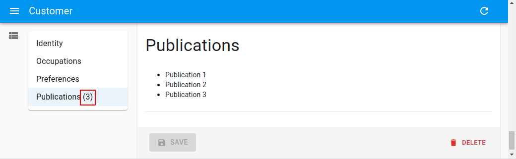
import React, { useEffect, useState } from 'react';
import { Edit, TextField } from 'react-admin';

import { LongForm } from '@react-admin/ra-form-layout';

const CustomerEditWithCardinality = () => {
    const [publications, setPublications] = useState([]);
    useEffect(() => {
        setTimeout(() => {
            setPublications([
                { id: 1, title: 'Publication 1' },
                { id: 2, title: 'Publication 2' },
                { id: 3, title: 'Publication 3' },
            ]);
        }, 500);
    }, []);

    return (
        <Edit component="div">
            <LongForm>
                <LongForm.Section label="Identity">...</LongForm.Section>
                <LongForm.Section label="Occupations">...</LongForm.Section>
                <LongForm.Section label="Preferences">...</LongForm.Section>
                <LongForm.Section
                    label="Publications"
                    cardinality={publications.length}
                >
                    <ul>
                        {publications.map(publication => (
                            <li key={publication.id}>
                                <TextField
                                    source="title"
                                    record={publication}
                                />
                            </li>
                        ))}
                    </ul>
                </LongForm.Section>
            </LongForm>
        </Edit>
    );
};
import React, { useEffect, useState } from "react";
import { Edit, TextField } from "react-admin";

import { LongForm } from "@react-admin/ra-form-layout";

const CustomerEditWithCardinality = () => {
    const [publications, setPublications] = useState([]);
    useEffect(() => {
        setTimeout(() => {
            setPublications([
                { id: 1, title: "Publication 1" },
                { id: 2, title: "Publication 2" },
                { id: 3, title: "Publication 3" },
            ]);
        }, 500);
    }, []);

    return (
        <Edit component="div">
            <LongForm>
                <LongForm.Section label="Identity">...</LongForm.Section>
                <LongForm.Section label="Occupations">...</LongForm.Section>
                <LongForm.Section label="Preferences">...</LongForm.Section>
                <LongForm.Section label="Publications" cardinality={publications.length}>
                    <ul>
                        {publications.map((publication) => (
                            <li key={publication.id}>
                                <TextField source="title" record={publication} />
                            </li>
                        ))}
                    </ul>
                </LongForm.Section>
            </LongForm>
        </Edit>
    );
};
<StackedFilters>
<StackedFilters> is an alternative filter component for <List>. It introduces the concept of operators to allow richer filtering.
Usage
import {
    BooleanField,
    CreateButton,
    DataTable,
    List,
    ReferenceArrayField,
    TopToolbar,
} from 'react-admin';
import {
    StackedFilters,
    FiltersConfig,
    textFilter,
    numberFilter,
    referenceFilter,
    booleanFilter,
} from '@react-admin/ra-form-layout';

const postListFilters: FiltersConfig = {
    title: textFilter(),
    views: numberFilter(),
    tag_ids: referenceFilter({ reference: 'tags' }),
    published: booleanFilter(),
};

const PostListToolbar = () => (
    <TopToolbar>
        <CreateButton />
        <StackedFilters config={postListFilters} />
    </TopToolbar>
);

const PostList = () => (
    <List actions={<PostListToolbar />}>
        <DataTable>
            <DataTable.Col source="title" />
            <DataTable.NumberCol source="views" />
            <DataTable.Col source="tag_ids">
                <ReferenceArrayField tags="tags" source="tag_ids" />
            </DataTable.Col>
            <DataTable.Col source="published" field={BooleanField} />
        </DataTable>
    </List>
);
import { BooleanField, CreateButton, DataTable, List, ReferenceArrayField, TopToolbar } from "react-admin";
import { StackedFilters, textFilter, numberFilter, referenceFilter, booleanFilter } from "@react-admin/ra-form-layout";

const postListFilters = {
    title: textFilter(),
    views: numberFilter(),
    tag_ids: referenceFilter({ reference: "tags" }),
    published: booleanFilter(),
};

const PostListToolbar = () => (
    <TopToolbar>
        <CreateButton />
        <StackedFilters config={postListFilters} />
    </TopToolbar>
);

const PostList = () => (
    <List actions={<PostListToolbar />}>
        <DataTable>
            <DataTable.Col source="title" />
            <DataTable.NumberCol source="views" />
            <DataTable.Col source="tag_ids">
                <ReferenceArrayField tags="tags" source="tag_ids" />
            </DataTable.Col>
            <DataTable.Col source="published" field={BooleanField} />
        </DataTable>
    </List>
);
You must also update your data provider to support filters with operators. See the data provider configuration section below.
Filters Configuration
<StackedFilters> and its underlying component, <StackedFiltersForm> needs a filter configuration. This is an object defining the operators and UI for each source that can be used as a filter.
It looks like this:
import { FiltersConfig } from '@react-admin/ra-form-layout';
import { NumberInput, TextInput } from 'react-admin';
import { MyNumberRangeInput } from './MyNumberRangeInput';

const postListFilters: FiltersConfig = {
    views: {
        operators: [
            { value: 'eq', label: 'Equals', type: 'single' },
            { value: 'neq', label: 'Not Equals', type: 'single', defaultValue: 0 },
            {
                value: 'between',
                label: 'Between',
                input: ({ source }) => <MyNumberRangeInput source={source} />,
                type: 'multiple',
            },
        ],
        input: ({ source }) => <NumberInput source={source} />,
    },
    title: {
        operators: [
            { value: 'eq', label: 'Equals', type: 'single' },
            { value: 'neq', label: 'Not Equals', type: 'single' },
        ],
        input: ({ source }) => <TextInput source={source} />,
        defaultValue: 'Lorem Ipsum',
    }
};
import { NumberInput, TextInput } from "react-admin";
import { MyNumberRangeInput } from "./MyNumberRangeInput";

const postListFilters = {
    views: {
        operators: [
            { value: "eq", label: "Equals", type: "single" },
            { value: "neq", label: "Not Equals", type: "single", defaultValue: 0 },
            {
                value: "between",
                label: "Between",
                input: ({ source }) => <MyNumberRangeInput source={source} />,
                type: "multiple",
            },
        ],
        input: ({ source }) => <NumberInput source={source} />,
    },
    title: {
        operators: [
            { value: "eq", label: "Equals", type: "single" },
            { value: "neq", label: "Not Equals", type: "single" },
        ],
        input: ({ source }) => <TextInput source={source} />,
        defaultValue: "Lorem Ipsum",
    },
};
As you can see, the source is the config object key. It contains an array of operators and a default input, used for operators that don't define their own.
An operator is an object that has a label, a value and a type. The label can be a translation key. The value will be used as a suffix to the source and passed to the list filters. For instance, with the source views, the operator eq and value set to 0 using the NumberInput, the dataProvider will receive the following filter:
{
    views_eq: 0;
}
The type ensures that when selecting an operator with a different type than the previous one, React-admin resets the filter value. Its value should be either single for filters that accepts a single value (for instance a string) or multiple for filters that accepts multiple values (for instance an Array of string). Should you need to differentiate a custom input from those two types, you may provide any type you want to the type option (for instance, map).
Besides, any operator can provide its own input or its own defaultValue if it needs.
In your filter declaration, you can provide an operator, an input and a defaultValue.
The input is a react object taking source as prop and rendering the input you will need to fill for your filter.
Tip: The defaultValue of an operator takes priority over the defaultValue of a filter.
Filter Configuration Builders
To make it easier to create a filter configuration, we provide some helper functions. Each of them has predefined operators and inputs. They accept an array of operators if you want to remove some of them.
textFilter: A filter for text fields. Defines the following operator:eq,neqandq.numberFilter: A filter for number fields. Defines the following operator:eq,neq,ltandgt.dateFilter: A filter for date fields. Defines the following operator:eq,neq,ltandgt.booleanFilter: A filter for boolean fields. Defines the following operator:eq.choicesFilter: A filter for fields that accept a value from a list of choices. Defines the following operator:eq,neq,eq_anyandneq_any.choicesArrayFilter: A filter for array fields. Defines the following operator:inc,inc_anyandninc_any.referenceFilter: A filter for reference fields. Defines the following operator:eq,neq,eq_anyandneq_any.
Build your filter configuration by calling the helpers for each source:
import {
    FiltersConfig,
    textFilter,
    numberFilter,
    referenceFilter,
    booleanFilter,
} from '@react-admin/ra-form-layout';

const postListFilters: FiltersConfig = {
    title: textFilter(),
    views: numberFilter(),
    tag_ids: referenceFilter({ reference: 'tags' }),
    published: booleanFilter(),
};
import { textFilter, numberFilter, referenceFilter, booleanFilter } from "@react-admin/ra-form-layout";

const postListFilters = {
    title: textFilter(),
    views: numberFilter(),
    tag_ids: referenceFilter({ reference: "tags" }),
    published: booleanFilter(),
};
Data Provider Configuration
In react-admin, dataProvider.getList() accepts a filter parameter to filter the records. There is no notion of operators in this parameter, as the expected format is an object like { field: value }. As StackedFilters needs operators, it uses a convention to concatenate the field name and the operator with an underscore.
For instance, if the Post resource has a title field, and you configure <StackedFilters> to allow filtering on this field as a text field, the dataProvider.getList() may receive the following filter parameter:
- title_eq
- title_neq
- title_q
The actual suffixes depend on the type of filter configured in <StackedFilter> (see filters configuration builders above). Here is an typical call to dataProvider.getList() with a posts list using <StackedFilters>:
const { data } = useGetList('posts', {
    filter: {
        title_q: 'lorem',
        date_gte: '2021-01-01',
        views_eq: 0,
        tags_inc_any: [1, 2],
    },
    pagination: { page: 1, perPage: 10 },
    sort: { field: 'title', order: 'ASC' },
});
It's up to your data provider to convert the filter parameter into a query that your API understands.
For instance, if your API expects filters as an array of criteria objects ([{ field, operator, value }]), dataProvider.getList() should convert the filter parameter as follows:
const dataProvider = {
    // ...
    getList: async (resource, params) => {
        const { filter } = params;
        const filterFields = Object.keys(filter);
        const criteria = [];
        // eq operator
        filterFields.filter(field => field.endsWith('_eq')).forEach(field => {
            criteria.push({ field: field.replace('_eq', ''), operator: 'eq', value: filter[field] });
        });
        // neq operator
        filterFields.filter(field => field.endsWith('_neq')).forEach(field => {
            criteria.push({ field: field.replace('_neq', ''), operator: 'neq', value: filter[field] });
        });
        // q operator
        filterFields.filter(field => field.endsWith('_q')).forEach(field => {
            criteria.push({ field: field.replace('_q', ''), operator: 'q', value: filter[field] });
        });
        // ...
    },
}
const dataProvider = {
    // ...
    getList: async (resource, params) => {
        const { filter } = params;
        const filterFields = Object.keys(filter);
        const criteria = [];
        // eq operator
        filterFields
            .filter((field) => field.endsWith("_eq"))
            .forEach((field) => {
                criteria.push({ field: field.replace("_eq", ""), operator: "eq", value: filter[field] });
            });
        // neq operator
        filterFields
            .filter((field) => field.endsWith("_neq"))
            .forEach((field) => {
                criteria.push({ field: field.replace("_neq", ""), operator: "neq", value: filter[field] });
            });
        // q operator
        filterFields
            .filter((field) => field.endsWith("_q"))
            .forEach((field) => {
                criteria.push({ field: field.replace("_q", ""), operator: "q", value: filter[field] });
            });
        // ...
    },
};
Few of the existing data providers implement this convention. this means you'll probably have to adapt your data provider to support the operators used by <StackedFilters>.
Internationalization
The source field names are translatable. ra-form-layout uses the react-admin resource and field name translation system. This is an example of an English translation file:
// in i18n/en.js

export default {
    resources: {
        customer: {
            name: 'Customer |||| Customers',
            fields: {
                first_name: 'First name',
                last_name: 'Last name',
                dob: 'Date of birth',
            },
        },
    },
};
// in i18n/en.js

export default {
    resources: {
        customer: {
            name: "Customer |||| Customers",
            fields: {
                first_name: "First name",
                last_name: "Last name",
                dob: "Date of birth",
            },
        },
    },
};
ra-form-layout also supports internationalization for operators. To leverage it, pass a translation key as the operator label:
import { FiltersConfig } from '@react-admin/ra-form-layout';
import DateRangeInput from './DateRangeInput';

const MyFilterConfig: FiltersConfig = {
    published_at: {
        operators: [
            {
                value: 'between',
                label: 'resources.posts.filters.operators.between',
            },
            {
                value: 'nbetween',
                label: 'resources.posts.filters.operators.nbetween',
            },
        ],
        input: ({ source }) => <DateRangeInput source={source} />,
    },
};
import DateRangeInput from "./DateRangeInput";

const MyFilterConfig = {
    published_at: {
        operators: [
            {
                value: "between",
                label: "resources.posts.filters.operators.between",
            },
            {
                value: "nbetween",
                label: "resources.posts.filters.operators.nbetween",
            },
        ],
        input: ({ source }) => <DateRangeInput source={source} />,
    },
};
Props
| Prop | Required | Type | Default | Description |
|---|---|---|---|---|
BadgeProps |
Optional | object | - | Additional props to pass to the MUI Badge |
ButtonProps |
Optional | object | - | Additional props to pass to the Button |
className |
Optional | string | - | Additional CSS class applied on the root component |
config |
Required (*) | object | - | The stacked filters configuration |
PopoverProps |
Optional | Object | - | Additional props to pass to the MUI Popover |
StackedFiltersFormProps |
Optional | Object | - | Additional props to pass to the StackedFiltersForm |
sx |
Optional | Object | - | An object containing the MUI style overrides to apply to the root component |
BadgeProps
This prop lets you pass additional props for the MUI Badge.
import {
    StackedFilters,
    StackedFiltersProps,
} from '@react-admin/ra-form-layout';

export const MyStackedFilter = (props: StackedFiltersProps) => (
    <StackedFilters {...props} BadgeProps={{ showZero: true }} />
);
import { StackedFilters } from "@react-admin/ra-form-layout";

export const MyStackedFilter = (props) => <StackedFilters {...props} BadgeProps={{ showZero: true }} />;
ButtonProps
This prop lets you pass additional props for the Button.
import {
    StackedFilters,
    StackedFiltersProps,
} from '@react-admin/ra-form-layout';

export const MyStackedFilter = (props: StackedFiltersProps) => (
    <StackedFilters {...props} ButtonProps={{ variant: 'contained' }} />
);
import { StackedFilters } from "@react-admin/ra-form-layout";

export const MyStackedFilter = (props) => <StackedFilters {...props} ButtonProps={{ variant: "contained" }} />;
className
This prop lets you pass additional CSS classes to apply to the root element (a div).
import {
    StackedFilters,
    StackedFiltersProps,
} from '@react-admin/ra-form-layout';

export const MyStackedFilter = (props: StackedFiltersProps) => (
    <StackedFilters {...props} className="my-css-class" />
);
import { StackedFilters } from "@react-admin/ra-form-layout";

export const MyStackedFilter = (props) => <StackedFilters {...props} className="my-css-class" />;
config
This prop lets you define the filter configuration, which is required. This is an object defining the operators and UI for each source that can be used as a filter:
import { FiltersConfig, StackedFilters } from '@react-admin/ra-form-layout';
import { NumberInput } from 'react-admin';
import { MyNumberRangeInput } from './MyNumberRangeInput';

const postListFilters: FiltersConfig = {
    views: {
        operators: [
            { value: 'eq', label: 'Equals', type: 'single' },
            { value: 'neq', label: 'Not Equals', type: 'single' },
            {
                value: 'between',
                label: 'Between',
                input: ({ source }) => <MyNumberRangeInput source={source} />,
                type: 'multiple',
            },
        ],
        input: ({ source }) => <NumberInput source={source} />,
    },
};

export const MyStackedFilter = (props: StackedFiltersProps) => (
    <StackedFilters {...props} config={postListFilters} />
);
import { StackedFilters } from "@react-admin/ra-form-layout";
import { NumberInput } from "react-admin";
import { MyNumberRangeInput } from "./MyNumberRangeInput";

const postListFilters = {
    views: {
        operators: [
            { value: "eq", label: "Equals", type: "single" },
            { value: "neq", label: "Not Equals", type: "single" },
            {
                value: "between",
                label: "Between",
                input: ({ source }) => <MyNumberRangeInput source={source} />,
                type: "multiple",
            },
        ],
        input: ({ source }) => <NumberInput source={source} />,
    },
};

export const MyStackedFilter = (props) => <StackedFilters {...props} config={postListFilters} />;
PopoverProps
This prop lets you pass additional props for the MUI Popover.
import {
    StackedFilters,
    StackedFiltersProps,
} from '@react-admin/ra-form-layout';

export const MyStackedFilter = (props: StackedFiltersProps) => (
    <StackedFilters {...props} PopoverProps={{ elevation: 4 }} />
);
import { StackedFilters } from "@react-admin/ra-form-layout";

export const MyStackedFilter = (props) => <StackedFilters {...props} PopoverProps={{ elevation: 4 }} />;
StackedFiltersFormProps
This prop lets you pass additional props for the StackedFiltersForm.
import {
    StackedFilters,
    StackedFiltersProps,
} from '@react-admin/ra-form-layout';

export const MyStackedFilter = (props: StackedFiltersProps) => (
    <StackedFilters
        {...props}
        StackedFiltersForm={{ className: 'my-css-class' }}
    />
);
import { StackedFilters } from "@react-admin/ra-form-layout";

export const MyStackedFilter = (props) => (
    <StackedFilters {...props} StackedFiltersForm={{ className: "my-css-class" }} />
);
sx: CSS API
This prop lets you override the styles of the inner components thanks to the sx property. This property accepts the following subclasses:
| Rule name | Description |
|---|---|
RaStackedFilters |
Applied to the root component |
& .RaStackedFilters-popover |
Applied to the MUI Popover |
& .RaStackedFilters-formContainer |
Applied to the form container (a div) |
<StackedFiltersForm>
This component is responsible for handling the filtering form. Use it to render a filter form anywhere else than in a popover (for instance, inside an <Accordion>, a <Modal>, a <Drawer>, etc.). It must be given the filtering configuration through its config prop.
If you need to be notified when users have applied filters, pass a function to the onFiltersApplied prop. This is useful if you want to close the filters container (<Modal>, <Drawer>, etc.).
import {
    List,
    DataTable,
    BooleanField,
    ReferenceArrayField,
} from 'react-admin';
import {
    StackedFiltersForm,
    FiltersConfig,
    textFilter,
    numberFilter,
    referenceFilter,
    booleanFilter,
} from '@react-admin/ra-form-layout';
import {
    Accordion,
    AccordionDetails,
    AccordionSummary,
    Card,
    Typography,
} from '@mui/material';
import ExpandMoreIcon from '@mui/icons-material/ExpandMore';

const postListFilters: FiltersConfig = {
    title: textFilter(),
    views: numberFilter(),
    tag_ids: referenceFilter({ reference: 'tags' }),
    published: booleanFilter(),
};

const PostList = () => (
    <ListBase>
        <Accordion sx={{ my: 1 }}>
            <AccordionSummary
                expandIcon={<ExpandMoreIcon />}
                aria-controls="filters-content"
                id="filters-header"
            >
                <Typography>Filters</Typography>
            </AccordionSummary>
            <AccordionDetails id="filters-content">
                <StackedFiltersForm config={postListFilters} />
            </AccordionDetails>
        </Accordion>
        <Card>
            <DataTable>
                <DataTable.Col source="title" />
                <DataTable.NumberCol source="views" />
                <DataTable.Col source="tag_ids">
                    <ReferenceArrayField tags="tags" source="tag_ids" />
                </DataTable.Col>
                <DataTable source="published" field={BooleanField} />
            </DataTable>
        </Card>
    </ListBase>
);
import { DataTable, BooleanField, ReferenceArrayField } from "react-admin";
import {
    StackedFiltersForm,
    textFilter,
    numberFilter,
    referenceFilter,
    booleanFilter,
} from "@react-admin/ra-form-layout";
import { Accordion, AccordionDetails, AccordionSummary, Card, Typography } from "@mui/material";
import ExpandMoreIcon from "@mui/icons-material/ExpandMore";

const postListFilters = {
    title: textFilter(),
    views: numberFilter(),
    tag_ids: referenceFilter({ reference: "tags" }),
    published: booleanFilter(),
};

const PostList = () => (
    <ListBase>
        <Accordion sx={{ my: 1 }}>
            <AccordionSummary expandIcon={<ExpandMoreIcon />} aria-controls="filters-content" id="filters-header">
                <Typography>Filters</Typography>
            </AccordionSummary>
            <AccordionDetails id="filters-content">
                <StackedFiltersForm config={postListFilters} />
            </AccordionDetails>
        </Accordion>
        <Card>
            <DataTable>
                <DataTable.Col source="title" />
                <DataTable.NumberCol source="views" />
                <DataTable.Col source="tag_ids">
                    <ReferenceArrayField tags="tags" source="tag_ids" />
                </DataTable.Col>
                <DataTable source="published" field={BooleanField} />
            </DataTable>
        </Card>
    </ListBase>
);
Props
| Prop | Required | Type | Default | Description |
|---|---|---|---|---|
className |
Optional | string | - | Additional CSS class applied on the root component |
config |
Required (*) | object | - | The stacked filters configuration |
onFiltersApplied |
Optional | Function | - | A function called when users click on the apply button |
sx |
Optional | Object | - | An object containing the MUI style overrides to apply to the root component |
className
This prop lets you pass additional CSS classes to apply to the root element (a Form).
import {
    StackedFiltersForm,
    StackedFiltersFormProps,
} from '@react-admin/ra-form-layout';

export const MyStackedFilterForm = (props: StackedFiltersFormProps) => (
    <StackedFiltersForm {...props} className="my-css-class" />
);
import { StackedFiltersForm } from "@react-admin/ra-form-layout";

export const MyStackedFilterForm = (props) => <StackedFiltersForm {...props} className="my-css-class" />;
config
This prop lets you define the filter configuration, which is required. This is an object defining the operators and UI for each source that can be used as a filter:
import {
    FiltersConfig,
    StackedFiltersForm,
    StackedFiltersFormProps,
} from '@react-admin/ra-form-layout';
import { NumberInput } from 'react-admin';
import { MyNumberRangeInput } from './MyNumberRangeInput';

const postListFilters: FiltersConfig = {
    views: {
        operators: [
            { value: 'eq', label: 'Equals', type: 'single' },
            { value: 'neq', label: 'Not Equals', type: 'single' },
            {
                value: 'between',
                label: 'Between',
                input: ({ source }) => <MyNumberRangeInput source={source} />,
                type: 'multiple',
            },
        ],
        input: ({ source }) => <NumberInput source={source} />,
    },
};

export const MyStackedFiltersForm = (props: StackedFiltersFormProps) => (
    <StackedFiltersForm {...props} config={postListFilters} />
);
import { StackedFiltersForm } from "@react-admin/ra-form-layout";
import { NumberInput } from "react-admin";
import { MyNumberRangeInput } from "./MyNumberRangeInput";

const postListFilters = {
    views: {
        operators: [
            { value: "eq", label: "Equals", type: "single" },
            { value: "neq", label: "Not Equals", type: "single" },
            {
                value: "between",
                label: "Between",
                input: ({ source }) => <MyNumberRangeInput source={source} />,
                type: "multiple",
            },
        ],
        input: ({ source }) => <NumberInput source={source} />,
    },
};

export const MyStackedFiltersForm = (props) => <StackedFiltersForm {...props} config={postListFilters} />;
onFiltersApplied
This prop lets you provide a function that will be called when users click the apply button:
import { FiltersConfig, StackedFiltersForm } from '@react-admin/ra-form-layout';

export const MyStackedFiltersForm = (props: StackedFiltersProps) => (
    <StackedFiltersForm
        {...props}
        onFiltersApplied={() => alert('Filters applied')}
    />
);
import { StackedFiltersForm } from "@react-admin/ra-form-layout";

export const MyStackedFiltersForm = (props) => (
    <StackedFiltersForm {...props} onFiltersApplied={() => alert("Filters applied")} />
);
sx: CSS API
This prop lets you override the styles of the inner components thanks to the sx property. This property accepts the following subclasses:
| Rule name | Description |
|---|---|
RaStackedFiltersForm |
Applied to the root component |
& .RaStackedFiltersForm-sourceInput |
Applied to the AutocompleteInput that allows users to select the field |
& .RaStackedFiltersForm-operatorInput |
Applied to the SelectInput that allows users to select the field |
& .RaStackedFiltersForm-valueInput |
Applied to the input that allows users to set the filter value |
useAutoSave
A hook that automatically saves the form at a regular interval. It works for the pessimistic and optimistic mutationMode but not for the undoable.
Note that you must add the resetOptions prop with { keepDirtyValues: true } to avoid having the user changes overridden by the latest update operation result.
Note: useAutoSave is not compatible with the default warnWhenUnsavedChanges prop of the react-admin form components. However, it implements its own similar mechanism which is enabled by default.
You can disable it with the disableWarnWhenUnsavedChanges prop.
Note: Due to limitations in react-router, this equivalent of warnWhenUnsavedChanges only works if you use the default router provided by react-admin, or if you use a Data Router with react-router v6 or with react-router v7.
If not, you'll need to use the disableWarnWhenUnsavedChanges prop.
Note: useAutoSave does not currently work with forms that have child routes such as the <TabbedForm>.
If you want to use it in a <TabbedForm>, you must set its syncWithLocation prop to false.
import { useAutoSave } from '@react-admin/ra-form-layout';
import { Edit, SaveButton, SimpleForm, TextInput, Toolbar } from 'react-admin';

const AutoSave = () => {
    const [lastSave, setLastSave] = useState();
    const [error, setError] = useState();
    useAutoSave({
        debounce: 5000,
        onSuccess: () => setLastSave(new Date()),
        onError: error => setError(error),
    });
    return (
        <div>
            {lastSave && <p>Saved at {lastSave.toLocaleString()}</p>}
            {error && <p>Error: {error}</p>}
        </div>
    );
};

const AutoSaveToolbar = () => (
    <Toolbar>
        <SaveButton />
        <AutoSave />
    </Toolbar>
);

const PostEdit = () => (
    <Edit mutationMode="optimistic">
        <SimpleForm
            resetOptions={{ keepDirtyValues: true }}
            toolbar={<AutoSaveToolbar />}
        >
            <TextInput source="title" />
            <TextInput source="teaser" />
        </SimpleForm>
    </Edit>
);
import { useAutoSave } from "@react-admin/ra-form-layout";
import { Edit, SaveButton, SimpleForm, TextInput, Toolbar } from "react-admin";

const AutoSave = () => {
    const [lastSave, setLastSave] = useState();
    const [error, setError] = useState();
    useAutoSave({
        debounce: 5000,
        onSuccess: () => setLastSave(new Date()),
        onError: (error) => setError(error),
    });
    return (
        <div>
            {lastSave && <p>Saved at {lastSave.toLocaleString()}</p>}
            {error && <p>Error: {error}</p>}
        </div>
    );
};

const AutoSaveToolbar = () => (
    <Toolbar>
        <SaveButton />
        <AutoSave />
    </Toolbar>
);

const PostEdit = () => (
    <Edit mutationMode="optimistic">
        <SimpleForm resetOptions={{ keepDirtyValues: true }} toolbar={<AutoSaveToolbar />}>
            <TextInput source="title" />
            <TextInput source="teaser" />
        </SimpleForm>
    </Edit>
);
useAutoSave returns a boolean indicating whether the form is currently being saved.
const isSaving = useAutoSave({
    debounce: 5000,
    onSuccess: () => setLastSave(new Date()),
    onError: error => setError(error),
});
Parameters
It accepts the following parameters:
| Parameter | Required | Type | Default | Description |
|---|---|---|---|---|
debounce |
- | number | 3000 (3s) | The interval in milliseconds between two autosaves. |
onSuccess |
- | function | A callback to call when the save request succeeds. | |
onError |
- | function | A callback to call when the save request fails. | |
transform |
- | function | A function to transform the data before saving. | |
disableWarnWhenUnsavedChanges |
- | boolean | false | A boolean indicating whether users should be warned when they close the browser tab or navigate away from the application if they have unsaved changes. |
debounce
The interval in milliseconds between two autosaves. Defaults to 3000 (3s).
const isSaving = useAutoSave({
    debounce: 5000,
});
const isSaving = useAutoSave({
    debounce: 5000,
});
onSuccess
A callback to call when the save request succeeds.
const [lastSave, setLastSave] = useState();

const isSaving = useAutoSave({
    onSuccess: () => setLastSave(new Date()),
});
const [lastSave, setLastSave] = useState();

const isSaving = useAutoSave({
    onSuccess: () => setLastSave(new Date()),
});
onError
A callback to call when the save request fails.
const [error, setError] = useState();

const isSaving = useAutoSave({
    onError: error => setError(error),
});
const [error, setError] = useState();

const isSaving = useAutoSave({
    onError: (error) => setError(error),
});
transform
A function to transform the data before saving.
const isSaving = useAutoSave({
    transform: data => ({
        ...data,
        fullName: `${data.firstName} ${data.lastName}`
    })
});
const isSaving = useAutoSave({
    transform: (data) => ({
        ...data,
        fullName: `${data.firstName} ${data.lastName}`,
    }),
});
disableWarnWhenUnsavedChanges
A boolean indicating whether users should be warned when they close the browser tab or navigate away from the application if they have unsaved changes.
const isSaving = useAutoSave({
    disableWarnWhenUnsavedChanges: true
});
const isSaving = useAutoSave({
    disableWarnWhenUnsavedChanges: true,
});
<WizardForm>
Alternative to <SimpleForm> that splits a form into a step-by-step interface, to facilitate the entry in long forms.
Test it live in the e-commerce demo.
Use <WizardForm> as the child of <Create>. It expects <WizardFormStep> elements as children.
import React from 'react';
import { Create, TextInput, required } from 'react-admin';
import { WizardForm } from '@react-admin/ra-form-layout';

const PostCreate = () => (
    <Create>
        <WizardForm>
            <WizardForm.Step label="First step">
                <TextInput source="title" validate={required()} />
            </WizardForm.Step>
            <WizardForm.Step label="Second step">
                <TextInput source="description" />
            </WizardForm.Step>
            <WizardForm.Step label="Third step">
                <TextInput source="fullDescription" validate={required()} />
            </WizardForm.Step>
        </WizardForm>
    </Create>
);
import React from "react";
import { Create, TextInput, required } from "react-admin";
import { WizardForm } from "@react-admin/ra-form-layout";

const PostCreate = () => (
    <Create>
        <WizardForm>
            <WizardForm.Step label="First step">
                <TextInput source="title" validate={required()} />
            </WizardForm.Step>
            <WizardForm.Step label="Second step">
                <TextInput source="description" />
            </WizardForm.Step>
            <WizardForm.Step label="Third step">
                <TextInput source="fullDescription" validate={required()} />
            </WizardForm.Step>
        </WizardForm>
    </Create>
);
Note: You can also use the <WizardForm> as child of <Edit> but it's considered as a bad practice to provide a wizard form for existing resources.
Tip: The label prop of the <WizardForm.Step> component accepts a translation key:
import React from 'react';
import { Create, TextInput, required } from 'react-admin';
import { WizardForm } from '@react-admin/ra-form-layout';

const PostCreate = () => (
    <Create>
        <WizardForm>
            <WizardForm.Step label="myapp.posts.steps.general">
                <TextInput source="title" validate={required()} />
            </WizardForm.Step>
            <WizardForm.Step label="myapp.posts.steps.description">
                <TextInput source="description" />
            </WizardForm.Step>
            <WizardForm.Step label="myapp.posts.steps.misc">
                <TextInput source="fullDescription" validate={required()} />
            </WizardForm.Step>
        </WizardForm>
    </Create>
);
import React from "react";
import { Create, TextInput, required } from "react-admin";
import { WizardForm } from "@react-admin/ra-form-layout";

const PostCreate = () => (
    <Create>
        <WizardForm>
            <WizardForm.Step label="myapp.posts.steps.general">
                <TextInput source="title" validate={required()} />
            </WizardForm.Step>
            <WizardForm.Step label="myapp.posts.steps.description">
                <TextInput source="description" />
            </WizardForm.Step>
            <WizardForm.Step label="myapp.posts.steps.misc">
                <TextInput source="fullDescription" validate={required()} />
            </WizardForm.Step>
        </WizardForm>
    </Create>
);
Props
This component accepts the following props in addition to the <Form> props:
| Prop | Required | Type | Default | Description |
|---|---|---|---|---|
authorizationError |
Optional | ReactNode |
null |
The content to display when authorization checks fail |
enableAccessControl |
Optional | boolean |
false |
Enable checking authorization rights for each panel and input |
loading |
Optional | ReactNode |
The content to display when checking authorizations | |
progress |
Optional | ReactNode |
The progress element | |
toolbar |
Optional | ReactNode |
The toolbar element |
authorizationError
Used when enableAccessControl is set to true and an error occurs while checking for users permissions. Defaults to null:
import { ArrayInput, Edit, DateInput, SimpleFormIterator, TextInput } from 'react-admin';
import { WizardForm } from '@react-admin/ra-form-layout';
import { Alert } from '@mui/material';

const CustomerEdit = () => (
    <Edit>
        <WizardForm
            enableAccessControl
            authorizationError={
                <Alert
                    severity="error"
                    sx={{ px: 2.5, py: 1, mt: 1, width: '100%' }}
                >
                    An error occurred while loading your permissions
                </Alert>
            }
        >
            <WizardForm.Step id="identity">
                <TextInput source="first_name" validate={required()} />
                <TextInput source="last_name" validate={required()} />
            </WizardForm.Step>
            <WizardForm.Step id="occupations">
                <ArrayInput source="occupations" label="">
                    <SimpleFormIterator>
                        <TextInput source="name" validate={required()} />
                        <DateInput source="from" validate={required()} />
                        <DateInput source="to" />
                    </SimpleFormIterator>
                </ArrayInput>
            </WizardForm.Step>
        </WizardForm>
    </Edit>
);
import { ArrayInput, Edit, DateInput, SimpleFormIterator, TextInput } from "react-admin";
import { WizardForm } from "@react-admin/ra-form-layout";
import { Alert } from "@mui/material";

const CustomerEdit = () => (
    <Edit>
        <WizardForm
            enableAccessControl
            authorizationError={
                <Alert severity="error" sx={{ px: 2.5, py: 1, mt: 1, width: "100%" }}>
                    An error occurred while loading your permissions
                </Alert>
            }
        >
            <WizardForm.Step id="identity">
                <TextInput source="first_name" validate={required()} />
                <TextInput source="last_name" validate={required()} />
            </WizardForm.Step>
            <WizardForm.Step id="occupations">
                <ArrayInput source="occupations" label="">
                    <SimpleFormIterator>
                        <TextInput source="name" validate={required()} />
                        <DateInput source="from" validate={required()} />
                        <DateInput source="to" />
                    </SimpleFormIterator>
                </ArrayInput>
            </WizardForm.Step>
        </WizardForm>
    </Edit>
);
enableAccessControl
When set to true, React-admin will call the authProvider.canAccess method for each panel with the following parameters:
action:writeresource:RESOURCE_NAME.section.PANEL_ID_OR_LABEL. For instance:customers.section.identityrecord: The current record
For each panel, react-admin will also call the authProvider.canAccess method for each input with the following parameters:
action:writeresource:RESOURCE_NAME.INPUT_SOURCE. For instance:customers.first_namerecord: The current record
Tip: <WizardForm.Step> direct children that don't have a source will always be displayed.
import { ArrayInput, Edit, DateInput, SimpleFormIterator, TextInput } from 'react-admin';
import { WizardForm } from '@react-admin/ra-form-layout';
const CustomerEdit = () => (
<Edit>
<WizardForm enableAccessControl>
<WizardForm.Step id="identity">
<TextInput source="first_name" validate={required()} />
<TextInput source="last_name" validate={required()} />
</WizardForm.Step>
<WizardForm.Step id="occupations">
<ArrayInput source="occupations" label="">
<SimpleFormIterator>
<TextInput source="name" validate={required()} />
<DateInput source="from" validate={required()} />
<DateInput source="to" />
</SimpleFormIterator>
</ArrayInput>
</WizardForm.Step>
</WizardForm>
</Edit>
);
import { ArrayInput, Edit, DateInput, SimpleFormIterator, TextInput } from "react-admin";
import { WizardForm } from "@react-admin/ra-form-layout";
const CustomerEdit = () => (
<Edit>
<WizardForm enableAccessControl>
<WizardForm.Step id="identity">
<TextInput source="first_name" validate={required()} />
<TextInput source="last_name" validate={required()} />
</WizardForm.Step>
<WizardForm.Step id="occupations">
<ArrayInput source="occupations" label="">
<SimpleFormIterator>
<TextInput source="name" validate={required()} />
<DateInput source="from" validate={required()} />
<DateInput source="to" />
</SimpleFormIterator>
</ArrayInput>
</WizardForm.Step>
</WizardForm>
</Edit>
);
loading
Used when enableAccessControl is set to true while checking for users permissions. Defaults to Loading from react-admin:
import { ArrayInput, Edit, DateInput, SimpleFormIterator, TextInput } from 'react-admin';
import { WizardForm } from '@react-admin/ra-form-layout';
import { Typography } from '@mui/material';
const CustomerEdit = () => (
<Edit>
<WizardForm
enableAccessControl
loading={
<Typography>
Loading your permissions...
</Typography>
}
>
<WizardForm.Step id="identity">
<TextInput source="first_name" validate={required()} />
<TextInput source="last_name" validate={required()} />
</WizardForm.Step>
<WizardForm.Step id="occupations">
<ArrayInput source="occupations" label="">
<SimpleFormIterator>
<TextInput source="name" validate={required()} />
<DateInput source="from" validate={required()} />
<DateInput source="to" />
</SimpleFormIterator>
</ArrayInput>
</WizardForm.Step>
</WizardForm>
</Edit>
);
import { ArrayInput, Edit, DateInput, SimpleFormIterator, TextInput } from "react-admin";
import { WizardForm } from "@react-admin/ra-form-layout";
import { Typography } from "@mui/material";
const CustomerEdit = () => (
<Edit>
<WizardForm enableAccessControl loading={<Typography>Loading your permissions...</Typography>}>
<WizardForm.Step id="identity">
<TextInput source="first_name" validate={required()} />
<TextInput source="last_name" validate={required()} />
</WizardForm.Step>
<WizardForm.Step id="occupations">
<ArrayInput source="occupations" label="">
<SimpleFormIterator>
<TextInput source="name" validate={required()} />
<DateInput source="from" validate={required()} />
<DateInput source="to" />
</SimpleFormIterator>
</ArrayInput>
</WizardForm.Step>
</WizardForm>
</Edit>
);
progress
You can also customize the progress stepper by passing a custom component in the progress prop.
import React from 'react';
import { Create, TextInput, required } from 'react-admin';
import {
WizardForm,
WizardFormProgressProps,
useWizardFormContext
} from '@react-admin/ra-form-layout';
const MyProgress = (props: WizardFormProgressProps) => {
const { currentStep, steps } = useWizardFormContext(props);
return (
<ul>
{steps.map((step, index) => {
const label = React.cloneElement(step, { intent: 'label' });
return (
<li key={`step_${index}`}>
<span
style={{
textDecoration:
currentStep === index
? 'underline'
: undefined,
}}
>
{label}
</span>
</li>
);
})}
</ul>
);
};
const PostCreate = () => (
<Create>
<WizardForm progress={<MyProgress />}>
<WizardForm.Step label="First step">
<TextInput source="title" validate={required()} />
</WizardForm.Step>
<WizardForm.Step label="Second step">
<TextInput source="description" />
</WizardForm.Step>
<WizardForm.Step label="Third step">
<TextInput source="fullDescription" validate={required()} />
</WizardForm.Step>
</WizardForm>
</Create>
);
import React from "react";
import { Create, TextInput, required } from "react-admin";
import { WizardForm, useWizardFormContext } from "@react-admin/ra-form-layout";
const MyProgress = (props) => {
const { currentStep, steps } = useWizardFormContext(props);
return (
<ul>
{steps.map((step, index) => {
const label = React.cloneElement(step, { intent: "label" });
return (
<li key={`step_${index}`}>
<span
style={{
textDecoration: currentStep === index ? "underline" : undefined,
}}
>
{label}
</span>
</li>
);
})}
</ul>
);
};
const PostCreate = () => (
<Create>
<WizardForm progress={<MyProgress />}>
<WizardForm.Step label="First step">
<TextInput source="title" validate={required()} />
</WizardForm.Step>
<WizardForm.Step label="Second step">
<TextInput source="description" />
</WizardForm.Step>
<WizardForm.Step label="Third step">
<TextInput source="fullDescription" validate={required()} />
</WizardForm.Step>
</WizardForm>
</Create>
);
Any additional props will be passed to the <Progress> component.
You can also hide the progress stepper completely by setting progress to false.
import React from 'react';
import { Create, TextInput, required } from 'react-admin';
import { WizardForm } from '@react-admin/ra-form-layout';
const PostCreate = () => (
<Create>
<WizardForm progress={false}>
<WizardForm.Step label="First step">
<TextInput source="title" validate={required()} />
</WizardForm.Step>
<WizardForm.Step label="Second step">
<TextInput source="description" />
</WizardForm.Step>
<WizardForm.Step label="Third step">
<TextInput source="fullDescription" validate={required()} />
</WizardForm.Step>
</WizardForm>
</Create>
);
import React from "react";
import { Create, TextInput, required } from "react-admin";
import { WizardForm } from "@react-admin/ra-form-layout";
const PostCreate = () => (
<Create>
<WizardForm progress={false}>
<WizardForm.Step label="First step">
<TextInput source="title" validate={required()} />
</WizardForm.Step>
<WizardForm.Step label="Second step">
<TextInput source="description" />
</WizardForm.Step>
<WizardForm.Step label="Third step">
<TextInput source="fullDescription" validate={required()} />
</WizardForm.Step>
</WizardForm>
</Create>
);
toolbar
You can customize the form toolbar by passing a custom component in the toolbar prop.
import { Button } from '@mui/material';
import React from 'react';
import { Create, required, TextInput, useSaveContext } from 'react-admin';
import { useFormState } from 'react-hook-form';
import { useWizardFormContext, WizardForm } from '@react-admin/ra-form-layout';
const MyToolbar = () => {
const { hasNextStep, hasPreviousStep, goToNextStep, goToPreviousStep } =
useWizardFormContext();
const { save } = useSaveContext();
const { isValidating } = useFormState();
return (
<ul>
{hasPreviousStep ? (
<li>
<Button onClick={() => goToPreviousStep()}>PREVIOUS</Button>
</li>
) : null}
{hasNextStep ? (
<li>
<Button
disabled={isValidating}
onClick={() => goToNextStep()}
>
NEXT
</Button>
</li>
) : (
<li>
<Button disabled={isValidating} onClick={save}>
SAVE
</Button>
</li>
)}
</ul>
);
};
const PostCreate = () => (
<Create>
<WizardForm toolbar={<MyToolbar />}>
<WizardForm.Step label="First step">
<TextInput source="title" validate={required()} />
</WizardForm.Step>
<WizardForm.Step label="Second step">
<TextInput source="description" />
</WizardForm.Step>
<WizardForm.Step label="Third step">
<TextInput source="fullDescription" validate={required()} />
</WizardForm.Step>
</WizardForm>
</Create>
);
import { Button } from "@mui/material";
import React from "react";
import { Create, required, TextInput, useSaveContext } from "react-admin";
import { useFormState } from "react-hook-form";
import { useWizardFormContext, WizardForm } from "@react-admin/ra-form-layout";
const MyToolbar = () => {
const { hasNextStep, hasPreviousStep, goToNextStep, goToPreviousStep } = useWizardFormContext();
const { save } = useSaveContext();
const { isValidating } = useFormState();
return (
<ul>
{hasPreviousStep ? (
<li>
<Button onClick={() => goToPreviousStep()}>PREVIOUS</Button>
</li>
) : null}
{hasNextStep ? (
<li>
<Button disabled={isValidating} onClick={() => goToNextStep()}>
NEXT
</Button>
</li>
) : (
<li>
<Button disabled={isValidating} onClick={save}>
SAVE
</Button>
</li>
)}
</ul>
);
};
const PostCreate = () => (
<Create>
<WizardForm toolbar={<MyToolbar />}>
<WizardForm.Step label="First step">
<TextInput source="title" validate={required()} />
</WizardForm.Step>
<WizardForm.Step label="Second step">
<TextInput source="description" />
</WizardForm.Step>
<WizardForm.Step label="Third step">
<TextInput source="fullDescription" validate={required()} />
</WizardForm.Step>
</WizardForm>
</Create>
);
Adding a Summary Final Step
In order to add a final step with a summary of the form values before submit, you can leverage react-hook-form useWatch hook:
const FinalStepContent = () => {
const values = useWatch({
name: ['title', 'description', 'fullDescription'],
});
return values?.length > 0 ? (
<>
<Typography>title: {values[0]}</Typography>
<Typography>description: {values[1]}</Typography>
<Typography>fullDescription: {values[2]}</Typography>
</>
) : null;
};
const PostCreate = () => (
<Create>
<WizardForm>
<WizardForm.Step label="First step">
<TextInput source="title" validate={required()} />
</WizardForm.Step>
<WizardForm.Step label="Second step">
<TextInput source="description" />
</WizardForm.Step>
<WizardForm.Step label="Third step">
<TextInput source="fullDescription" validate={required()} />
</WizardForm.Step>
<WizardForm.Step label="">
<FinalStepContent />
</WizardForm.Step>
</WizardForm>
</Create>
);
const FinalStepContent = () => {
const values = useWatch({
name: ["title", "description", "fullDescription"],
});
return values?.length > 0 ? (
<>
<Typography>title: {values[0]}</Typography>
<Typography>description: {values[1]}</Typography>
<Typography>fullDescription: {values[2]}</Typography>
</>
) : null;
};
const PostCreate = () => (
<Create>
<WizardForm>
<WizardForm.Step label="First step">
<TextInput source="title" validate={required()} />
</WizardForm.Step>
<WizardForm.Step label="Second step">
<TextInput source="description" />
</WizardForm.Step>
<WizardForm.Step label="Third step">
<TextInput source="fullDescription" validate={required()} />
</WizardForm.Step>
<WizardForm.Step label="">
<FinalStepContent />
</WizardForm.Step>
</WizardForm>
</Create>
);
<WizardForm.Step>
The children of <WizardForm> must be <WizardForm.Step> elements.
It accepts the following props:
| Prop | Required | Type | Default | Description |
|---|---|---|---|---|
authorizationError |
Optional | ReactNode |
- | The content to display when authorization checks fail |
enableAccessControl |
Optional | ReactNode |
- | Enable authorization checks |
label |
Required | string |
- | The main label used as the step title. Appears in red when the section has errors |
loading |
Optional | ReactNode |
- | The content to display while checking authorizations |
children |
Required | ReactNode |
- | A list of <Input> elements |
sx |
Optional | object |
- | An object containing the MUI style overrides to apply to the root component |
authorizationError
Used when enableAccessControl is set to true and an error occurs while checking for users permissions. Defaults to null:
import { ArrayInput, Edit, DateInput, SimpleFormIterator, TextInput } from 'react-admin';
import { WizardForm } from '@react-admin/ra-form-layout';
import { Alert } from '@mui/material';
const CustomerEdit = () => (
<Edit>
<WizardForm enableAccessControl>
<WizardForm.Step id="identity">
<TextInput source="first_name" validate={required()} />
<TextInput source="last_name" validate={required()} />
</WizardForm.Step>
<WizardForm.Step id="occupations" authorizationError={
<Alert
severity="error"
sx={{ px: 2.5, py: 1, mt: 1, width: '100%' }}
>
An error occurred while loading your permissions
</Alert>
}>
<ArrayInput source="occupations" label="">
<SimpleFormIterator>
<TextInput source="name" validate={required()} />
<DateInput source="from" validate={required()} />
<DateInput source="to" />
</SimpleFormIterator>
</ArrayInput>
</WizardForm.Step>
</WizardForm>
</Edit>
);
import { ArrayInput, Edit, DateInput, SimpleFormIterator, TextInput } from "react-admin";
import { WizardForm } from "@react-admin/ra-form-layout";
import { Alert } from "@mui/material";
const CustomerEdit = () => (
<Edit>
<WizardForm enableAccessControl>
<WizardForm.Step id="identity">
<TextInput source="first_name" validate={required()} />
<TextInput source="last_name" validate={required()} />
</WizardForm.Step>
<WizardForm.Step
id="occupations"
authorizationError={
<Alert severity="error" sx={{ px: 2.5, py: 1, mt: 1, width: "100%" }}>
An error occurred while loading your permissions
</Alert>
}
>
<ArrayInput source="occupations" label="">
<SimpleFormIterator>
<TextInput source="name" validate={required()} />
<DateInput source="from" validate={required()} />
<DateInput source="to" />
</SimpleFormIterator>
</ArrayInput>
</WizardForm.Step>
</WizardForm>
</Edit>
);
enableAccessControl
When set to true, react-admin will also call the authProvider.canAccess method for each input with the following parameters:
action:writeresource:RESOURCE_NAME.INPUT_SOURCE. For instance:customers.first_namerecord: The current record
Tip: <WizardForm.Step> direct children that don't have a source will always be displayed.
import { ArrayInput, Edit, DateInput, SimpleFormIterator, TextInput } from 'react-admin';
import { WizardForm } from '@react-admin/ra-form-layout';
const CustomerEdit = () => (
<Edit>
<WizardForm>
<WizardForm.Step id="identity">
<TextInput source="first_name" validate={required()} />
<TextInput source="last_name" validate={required()} />
</WizardForm.Step>
<WizardForm.Step id="occupations" enableAccessControl>
<ArrayInput source="occupations" label="">
<SimpleFormIterator>
<TextInput source="name" validate={required()} />
<DateInput source="from" validate={required()} />
<DateInput source="to" />
</SimpleFormIterator>
</ArrayInput>
</WizardForm.Step>
</WizardForm>
</Edit>
);
import { ArrayInput, Edit, DateInput, SimpleFormIterator, TextInput } from "react-admin";
import { WizardForm } from "@react-admin/ra-form-layout";
const CustomerEdit = () => (
<Edit>
<WizardForm>
<WizardForm.Step id="identity">
<TextInput source="first_name" validate={required()} />
<TextInput source="last_name" validate={required()} />
</WizardForm.Step>
<WizardForm.Step id="occupations" enableAccessControl>
<ArrayInput source="occupations" label="">
<SimpleFormIterator>
<TextInput source="name" validate={required()} />
<DateInput source="from" validate={required()} />
<DateInput source="to" />
</SimpleFormIterator>
</ArrayInput>
</WizardForm.Step>
</WizardForm>
</Edit>
);
loading
Used when enableAccessControl is set to true while checking for users permissions. Defaults to Loading from react-admin:
import { ArrayInput, Edit, DateInput, SimpleFormIterator, TextInput } from 'react-admin';
import { WizardForm } from '@react-admin/ra-form-layout';
import { Typography } from '@mui/material';
const CustomerEdit = () => (
<Edit>
<WizardForm enableAccessControl>
<WizardForm.Step id="identity" loading={
<Typography>
Loading your permissions...
</Typography>
}>
<TextInput source="first_name" validate={required()} />
<TextInput source="last_name" validate={required()} />
</WizardForm.Step>
<WizardForm.Step id="occupations" loading={
<Typography>
Loading your permissions...
</Typography>
}>
<ArrayInput source="occupations" label="">
<SimpleFormIterator>
<TextInput source="name" validate={required()} />
<DateInput source="from" validate={required()} />
<DateInput source="to" />
</SimpleFormIterator>
</ArrayInput>
</WizardForm.Step>
</WizardForm>
</Edit>
);
import { ArrayInput, Edit, DateInput, SimpleFormIterator, TextInput } from "react-admin";
import { WizardForm } from "@react-admin/ra-form-layout";
import { Typography } from "@mui/material";
const CustomerEdit = () => (
<Edit>
<WizardForm enableAccessControl>
<WizardForm.Step id="identity" loading={<Typography>Loading your permissions...</Typography>}>
<TextInput source="first_name" validate={required()} />
<TextInput source="last_name" validate={required()} />
</WizardForm.Step>
<WizardForm.Step id="occupations" loading={<Typography>Loading your permissions...</Typography>}>
<ArrayInput source="occupations" label="">
<SimpleFormIterator>
<TextInput source="name" validate={required()} />
<DateInput source="from" validate={required()} />
<DateInput source="to" />
</SimpleFormIterator>
</ArrayInput>
</WizardForm.Step>
</WizardForm>
</Edit>
);
CHANGELOG
v6.2.0
2026-02-10
- Add
<DataTableInput>component to select choices from a data table.
v6.1.0
2026-02-03
<AutoPersistInStore>now accepts amaxAgeprop that will remove all auto-persisted values older thanmaxAgeeach time new values are persisted.
v6.0.0
2025-12-11
- Add
<FilterValue>component to display the active filters in a list - Upgrade to
@mui/x-date-pickersv8 - Add
<AutoPersistNotification> - Use
@react-admin/ra-core-eefor headless components and hooks
Breaking changes
As useAutoPersistInStore is now in @react-admin/ra-core-ee, it does not have a default notification component. If you rely on this hook, you must now pass it the notification prop:
- useAutoPersistInStore();
+ useAutoPersistInStore({
+ notification: <AutoPersistNotification />
+ })
Note that useAutoPersistInStore and related component require a SaveContext with support for middlewares
Tip: This does not affect the <AutoPersistInStore> component, which still includes the notification by default.
If you provide your own LocalizationProvider to either <DateInput>, <DateTimeInput>, <TimeInput> or <DateRangeInput>, you need to update the import to get the date-fns adapter:
-import { AdapterDateFns } from '@mui/x-date-pickers/AdapterDateFnsV3';
+import { AdapterDateFns } from '@mui/x-date-pickers/AdapterDateFns';
v5.17.0
2025-11-12
- Fix
<AutoPersistInStore>compatibility withreact-hook-formversion 7.65.0 and above - Bump minimum
react-hook-formversion to 7.65.0
v5.16.2
2025-09-30
- Fix
<LongForm>might trigger infinite rerenders indevelopment - Fix
<LongFormView>is not exported
v5.16.1
2025-09-19
- Fix
<DateRangeInput>does not let users enter a date using their keyboard
v5.16.0
2025-08-01
- Use
@react-admin/ra-core-eefor headless hooks
v5.15.1
2025-08-20
- Fix peer dependencies to properly allow Material UI v7
v5.15.0
2025-06-25
- Fix
<BulkUpdateFormButton>middleware implementation does not support optimistic cases - Fix: remove middleware workaround from
<InputSelectorForm> - Upgrade to
react-adminv5.9.0
v5.14.2
2025-06-18
- Fix
<InputSelectorForm>does not properly sanitize the submitted values when used with<BulkUpdateFormButton>
v5.14.1
2025-06-17
- Fix
<AccordionSection>does not show its error state when its children are wrapped in other components
v5.14.0
2025-06-16
- Make components compatible with Material UI v7
v5.13.0
2025-05-20
- Add access control on
<CreateInDialogButton>,<EditInDialogButton>and<ShowInDialogButton>
v5.12.0
2025-05-05
- Make
<AutoPersistInStore>save values on change (instead of on unmount). - Make
<AutoPersistInStore>delete stored data on the notification's "Cancel" button click
v5.11.0
2025-04-10
- Introduce the
<AutoPersistInStore>component.
v5.10.2
2025-04-04
- Fix
<CreateDialog>and<CreateInDialogButton>don't render theirtitleinside theirCreateContext
v5.10.1
2025-03-20
- Prevent
<WizardForm>to move too many steps forward, bypassing validation, when using an async validator.
v5.10.0
2025-03-10
- Introduce the
<EditInDialogButton emptyWhenLoading>prop.
v5.9.0
2025-02-27
- Warn about unsaved changes with
<AutoSave> - Introduce the
<AutoSave disableWarnWhenUnsavedChanges>prop.
v5.8.0
2025-02-12
- Feat: Dialog components (
<CreateDialog>,<EditDialog>,<ShowDialog>,<CreateInDialogButton>,<EditInDialogButton>,<ShowInDialogButton>) now support hiding the title withtitle={null}
v5.7.0
2025-02-03
- Feat: Introduce
<WarnWhenUnsavedChangesInDialog>
v5.6.1
2025-01-31
- Make
cardinalityprop inLongFormSectionMenuItemPropsoptional - Make
WizardFormContext.stepsan array ofReactElement<WizardFormStepProps>
v5.6.0
2025-01-29
- Support React 19 and MUI v6
- Update
react-admindependency - Update
@mui/x-date-pickersdependencies - Update
@mui/x-date-pickers-propeer dependency
v5.5.2
2025-01-22
- Revert fix
<AutoSave>should not trigger a save after the form is unmounted
v5.5.1
2025-01-06
- Fix dialogs forms should allow to override their
resource.
v5.5.0
2025-01-02
- Support
onClickin theButtonsProp's prop of<EditInDialogButton>,<CreateInDialogButton>,<ShowInDialogButton>.
v5.4.2
2024-12-20
- Fix
<AutoSave>should not trigger a save after the form is unmounted - Fix
<AutoSave>should not trigger a save if the form is set back to its pristine state
v5.4.1
2024-12-12
- Fix
<CreateDialog>refreshes list twice on success
v5.4.0
2024-12-09
- Add support for access control to
<AccordionForm>,<AccordionForm.Panel>and<AccordionSection> - Add support for access control to
<LongForm>and<LongForm.Section> - Add support for access control to
<WizardForm>and<WizardForm.Step>
v5.3.0
2024-10-24
- Introduce the
defaultValueoption to<StackedFilters>filters. - Introduce the
defaultValueoption to<StackedFilters>operators filters. - Fix
<StackedFilters>does not reset the filter value when the filter source is changed.
v5.2.1
2024-10-10
- Fix:
<WizardForm>'s<NextButton>should be enabled even when the form is pristine - Fix: Remove unusable props
<PreviousButton alwaysEnable>and<NextButton alwaysEnable>
v5.2.0
2024-10-07
- Introduce the
typeoption to<StackedFilters>operators. - Fix
<StackedFilters>may send wrong values to the filters when switching from an operator that accepts single values to one that accepts multiple values.
v5.1.1
2024-09-23
- Separate
<DateRangeInput>exports to avoid strong dependency on@mui/x-date-pickers-pro
-import { DateRangeInput } from '@react-admin/ra-form-layout';
+import { DateRangeInput } from '@react-admin/ra-form-layout/DateRangeInput';
import { Edit, SimpleForm } from 'react-admin';
export const EventEdit = () => (
<Edit>
<SimpleForm>
<DateRangeInput source="subscription_period" />
</SimpleForm>
</Edit>
);
v5.1.0
2024-09-06
- Introduce the
<DateRangeInput>component, a wrapper of the MUI DateRangePicker
v5.0.1
2024-07-25
- Fix
onClickevent propagation to the parent in<EditDialog>and<ShowDialog>components (e.g. row click in a list)
v5.0.0
2024-07-25
- Upgrade to react-admin v5
- Upgrade to
@mui/x-date-pickersv7 - Upgrade to
date-fnsv3 - WizardForm:
<NextButton>won't be disabled anymore if the current step inputs are invalid, and it will be disabled when the form is pristine. This makes its behavior more consistent with<SaveButton>. <AccordionSection>is nowfullWidthby default- Remove deprecated
recordprop injection toFormDialogTitle(useuseRecordContextinstead) - Added ability to use
recordfields inFormDialogTitleusing i18n interpolation - [TypeScript]:
useWizardFormContextnow returns aPartial<WizardFormContextValue> - [TypeScript]:
useFormDialogContextnow returns aPartial<FormDialogContextType> - [TypeScript]: Enable strictNullChecks
v4.12.3
2024-05-07
- Fix
<InputSelector>label should be hidden in<InputSelectorForm>
v4.12.2
2024-02-27
- Fix badly positioned label in
<WizardForm>outlined<TextField>
v4.12.1
2024-02-26
- Fix the
<LongForm>RaLongFormroot class is not exposed
v4.12.0
2024-02-08
- Accept a React element for
<AccordionFormPanel label>,<AccordionFormPanel secondary>,<AccordionSection label>,<AccordionSection secondary> - Accept an
idprop forAccordionFormPanelandAccordionSectioncomponents
v4.11.2
2024-02-07
- Add support for
<AccordionFrom sx>and<AccordionFromPanel sx>props.
v4.11.1
2024-01-29
- Fix
EditDialogpasses thequeryOptionsprop to the MaterialUIDialogcomponent.
v4.11.0
2024-01-15
- Introduce
<DateInput>,<DateTimeInput>and<TimeInput>, date/time picker components based on MUI X.
v4.10.4
2023-12-12
- Add
<AccordionFormPanel count>and<AccordionSection count>to allow customizing the count displayed in the accordion summary
v4.10.3
2023-12-01
- Fix
<BulkUpdateFormButton>does not disable the save button while saving
v4.10.2
2023-10-27
- Fix
lodashimport to avoid bundling the entire library
v4.10.1
2023-10-09
- Update documentation to explain how to use
<StackedFilters>well.
v4.10.0
2023-10-05
- Add support for
classNameandsxprops to<StackedFilters>,<StackedFiltersForm>and<StackedFiltersActions>components.
v4.9.7
2023-10-03
- Fix
<InputSelectorForm>briefly displays a validation error notification after submitting the form with React 18
v4.9.6
2023-10-03
- Fix
<InputSelectorForm>briefly displays a validation error after submitting the form - Fix
<BulkUpdateFormButton>does not close the dialog when providing a customonSuccesscallback
v4.9.5
2023-10-02
- Fix redirection in custom
onSuccessis ignored by<CreateDialog>and<EditDialog>
v4.9.4
2023-09-05
- Fix passing custom onSuccess does not close the dialog
v4.9.3
2023-08-30
- Fix Dialogs don't pass MUI onClose arguments to their
closehandler
v4.9.2
2023-08-10
- Fix
<EditInDialogButton>causes console warning when using thetransformprop
v4.9.1
2023-08-03
- Fix
<WizardForm/>makes it hard to override the progress margins.
v4.9.0
2023-07-06
- Introduce
<BulkUpdateButton> - Introduce
<InputSelectorForm>
v4.8.3
2023-06-19
- Fix
<WizardForm>to support middlewares.
v4.8.2
2023-06-16
- Fix exports that are problematic with some bundlers
v4.8.1
2023-06-14
- Fix
<StackedFilters>uses an incorrect translation key for the Filters button label (ra-form-layout.stacked_filters.filters_button_labelis nowra-form-layout.filters.filters_button_label) - Fix labels in the
<StackedFiltersForm>now have a hard-coded label supporting translations:ra-form-layout.filters.sourcera-form-layout.filters.operatorra-form-layout.filters.value
v4.8.0
2023-05-05
- Add
<AutoSave>component to automatically save a form when the user stops typing. - Add
useAutoSavehook - Add
<PreviousButton>for customizing the<WizardForm>toolbar. - Add
<WizardForm.Step>shortcut to<WizardFormStep> - Add
<AccordionForm.Panel>shortcut to<AccordionFormPanel>
This version requires react-admin version 4.11.0 or higher.
v4.7.1
2023-05-30
- Fix compatibility with latest react-hook-form versions (>= 7.43), and hence with react-admin >= v4.11
v4.7.0
2023-05-24
- Upgraded to react-admin
4.10.6
v4.6.2
2023-03-17
- Fix usage of
cloneElementby ensuring children are React elements.
v4.6.1
2023-03-02
- Fix
<EditDialog>ignoresredirectprop when passing custommutationOptions - Fix MUI warning when passing
mutationModeto<EditDialog>
v4.6.0
2023-02-01
- Added the
<StackedFilters>component.
v4.5.3
2023-01-25
- Fix React warnings about unknown or invalid props
v4.5.2
2022-10-28
- (fix) Fix
WizardFormnext buttondisabledstatus - (doc) Fix
WizardFormcustom toolbar example
v4.5.1
2022-10-24
- (fix) Add missing exports for
CreateInDialogButton,EditInDialogButtonandShowInDialogButton
v4.5.0
2022-10-12
- Feat: Add ability to use
CreateDialog,EditDialogandShowDialogstandalone, without routing
v4.4.0
2022-08-29
- Feat: Provide record in context for their title to
EditDialog&ShowDialog
v4.3.0
2022-08-25
- Remove
<JsonSchemaForm>component. (new location inra-json-schema-form)
v4.2.0
2022-07-29
- Add
<JsonSchemaForm>component.
v4.1.5
2022-07-21
- Fix
redirectprop is ignored by<CreateDialog>and<EditDialog>
v4.1.4
2022-07-01
- Fix
<AccordionSection>style (summary height, bottom border, etc.)
v4.1.3
2022-06-29
- Fix: Replace
classnameswithclsx
v4.1.2
2022-06-21
- Fix
<EditDialog>not callingdataProvider.updatewhenmutationModeis undefined - Fix Dialog Forms not working properly with
<TabbedForm> - Doc: Add
hasCreatein the Dialog Forms examples
v4.1.1
2022-06-20
- Fix Dialog Forms are not displayed when
<Admin>has itsbasenameprop set.
v4.1.0
2022-06-16
- Add
<LongForm>component
v4.0.3
2022-06-10
- (fix) Fix
<EditDialog>and<CreateDialog>scroll to top on submit and on cancel
v4.0.2
2022-06-10
- (fix) Fix
<WizardForm>does not trigger save action
v4.0.1
2022-06-08
- (fix) Update peer dependencies ranges (support React 18)
v4.0.0
2022-06-07
- Upgrade to react-admin v4
v1.9.0
2022-01-05
- (feat) Add
<ShowDialog>component
v1.8.1
2021-12-17
- (fix) Fix sanitize mutationMode out of WizardFormView
- (fix) Fix change justify for justifyContent prop
v1.8.0
2021-11-12
- (feat) Add ability to pass custom
<Stepper>props to<WizardProgress>
v1.7.0
2021-08-03
- (feat) Add translation key support for the
labelprop of the<WizardFormStep>
v1.6.2
2021-07-06
- (doc) Add an example of summary step for the
<WizardForm>
v1.6.1
2021-06-29
- (fix) Update peer dependencies ranges (support react 17)
v1.6.0
2021-05-17
- (chore) Update
AccordionFormto useFormGroupContextfor error tracking. - (feat) Ensure
AccordionFormPanel,AccordionFormToolbarandFormDialogTitlestyles are overridable through Material UI theme by providing it a key (RaAccordionFormPanel,RaAccordionFormToolbarandRaFormDialogTitle).
v1.5.5
2021-04-29
- (fix) Allow additional properties on
AccordionSectioncomponent
v1.5.4
2021-01-29
- (fix) Fix wizard form does not handle submit on enter correctly
v1.5.3
2021-01-18
- (fix) Fix dialog forms
v1.5.2
2020-11-04
- (fix) Fix dialog forms prop interfaces
v1.5.1
2020-11-03
- (fix) Fix providing sub-components (
Accordion,<AccordionSummary>and<AccordionDetails>) should not be required.
v1.5.0
2020-11-02
- (feat) Allow customizing the accordion sub-components (
Accordion,<AccordionSummary>and<AccordionDetails>) by providing your own.
v1.4.0
2020-10-26
- (feat) Allow customizing the accordion sub-components (
Accordion,<AccordionSummary>and<AccordionDetails>) - (feat) Add types for the
<AccordionSection>
v1.3.0
2020-10-05
- (deps) Upgrade react-admin to v3.9.0
v1.2.0
2020-10-01
- (feat) Dialog Form (CreateDialog & EditDialog)
v1.1.0
2020-09-28
- (feat) Wizard Form
v1.0.1
2020-09-22
- (fix) Fix Storybook error on
history.replace
v1.0.0
2020-09-22
- First release