ra-markdown: Markdown Utilities For React-Admin
For applications that need to display and edit Markdown content, this package offers two components:
<MarkdownField>: Display formatted markdown, using material-ui styles<MarkdownInput>: Edit a Markdown field, using a WYSIWYG editor supporting preview
Test it live on the Enterprise Edition Storybook, and in the e-commerce demo.
Installation
npm install --save @react-admin/ra-markdown
# or
yarn add @react-admin/ra-markdown
Tip: ra-markdown is part of the React-Admin Enterprise Edition, and hosted in a private npm registry. You need to subscribe to one of the Enterprise Edition plans to access this package.
CVE-2025-26791 ADVISORY
The version of dompurify used by @toastui/editor is vulnerable to a cross-site scripting (XSS) attack (see Github security advisory GHSA-vhxf-7vqr-mrjg). This vulnerability has been fixed in dompurify version 3.2.4. To address this vulnerability, you should use npm's override or yarn's resolutions feature to force the installation of a fixed version of dompurify in your project.
Example for npm:
{
    "overrides": {
        "dompurify": "^3.2.4"
    }
}
Example for yarn:
{
    "resolutions": {
        "dompurify": "^3.2.4"
    }
}
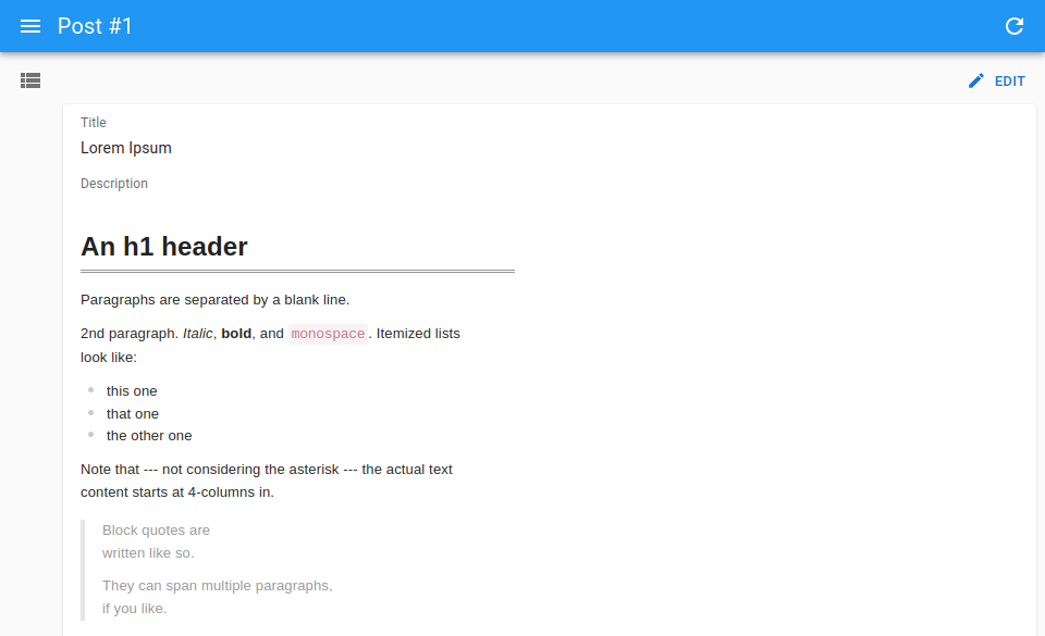
<MarkdownField>
A Field component for Markdown content. To be used e.g. in Show views.
import { Show, SimpleShowLayout, TextField } from 'react-admin';
import { MarkdownField } from '@react-admin/ra-markdown';

const PostShow = () => (
    <Show>
        <SimpleShowLayout>
            <TextField source="title" />
            <MarkdownField source="description" />
        </SimpleShowLayout>
    </Show>
);
import { Show, SimpleShowLayout, TextField } from "react-admin";
import { MarkdownField } from "@react-admin/ra-markdown";

const PostShow = () => (
    <Show>
        <SimpleShowLayout>
            <TextField source="title" />
            <MarkdownField source="description" />
        </SimpleShowLayout>
    </Show>
);
Tip: If you want to display raw (unformatted) markdown, use <TextField component="pre"> instead:
import { Show, SimpleShowLayout, TextField } from 'react-admin';

const PostShow = () => (
    <Show>
        <SimpleShowLayout>
            <TextField source="title" />
            <TextField source="description" component="pre" />
        </SimpleShowLayout>
    </Show>
);
import { Show, SimpleShowLayout, TextField } from "react-admin";

const PostShow = () => (
    <Show>
        <SimpleShowLayout>
            <TextField source="title" />
            <TextField source="description" component="pre" />
        </SimpleShowLayout>
    </Show>
);
<MarkdownInput>
An Input component for Markdown content, based on the tui-editor package. To be used in Edit and Create views.
Usage
import { Edit, SimpleForm, TextInput } from 'react-admin';
import { MarkdownInput } from '@react-admin/ra-markdown';

const PostEdit = () => (
    <Edit>
        <SimpleForm>
            <TextInput source="title" />
            <MarkdownInput source="description" />
        </SimpleForm>
    </Edit>
);
import { Edit, SimpleForm, TextInput } from "react-admin";
import { MarkdownInput } from "@react-admin/ra-markdown";

const PostEdit = () => (
    <Edit>
        <SimpleForm>
            <TextInput source="title" />
            <MarkdownInput source="description" />
        </SimpleForm>
    </Edit>
);
You can customize the markdown renderer used for the preview, so that it matches the rendering you need in read mode just by applying the CSS rules you want.
import { Edit, SimpleForm, TextInput } from 'react-admin';
import { MarkdownInput, MarkdownInputProps } from '@react-admin/ra-markdown';

// Additional props are passed to `tui-editor`'s `<Editor>` component
const options: Partial<MarkdownInputProps> = {
    previewStyle: 'tab',
    height: '300px',
    initialEditType: 'markdown',
    useCommandShortcut: false,
};

const PostEdit = () => (
    <Edit>
        <SimpleForm>
            <TextInput source="title" />
            <MarkdownInput source="description" {...options} />
        </SimpleForm>
    </Edit>
);
import { Edit, SimpleForm, TextInput } from "react-admin";
import { MarkdownInput } from "@react-admin/ra-markdown";

// Additional props are passed to `tui-editor`'s `<Editor>` component
const options = {
    previewStyle: "tab",
    height: "300px",
    initialEditType: "markdown",
    useCommandShortcut: false,
};

const PostEdit = () => (
    <Edit>
        <SimpleForm>
            <TextInput source="title" />
            <MarkdownInput source="description" {...options} />
        </SimpleForm>
    </Edit>
);
Props
<MarkdownInput> accepts the following props:
| Prop | Required | Type | Default | Description |
|---|---|---|---|---|
source |
Required | string |
The field name in the record | |
fullWidth |
Optional | boolean |
true |
If true, the input will expand to fill the form width |
height |
Optional | string |
512px |
Markdown editor's height |
helperText |
Optional | string |
The helper text to display under the input | |
initialEditType |
Optional | string |
wysiwyg |
Markdown editor's initial edit type. Can be markdown or wysiwyg |
label |
Optional | string |
The label. If not set, the label is inferred from the child component | |
previewStyle |
Optional | string |
vertical |
Markdown editor's preview style. Can be tab or vertical |
toolbarItems |
Optional | array |
The toolbar items to display in the editor. See Adding Buttons for more details. | |
useCommandShortcut |
Optional | boolean |
true |
Whether use keyboard shortcuts to perform commands |
<MarkdownInput> also accepts the common input props and the editor props from the Toast UI editor.
fullWidth
You can make the markdown editor full width by setting the fullWidth prop to true:
<SimpleForm>
    <MarkdownInput source="description" fullwidth />
</SimpleForm>
height
The editor has a size that can be customized by setting the height prop. It is set to 512px by default. You can use px or % units.
<SimpleForm>
    <MarkdownInput source="description" height="300px" />
</SimpleForm>
helperText
If you need to display a text below the markdown editor (usually to explain the expected data to the user), use the helperText prop.
<SimpleForm>
    <MarkdownInput
        source="description"
        helperText="Enter a description of the post"
    />
</SimpleForm>
initialEditType
This prop allows to set the initial edit type of the editor. It accepts markdown or wysiwyg and is set to wysiwyg by default.
<SimpleForm>
    <MarkdownInput source="description" initialEditType="markdown" />
</SimpleForm>
label
You can customize the label by setting the label prop. It is inferred from the source prop by default.
<SimpleForm>
    <MarkdownInput source="description" label="Explanation" />
</SimpleForm>
previewStyle
You can customize the preview style by setting the previewStyle prop. It accepts tab or vertical and is set to vertical by default.
- With the
verticalstyle, the content and the preview will be displayed side by side. - With the
tabstyle, the content and the preview will be displayed in two separate tabs. Users can switch between the two tabs by clicking on the tab header.
<SimpleForm>
    <MarkdownInput source="description" previewStyle="tab" />
</SimpleForm>
source
Specifies the field of the record that the input should edit. It is required.
<Form record={{ id: 123, title: 'Hello, world!', body: '**Lorem Ipsum**' }}>
    <MarkdownInput source="body" />
    {/* default value is "**Lorem Ipsum**" */}
</Form>
useCommandShortcut
You can disable the keyboard shortcuts by setting the useCommandShortcut prop to false. It is set to true by default.
<SimpleForm>
    <MarkdownInput source="description" useCommandShortcut={false} />
</SimpleForm>
Adding Buttons
You can add your own buttons to the markdown editor by using the toolbarItems prop. It accepts an array of toolbar items and is set to null by default.
The following example shows a custom button in the toolbar that displays an alert when clicked. It uses the createLastButton function to create an HTML button element, and the toolbarItems prop to pass it to the toolbar.
// src/Example.tsx
import { Edit, SimpleForm } from 'react-admin';
import { MarkdownInput } from '@react-admin/ra-markdown';

function createLastButton(): HTMLButtonElement {
    const button = document.createElement('button');
    button.className = 'toastui-editor-toolbar-icons last';
    button.style.backgroundImage = 'none';
    button.style.margin = '0';
    button.style.width = '100%';
    button.innerHTML = `<i>Custom Button</i>`;
    button.addEventListener('click', () => {
        alert('Custom Button action');
    });

    return button;
}

const Example = () => (
    <Edit>
        <SimpleForm>
            <MarkdownInput
                source="description"
                toolbarItems={[
                    ['heading', 'bold', 'italic', 'strike'],
                    [
                        {
                            el: createLastButton(),
                            tooltip: 'Custom Command',
                            name: 'custom',
                        },
                    ],
                ]}
            />
        </SimpleForm>
    </Edit>
);
// src/Example.tsx
import { Edit, SimpleForm } from "react-admin";
import { MarkdownInput } from "@react-admin/ra-markdown";

function createLastButton() {
    const button = document.createElement("button");
    button.className = "toastui-editor-toolbar-icons last";
    button.style.backgroundImage = "none";
    button.style.margin = "0";
    button.style.width = "100%";
    button.innerHTML = `<i>Custom Button</i>`;
    button.addEventListener("click", () => {
        alert("Custom Button action");
    });

    return button;
}

const Example = () => (
    <Edit>
        <SimpleForm>
            <MarkdownInput
                source="description"
                toolbarItems={[
                    ["heading", "bold", "italic", "strike"],
                    [
                        {
                            el: createLastButton(),
                            tooltip: "Custom Command",
                            name: "custom",
                        },
                    ],
                ]}
            />
        </SimpleForm>
    </Edit>
);
Refer to the tui-editor documentation for the details about the editor configuration.
Accessing The Editor Instance
If you need to interact with the editor instance, you can access it by using a ref prop.
The following example shows how to access the editor instance and call the getMarkdown method to display the markdown content.
import { useRef, useState } from 'react';
import { Button, Edit, SimpleForm } from 'react-admin';
import { Alert } from '@mui/material';
import { Editor, MarkdownInput } from '@react-admin/ra-markdown';

export const PostEdit = () => {
    const editorRef = useRef<Editor>(null);
    const [md, setMd] = useState(null);
    const onClickGetMarkdownButton = () => {
        const instance = editorRef.current.getInstance();
        setMd(instance.getMarkdown());
    };
    return (
        <Edit>
            <SimpleForm>
                <MarkdownInput
                    label="Body"
                    source="body"
                    ref={editorRef}
                    defaultValue={'**Hello world**'}
                />
                <Button
                    label="Get markdown value"
                    onClick={onClickGetMarkdownButton}
                />
                {md && <Alert severity="success">Markdown result: {md}</Alert>}
            </SimpleForm>
        </Edit>
    );
};
import { useRef, useState } from "react";
import { Button, Edit, SimpleForm } from "react-admin";
import { Alert } from "@mui/material";
import { MarkdownInput } from "@react-admin/ra-markdown";

export const PostEdit = () => {
    const editorRef = useRef(null);
    const [md, setMd] = useState(null);
    const onClickGetMarkdownButton = () => {
        const instance = editorRef.current.getInstance();
        setMd(instance.getMarkdown());
    };
    return (
        <Edit>
            <SimpleForm>
                <MarkdownInput label="Body" source="body" ref={editorRef} defaultValue={"**Hello world**"} />
                <Button label="Get markdown value" onClick={onClickGetMarkdownButton} />
                {md && <Alert severity="success">Markdown result: {md}</Alert>}
            </SimpleForm>
        </Edit>
    );
};
Refer to the tui-editor documentation for the details about the editor methods.
CHANGELOG
v5.1.2
2025-10-28
- Disable
toast-uitelemetry for<MarkdownField>and<MarkdownInput>
v5.1.1
2025-06-24
- Fix
<MarkdownField>not updating when its value changes
v5.1.0
2025-06-16
- Make components compatible with Material UI v7
v5.0.2
2025-03-21
- Fix
<MarkdownInput helperText>prop type
v5.0.1
2025-03-11
- Fix
<MarkdownInput>does not show its error state like other inputs
v5.0.0
2024-07-25
- Upgrade to react-admin v5
- [TypeScript]: Enable strictNullChecks
v4.2.0
2023-05-24
- Upgraded to react-admin
4.10.6
v4.1.5
2023-03-02
- (feat) Add dark mode support to
MarkdownInput - (fix) Fix
MarkdownInputshould supportlabel={false} - (doc) Fix
MarkdownInputcustom Editor options example
v4.1.4
2023-01-19
- (fix) Fix usage with React 18
v4.1.3
2023-01-16
- (fix) Fix
MarkdownInputdoes not apply value when it has changed from outside the input
v4.1.2
2022-11-15
- (fix) Fix emotion warning about potentially unsafe CSS pseudo class ":first-child" when doing SSR
v4.1.1
2022-10-18
- (fix) Fix compatibility with Next.JS (toastui's css is now embedded in ra-markdown rather than requiring a global css import)
v4.1.0
2022-10-17
- (fix) Bump to react-admin v4.4.3 and fix
MarkdownInput'sdefaultValuefollowing https://github.com/marmelab/react-admin/pull/8262- NOTICE - This version requires at least react-admin v4.4.3
v4.0.1
2022-06-08
- (fix) Update peer dependencies ranges (support React 18)
v4.0.0
2022-06-07
- Upgrade to react-admin v4
- Upgraded toast-ui/react-editor to v3
Breaking Changes
toast-ui/react-editor is now using ProseMirror. If you customized the editor or the viewer with plugins, you should follow their upgrade guide.
It also means we had to drop the default support for syntax highlighting. Indeed, the new toast-ui/react-editor requires to add a plugin for that (code-syntax-highlight) and to specify the languages to support.
import { Edit, EditProps, SimpleForm, TextInput } from 'react-admin';
import { MarkdownInput } from '@react-admin/ra-markdown';
+import codeSyntaxHighlight from '@toast-ui/editor-plugin-code-syntax-highlight';
+import 'prismjs/themes/prism.css';
+import '@toast-ui/editor-plugin-code-syntax-highlight/dist/toastui-editor-plugin-code-syntax-highlight.css';
+import Prism from 'prismjs';
+import 'prismjs/components/prism-jsx.js';

+ const options = {
+    plugins: [codeSyntaxHighlight]
+ };

const PostEdit = (props: EditProps) => (
    <Edit {...props}>
        <SimpleForm>
            <TextInput source="title" />
            <MarkdownInput
                source="description"
+                options={options}
            />
        </SimpleForm>
    </Edit>
);
v1.3.2
2021-12-20
- (fix) MarkdownField can't process nested source
v1.3.1
2021-06-29
- (fix) Update peer dependencies ranges (support react 17)
v1.3.0
2021-06-15
- Add support for helperText and validation to
<MarkdownInput> - Export the props interfaces of both
<MarkdownInput>and<MarkdownField>
v1.2.0
2020-10-17
- Upgrade to react-admin
3.15 - (feat) Ensure
MarkdownFieldstyles are customizable through MUI theme by providing their key (RaMarkdownField).
v1.1.0
2020-10-05
- Upgrade to react-admin
3.9
v1.0.3
2020-09-30
- Update Readme
v1.0.2
2020-09-16
- (deps) Upgrade dependencies
v1.0.1
2020-08-31
- (fix) Fix
fullWidthsupport
v1.0.0
2020-07-31
- First release