ra-navigation
Complex admins with many resources need to organize their pages in a tree structure, and provide navigation widgets to help their users find their way in that structure. ra-navigation offers specialized React components to implement a breadcrumb, menu hierarchies, and sliding menu panels, together with hooks to handle the user location.
Test it live in the Enterprise Edition Storybook and the e-commerce demo.
Installation
npm install --save @react-admin/ra-navigation
# or
yarn add @react-admin/ra-navigation
Tip: ra-navigation is part of the React-Admin Enterprise Edition, and hosted in a private npm registry. You need to subscribe to one of the Enterprise Edition plans to access this package.
Concepts
ra-navigation introduces the concept of application location (AppLocation) which is distinct from the browser location. This distinction is important as it allows displaying a navigation UI independent of the URL (e.g. grouping resources under a common section, like "Catalog / Products" and "Catalog / Categories", or nesting resources, like "Customers / John Doe / Orders / 1234").
Each page in a react-admin application can define its app location using the useDefineAppLocation hook. ra-navigation stores this string in a React context. UI components like <Breadcrumb> use that context to display consistent navigation information.
You don't need to define the app location for CRUD pages as react-admin does it by default:
- List:
[resource] - Create:
[resource].create - Edit:
[resource].edit. The location also contains the currentrecord - Show:
[resource].show. The location also contains the currentrecord
However, you can customize these default app locations in your CRUD pages, and you must define the location for custom pages.
Setting Up The <AppLocationContext>
To leverage the provided components such as the <Breadcrumb> or <MultiLevelMenu>, the layout must be wrapped with <AppLocationContext>.
Layout components from ra-navigation (<ContainerLayout> or <SolarLayout>) already include that context, so you can skip that step if you are using one of these layouts.
If, however, you are using the default <Layout> component from react-admin, or a custom layout, you must wrap it with <AppLocationContext>:
import { AppLocationContext } from '@react-admin/ra-navigation';
import { Admin, Resource, Layout } from 'react-admin';

const MyLayout = ({ children }) => (
    <AppLocationContext>
        <Layout>
            {children}
        </Layout>
    </AppLocationContext>
);

const App = () => (
    <Admin dataProvider={dataProvider} layout={MyLayout}>
        <Resource name="posts" list={PostList} />
    </Admin>
);
import { AppLocationContext } from "@react-admin/ra-navigation";
import { Admin, Resource, Layout } from "react-admin";

const MyLayout = ({ children }) => (
    <AppLocationContext>
        <Layout>{children}</Layout>
    </AppLocationContext>
);

const App = () => (
    <Admin dataProvider={dataProvider} layout={MyLayout}>
        <Resource name="posts" list={PostList} />
    </Admin>
);
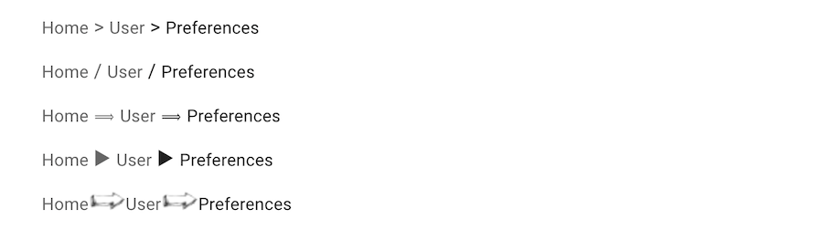
<Breadcrumb>
This component renders a breadcrumb path that automatically adapts to the page location. It helps users navigate large web applications.
The breadcrumb path can complement and/or replace navigation menus, back buttons, page titles, and site maps. It's a small but effective navigation control.
React-admin's <Breadcrumb> is not a pure UI component that you use in each page to manually render a breadcrumb path (for that, you can use Material-UI's <Breadcrumbs>). It's a smart component designed to be inserted in the application layout that renders the breadcrumb path of the current page. Breadcrumb items can be completely customized, and may include data from the current context (e.g. the name or title of the current record).
Usage
Create a custom layout component containing the <Breadcrumb> component. For example, using the default <Layout> component from react-admin:
// in src/MyLayout.jsx
import { AppLocationContext, Breadcrumb } from '@react-admin/ra-navigation';
import { Layout } from 'react-admin';

export const MyLayout = ({ children }) => (
    <AppLocationContext>
        <Layout>
            <Breadcrumb />
            {children}
        </Layout>
    </AppLocationContext>
);
Tip: The layout must be wrapped with <AppLocationContext>, as <Breadcrumb> reads the app location from this context and not the URL. Layout components from ra-navigation (<ContainerLayout> or <SolarLayout>) already include that context, so it's not necessary to include it in the custom layout.
Tip: The ra-enterprise package exports an alternative <Layout>, which contains a pre-configured <Breadcrumb> that renders breadcrumb paths for all resources.
Next, set this custom layout as the <Admin layout> component:
import { Admin } from 'react-admin';
import { DataProvider } from './dataProvider';
import { MyLayout } from './MyLayout';

const App = () => (
    <Admin dataProvider={dataProvider} layout={MyLayout}>
        ...
    </Admin>
);
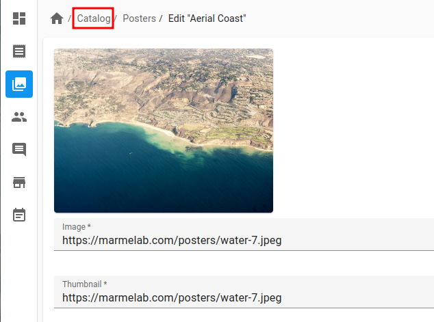
Now every CRUD page for the declared resources displays a breadcrumb path. For example, for the posts resource:
- "Posts" on the Post List page
- "Posts / #1" on the Post Edition page with id = 1
- "Posts / #1" on the Post Show page with id = 1
- "Posts / Create" on the Post Creation page
By default, <Breadcrumb> uses the id field to identify the current record on show and edit pages. You can customize it by setting the <Resource recordRepresentation> prop to a string or a function:
const App = () => {
    <Admin dataProvider={dataProvider} layout={MyLayout}>
        <Resource
            name="posts"
            recordRepresentation="title"
            list={PostList}
            edit={PostEdit}
            show={PostShow}
            create={PostCreate}
        />
        ...
    </Admin>;
};
With this setup, the breadcrumb on the post pages will use the title field of the record:
- "Posts" on the Post List page
- "Posts / Lorem ipsum" on the Post Edition page with id = 1
- "Posts / Lorem ipsum" on the Post Show page with id = 1
- "Posts / Create" on the Post Creation page
The Breadcrumb component will automatically detect if your app has a home or dashboard page, thanks to react-admin's useHasDashboard hook.
With a dashboard, the breadcrumb on the post pages now renders as:
- "🏠️ / Posts" on the Post List page
- "🏠️ / Posts / Lorem ipsum" on the Post Edition page with id = 1
- "🏠️ / Posts / Lorem ipsum" on the Post Show page with id = 1
- "🏠️ / Posts / Create" on the Post Creation page
You can customize the breadcrumb path of each page, as well as add custom pages to the breadcrumb, by adding children to the <Breadcrumb> component. See the children section below for more information.
Props
| Prop | Required | Type | Default | Description |
|---|---|---|---|---|
children |
Optional | ReactNode |
- | The Breadcrumb Items to be rendered. |
separator |
Optional | string or function | ' / ' | The character user as separator |
sx |
Optional | SxProps |
- | Style overrides, powered by MUI System |
Additional props are passed down to the root <nav> component.
children
Use the <Breadcrumb> children prop to define how a given app location renders in the breadcrumb. Children of the <Breadcrumb> component must be <Breadcrumb.Item> components, or any of its derivatives (<Breadcrumb.ResourceItem>, <Breadcrumb.ResourceItems>). These components can themselves have children in order to create a breadcrumb path of any depth.
Every <Breadcrumb> child must have a name prop. This name corresponds to a segment of the app location. For example, for an app location catalog.categories.list, the <Breadcrumb> will display the child with the name prop set to catalog. If no child matches the current app location, the <Breadcrumb> won't display anything.
For instance, Here's how you can create a custom breadcrumb for three resources: posts, comments, and users.
// in src/MyBreadcrumb.jsx
import { Breadcrumb } from '@react-admin/ra-navigation';

export const MyBreadcrumb = () => (
    <Breadcrumb>
        // The simplest without any customization
        <Breadcrumb.ResourceItems resource="posts" />
        // Here, there's no create Breadcrumb item
        <Breadcrumb.ListItem resource="comments">
            <Breadcrumb.EditItem resource="comments" />
            <Breadcrumb.ShowItem resource="comments" />
        </Breadcrumb.ListItem>
        // Customize the labels
        <Breadcrumb.ListItem resource="users">
            <Breadcrumb.EditItem
                resource="users"
                label={({ record }) => `Edit #${record.id}`}
            />
            <Breadcrumb.ShowItem
                resource="users"
                label={({ record }) => `Show #${record.id}`}
            />
            <Breadcrumb.CreateItem
                resource="users"
                label="Create User"
            />
        </Breadcrumb.ListItem>
    </Breadcrumb>
);
Replace the default <Breadcrumb> in your layout with your custom <MyBreadcrumb> component:
// in src/MyLayout.jsx
import { AppLocationContext, Breadcrumb } from '@react-admin/ra-navigation';
import { Layout } from 'react-admin';

import { MyBreadcrumb } from './MyBreadcrumb';

export const MyLayout = ({ children }) => (
    <AppLocationContext>
        <Layout>
            <MyBreadcrumb />
            {children}
        </Layout>
    </AppLocationContext>
);
The above breadcrumb setup will display:
- "Posts" on the Post List page
- "Posts / Lorem Ipsum" on the Post Show page with id = 1
- "Posts / Lorem Ipsum" on the Post Edition page with id = 1
- "Posts / Create" on the Post Creation page
- "Comments" on the Comment list page
- "Comments / #1" on the Comment Show page with id = 1
- "Comments / #1" on the Comment Edition page with id = 1
- "Users" on the User List page
- "Users / Show #1" on the User Show page with id = 1
- "Users / Edit #1" on the User Edition page with id = 1
- "Users / Create" on the User Creation page
As defining the paths for all the resources is a common use case, <Breadcrumb> provides a component that does the same. It's called <Breadcrumb.ResourceItems>. So the following breadcrumb is equivalent to the previous one:
// in src/MyBreadcrumb.jsx
import { Breadcrumb } from '@react-admin/ra-navigation';

export const MyBreadcrumb = () => (
    <Breadcrumb>
        <Breadcrumb.ResourceItems />
    </Breadcrumb>
);
This means you can use the default breadcrumb for CRUD pages, and only define breadcrumb items for custom pages. For instance, to set up a breadcrumb for an app with a Settings page, you can do the following:
// in src/MyBreadcrumb.jsx
import { Breadcrumb } from '@react-admin/ra-navigation';

const MyBreadcrumb = () => (
    <Breadcrumb>
        <Breadcrumb.ResourceItems />
        <Breadcrumb.Item name="settings" label="Settings" to="/settings" />
    </Breadcrumb>
);
See the following sections for the detailed syntax of possible <Breadcrumb> children:
<Breadcrumb.ResourceItem><Breadcrumb.ResourceItems><Breadcrumb.DashboardItem><Breadcrumb.ListItem><Breadcrumb.CreateItem><Breadcrumb.EditItem><Breadcrumb.ShowItem><Breadcrumb.Item>
separator
The breadcrumb separator used by default is " / ". You can override it by passing a string or a function as the separator prop.
// use a separator string
const MyBreadcrumb = () => (
    <Breadcrumb separator=" > ">
        ...
    </Breadcrumb>
);

// use a separator function to set the separator pseudo-content CSS
const MyBreadcrumb = () => (
    <Breadcrumb separator={() => `url('data:image/png;base64,iVBORw0KGgoAA....')`}>
        ...
    </Breadcrumb>
);
sx
You can override the style of the breadcrumb and its items using the sx prop.
const MyBreadcrumb = () => (
    <Breadcrumb
        sx={{
            '& ul': { padding: 1, paddingLeft: 0 },
            '& ul:empty': { padding: 0 },
        }}
    >
        // ...
    </Breadcrumb>
);
<Breadcrumb.ResourceItem>
This component renders the 4 breadcrumb items for the CRUD routes of a given resource. It only takes the resource name and relies on the label prop defined in the <Resource options> for the label.
import { Breadcrumb } from '@react-admin/ra-navigation';

const MyBreadcrumb = () => (
    <Breadcrumb>
        <Breadcrumb.ResourceItem resource="posts" />
        <Breadcrumb.ResourceItem resource="comments" />
    </Breadcrumb>
);
is equivalent to:
// in src/MyBreadcrumb.jsx
import { Breadcrumb } from '@react-admin/ra-navigation';

export const MyBreadcrumb = () => (
    <Breadcrumb>
        <Breadcrumb.ListItem resource="posts">
            <Breadcrumb.EditItem resource="posts" />
            <Breadcrumb.ShowItem resource="posts" />
            <Breadcrumb.CreateItem resource="posts" />
        </Breadcrumb.ListItem>
        <Breadcrumb.ListItem resource="comments">
            <Breadcrumb.EditItem resource="comments" />
            <Breadcrumb.ShowItem resource="comments" />
            <Breadcrumb.CreateItem resource="comments" />
        </Breadcrumb.ListItem>
    </Breadcrumb>
);
Tip: If you need more fine-grained control over the labels, you can override the Resource Breadcrumb items.
<Breadcrumb.ResourceItems>
This component renders one <Breadcrumb.ResourceItem> for each of the <Resource> declared in the admin.
import { Breadcrumb } from '@react-admin/ra-navigation';

const MyBreadcrumb = () => (
    <Breadcrumb>
        <Breadcrumb.ResourceItems />
    </Breadcrumb>
);
Given the following app:
const App = () => (
    <Admin dataProvider={dataProvider} layout={MyLayout}>
        <Resource name="posts" list={PostList} />
        <Resource name="comments" list={CommentList} />
        <Resource name="tags" list={TagList} />
    </Admin>
);
The <Breadcrumb.ResourceItems> is equivalent to:
const MyBreadcrumb = () => (
    <Breadcrumb>
        <Breadcrumb.ResourceItem resource="posts" />
        <Breadcrumb.ResourceItem resource="comments" />
        <Breadcrumb.ResourceItem resource="tags" />
    </Breadcrumb>
);
This component can render <Breadcrumb.ResourceItem> for only a subset of resources defined in the resources prop.
const MyBreadcrumb = () => (
    <Breadcrumb>
        <Breadcrumb.ResourceItems resources={['posts', 'comments']} />
    </Breadcrumb>
);
This is equivalent to:
const MyBreadcrumb = () => (
    <Breadcrumb>
        <Breadcrumb.ResourceItem resource="posts" />
        <Breadcrumb.ResourceItem resource="comments" />
    </Breadcrumb>
);
Check the <Breadcrumb.ResourceItem> section for more information.
<Breadcrumb.DashboardItem>
A version of the <Breadcrumb.Item> dedicated to the dashboard.
It is convenient for customizing the dashboard item label.
const MyBreadcrumbCustomHome = () => (
    <Breadcrumb>
        <Breadcrumb.DashboardItem label="My Home">
            <Breadcrumb.ResourceItem resource="posts" />
            <Breadcrumb.ResourceItem resource="comments" />
        </Breadcrumb.DashboardItem>
    </Breadcrumb>
);
const MyBreadcrumbCustomHome = () => (
    <Breadcrumb>
        <Breadcrumb.DashboardItem label="My Home">
            <Breadcrumb.ResourceItem resource="posts" />
            <Breadcrumb.ResourceItem resource="comments" />
        </Breadcrumb.DashboardItem>
    </Breadcrumb>
);
Just like with <Breadcrumb.Item>, you can also use a React component as label:
import { Breadcrumb } from '@react-admin/ra-navigation';
import { Box, Stack } from '@mui/material';
import { visuallyHidden } from '@mui/utils';
import CabinIcon from '@mui/icons-material/Cabin';

const MyBreadcrumbCustomHome = () => (
    <Breadcrumb>
        <Breadcrumb.DashboardItem
            label={
                <Stack direction="row" alignItems="center" spacing={1}>
                    <CabinIcon />
                    <Box sx={visuallyHidden}>Dashboard</Box>
                </Stack>
            }
        >
            <Breadcrumb.ResourceItem resource="posts" />
            <Breadcrumb.ResourceItem resource="comments" />
        </Breadcrumb.DashboardItem>
    </Breadcrumb>
);
import { Breadcrumb } from "@react-admin/ra-navigation";
import { Box, Stack } from "@mui/material";
import { visuallyHidden } from "@mui/utils";
import CabinIcon from "@mui/icons-material/Cabin";

const MyBreadcrumbCustomHome = () => (
    <Breadcrumb>
        <Breadcrumb.DashboardItem
            label={
                <Stack direction="row" alignItems="center" spacing={1}>
                    <CabinIcon />
                    <Box sx={visuallyHidden}>Dashboard</Box>
                </Stack>
            }
        >
            <Breadcrumb.ResourceItem resource="posts" />
            <Breadcrumb.ResourceItem resource="comments" />
        </Breadcrumb.DashboardItem>
    </Breadcrumb>
);
Tip: It's a good practice to include a visually hidden placeholder ('Dashboard' in this example) for screen readers when using an icon as label.
<Breadcrumb.ListItem>
A version of the <Breadcrumb.Item> dedicated to list views. It accepts all <Breadcrumb.Item> props.
It is convenient for building custom breadcrumbs.
const MyBreadcrumb = () => (
    <Breadcrumb>
        <Breadcrumb.ListItem resource="posts">
            <Breadcrumb.EditItem resource="posts" />
            <Breadcrumb.ShowItem resource="posts" />
            <Breadcrumb.CreateItem resource="posts" />
        </Breadcrumb.ListItem>
    </Breadcrumb>
);
<Breadcrumb.CreateItem>
A version of the <Breadcrumb.Item> dedicated to create views. It accepts all <Breadcrumb.Item> props.
It is convenient for building custom breadcrumbs.
const MyBreadcrumb = () => (
    <Breadcrumb>
        <Breadcrumb.ListItem resource="posts">
            <Breadcrumb.EditItem resource="posts" />
            <Breadcrumb.ShowItem resource="posts" />
            <Breadcrumb.CreateItem resource="posts" />
        </Breadcrumb.ListItem>
    </Breadcrumb>
);
const MyBreadcrumb = () => (
    <Breadcrumb>
        <Breadcrumb.ListItem resource="posts">
            <Breadcrumb.EditItem resource="posts" />
            <Breadcrumb.ShowItem resource="posts" />
            <Breadcrumb.CreateItem resource="posts" />
        </Breadcrumb.ListItem>
    </Breadcrumb>
);
<Breadcrumb.EditItem>
A version of the <Breadcrumb.Item> dedicated to edit views. It is convenient for building custom breadcrumbs.
It accepts all <Breadcrumb.Item> props and an optional meta prop that allows you to provide a meta parameter matching the one set in the <Edit> component:
const MyBreadcrumb = () => (
    <Breadcrumb>
        <Breadcrumb.ListItem resource="posts">
            <Breadcrumb.EditItem resource="posts" meta={{ test: true }} />
            <Breadcrumb.ShowItem resource="posts" />
            <Breadcrumb.CreateItem resource="posts" />
        </Breadcrumb.ListItem>
    </Breadcrumb>
);

const PostEdit = () => (
    <Edit queryOptions={{ meta: { test: true }}}>
        // ...
    </Edit>
);
const MyBreadcrumb = () => (
    <Breadcrumb>
        <Breadcrumb.ListItem resource="posts">
            <Breadcrumb.EditItem resource="posts" meta={{ test: true }} />
            <Breadcrumb.ShowItem resource="posts" />
            <Breadcrumb.CreateItem resource="posts" />
        </Breadcrumb.ListItem>
    </Breadcrumb>
);

const PostEdit = () => <Edit queryOptions={{ meta: { test: true } }}>// ...</Edit>;
Tip: If your <Edit> component has a meta parameter but manually calls useDefineAppLocation and provides it with the record, you don't need to set the meta prop on the <Breadcrumb.EditItem> as it will read the record from the AppLocationContext:
const MyBreadcrumb = () => (
    <Breadcrumb>
        <Breadcrumb.ListItem resource="posts">
            {/* meta are not provided here */}
            <Breadcrumb.EditItem resource="posts" />
            <Breadcrumb.ShowItem resource="posts" />
            <Breadcrumb.CreateItem resource="posts" />
        </Breadcrumb.ListItem>
    </Breadcrumb>
);

const PostEdit = () => (
    /* meta are provided here */
    <Edit queryOptions={{ meta: { test: true }}}>
      <PostAppLocation />
      {/*  */}
    </Edit>
);

const PostAppLocation = () => {
    const record = useRecordContext();
    // Pass the current record in the app location
    useDefineAppLocation('posts.edit', { record });
    return null;
}
const MyBreadcrumb = () => (
    <Breadcrumb>
        <Breadcrumb.ListItem resource="posts">
            {/* meta are not provided here */}
            <Breadcrumb.EditItem resource="posts" />
            <Breadcrumb.ShowItem resource="posts" />
            <Breadcrumb.CreateItem resource="posts" />
        </Breadcrumb.ListItem>
    </Breadcrumb>
);

const PostEdit = () => (
    /* meta are provided here */
    <Edit queryOptions={{ meta: { test: true } }}>
        <PostAppLocation />
        {/*  */}
    </Edit>
);

const PostAppLocation = () => {
    const record = useRecordContext();
    // Pass the current record in the app location
    useDefineAppLocation("posts.edit", { record });
    return null;
};
<Breadcrumb.ShowItem>
A version of the <Breadcrumb.Item> dedicated to show views. It is convenient for building custom breadcrumbs.
It accepts all <Breadcrumb.Item> props and an optional meta prop that allows you to provide a meta parameter matching the one set in the <Show> component:
const MyBreadcrumb = () => (
    <Breadcrumb>
        <Breadcrumb.ListItem resource="posts">
            <Breadcrumb.EditItem resource="posts" />
            <Breadcrumb.ShowItem resource="posts" meta={{ test: true }} />
            <Breadcrumb.CreateItem resource="posts" />
        </Breadcrumb.ListItem>
    </Breadcrumb>
);


const PostShow = () => (
    <Show queryOptions={{ meta: { test: true }}}>
        // ...
    </Show>
);
const MyBreadcrumb = () => (
    <Breadcrumb>
        <Breadcrumb.ListItem resource="posts">
            <Breadcrumb.EditItem resource="posts" />
            <Breadcrumb.ShowItem resource="posts" meta={{ test: true }} />
            <Breadcrumb.CreateItem resource="posts" />
        </Breadcrumb.ListItem>
    </Breadcrumb>
);

const PostShow = () => <Show queryOptions={{ meta: { test: true } }}>// ...</Show>;
Tip: If your <Show> component has a meta parameter but manually calls useDefineAppLocation and provides it with the record, you don't need to set the meta prop on the <Breadcrumb.ShowItem> as it will read the record from the AppLocationContext:
const MyBreadcrumb = () => (
    <Breadcrumb>
        <Breadcrumb.ListItem resource="posts">
            <Breadcrumb.EditItem resource="posts" />
            {/* meta are not provided here */}
            <Breadcrumb.ShowItem resource="posts" />
            <Breadcrumb.CreateItem resource="posts" />
        </Breadcrumb.ListItem>
    </Breadcrumb>
);

const PostShow = () => (
    /* meta are provided here */
    <Show queryOptions={{ meta: { test: true }}}>
      <PostAppLocation />
      {/*  */}
    </Show>
);

const PostAppLocation = () => {
    const record = useRecordContext();
    // Pass the current record in the app location
    useDefineAppLocation('posts.show', { record });
    return null;
}
const MyBreadcrumb = () => (
    <Breadcrumb>
        <Breadcrumb.ListItem resource="posts">
            <Breadcrumb.EditItem resource="posts" />
            {/* meta are not provided here */}
            <Breadcrumb.ShowItem resource="posts" />
            <Breadcrumb.CreateItem resource="posts" />
        </Breadcrumb.ListItem>
    </Breadcrumb>
);

const PostShow = () => (
    /* meta are provided here */
    <Show queryOptions={{ meta: { test: true } }}>
        <PostAppLocation />
        {/*  */}
    </Show>
);

const PostAppLocation = () => {
    const record = useRecordContext();
    // Pass the current record in the app location
    useDefineAppLocation("posts.show", { record });
    return null;
};
<Breadcrumb.Item>
The <Breadcrumb.Item> component is responsible for rendering individual breadcrumb items. It displays the item when the app's location matches the specified name. You can nest this component to create breadcrumb paths of varying depths.
It requires the following props:
name: Represents the item's name, which is used to determine its full path in the breadcrumb.label: Specifies the display label for the item. Can be a string (including a translation key), a React component, or a function returning a string or a React component based on the location context.
It accepts the following optional props:
to: Defines the react-router path for the link. Can be a string, or a function that returns a string based on the location context.
Note: If the to prop is provided, <Breadcrumb.Item> will render as a link. Without it, the component will render as a <span>.
Note: <Breadcrumb.Item> is a primitive component which is used to build more specialized ones such as <Breadcrumb.EditItem>, <Breadcrumb.CreateItem>, <Breadcrumb.ShowItem> or <Breadcrumb.ListItem>. You should only need it for custom pages.
Given the following settings pages:
import { Admin, CustomRoutes, useGetIdentity } from 'react-admin';
import { useDefineAppLocation } from '@react-admin/ra-navigation';
import { Route } from 'react-router-dom';
import { EditProfile } from './EditProfile';

const MyApp = () => (
  <Admin>
    <CustomRoutes>
      <Route path="/profile" element={<ProfilePage />} />
    </CustomRoutes>
  </Admin>
)

const ProfilePage = () => {
  const { data } = useGetIdentity();
  useDefineAppLocation('profile', { identity: data });

  return (
      <EditProfile />
  );
};
import { Admin, CustomRoutes, useGetIdentity } from "react-admin";
import { useDefineAppLocation } from "@react-admin/ra-navigation";
import { Route } from "react-router-dom";
import { EditProfile } from "./EditProfile";

const MyApp = () => (
    <Admin>
        <CustomRoutes>
            <Route path="/profile" element={<ProfilePage />} />
        </CustomRoutes>
    </Admin>
);

const ProfilePage = () => {
    const { data } = useGetIdentity();
    useDefineAppLocation("profile", { identity: data });

    return <EditProfile />;
};
You may have the following breadcrumb:
import { Breadcrumb } from '@react-admin/ra-navigation';

const MyBreadcrumb = () => (
    <Breadcrumb>
        <Breadcrumb.Item
            name="profile"
            label={({ identity }) => identity ? identity.fullName : 'My profile'}
            to="/profile"
        />
    </Breadcrumb>
);
Here is another example, showing how to use a React component as label:
import { Breadcrumb } from '@react-admin/ra-navigation';
import { Typography, Stack } from '@mui/material';
import PersonIcon from '@mui/icons-material/Person';

const IconAndLabel = ({
    label,
    icon,
}: {
    label: string;
    icon: React.ReactNode;
}) => (
    <Stack direction="row" alignItems="center" spacing={1}>
        {icon}
        <Typography variant="body2">{label}</Typography>
    </Stack>
);

const MyBreadcrumb = () => (
    <Breadcrumb>
        <Breadcrumb.Item
            name="profile"
            label={({ identity }) => identity ? (
                <IconAndLabel
                    label={identity.fullName}
                    icon={<PersonIcon />}
                />
            ): null}
            to="/profile"
        />
    </Breadcrumb>
);
<Breadcrumb> contains shortcut components for defining several <Breadcrumb.Item> children in a row: <Breadcrumb.ResourceItem>and <Breadcrumb.ResourceItems>.
Admins With A Dashboard
If the app has a home page defined via the <Admin dashboard> prop, the Breadcrumb will automatically detect it and set the root of the Breadcrumb to this page.
The breadcrumb will show respectively:
- "🏠️ / Posts" on the Post List page
- "🏠️ / Posts / Show #1" on the Post Show page with id = 1
- "🏠️ / Posts / Edit #1" on the Post Edition page with id = 1
- "🏠️ / Posts / Create" on the Post Creation page
Tip: Even though it is rendered as a 'home' icon (🏠️), the dashboard breadcrumb item also contains the hidden placeholder text 'Dashboard', for screen readers. If you want to customize this text, e.g. to rename "Dashboard" to "Home", provide a custom translation for the ra.page.dashboard message.
If you want to provide your own label for the dashboard breadcrumb item (either a string or a React component), you can use the <Breadcrumb.DashboardItem> component.
Adding Custom Pages
A page component can define its app location using the useDefineAppLocation hook:
// in src/UserPreferences.jsx
import { useDefineAppLocation } from '@react-admin/ra-navigation';

const UserPreferences = () => {
    useDefineAppLocation('user.preferences');
    return <span>My Preferences</span>;
};
Let's say that this custom page is added to the app under the /settings URL:
// in src/App.jsx
import { Admin, Resource, CustomRoutes, } from 'react-admin';
import { Route } from 'react-router-dom';

import { MyLayout } from './MyLayout';
import { UserPreferences } from './UserPreferences';

const App = () => (
    <Admin dataProvider={dataProvider} layout={MyLayout}>
        ...
        <CustomRoutes>
            <Route exact path="/settings" component={UserPreferences} />,
        </CustomRoutes>
    </Admin>
);
It's the job of the <Breadcrumb> component to define the breadcrumb path for this page location using its children:
// in src/MyBreadcrumb.jsx
import { Breadcrumb } from '@react-admin/ra-navigation';

export const MyBreadcrumb = () => (
    <Breadcrumb>
        <Breadcrumb.ResourceItems />
        <Breadcrumb.Item name="user" label="User">
            <Breadcrumb.Item name="preferences" label="Preferences" to="/settings" />
        </Breadcrumb.Item>
    </Breadcrumb>
);
Finally, don't forget to use the <MyBreadcrumb> component in the layout:
// in src/MyLayout.jsx
import { AppLocationContext, Breadcrumb } from '@react-admin/ra-navigation';
import { Layout } from 'react-admin';

import { MyBreadcrumb } from './MyBreadcrumb';

export const MyLayout = ({ children }) => (
    <AppLocationContext>
        <Layout>
            <MyBreadcrumb />
            {children}
        </Layout>
    </AppLocationContext>
);
Overriding Items For One Resource
In some cases, it's useful to override the default resource breadcrumb path, e.g. to add a custom label instead of "Show #1", "Edit #1", etc. If the <Resource recordRepresentation> is not enough, you can disable the concerned resources in the <Breadcrumb.ResourceItems resources> prop, and declare the breadcrumb items for these resources manually.
import React from 'react';
import { AppLocationContext, Breadcrumb } from '@react-admin/ra-navigation';
import { Admin, Resource, Layout, useCreatePath, List } from 'react-admin';

const MyBreadcrumb = () => {
    const createPath = useCreatePath();

    return (
        <Breadcrumb>
            {/* no Breadcrumb.ResourceItem for the 'posts' resource */}
            <Breadcrumb.ResourceItems resources={['comments', 'tags']} />
            {/* we define it manually */}
            <Breadcrumb.ListItem resource="posts" label="Posts">
                <Breadcrumb.EditItem
                    resource="posts"
                    label={({ record }) => `Edit "${record.title}"`}
                />
                <Breadcrumb.ShowItem
                    resource="posts"
                    label={({ record }) => record.title}
                />
                <Breadcrumb.CreateItem resource="posts" label="Create" />
            </Breadcrumb.ListItem>
        </Breadcrumb>
    );
};

const MyLayout = ({ children }) => (
    <AppLocationContext>
        <Layout>
            <MyBreadcrumb />
            {children}
        </Layout>
    </AppLocationContext>
);

const App = () => (
    <Admin dataProvider={dataProvider} layout={MyLayout}>
        <Resource name="posts" list={PostList} />
        <Resource name="comments" list={CommentList} />
        <Resource name="tags" list={TagList} />
    </Admin>
);
import React from "react";
import { AppLocationContext, Breadcrumb } from "@react-admin/ra-navigation";
import { Admin, Resource, Layout, useCreatePath } from "react-admin";

const MyBreadcrumb = () => {
    const createPath = useCreatePath();

    return (
        <Breadcrumb>
            {/* no Breadcrumb.ResourceItem for the 'posts' resource */}
            <Breadcrumb.ResourceItems resources={["comments", "tags"]} />
            {/* we define it manually */}
            <Breadcrumb.ListItem resource="posts" label="Posts">
                <Breadcrumb.EditItem resource="posts" label={({ record }) => `Edit "${record.title}"`} />
                <Breadcrumb.ShowItem resource="posts" label={({ record }) => record.title} />
                <Breadcrumb.CreateItem resource="posts" label="Create" />
            </Breadcrumb.ListItem>
        </Breadcrumb>
    );
};

const MyLayout = ({ children }) => (
    <AppLocationContext>
        <Layout>
            <MyBreadcrumb />
            {children}
        </Layout>
    </AppLocationContext>
);

const App = () => (
    <Admin dataProvider={dataProvider} layout={MyLayout}>
        <Resource name="posts" list={PostList} />
        <Resource name="comments" list={CommentList} />
        <Resource name="tags" list={TagList} />
    </Admin>
);
Nested Resources
When using nested resources, you should create breadcrumb items for the sub-resources.
For instance, the screencast at the top of this page shows a songs resource nested in an artists resource, using the following routes:
import { Admin, Resource } from 'react-admin';
import { Route } from 'react-router-dom';

export const App = () => (
    <Admin dataProvider={dataProvider}>
        <Resource name="artists" list={ArtistList} edit={ArtistDetail}>
            <Route path=":id/songs" element={<SongList />} />
            <Route path=":id/songs/:songId" element={<SongDetail />} />
        </Resource>
    </Admin>
);
This setup creates four routes:
/artistsrenders the<ArtistList>element/artists/:idrenders the<ArtistDetail>element/artists/:id/songsrenders the<SongList>element/artists/:id/songs/:songIdrenders the<SongDetail>element
One app location is defined for each route:
/artists:artists(defined automatically)/artists/:id:artists.edit(defined automatically)/artists/:id/songs:artists.edit.songs(defined manually)/artists/:id/songs/:songId:artists.edit.songs.edit(defined manually)
Let's see how the components for the songs list and detail pages define their app location:
// in src/songs/SongList.js
import { useGetOne, List, SearchInput, DataTable, DateField } from 'react-admin';
import { useDefineAppLocation } from '@react-admin/ra-navigation';
import { useParams } from 'react-router-dom';

export const SongList = () => {
    const { id } = useParams();
    const { data: record } = useGetOne('artists', { id });
    useDefineAppLocation('artists.edit.songs', { record });
    return (
        <List
            resource="songs"
            filter={{ artist_id: id }}
            filters={[<SearchInput key="q" source="q" alwaysOn />]}
        >
            <DataTable>
                <DataTable.Col source="title" />
                <DataTable.Col source="released" field={DateField} />
                <DataTable.Col source="writer" />
                <DataTable.Col source="producer" />
                <DataTable.Col source="recordCompany" label="Label" />
                <DataTable.Col>
                    <EditSongButton />
                </DataTable.Col>
            </DataTable>
        </List>
    );
};

const EditSongButton = () => {
    const song = useRecordContext();
    return (
        <Button
            component={Link}
            to={`/artists/${song?.artist_id}/songs/${song?.id}`}
            startIcon={<EditIcon />}
        >
            Edit
        </Button>
    );
};
// in src/songs/SongDetail.js
import { useGetOne, Edit, SimpleForm, TextInput, DateInput } from 'react-admin';
import { useDefineAppLocation } from '@react-admin/ra-navigation';
import { useParams } from 'react-router-dom';

export const SongDetail = () => {
    const { id, songId } = useParams();
    const { data: record } = useGetOne('artists', { id });
    const { data: song } = useGetOne('songs', { id: songId });
    useDefineAppLocation('artists.edit.songs.edit', { record, song });
    return (
        <Edit resource="songs" id={songId} redirect={`/artists/${id}/songs`}>
            <SimpleForm>
                <TextInput source="title" />
                <DateInput source="released" />
                <TextInput source="writer" />
                <TextInput source="producer" />
                <TextInput source="recordCompany" label="Label" />
            </SimpleForm>
        </Edit>
    );
};
Tip: The <Edit> component will call dataProvider.getOne("songs", { id: songId }) to fetch the song record. Since the <SongDetail> component makes the same request, React-admin will deduplicate the calls and only make one request to the dataProvider.
Tip: You don't need to call useDefineAppLocation for the pages of the parent resource (artists) as this resource uses the default URLs (/artists, /artists/:id). The app location will be deduced automatically from these URLs (i.e. artists and artists.edit).
Once the app locations are properly set up, the Breadcrumb code comes naturally as:
const MyBreadcrumb = () => (
    <Breadcrumb>
        <Breadcrumb.ListItem resource="artists">
            <Breadcrumb.EditItem resource="artists">
                <Breadcrumb.Item
                    name="songs"
                    label="Songs"
                    to={({ record }) => `/artists/${record?.id}/songs`}
                >
                    <Breadcrumb.Item
                        name="edit"
                        label={({ song }) => song?.title}
                        to={({ song }) => `/artists/${song?.artist_id}/songs/${song?.id}`}
                    />
                </Breadcrumb.Item>
            </Breadcrumb.EditItem>
            <Breadcrumb.CreateItem resource="artists" />
        </Breadcrumb.ListItem>
    </Breadcrumb>
);
Grouping Resources
You may want to group CRUD pages for several resources under a common parent item. For instance, let's say that the pages for the songs and artists resources have to be grouped under a "Music" item. The breadcrumb path for the list pages of these resources should look like the following:
- "Music / Songs" on the Song List page
- "Music / Artists" on the Artist List page
To do so, override the app location of the CRUD pages using the useDefineAppLocation hook. Here is an example for the songs resource:
// in src/songs/SongList.jsx
import { List, DataTable } from 'react-admin';
import { useDefineAppLocation } from '@react-admin/ra-navigation';

export const SongList = () => {
    useDefineAppLocation('music.songs');
    return (
        <List>
            <DataTable rowClick="edit">
                <DataTable.Col source="title" />
            </DataTable>
        </List>
    );
};

// in src/songs/SongEdit.jsx
import { Edit, SimpleForm, TextInput, useRecordContext } from 'react-admin';
import { useDefineAppLocation } from '@react-admin/ra-navigation';

const SongEditAppLocation = () => {
    const record = useRecordContext();
    useDefineAppLocation('music.songs.edit', { record });
    return null;
};

export const SongEdit = () => (
    <Edit>
        <SongEditAppLocation />
        <SimpleForm>
            <TextInput source="title" />
        </SimpleForm>
    </Edit>
);

// in src/songs/SongShow.jsx
import { Show, SimpleShowLayout, TextField, useRecordContext } from 'react-admin';
import { useDefineAppLocation } from '@react-admin/ra-navigation';

const SongShowAppLocation = () => {
    const record = useRecordContext();
    useDefineAppLocation('music.songs.show', { record });
    return null;
};

export const SongShow = () => (
    <Show>
        <SongShowAppLocation />
        <SimpleShowLayout>
            <TextField source="title" />
        </SimpleShowLayout>
    </Show>
);

// in src/songs/SongCreate.jsx
import { Create, SimpleForm, TextInput } from 'react-admin';
import { useDefineAppLocation } from '@react-admin/ra-navigation';

export const SongCreate = () => {
    useDefineAppLocation('music.songs.create');
    return (
        <Create>
            <SimpleForm>
                <TextInput source="title" />
            </SimpleForm>
        </Create>
    );
};
Then, in the breadcrumb, nest <Breadcrumb.ResourceItem> elements for the songs and artists resources under a parent <Breadcrumb.Item name="music">:
const MyBreadcrumb = () => (
    <Breadcrumb>
        <Breadcrumb.Item name="music" label="Music">
            <Breadcrumb.ResourceItem resource="songs" />
            <Breadcrumb.ResourceItem resource="artists" />
        </Breadcrumb.Item>
    </Breadcrumb>
);
As you see, you can compose Breadcrumb item elements at will.
<MultiLevelMenu>
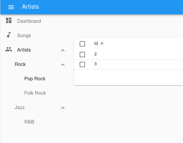
When a React-admin application grows significantly, the default menu might not be the best solution. The <MultiLevelMenu> can help unclutter the navigation: it renders a menu with an infinite number of levels and sub-menus. Menu Items that are not at the top level are rendered inside a collapsible panel.
The <MultiLevelMenu> accepts <MultiLevelMenu.Item> components as its children. They are very similar to the default <MenuItemLink> from react-admin, except that they accept other <MultiLevelMenu.Item> as their children. To use it, the layout of the app must be inside a <AppLocationContext>.
The <MultiLevelMenu.Item> component accepts a name, a label, and an optional icon prop.
import { Admin, Layout, Resource } from 'react-admin';
import { AppLocationContext, MultiLevelMenu } from '@react-admin/ra-navigation';
import { Dashboard } from './Dashboard';
import { dataProvider } from './dataProvider';
import { SongList } from './songs';
import { ArtistList } from './artists';

const MyMenu = () => (
    <MultiLevelMenu>
        <MultiLevelMenu.DashboardItem />
        <MultiLevelMenu.ResourceItem resource="songs" />
        {/* The empty filter is required to avoid falling back to the previously set filter */}
        <MultiLevelMenu.ResourceItem
            resource="artists"
            to={'/artists?filter={}'}
        >
            <MultiLevelMenu.Item
                name="artists.rock"
                to={'/artists?filter={"type":"Rock"}'}
                label="Rock"
            >
                <MultiLevelMenu.Item
                    name="artists.rock.pop"
                    to={'/artists?filter={"type":"Pop Rock"}'}
                    label="Pop Rock"
                />
                <MultiLevelMenu.Item
                    name="artists.rock.folk"
                    to={'/artists?filter={"type":"Folk Rock"}'}
                    label="Folk Rock"
                />
            </MultiLevelMenu.Item>
            <MultiLevelMenu.Item
                name="artists.jazz"
                to={'/artists?filter={"type":"Jazz"}'}
                label="Jazz"
            >
                <MultiLevelMenu.Item
                    name="artists.jazz.rb"
                    to={'/artists?filter={"type":"RB"}'}
                    label="R&B"
                />
            </MultiLevelMenu.Item>
        </MultiLevelMenu.ResourceItem>
    </MultiLevelMenu>
);

const MyLayout = ({ children }) => (
    <AppLocationContext>
        <Layout menu={MyMenu}>
            {children}
        </Layout>
    </AppLocationContext>
);

export const Basic = () => (
    <Admin dashboard={Dashboard} dataProvider={dataProvider} layout={MyLayout}>
        <Resource name="songs" list={SongList} />
        <Resource name="artists" list={ArtistList} />
    </Admin>
);
import { Admin, Layout, Resource } from "react-admin";
import { AppLocationContext, MultiLevelMenu } from "@react-admin/ra-navigation";
import { Dashboard } from "./Dashboard";
import { dataProvider } from "./dataProvider";
import { SongList } from "./songs";
import { ArtistList } from "./artists";

const MyMenu = () => (
    <MultiLevelMenu>
        <MultiLevelMenu.DashboardItem />
        <MultiLevelMenu.ResourceItem resource="songs" />
        {/* The empty filter is required to avoid falling back to the previously set filter */}
        <MultiLevelMenu.ResourceItem resource="artists" to={"/artists?filter={}"}>
            <MultiLevelMenu.Item name="artists.rock" to={'/artists?filter={"type":"Rock"}'} label="Rock">
                <MultiLevelMenu.Item
                    name="artists.rock.pop"
                    to={'/artists?filter={"type":"Pop Rock"}'}
                    label="Pop Rock"
                />
                <MultiLevelMenu.Item
                    name="artists.rock.folk"
                    to={'/artists?filter={"type":"Folk Rock"}'}
                    label="Folk Rock"
                />
            </MultiLevelMenu.Item>
            <MultiLevelMenu.Item name="artists.jazz" to={'/artists?filter={"type":"Jazz"}'} label="Jazz">
                <MultiLevelMenu.Item name="artists.jazz.rb" to={'/artists?filter={"type":"RB"}'} label="R&B" />
            </MultiLevelMenu.Item>
        </MultiLevelMenu.ResourceItem>
    </MultiLevelMenu>
);

const MyLayout = ({ children }) => (
    <AppLocationContext>
        <Layout menu={MyMenu}>{children}</Layout>
    </AppLocationContext>
);

export const Basic = () => (
    <Admin dashboard={Dashboard} dataProvider={dataProvider} layout={MyLayout}>
        <Resource name="songs" list={SongList} />
        <Resource name="artists" list={ArtistList} />
    </Admin>
);
Props
| Prop | Required | Type | Default | Description |
|---|---|---|---|---|
children |
Optional | ReactNode |
- | The menu items to render. |
initialOpen |
Optional | boolean |
false |
Whether the menu items with sub menus should be open initially. Has no effect if using the categories variant. |
openItemList |
Optional | string[] |
- | List of names of menu items that should be opened by default. |
sx |
Optional | SxProps |
- | Style overrides, powered by MUI System |
Additional props are passed down to the root <div> component.
children
The menu items to render:
import { MultiLevelMenu } from '@react-admin/ra-navigation';

const MyMenu = () => (
    <MultiLevelMenu>
        <MultiLevelMenu.DashboardItem />
        <MultiLevelMenu.ResourceItem resource="songs" />
        {/* The empty filter is required to avoid falling back to the previously set filter */}
        <MultiLevelMenu.ResourceItem
            resource="artists"
            to={'/artists?filter={}'}
        >
            <MultiLevelMenu.Item
                name="artists.rock"
                to={'/artists?filter={"type":"Rock"}'}
                label="Rock"
            >
                <MultiLevelMenu.Item
                    name="artists.rock.pop"
                    to={'/artists?filter={"type":"Pop Rock"}'}
                    label="Pop Rock"
                />
                <MultiLevelMenu.Item
                    name="artists.rock.folk"
                    to={'/artists?filter={"type":"Folk Rock"}'}
                    label="Folk Rock"
                />
            </MultiLevelMenu.Item>
            <MultiLevelMenu.Item
                name="artists.jazz"
                to={'/artists?filter={"type":"Jazz"}'}
                label="Jazz"
            >
                <MultiLevelMenu.Item
                    name="artists.jazz.rb"
                    to={'/artists?filter={"type":"RB"}'}
                    label="R&B"
                />
            </MultiLevelMenu.Item>
        </MultiLevelMenu.ResourceItem>
    </MultiLevelMenu>
);
import { MultiLevelMenu } from "@react-admin/ra-navigation";

const MyMenu = () => (
    <MultiLevelMenu>
        <MultiLevelMenu.DashboardItem />
        <MultiLevelMenu.ResourceItem resource="songs" />
        {/* The empty filter is required to avoid falling back to the previously set filter */}
        <MultiLevelMenu.ResourceItem resource="artists" to={"/artists?filter={}"}>
            <MultiLevelMenu.Item name="artists.rock" to={'/artists?filter={"type":"Rock"}'} label="Rock">
                <MultiLevelMenu.Item
                    name="artists.rock.pop"
                    to={'/artists?filter={"type":"Pop Rock"}'}
                    label="Pop Rock"
                />
                <MultiLevelMenu.Item
                    name="artists.rock.folk"
                    to={'/artists?filter={"type":"Folk Rock"}'}
                    label="Folk Rock"
                />
            </MultiLevelMenu.Item>
            <MultiLevelMenu.Item name="artists.jazz" to={'/artists?filter={"type":"Jazz"}'} label="Jazz">
                <MultiLevelMenu.Item name="artists.jazz.rb" to={'/artists?filter={"type":"RB"}'} label="R&B" />
            </MultiLevelMenu.Item>
        </MultiLevelMenu.ResourceItem>
    </MultiLevelMenu>
);
initialOpen
Whether the menu items with sub menus should be open initially. Has no effect if using the categories variant. Defaults to false.
import { MultiLevelMenu } from '@react-admin/ra-navigation';

const MyMenu = () => (
    <MultiLevelMenu initialOpen>
        <MultiLevelMenu.DashboardItem />
        <MultiLevelMenu.ResourceItem resource="songs" />
        <MultiLevelMenu.ResourceItem resource="artists" />
    </MultiLevelMenu>
);
import { MultiLevelMenu } from "@react-admin/ra-navigation";

const MyMenu = () => (
    <MultiLevelMenu initialOpen>
        <MultiLevelMenu.DashboardItem />
        <MultiLevelMenu.ResourceItem resource="songs" />
        <MultiLevelMenu.ResourceItem resource="artists" />
    </MultiLevelMenu>
);
openItemList
List of names of menu items that should be opened by default.
If the menu item to be opened is nested, you have to fill in the name of all the parent items. Ex: ['artists', 'artists.rock', 'artists.rock.pop']
import { MultiLevelMenu } from '@react-admin/ra-navigation';

const MyMenu = () => (
    <MultiLevelMenu openItemList={['artists', 'artists.rock', 'artists.rock.pop']}>
        <MultiLevelMenu.DashboardItem />
        <MultiLevelMenu.ResourceItem resource="songs" />
        {/* The empty filter is required to avoid falling back to the previously set filter */}
        <MultiLevelMenu.ResourceItem
            resource="artists"
            to={'/artists?filter={}'}
        >
            <MultiLevelMenu.Item
                name="artists.rock"
                to={'/artists?filter={"type":"Rock"}'}
                label="Rock"
            >
                <MultiLevelMenu.Item
                    name="artists.rock.pop"
                    to={'/artists?filter={"type":"Pop Rock"}'}
                    label="Pop Rock"
                />
                <MultiLevelMenu.Item
                    name="artists.rock.folk"
                    to={'/artists?filter={"type":"Folk Rock"}'}
                    label="Folk Rock"
                />
            </MultiLevelMenu.Item>
            <MultiLevelMenu.Item
                name="artists.jazz"
                to={'/artists?filter={"type":"Jazz"}'}
                label="Jazz"
            >
                <MultiLevelMenu.Item
                    name="artists.jazz.rb"
                    to={'/artists?filter={"type":"RB"}'}
                    label="R&B"
                />
            </MultiLevelMenu.Item>
        </MultiLevelMenu.ResourceItem>
    </MultiLevelMenu>
);
import { MultiLevelMenu } from "@react-admin/ra-navigation";

const MyMenu = () => (
    <MultiLevelMenu openItemList={["artists", "artists.rock", "artists.rock.pop"]}>
        <MultiLevelMenu.DashboardItem />
        <MultiLevelMenu.ResourceItem resource="songs" />
        {/* The empty filter is required to avoid falling back to the previously set filter */}
        <MultiLevelMenu.ResourceItem resource="artists" to={"/artists?filter={}"}>
            <MultiLevelMenu.Item name="artists.rock" to={'/artists?filter={"type":"Rock"}'} label="Rock">
                <MultiLevelMenu.Item
                    name="artists.rock.pop"
                    to={'/artists?filter={"type":"Pop Rock"}'}
                    label="Pop Rock"
                />
                <MultiLevelMenu.Item
                    name="artists.rock.folk"
                    to={'/artists?filter={"type":"Folk Rock"}'}
                    label="Folk Rock"
                />
            </MultiLevelMenu.Item>
            <MultiLevelMenu.Item name="artists.jazz" to={'/artists?filter={"type":"Jazz"}'} label="Jazz">
                <MultiLevelMenu.Item name="artists.jazz.rb" to={'/artists?filter={"type":"RB"}'} label="R&B" />
            </MultiLevelMenu.Item>
        </MultiLevelMenu.ResourceItem>
    </MultiLevelMenu>
);
sx
Style overrides, powered by MUI System:
| Rule name | Description |
|---|---|
RaMultiLevelMenu |
Applied to the root div element |
& .RaMultiLevelMenu-nav |
Applied to the nav element |
& .RaMultiLevelMenu-navWithCategories |
Applied to the nav element when using the categories variant |
& .RaMultiLevelMenu-list |
Applied to the MUI <List> |
import { MultiLevelMenu } from '@react-admin/ra-navigation';

const MyMenu = () => (
    <MultiLevelMenu sx={{ border: 'solid 1px #000' }}>
        <MultiLevelMenu.DashboardItem />
        <MultiLevelMenu.ResourceItem resource="songs" />
        <MultiLevelMenu.ResourceItem resource="artists" />
    </MultiLevelMenu>
);
import { MultiLevelMenu } from "@react-admin/ra-navigation";

const MyMenu = () => (
    <MultiLevelMenu sx={{ border: "solid 1px #000" }}>
        <MultiLevelMenu.DashboardItem />
        <MultiLevelMenu.ResourceItem resource="songs" />
        <MultiLevelMenu.ResourceItem resource="artists" />
    </MultiLevelMenu>
);
<MultiLevelMenu.Item>
Usage
import { MultiLevelMenu } from '@react-admin/ra-navigation';

const MyMenu = () => (
    <MultiLevelMenu>
        {/* The empty filter is required to avoid falling back to the previously set filter */}
        <MultiLevelMenu.Item
            name="artists"
            to={'/artists?filter={}'}
            label="artists"
        >
            <MultiLevelMenu.Item
                name="artists.rock"
                to={'/artists?filter={"type":"Rock"}'}
                label="Rock"
            >
                <MultiLevelMenu.Item
                    name="artists.rock.pop"
                    to={'/artists?filter={"type":"Pop Rock"}'}
                    label="Pop Rock"
                />
                <MultiLevelMenu.Item
                    name="artists.rock.folk"
                    to={'/artists?filter={"type":"Folk Rock"}'}
                    label="Folk Rock"
                />
            </MultiLevelMenu.Item>
            <MultiLevelMenu.Item
                name="artists.jazz"
                to={'/artists?filter={"type":"Jazz"}'}
                label="Jazz"
            >
                <MultiLevelMenu.Item
                    name="artists.jazz.rb"
                    to={'/artists?filter={"type":"RB"}'}
                    label="R&B"
                />
            </MultiLevelMenu.Item>
        </MultiLevelMenu.Item>
    </MultiLevelMenu>
);
import { MultiLevelMenu } from "@react-admin/ra-navigation";

const MyMenu = () => (
    <MultiLevelMenu>
        {/* The empty filter is required to avoid falling back to the previously set filter */}
        <MultiLevelMenu.Item name="artists" to={"/artists?filter={}"} label="artists">
            <MultiLevelMenu.Item name="artists.rock" to={'/artists?filter={"type":"Rock"}'} label="Rock">
                <MultiLevelMenu.Item
                    name="artists.rock.pop"
                    to={'/artists?filter={"type":"Pop Rock"}'}
                    label="Pop Rock"
                />
                <MultiLevelMenu.Item
                    name="artists.rock.folk"
                    to={'/artists?filter={"type":"Folk Rock"}'}
                    label="Folk Rock"
                />
            </MultiLevelMenu.Item>
            <MultiLevelMenu.Item name="artists.jazz" to={'/artists?filter={"type":"Jazz"}'} label="Jazz">
                <MultiLevelMenu.Item name="artists.jazz.rb" to={'/artists?filter={"type":"RB"}'} label="R&B" />
            </MultiLevelMenu.Item>
        </MultiLevelMenu.Item>
    </MultiLevelMenu>
);
Props
In addition to the props of react-router <NavLink> and those of material-ui <ListItem>.
| Prop | Required | Type | Default | Description |
|---|---|---|---|---|
children |
Optional | ReactNode |
The sub-menu items to be rendered. | |
name |
Required | string |
The name of the item. Used to manage its open/closed state. | |
icon |
Optional | ReactNode |
- | An icon element to display in front of the item. |
label |
Optional | string |
- | The label to display for this item. Accepts translation keys. |
to |
Required | string |
- | The location to link to. |
sx |
Optional | SxProps |
- | Style overrides, powered by MUI System. |
Tip: You can omit the to from <NavLink> property for <MultiLevelMenu.Item> elements that have a child menu item.
children
Pass a children to <MultiLevelMenu.Item> to define the sub-menu entries:
import { MultiLevelMenu } from "@react-admin/ra-navigation";
import PeopleIcon from '@mui/icons-material/People';

const MyMenu = () => (
    <MultiLevelMenu>
        <MultiLevelMenu.Item
            name="artists"
            to={'/artists?filter={}'}
            label="Artists"
            icon={<PeopleIcon />}
        >
            <MultiLevelMenu.Item
                name="artists.rock"
                to={'/artists?filter={"type":"Rock"}'}
                label="Rock"
            >
                <MultiLevelMenu.Item
                    name="artists.rock.pop"
                    to={'/artists?filter={"type":"Pop Rock"}'}
                    label="Pop Rock"
                />
                <MultiLevelMenu.Item
                    name="artists.rock.folk"
                    to={'/artists?filter={"type":"Folk Rock"}'}
                    label="Folk Rock"
                />
            </MultiLevelMenu.Item>
            <MultiLevelMenu.Item
                name="artists.jazz"
                to={'/artists?filter={"type":"Jazz"}'}
                label="Jazz"
            >
                <MultiLevelMenu.Item
                    name="artists.jazz.rb"
                    to={'/artists?filter={"type":"RB"}'}
                    label="R&B"
                />
            </MultiLevelMenu.Item>
        </MultiLevelMenu.Item>
    </MultiLevelMenu>
);
name
The name of the item. Used to manage its open/closed state.
import { MultiLevelMenu } from '@react-admin/ra-navigation';

const MyMenu = () => (
    <MultiLevelMenu>
        <MultiLevelMenu.Item name="artists" to={'/artists?filter={}'} />
    </MultiLevelMenu>
);
import { MultiLevelMenu } from "@react-admin/ra-navigation";

const MyMenu = () => (
    <MultiLevelMenu>
        <MultiLevelMenu.Item name="artists" to={"/artists?filter={}"} />
    </MultiLevelMenu>
);
icon
An icon element to display in front of the item.
import { MultiLevelMenu } from '@react-admin/ra-navigation';
import PeopleIcon from '@mui/icons-material/People';

const MyMenu = () => (
    <MultiLevelMenu>
        <MultiLevelMenu.Item name="artists" to={'/artists?filter={}'} icon={<PeopleIcon />} />
    </MultiLevelMenu>
);
import { MultiLevelMenu } from "@react-admin/ra-navigation";
import PeopleIcon from "@mui/icons-material/People";

const MyMenu = () => (
    <MultiLevelMenu>
        <MultiLevelMenu.Item name="artists" to={"/artists?filter={}"} icon={<PeopleIcon />} />
    </MultiLevelMenu>
);
label
The label to display for this item. Accepts translation keys.
import { MultiLevelMenu } from '@react-admin/ra-navigation';
import PeopleIcon from '@mui/icons-material/People';

const MyMenu = () => (
    <MultiLevelMenu>
        <MultiLevelMenu.Item name="artists" to={'/artists?filter={}'} label="Artists" />
        <MultiLevelMenu.Item name="settings" to={'/artists?filter={}'} label="myapp.menu.settings" />
    </MultiLevelMenu>
);
import { MultiLevelMenu } from "@react-admin/ra-navigation";

const MyMenu = () => (
    <MultiLevelMenu>
        <MultiLevelMenu.Item name="artists" to={"/artists?filter={}"} label="Artists" />
        <MultiLevelMenu.Item name="settings" to={"/artists?filter={}"} label="myapp.menu.settings" />
    </MultiLevelMenu>
);
to
The location to go to for this item. Accepts a path.
import { MultiLevelMenu } from '@react-admin/ra-navigation';

const MyMenu = () => (
    <MultiLevelMenu>
        <MultiLevelMenu.Item name="artists" to="/artists" />
        <MultiLevelMenu.Item name="settings" to="/settings" />
    </MultiLevelMenu>
);
import { MultiLevelMenu } from "@react-admin/ra-navigation";

const MyMenu = () => (
    <MultiLevelMenu>
        <MultiLevelMenu.Item name="artists" to="/artists" />
        <MultiLevelMenu.Item name="settings" to="/settings" />
    </MultiLevelMenu>
);
sx
Style overrides, powered by MUI System:
| Rule name | Description |
|---|---|
RaMenuItem |
Applied to the root div element |
& .RaMenuItem-container |
Applied to the MUI <ListItem> element |
& .RaMenuItem-link |
Applied to the text of the NavLink |
& .RaMenuItem-active |
Applied to the text of the NavLink when active (this item is the current page) |
& .RaMenuItem-menuIcon |
Applied to the MUI <ListItemIcon> element |
& .RaMenuItem-icon |
Applied to the item icon element |
& .RaMenuItem-button |
Applied to the MUI <IconButton> that open/closes the item children list |
& .RaMenuItem-nestedList |
Applied to the MUI <List> element that contains the item children |
& .RaMenuItem-hiddenNestedList |
Applied to the MUI <List> element that contains the item children when collapsed |
& .RaMenuItem-itemButton |
Applied to the MUI <ListItemButton> |
import { MultiLevelMenu } from '@react-admin/ra-navigation';

const MyMenu = () => (
    <MultiLevelMenu>
        <MultiLevelMenu.Item name="artists" to={'/artists?filter={}'} sx={{ border: 'solid 1px #000' }} />
    </MultiLevelMenu>
);
import { MultiLevelMenu } from "@react-admin/ra-navigation";

const MyMenu = () => (
    <MultiLevelMenu>
        <MultiLevelMenu.Item name="artists" to={"/artists?filter={}"} sx={{ border: "solid 1px #000" }} />
    </MultiLevelMenu>
);
<MultiLevelMenu.DashboardItem>
A <MultiLevelMenu.Item> for the dashboard.
Usage
import { MultiLevelMenu } from '@react-admin/ra-navigation';

const MyMenu = () => (
    <MultiLevelMenu>
        <MultiLevelMenu.DashboardItem />
    </MultiLevelMenu>
);
import { MultiLevelMenu } from "@react-admin/ra-navigation";

const MyMenu = () => (
    <MultiLevelMenu>
        <MultiLevelMenu.DashboardItem />
    </MultiLevelMenu>
);
It accepts all props from <MultiLevelMenu.Item>
<MultiLevelMenu.ResourceItem>
A <MultiLevelMenu.Item> for resources. It only needs the resource name and automatically applies access control if your authProvider implements canAccess by calling it with the following parameters:
{
    resource: "posts",
    action: "list",
}
Usage
import { MultiLevelMenu } from '@react-admin/ra-navigation';

const MyMenu = () => (
    <MultiLevelMenu>
        <MultiLevelMenu.ResourceItem resource="artists" />
    </MultiLevelMenu>
);
import { MultiLevelMenu } from "@react-admin/ra-navigation";

const MyMenu = () => (
    <MultiLevelMenu>
        <MultiLevelMenu.ResourceItem resource="artists" />
    </MultiLevelMenu>
);
Props
In addition to the props of <MultiLevelMenu.Item>, it accepts the following props
| Prop | Required | Type | Default | Description |
|---|---|---|---|---|
resource |
Required | string |
The resource this item refers to. |
Tip: Note that the name prop from <MultiLevelMenu.Item> is optional for <MultiLevelMenu.ResourceItem>.
resource
The resource this item refers to
import { MultiLevelMenu } from '@react-admin/ra-navigation';

const MyMenu = () => (
    <MultiLevelMenu>
        <MultiLevelMenu.ResourceItem resource="artists" />
    </MultiLevelMenu>
);
import { MultiLevelMenu } from "@react-admin/ra-navigation";

const MyMenu = () => (
    <MultiLevelMenu>
        <MultiLevelMenu.ResourceItem resource="artists" />
    </MultiLevelMenu>
);
<IconMenu>
Sometimes, even menus with sub-menus are not enough to organize the navigation. ra-navigation offers an alternative UI for that case: a vertical bar with small items, where the menu label renders underneath the icon. Clicking on any of those items opens a panel containing as many navigation links as you like, laid out as you wish.
Usage
To create a menu with that UI, use the <IconMenu> component. As children, use <IconMenu.Item> elements to define the icon, label, and target of the element. To define the content of the panel, add children to the <IconMenu.Item> element.
import { Admin, Layout, Resource } from 'react-admin';
import {
    AppLocationContext,
    MenuItemList,
    MenuItemNode,
    IconMenu,
    theme,
} from '@react-admin/ra-navigation';
import MusicIcon from '@mui/icons-material/Music';
import PeopleIcon from '@mui/icons-material/People';

import { Dashboard } from './Dashboard';
import { dataProvider } from './dataProvider';
import { SongList } from './songs';
import { ArtistList } from './artists';

const MyMenu = () => (
    <IconMenu variant="categories">
        <IconMenu.DashboardItem />
        <IconMenu.ResourceItem resource="songs" />
        {/* The empty filter is required to avoid falling back to the previously set filter */}
        <IconMenu.ResourceItem resource="artists" to={'/artists?filter={}'}>
            <CardContent>
                {/* to get consistent spacing */}
                <Typography variant="h3" gutterBottom>
                    Artist Categories
                </Typography>
                {/* Note that we must wrap our MenuItemNode components in a MenuItemList */}
                <MenuItemList>
                    <MenuItemNode
                        name="artists.rock"
                        to={'/artists?filter={"type":"rock"}'}
                        label="Rock"
                    />
                    <MenuItemNode
                        name="artists.jazz"
                        to={'/artists?filter={"type":"jazz"}'}
                        label="Jazz"
                    />
                    <MenuItemNode
                        name="artists.classical"
                        to={'/artists?filter={"type":"classical"}'}
                        label="Rock"
                    />
                </MenuItemList>
            </CardContent>
        </IconMenu.ResourceItem>
        <IconMenu.Item
            name="configuration"
            to="/"
            exact
            label="Configuration"
            icon={<SettingsIcon />}
            sx={{ marginTop: 'auto' }}
        />
    </IconMenu>
);

const MyLayout = ({ children }) => (
    <AppLocationContext>
        <Layout menu={MyMenu}>
            {children}
        </Layout>
    </AppLocationContext>
);

export const MyApp = () => (
    <Admin
        dataProvider={dataProvider}
        layout={MyLayout}
        dashboard={Dashboard}
        /* Apply the theme provided by ra-navigation */
        theme={theme}
    >
        <Resource name="songs" list={SongList} icon={<MusicIcon />}/>
        <Resource name="artists" list={ArtistList} icon={<PeopleIcon />} />
    </Admin>
);
import { Admin, Layout, Resource } from "react-admin";
import { AppLocationContext, MenuItemList, MenuItemNode, IconMenu, theme } from "@react-admin/ra-navigation";
import MusicIcon from "@mui/icons-material/Music";
import PeopleIcon from "@mui/icons-material/People";

import { Dashboard } from "./Dashboard";
import { dataProvider } from "./dataProvider";
import { SongList } from "./songs";
import { ArtistList } from "./artists";

const MyMenu = () => (
    <IconMenu variant="categories">
        <IconMenu.DashboardItem />
        <IconMenu.ResourceItem resource="songs" />
        {/* The empty filter is required to avoid falling back to the previously set filter */}
        <IconMenu.ResourceItem resource="artists" to={"/artists?filter={}"}>
            <CardContent>
                {/* to get consistent spacing */}
                <Typography variant="h3" gutterBottom>
                    Artist Categories
                </Typography>
                {/* Note that we must wrap our MenuItemNode components in a MenuItemList */}
                <MenuItemList>
                    <MenuItemNode name="artists.rock" to={'/artists?filter={"type":"rock"}'} label="Rock" />
                    <MenuItemNode name="artists.jazz" to={'/artists?filter={"type":"jazz"}'} label="Jazz" />
                    <MenuItemNode name="artists.classical" to={'/artists?filter={"type":"classical"}'} label="Rock" />
                </MenuItemList>
            </CardContent>
        </IconMenu.ResourceItem>
        <IconMenu.Item
            name="configuration"
            to="/"
            exact
            label="Configuration"
            icon={<SettingsIcon />}
            sx={{ marginTop: "auto" }}
        />
    </IconMenu>
);

const MyLayout = ({ children }) => (
    <AppLocationContext>
        <Layout menu={MyMenu}>{children}</Layout>
    </AppLocationContext>
);

export const MyApp = () => (
    <Admin
        dataProvider={dataProvider}
        layout={MyLayout}
        dashboard={Dashboard}
        /* Apply the theme provided by ra-navigation */
        theme={theme}
    >
        <Resource name="songs" list={SongList} icon={<MusicIcon />} />
        <Resource name="artists" list={ArtistList} icon={<PeopleIcon />} />
    </Admin>
);
In order to adjust the size of the React-Admin <Sidebar> component according to the categories, you should either apply the theme provided by the @react-admin/ra-navigation package (as above), or merge it in your own custom theme.
import merge from 'lodash/merge';
import { defaultTheme } from 'react-admin';
import { ThemeOptions } from '@react-admin/ra-navigation';

export const theme: ThemeOptions = merge({}, defaultTheme, {
    sidebar: {
        width: 96,
        closedWidth: 48,
    },
    overrides: {
        RaSidebar: {
            fixed: {
                zIndex: 1200,
            },
        },
    },
});
import merge from "lodash/merge";
import { defaultTheme } from "react-admin";

export const theme = merge({}, defaultTheme, {
    sidebar: {
        width: 96,
        closedWidth: 48,
    },
    overrides: {
        RaSidebar: {
            fixed: {
                zIndex: 1200,
            },
        },
    },
});
Tip: With <IconMenu />, labels may disappear when the sidebar is in reduced mode. This is because of the internal workings of react-admin. That's why we recommend implementing your own <AppBar />, and hiding the Hamburger Button. <IconMenu /> is thin enough not to interfere with the navigation anyway.
Props
| Prop | Required | Type | Default | Description |
|---|---|---|---|---|
children |
Optional | ReactNode |
- | The menu items to render. |
initialOpen |
Optional | boolean |
false |
Whether the menu items with sub menus should be open initially. Has no effect if using the categories variant. |
openItemList |
Optional | string[] |
- | List of names of menu items that should be opened by default. |
sx |
Optional | SxProps |
- | Style overrides, powered by MUI System |
Additional props are passed down to the root <div> component.
children
The menu items to render:
import { IconMenu } from '@react-admin/ra-navigation';

const MyMenu = () => (
    <IcomMenu>
        <IcomMenu.DashboardItem />
        <IcomMenu.ResourceItem resource="songs" />
        {/* The empty filter is required to avoid falling back to the previously set filter */}
        <IcomMenu.ResourceItem
            resource="artists"
            to={'/artists?filter={}'}
        >
            <IcomMenu.Item
                name="artists.rock"
                to={'/artists?filter={"type":"Rock"}'}
                label="Rock"
            >
                <IcomMenu.Item
                    name="artists.rock.pop"
                    to={'/artists?filter={"type":"Pop Rock"}'}
                    label="Pop Rock"
                />
                <IcomMenu.Item
                    name="artists.rock.folk"
                    to={'/artists?filter={"type":"Folk Rock"}'}
                    label="Folk Rock"
                />
            </IcomMenu.Item>
            <IcomMenu.Item
                name="artists.jazz"
                to={'/artists?filter={"type":"Jazz"}'}
                label="Jazz"
            >
                <IcomMenu.Item
                    name="artists.jazz.rb"
                    to={'/artists?filter={"type":"RB"}'}
                    label="R&B"
                />
            </IcomMenu.Item>
        </IcomMenu.ResourceItem>
    </IcomMenu>
);
const MyMenu = () => (
    <IcomMenu>
        <IcomMenu.DashboardItem />
        <IcomMenu.ResourceItem resource="songs" />
        {/* The empty filter is required to avoid falling back to the previously set filter */}
        <IcomMenu.ResourceItem resource="artists" to={"/artists?filter={}"}>
            <IcomMenu.Item name="artists.rock" to={'/artists?filter={"type":"Rock"}'} label="Rock">
                <IcomMenu.Item name="artists.rock.pop" to={'/artists?filter={"type":"Pop Rock"}'} label="Pop Rock" />
                <IcomMenu.Item name="artists.rock.folk" to={'/artists?filter={"type":"Folk Rock"}'} label="Folk Rock" />
            </IcomMenu.Item>
            <IcomMenu.Item name="artists.jazz" to={'/artists?filter={"type":"Jazz"}'} label="Jazz">
                <IcomMenu.Item name="artists.jazz.rb" to={'/artists?filter={"type":"RB"}'} label="R&B" />
            </IcomMenu.Item>
        </IcomMenu.ResourceItem>
    </IcomMenu>
);
export {};
initialOpen
Whether the menu items with sub menus should be open initially. Has no effect if using the categories variant. Defaults to false.
import { IcomMenu } from '@react-admin/ra-navigation';

const MyMenu = () => (
    <IcomMenu initialOpen>
        <IcomMenu.DashboardItem />
        <IcomMenu.ResourceItem resource="songs" />
        <IcomMenu.ResourceItem resource="artists" />
    </IcomMenu>
);
import { IcomMenu } from "@react-admin/ra-navigation";

const MyMenu = () => (
    <IcomMenu initialOpen>
        <IcomMenu.DashboardItem />
        <IcomMenu.ResourceItem resource="songs" />
        <IcomMenu.ResourceItem resource="artists" />
    </IcomMenu>
);
openItemList
List of names of menu items that should be opened by default.
If the menu item to be opened is nested, you have to fill in the name of all the parent items. Ex: ['artists', 'artists.rock', 'artists.rock.pop']
import { IcomMenu } from '@react-admin/ra-navigation';

const MyMenu = () => (
    <IcomMenu openItemList={['artists', 'artists.rock', 'artists.rock.pop']}>
        <IcomMenu.DashboardItem />
        <IcomMenu.ResourceItem resource="songs" />
        {/* The empty filter is required to avoid falling back to the previously set filter */}
        <IcomMenu.ResourceItem
            resource="artists"
            to={'/artists?filter={}'}
        >
            <IcomMenu.Item
                name="artists.rock"
                to={'/artists?filter={"type":"Rock"}'}
                label="Rock"
            >
                <IcomMenu.Item
                    name="artists.rock.pop"
                    to={'/artists?filter={"type":"Pop Rock"}'}
                    label="Pop Rock"
                />
                <IcomMenu.Item
                    name="artists.rock.folk"
                    to={'/artists?filter={"type":"Folk Rock"}'}
                    label="Folk Rock"
                />
            </IcomMenu.Item>
            <IcomMenu.Item
                name="artists.jazz"
                to={'/artists?filter={"type":"Jazz"}'}
                label="Jazz"
            >
                <IcomMenu.Item
                    name="artists.jazz.rb"
                    to={'/artists?filter={"type":"RB"}'}
                    label="R&B"
                />
            </IcomMenu.Item>
        </IcomMenu.ResourceItem>
    </IcomMenu>
);
import { IcomMenu } from "@react-admin/ra-navigation";

const MyMenu = () => (
    <IcomMenu openItemList={["artists", "artists.rock", "artists.rock.pop"]}>
        <IcomMenu.DashboardItem />
        <IcomMenu.ResourceItem resource="songs" />
        {/* The empty filter is required to avoid falling back to the previously set filter */}
        <IcomMenu.ResourceItem resource="artists" to={"/artists?filter={}"}>
            <IcomMenu.Item name="artists.rock" to={'/artists?filter={"type":"Rock"}'} label="Rock">
                <IcomMenu.Item name="artists.rock.pop" to={'/artists?filter={"type":"Pop Rock"}'} label="Pop Rock" />
                <IcomMenu.Item name="artists.rock.folk" to={'/artists?filter={"type":"Folk Rock"}'} label="Folk Rock" />
            </IcomMenu.Item>
            <IcomMenu.Item name="artists.jazz" to={'/artists?filter={"type":"Jazz"}'} label="Jazz">
                <IcomMenu.Item name="artists.jazz.rb" to={'/artists?filter={"type":"RB"}'} label="R&B" />
            </IcomMenu.Item>
        </IcomMenu.ResourceItem>
    </IcomMenu>
);
sx
Style overrides, powered by MUI System:
| Rule name | Description |
|---|---|
RaIconMenu |
Applied to the root div element |
& .RaIconMenu-nav |
Applied to the nav element |
& .RaIconMenu-navWithCategories |
Applied to the nav element when using the categories variant |
& .RaIconMenu-list |
Applied to the MUI <List> |
import { IcomMenu } from '@react-admin/ra-navigation';

const MyMenu = () => (
    <IcomMenu sx={{ border: 'solid 1px #000' }}>
        <IcomMenu.DashboardItem />
        <IcomMenu.ResourceItem resource="songs" />
        <IcomMenu.ResourceItem resource="artists" />
    </IcomMenu>
);
import { IcomMenu } from "@react-admin/ra-navigation";

const MyMenu = () => (
    <IcomMenu sx={{ border: "solid 1px #000" }}>
        <IcomMenu.DashboardItem />
        <IcomMenu.ResourceItem resource="songs" />
        <IcomMenu.ResourceItem resource="artists" />
    </IcomMenu>
);
<IconMenu.Item>
Usage
import { IconMenu } from '@react-admin/ra-navigation';

const MyMenu = () => (
    <IconMenu>
        {/* The empty filter is required to avoid falling back to the previously set filter */}
        <IconMenu.Item
            name="artists"
            to={'/artists?filter={}'}
            label="artists"
        >
            <IconMenu.Item
                name="artists.rock"
                to={'/artists?filter={"type":"Rock"}'}
                label="Rock"
            >
                <IconMenu.Item
                    name="artists.rock.pop"
                    to={'/artists?filter={"type":"Pop Rock"}'}
                    label="Pop Rock"
                />
                <IconMenu.Item
                    name="artists.rock.folk"
                    to={'/artists?filter={"type":"Folk Rock"}'}
                    label="Folk Rock"
                />
            </IconMenu.Item>
            <IconMenu.Item
                name="artists.jazz"
                to={'/artists?filter={"type":"Jazz"}'}
                label="Jazz"
            >
                <IconMenu.Item
                    name="artists.jazz.rb"
                    to={'/artists?filter={"type":"RB"}'}
                    label="R&B"
                />
            </IconMenu.Item>
        </IconMenu.Item>
    </IconMenu>
);
import { IconMenu } from "@react-admin/ra-navigation";

const MyMenu = () => (
    <IconMenu>
        {/* The empty filter is required to avoid falling back to the previously set filter */}
        <IconMenu.Item name="artists" to={"/artists?filter={}"} label="artists">
            <IconMenu.Item name="artists.rock" to={'/artists?filter={"type":"Rock"}'} label="Rock">
                <IconMenu.Item name="artists.rock.pop" to={'/artists?filter={"type":"Pop Rock"}'} label="Pop Rock" />
                <IconMenu.Item name="artists.rock.folk" to={'/artists?filter={"type":"Folk Rock"}'} label="Folk Rock" />
            </IconMenu.Item>
            <IconMenu.Item name="artists.jazz" to={'/artists?filter={"type":"Jazz"}'} label="Jazz">
                <IconMenu.Item name="artists.jazz.rb" to={'/artists?filter={"type":"RB"}'} label="R&B" />
            </IconMenu.Item>
        </IconMenu.Item>
    </IconMenu>
);
Props
In addition to the props of react-router <NavLink> and those of material-ui <ListItem>.
| Prop | Required | Type | Default | Description |
|---|---|---|---|---|
name |
Required | string |
The name of the item. Used to manage its open/closed state. | |
icon |
Optional | ReactNode |
- | An icon element to display in front of the item. |
label |
Optional | string |
- | The label to display for this item. Accepts translation keys. |
sx |
Optional | SxProps |
- | Style overrides, powered by MUI System. |
Tip: You can omit the to from <NavLink> property for <IconMenu.Item> elements that have a child menu item.
name
The name of the item. Used to manage its open/closed state.
import { IconMenu } from '@react-admin/ra-navigation';

const MyMenu = () => (
    <IconMenu>
        <IconMenu.Item name="artists" to={'/artists?filter={}'} />
    </IconMenu>
);
import { IconMenu } from "@react-admin/ra-navigation";

const MyMenu = () => (
    <IconMenu>
        <IconMenu.Item name="artists" to={"/artists?filter={}"} />
    </IconMenu>
);
icon
An icon element to display in front of the item.
import { IconMenu } from '@react-admin/ra-navigation';
import PeopleIcon from '@mui/icons-material/People';

const MyMenu = () => (
    <IconMenu>
        <IconMenu.Item name="artists" to={'/artists?filter={}'} icon={<PeopleIcon />} />
    </IconMenu>
);
import { IconMenu } from "@react-admin/ra-navigation";
import PeopleIcon from "@mui/icons-material/People";

const MyMenu = () => (
    <IconMenu>
        <IconMenu.Item name="artists" to={"/artists?filter={}"} icon={<PeopleIcon />} />
    </IconMenu>
);
label
The label to display for this item. Accepts translation keys.
import { IconMenu } from '@react-admin/ra-navigation';

const MyMenu = () => (
    <IconMenu>
        <IconMenu.Item name="artists" to={'/artists?filter={}'} label="Artists" />
        <IconMenu.Item name="settings" to={'/artists?filter={}'} label="myapp.menu.settings" />
    </IconMenu>
);
import { IconMenu } from "@react-admin/ra-navigation";

const MyMenu = () => (
    <IconMenu>
        <IconMenu.Item name="artists" to={"/artists?filter={}"} label="Artists" />
        <IconMenu.Item name="settings" to={"/artists?filter={}"} label="myapp.menu.settings" />
    </IconMenu>
);
sx
Style overrides, powered by MUI System:
| Rule name | Description |
|---|---|
RaMenuItemCategory |
Applied to the root div element |
& .RaMenuItemCategory-container |
Applied to the MUI <ListItem> element |
& .RaMenuItemCategory-link |
Applied to the text of the NavLink |
& .RaMenuItemCategory-active |
Applied to the text of the NavLink when active (this item is the current page) |
& .RaMenuItemCategory-icon |
Applied to the item icon element |
import { IconMenu } from '@react-admin/ra-navigation';

const MyMenu = () => (
    <IconMenu>
        <IconMenu.Item name="artists" to={'/artists?filter={}'} sx={{ border: 'solid 1px #000' }} />
    </IconMenu>
);
import { IconMenu } from "@react-admin/ra-navigation";

const MyMenu = () => (
    <IconMenu>
        <IconMenu.Item name="artists" to={"/artists?filter={}"} sx={{ border: "solid 1px #000" }} />
    </IconMenu>
);
<IconMenu.DashboardItem>
A <IconMenu.Item> for the dashboard.
Usage
import { IconMenu } from '@react-admin/ra-navigation';

const MyMenu = () => (
    <IconMenu>
        <IconMenu.DashboardItem />
    </IconMenu>
);
import { IconMenu } from "@react-admin/ra-navigation";

const MyMenu = () => (
    <IconMenu>
        <IconMenu.DashboardItem />
    </IconMenu>
);
It accepts all props from <IconMenu.Item>
<IconMenu.ResourceItem>
A <IconMenu.Item> for resources. It only needs the resource name and automatically applies access control if your authProvider implements canAccess by calling it with the following parameters:
{
    resource: "posts",
    action: "list",
}
Usage
import { IconMenu } from '@react-admin/ra-navigation';

const MyMenu = () => (
    <IconMenu>
        <IconMenu.ResourceItem resource="artists" />
    </IconMenu>
);
import { IconMenu } from "@react-admin/ra-navigation";

const MyMenu = () => (
    <IconMenu>
        <IconMenu.ResourceItem resource="artists" />
    </IconMenu>
);
Props
In addition to the props of <IconMenu.Item>, it accepts the following props
| Prop | Required | Type | Default | Description |
|---|---|---|---|---|
resource |
Required | string |
The resource this item refers to. |
Tip: Note that the name prop from <IconMenu.Item> is optional for <IconMenu.ResourceItem>.
resource
The resource this item refers to
import { IconMenu } from '@react-admin/ra-navigation';

const MyMenu = () => (
    <IconMenu>
        <IconMenu.ResourceItem resource="artists" />
    </IconMenu>
);
import { IconMenu } from "@react-admin/ra-navigation";

const MyMenu = () => (
    <IconMenu>
        <IconMenu.ResourceItem resource="artists" />
    </IconMenu>
);
<IconMenuResources>
A <IconMenu> configured to render one menu item per resource, plus an item for the dashboard if it is present.
This component doesn't need any configuration as it reads the resources from the <Admin> context.
import { Layout } from 'react-admin';
import {
    IconMenuResources,
    AppLocationContext,
} from '@react-admin/ra-navigation';

export const MyLayout = ({ children }) => (
    <AppLocationContext>
        <Layout menu={IconMenuResources}>
            {children}
        </Layout>
    </AppLocationContext>
);
<MenuItemNode>
This menu item component is the same as <MultiLevelMenu.Item>. When used in standalone, it must be a child of a <MenuItemList> component. It can have other <MenuItemNode> children.
import { MenuItemList, MenuItemNode } from '@react-admin/ra-navigation';
import { CardContent, Typography } from '@mui/material';

const MenuPopover = () => (
    <CardContent>
        <Typography variant="h3" gutterBottom>
            Artist Categories
        </Typography>
        <MenuItemList>
            <MenuItemNode
                name="artists.rock"
                to={'/artists?filter={"type":"rock"}'}
                label="Rock"
            />
            <MenuItemNode
                name="artists.jazz"
                to={'/artists?filter={"type":"jazz"}'}
                label="Jazz"
            />
            <MenuItemNode
                name="artists.classical"
                to={'/artists?filter={"type":"classical"}'}
                label="Rock"
            />
        </MenuItemList>
    </CardContent>
);
<MenuItemList>
A wrapper to display a list of <MenuItemNode> with proper styles (see above).
Accepts the same props as the material-ui <List> component. See https://material-ui.com/api/list/.
<ContainerLayout>
An alternative to react-admin's <Layout> for applications with a limited number of resources. This layout replaces the sidebar menu by an AppBar menu, and displays the content in a centered container.
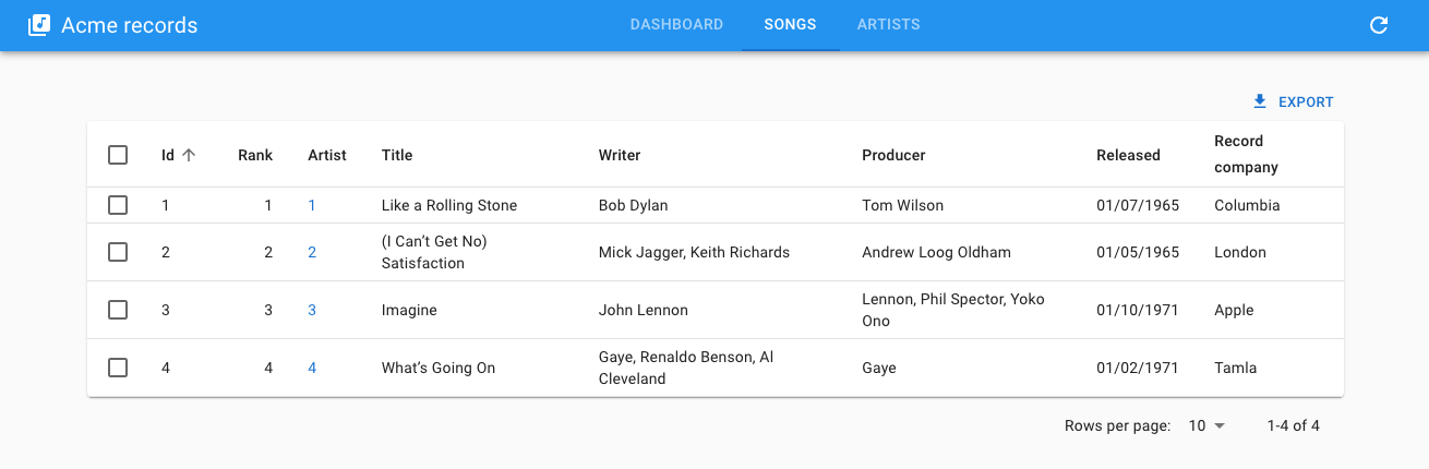
Usage
Set <ContainerLayout> as the <Admin layout> value:
import { Admin, Resource } from 'react-admin';
import { ContainerLayout } from '@react-admin/ra-navigation';

export const App = () => (
    <Admin dataProvider={dataProvider} layout={ContainerLayout}>
        <Resource name="songs" list={SongList} />
        <Resource name="artists" list={ArtistList} />
    </Admin>
);
<ContainerLayout> accepts the following props:
menu: The menu component to use. Defaults to<HorizontalMenu>.appBar: The component to use to render the top AppBar. Defaults to<Header>toolbar: The buttons to render on the top right of the toolbar.maxWidth: The maximum width of the content<Container>. Defaults tomd.fixed: Whether the content<Container>should be fixed. Defaults to false.
appBar
If you want to use a different color for the AppBar, or to make it sticky, pass a custom appBar element based on <Header>, which is a simple wrapper around MUI's <AppBar> component.
import { ContainerLayout, Header } from '@react-admin/ra-navigation';

const myAppBar = <Header color="primary" position="sticky" />;

const MyLayout = ({ children }) => (
    <ContainerLayout appBar={myAppBar}>
        {children}
    </ContainerLayout>
);
fixed
If you prefer to design for a fixed set of sizes instead of trying to accommodate a fully fluid viewport, you can set the fixed prop. The max-width matches the min-width of the current breakpoint.
import { ContainerLayout } from '@react-admin/ra-navigation';

const MyLayout = ({ children }) => (
    <ContainerLayout fixed>
        {children}
    </ContainerLayout>
);
maxWidth
This prop allows to set the maximum width of the content <Container>. It accepts a string, one of xs, sm, md, lg, xl, or false to remove side margins and occupy the full width of the screen.
import { ContainerLayout } from '@react-admin/ra-navigation';

const MyLayout = ({ children }) => (
    <ContainerLayout maxWidth="md">
        {children}
    </ContainerLayout>
);
menu
By default, <ContainerLayout> renders one menu item per resource in the admin. To reorder the menu, omit resources, or add custom pages, pass a custom menu element to the menu prop. This element should be a <HorizontalMenu> component with <HorizontalMenu.DashboardItem> or <HorizontalMenu.Item> children. Each child should have a value corresponding to the application location of the target, and can have a to prop corresponding to the target location if different from the app location.
import {
    Admin,
    Resource,
    CustomRoutes,
    ListGuesser,
    EditGuesser,
} from 'react-admin';
import { Route } from 'react-router-dom';
import {
    ContainerLayout,
    HorizontalMenu,
    useDefineAppLocation,
} from '@react-admin/ra-navigation';

const Menu = () => (
    <HorizontalMenu>
        <HorizontalMenu.DashboardItem label="Dashboard" />
        <HorizontalMenu.ResourceItem resource="songs" />
        <HorizontalMenu.ResourceItem resource="artists" />
        <HorizontalMenu.Item label="Custom" to="/custom" value="custom" />
        <HorizontalMenu.Item label="Business" value="business">
            <HorizontalMenu.Item resource="sales" />
            <HorizontalMenu.Item resource="customers" />
        </HorizontalMenu.Item>
    </HorizontalMenu>
);

const MyLayout = ({ children }) => (
    <ContainerLayout menu={<Menu />}>
        {children}
    </ContainerLayout>
);

const CustomPage = () => {
    useDefineAppLocation('custom');
    return <h1>Custom page</h1>;
};

const Dashboard = () => <h1>Dashboard</h1>;
const CustomPage = () => <h1>Custom page</h1>;

export const App = () => (
    <Admin dataProvider={dataProvider} layout={MyLayout} dashboard={Dashboard}>
        <Resource name="songs" list={ListGuesser} edit={EditGuesser} />
        <Resource name="artists" list={ListGuesser} edit={EditGuesser} />
        <CustomRoutes>
            <Route path="custom" element={<CustomPage />} />
        </CustomRoutes>
    </Admin>
);
sx
The sx prop allows to customize the style of the layout, and the underlying component. It accepts a MUI sx prop.
import { ContainerLayout } from '@react-admin/ra-navigation';

const MyLayout = ({ children }) => (
    <ContainerLayout
        sx={{
            '& .MuiToolbar-root': { padding: 0 },
        }}
    >
        {children}
    </ContainerLayout>
);
toolbar
The toolbar prop allows to add buttons to the top right of the toolbar. It accepts an element.
import { LocalesMenuButton, LoadingIndicator } from 'react-admin';
import { ContainerLayout } from '@react-admin/ra-navigation';

const toolbar = (
    <>
        <LocalesMenuButton />
        <LoadingIndicator />
    </>
);
const MyLayout = ({ children }) => (
    <ContainerLayout toolbar={toolbar}>
        {children}
    </ContainerLayout>
);
userMenu
By default, the <ContainerLayout> shows a user menu with a single item (logout) when the application has an authProvider. You can customize the user menu by passing a custom element to the userMenu prop.
import { Logout, UserMenu, useUserMenu } from 'react-admin';
import { MenuList, MenuItem, ListItemIcon, ListItemText } from '@mui/material';
import SettingsIcon from '@mui/icons-material/Settings';
import { ContainerLayout } from '@react-admin/ra-navigation';

const ConfigurationMenu = React.forwardRef((props, ref) => {
    const { onClose } = useUserMenu();
    return (
        <MenuItem
            ref={ref}
            {...props}
            to="/configuration"
            onClick={onClose}
            sx={{ color: 'text.secondary' }}
        >
            <ListItemIcon>
                <SettingsIcon />
            </ListItemIcon>
            <ListItemText>Configuration</ListItemText>
        </MenuItem>
    );
});

const CustomUserMenu = () => (
    <UserMenu>
        <MenuList>
            <ConfigurationMenu />
            <Logout />
        </MenuList>
    </UserMenu>
);

export const MyLayout = ({ children }) => (
    <ContainerLayout userMenu={<CustomUserMenu />}>
        {children}
    </ContainerLayout>
);
<HorizontalMenu>
A horizontal menu component, alternative to react-admin's <Menu>, to be used in the AppBar of the <ContainerLayout>.
Usage
Create a menu component based on <HorizontalMenu> and <HorizontalMenu.Item> (or <HorizontalMenu.DashboardItem>) children. Each child should have a value corresponding to the application location of the target, and can have a to prop corresponding to the target location if different from the app location.
import { HorizontalMenu } from '@react-admin/ra-navigation';

export const Menu = () => (
    <HorizontalMenu>
        <HorizontalMenu.DashboardItem />
        <HorizontalMenu.ResourceItem resource="songs" />
        <HorizontalMenu.ResourceItem resource="artists" />
    </HorizontalMenu>
);
Then pass it to the <ContainerLayout>:
import { Admin, Resource } from 'react-admin';
import { ContainerLayout } from '@react-admin/ra-navigation';

import { Menu } from './Menu';

const MyLayout = ({ children }) => (
    <ContainerLayout menu={<Menu />}>
        {children}
    </ContainerLayout>
);

const App = () => (
    <Admin dataProvider={dataProvider} layout={MyLayout}>
        ...
    </Admin>
);
Prop
| Prop | Required | Type | Default | Description |
|---|---|---|---|---|
hasDashboard |
Optional | Boolean | Display an <HorizontalMenu.DashboardItem> with your resources if no children specified |
It also accept the props of MUI Tabs.
hasDashboard
When you're using <HorizontalMenu> without any child, it detects your resources and adds dedicated <HorizontalMenu.ResourceItem> components for you. You can specify that you want a <HorizontalMenu.DashboardItem> with it thanks to the hasDashboard prop. This is usually not needed as the dashboard is automatically detected.
import { ContainerLayout, HorizontalMenu } from '@react-admin/ra-navigation';

const MyLayout = ({ children }) => (
    <ContainerLayout menu={<HorizontalMenu hasDashboard />}>
        {children}
    </ContainerLayout>
);
import { ContainerLayout, HorizontalMenu } from "@react-admin/ra-navigation";

const MyLayout = ({ children }) => <ContainerLayout menu={<HorizontalMenu hasDashboard />}>{children}</ContainerLayout>;
<HorizontalMenu.Item>
An item for the <HorizontalMenu> component. Used to define access to a custom route.
<HorizontalMenu>
    <HorizontalMenu.DashboardItem label="Home" />
    <HorizontalMenu.ResourceItem name="artists" />
    <HorizontalMenu.Item label="Custom" to="/custom" value="custom" />
</HorizontalMenu>
<HorizontalMenu>
    <HorizontalMenu.DashboardItem label="Home" />
    <HorizontalMenu.ResourceItem name="artists" />
    <HorizontalMenu.Item label="Custom" to="/custom" value="custom" />
</HorizontalMenu>;
Props
| Prop | Required | Type | Default | Description |
|---|---|---|---|---|
value |
Required | string | The value of the Tab and the default route to use if no to is provided |
|
label |
Optional | string | The text to display | |
to |
Optional | string | The route to which the item redirects | |
TabProps |
Optional | TabProps | Additional props of the Tab | |
MenuProps |
Optional | MenuProps | Additional props of the Menu (HorizontalMenu.Item with children) |
|
MenuItemProps |
Optional | MenuItemProps | Additional props of the MenuItem (children of a HorizontalMenu.Item) |
value
The value passed to the MUI Tab:
<HorizontalMenu>
    <HorizontalMenu.Item value="artists" />
    <HorizontalMenu.Item value="songs" />
</HorizontalMenu>
<HorizontalMenu>
    <HorizontalMenu.Item value="artists" />
    <HorizontalMenu.Item value="songs" />
</HorizontalMenu>;
label
You can customize the label by setting the label prop. It is inferred from the value prop by default.
<HorizontalMenu.Item> uses the i18n layer, so you can translate the label. Check the Translation chapter for more information.
<HorizontalMenu>
    <HorizontalMenu.Item label="Artists" value="artists" />
    <HorizontalMenu.Item label="ra.custom.path.resource.song" value="songs" />
</HorizontalMenu>
<HorizontalMenu>
    <HorizontalMenu.Item label="Artists" value="artists" />
    <HorizontalMenu.Item label="ra.custom.path.resource.song" value="songs" />
</HorizontalMenu>;
to
You can customize the link of your resource by setting the to prop. It is inferred from the value prop by default as /${value}.
<HorizontalMenu>
    <HorizontalMenu.Item to="/artists" value="artists" />
    <HorizontalMenu.Item to="/musics" value="songs" />
</HorizontalMenu>
<HorizontalMenu>
    <HorizontalMenu.Item to="/artists" value="artists" />
    <HorizontalMenu.Item to="/musics" value="songs" />
</HorizontalMenu>;
TabProps
Additional props passed to the Tab.
import { HorizontalMenu } from '@react-admin/ra-navigation';
import MusicNoteIcon from '@mui/icons-material/MusicNote';

const Menu = () => (
    <HorizontalMenu>
        <HorizontalMenu.Item
            value="songs"
            TabProps={{ icon: <MusicNoteIcon />, iconPosition: 'start' }}
        />
    </HorizontalMenu>
);
import { HorizontalMenu } from "@react-admin/ra-navigation";
import MusicNoteIcon from "@mui/icons-material/MusicNote";

const Menu = () => (
    <HorizontalMenu>
        <HorizontalMenu.Item value="songs" TabProps={{ icon: <MusicNoteIcon />, iconPosition: "start" }} />
    </HorizontalMenu>
);
MenuProps
Additional props passed to the Menu (item displayed if it has children).
<HorizontalMenu>
    <HorizontalMenu.Item
        value="songs"
        MenuProps={{ open: true, autoFocus: true }}
    >
        <HorizontalMenu.Item value="albums" />
        <HorizontalMenu.Item value="singles" />
    </HorizontalMenu.Item>
</HorizontalMenu>
<HorizontalMenu>
    <HorizontalMenu.Item value="songs" MenuProps={{ open: true, autoFocus: true }}>
        <HorizontalMenu.Item value="albums" />
        <HorizontalMenu.Item value="singles" />
    </HorizontalMenu.Item>
</HorizontalMenu>;
MenuItemProps
Additional props passed to the MenuItem (item displayed in a sub-menu).
<HorizontalMenu>
    <HorizontalMenu.Item value="songs">
        <HorizontalMenu.Item
            value="albums"
            MenuItemProps={{
                divider: true,
                selected: isSelected(),
            }}
        />
        <HorizontalMenu.Item value="singles" />
    </HorizontalMenu.Item>
</HorizontalMenu>
<HorizontalMenu>
    <HorizontalMenu.Item value="songs">
        <HorizontalMenu.Item
            value="albums"
            MenuItemProps={{
                divider: true,
                selected: isSelected(),
            }}
        />
        <HorizontalMenu.Item value="singles" />
    </HorizontalMenu.Item>
</HorizontalMenu>;
<HorizontalMenu.DashboardItem>
This component adds a menu item that redirects to the / route. It accepts the same props as <HorizontalMenu.Item>.
<HorizontalMenu.DashboardItem />
<HorizontalMenu.DashboardItem />;
Tip: Note that the value prop from <HorizontalMenu.Item> is optional for <HorizontalMenu.DashboardItem>.
<HorizontalMenu.ResourceItem>
This component adds a menu item that redirects to the resource list route. It automatically applies access control if your authProvider implements canAccess by calling it with the following parameters:
{
    resource: "posts",
    action: "list",
}
Usage
<HorizontalMenu.ResourceItem resource="posts" />
<HorizontalMenu.ResourceItem resource="posts" />;
Props
In addition to the props of <HorizontalMenu.Item>, it accepts the following props
| Prop | Required | Type | Default | Description |
|---|---|---|---|---|
resource |
Required | string |
The resource this item refers to. |
Tip: Note that the value prop from <HorizontalMenu.Item> is optional for <HorizontalMenu.ResourceItem>.
resource
The resource this item refers to
import { HorizontalMenu } from '@react-admin/ra-navigation';

const MyMenu = () => (
    <HorizontalMenu>
        <HorizontalMenu.ResourceItem resource="artists" />
    </HorizontalMenu>
);
import { HorizontalMenu } from "@react-admin/ra-navigation";

const MyMenu = () => (
    <HorizontalMenu>
        <HorizontalMenu.ResourceItem resource="artists" />
    </HorizontalMenu>
);
Adding Sub-Menus
<HorizontalMenu.Item> creates a menu item for a given path. But you can also add <HorizontalMenu.Item> components as a child to create a submenu.
<HorizontalMenu>
    <HorizontalMenu.DashboardItem label="Home" />
    <HorizontalMenu.ResourceItem resource="artists" />
    <HorizontalMenu.Item label="Business" value="business">
        <HorizontalMenu.ResourceItem resource="producers" />
        <HorizontalMenu.ResourceItem resource="label" />
    </HorizontalMenu.Item>
    <HorizontalMenu.ResourceItem resource="songs" />
</HorizontalMenu>
<SolarLayout>
An alternative application layout without top bar, and using a narrow menu to maximize the usable screen real estate. The menu items can reveal a secondary panel to show sub menus, preference forms, a search engine, etc. Ideal for applications with a large number of resources.
On mobile, it shows the AppBar to allow opening the navigation menu:
It includes and leverages the AppLocationContext
Usage
import { Admin, Resource, ListGuesser } from 'react-admin';
import { SolarLayout } from '@react-admin/ra-navigation';

export const App = () => (
    <Admin dataProvider={dataProvider} layout={SolarLayout}>
        <Resource name="songs" list={ListGuesser} />
        <Resource name="artists" list={ListGuesser} />
    </Admin>
);
import { Admin, Resource, ListGuesser } from "react-admin";
import { SolarLayout } from "@react-admin/ra-navigation";

export const App = () => (
    <Admin dataProvider={dataProvider} layout={SolarLayout}>
        <Resource name="songs" list={ListGuesser} />
        <Resource name="artists" list={ListGuesser} />
    </Admin>
);
By default, <SolarLayout> creates a menu based on the <Resource> components passed to <Admin>. You can customize the menu by passing a custom menu component to the menu prop.
Props
| Prop | Required | Type | Default | Description |
|---|---|---|---|---|
appBar |
Optional | Component | SolarAppBar | Allows to customize the AppBar |
className |
Optional | string | A class name to apply to the AppBar container. | |
error |
Optional | Component | A React component rendered in the content area in case of error | |
logo |
Optional | Component | A React component used as the dashboard icon | |
menu |
Optional | Component | SolarMenu | A React component used as the sidebar menu. Pass a custom SolarMenu to leverage this layout design |
sx |
Optional | SxProps |
Style overrides, powered by MUI System |
appBar
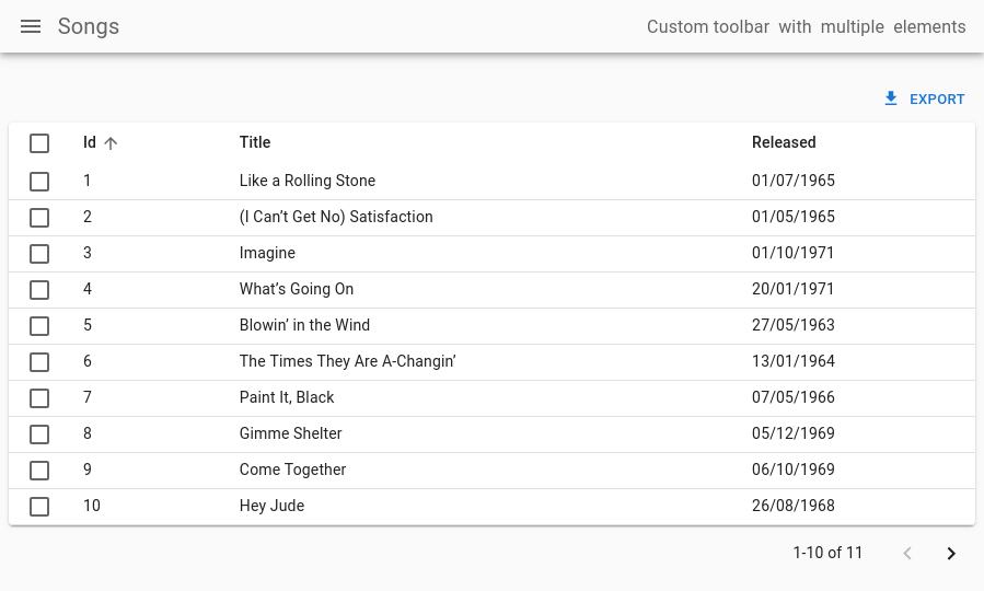
You can customize the AppBar that appears on Mobile by setting the appBar prop. For instance, here's how you could customize its colors and add some extra content to its far right:
import { Admin, Resource, ListGuesser } from 'react-admin';
import {
    SolarAppBar,
    SolarLayoutProps,
    SolarLayout,
} from '@react-admin/ra-navigation';

const CustomAppBar = () => (
    <SolarAppBar
        sx={{ color: 'text.secondary', bgcolor: 'background.default' }}
        toolbar={
            <Box
                display="flex"
                justifyContent="space-between"
                alignItems="center"
            >
                <Box mr={1}>Custom toolbar</Box>
                <Box mr={1}>with</Box>
                <Box mr={1}>multiple</Box>
                <Box mr={1}>elements</Box>
            </Box>
        }
    />
);

const CustomLayout = (props: SolarLayoutProps) => (
    <SolarLayout {...props} appBar={CustomAppBar} />
);

export const App = () => (
    <Admin layout={CustomLayout}>
        <Resource name="songs" list={ListGuesser} />
        <Resource name="artists" list={ListGuesser} />
    </Admin>
);
import { Admin, Resource, ListGuesser } from "react-admin";
import { SolarAppBar, SolarLayout } from "@react-admin/ra-navigation";

const CustomAppBar = () => (
    <SolarAppBar
        sx={{ color: "text.secondary", bgcolor: "background.default" }}
        toolbar={
            <Box display="flex" justifyContent="space-between" alignItems="center">
                <Box mr={1}>Custom toolbar</Box>
                <Box mr={1}>with</Box>
                <Box mr={1}>multiple</Box>
                <Box mr={1}>elements</Box>
            </Box>
        }
    />
);

const CustomLayout = (props) => <SolarLayout {...props} appBar={CustomAppBar} />;

export const App = () => (
    <Admin layout={CustomLayout}>
        <Resource name="songs" list={ListGuesser} />
        <Resource name="artists" list={ListGuesser} />
    </Admin>
);
className
className is passed to the root <div> component. It lets you style the layout with CSS - but the sx prop is preferred.
error
Whenever a client-side error happens in react-admin, the user sees an error page. React-admin uses React's Error Boundaries to render this page when any component in the page throws an unrecoverable error.
If you want to customize this page, or log the error to a third-party service, create your own <Error> component, and pass it to a custom Layout, as follows:
// in src/MyLayout.tsx
import { Layout } from 'react-admin';
import { MyError } from './MyError';

export const MyLayout = props => <Layout {...props} error={MyError} />;
// in src/MyLayout.tsx
import { Layout } from "react-admin";
import { MyError } from "./MyError";

export const MyLayout = (props) => <Layout {...props} error={MyError} />;
The following snippet is a simplified version of the react-admin Error component, that you can use as a base for your own:
// in src/MyError.tsx
import * as React from 'react';
import Button from '@mui/material/Button';
import ErrorIcon from '@mui/icons-material/Report';
import History from '@mui/icons-material/History';
import { Title, useTranslate } from 'react-admin';
import { useLocation } from 'react-router-dom';

export const MyError = ({
    error,
    resetErrorBoundary,
}: {
    error: any;
    errorInfo: any;
    resetErrorBoundary: (...args: any[]) => void;
}) => {
    const { pathname } = useLocation();
    const originalPathname = useRef(pathname);

    // Effect that resets the error state whenever the location changes
    useEffect(() => {
        if (pathname !== originalPathname.current) {
            resetErrorBoundary();
        }
    }, [pathname, resetErrorBoundary]);

    const translate = useTranslate();
    return (
        <div>
            <Title title="Error" />
            <h1>
                <ErrorIcon /> Something Went Wrong{' '}
            </h1>
            <div>
                A client error occurred and your request couldn't be completed.
            </div>
            {process.env.NODE_ENV !== 'production' && (
                <details>
                    <h2>{translate(error.toString())}</h2>
                    {errorInfo.componentStack}
                </details>
            )}
            <div>
                <Button
                    variant="contained"
                    startIcon={<History />}
                    onClick={() => history.go(-1)}
                >
                    Back
                </Button>
            </div>
        </div>
    );
};
// in src/MyError.tsx
import * as React from "react";
import Button from "@mui/material/Button";
import ErrorIcon from "@mui/icons-material/Report";
import History from "@mui/icons-material/History";
import { Title, useTranslate } from "react-admin";
import { useLocation } from "react-router-dom";

export const MyError = ({ error, resetErrorBoundary }) => {
    const { pathname } = useLocation();
    const originalPathname = useRef(pathname);

    // Effect that resets the error state whenever the location changes
    useEffect(() => {
        if (pathname !== originalPathname.current) {
            resetErrorBoundary();
        }
    }, [pathname, resetErrorBoundary]);

    const translate = useTranslate();
    return (
        <div>
            <Title title="Error" />
            <h1>
                <ErrorIcon /> Something Went Wrong{" "}
            </h1>
            <div>A client error occurred and your request couldn't be completed.</div>
            {process.env.NODE_ENV !== "production" && (
                <details>
                    <h2>{translate(error.toString())}</h2>
                    {errorInfo.componentStack}
                </details>
            )}
            <div>
                <Button variant="contained" startIcon={<History />} onClick={() => history.go(-1)}>
                    Back
                </Button>
            </div>
        </div>
    );
};
Tip: React's Error Boundaries are used internally to display the Error Page whenever an error occurs. Error Boundaries only catch errors during rendering, in lifecycle methods, and in constructors of the components tree. This implies in particular that errors during event callbacks (such as 'onClick') are not concerned. Also note that the Error Boundary component is only set around the main container of React Admin. In particular, you won't see it for errors thrown by the sidebar Menu, nor the AppBar. This ensures the user is always able to navigate away from the Error Page.
logo
You can customize the icon of the dashboard menu item of the default menu by setting the logo prop:
import { Admin, Resource, ListGuesser } from 'react-admin';
import { SolarLayoutProps, SolarLayout } from '@react-admin/ra-navigation';
import { Dashboard } from './Dashboard';
import { Logo } from './Logo';

const CustomLayout = (props: SolarLayoutProps) => (
    <SolarLayout {...props} logo={<Logo />} />
);

export const WithDashboardAndCustomLogo = () => (
    <Admin dashboard={Dashboard} layout={CustomLayout}>
        <Resource name="songs" list={SongList} />
        <Resource name="artists" list={ArtistList} />
    </Admin>
);
import { Admin, Resource } from "react-admin";
import { SolarLayout } from "@react-admin/ra-navigation";
import { Dashboard } from "./Dashboard";
import { Logo } from "./Logo";

const CustomLayout = (props) => <SolarLayout {...props} logo={<Logo />} />;

export const WithDashboardAndCustomLogo = () => (
    <Admin dashboard={Dashboard} layout={CustomLayout}>
        <Resource name="songs" list={SongList} />
        <Resource name="artists" list={ArtistList} />
    </Admin>
);
menu
If you need a customized menu, pass it to the menu prop. It's recommended to pass a customized <SolarMenu> to leverage this layout. This is useful to organize many resources into categories or to provide shortcuts to filtered lists:
import { Admin, Resource, ListGuesser } from 'react-admin';
import {
    SolarLayoutProps,
    SolarLayout,
    SolarMenu,
} from '@react-admin/ra-navigation';

export const App = () => (
    <Admin
        dashboard={Dashboard}
        dataProvider={dataProvider}
        layout={CustomLayout}
    >
        <Resource name="songs" icon={MusicNote} list={ListGuesser} />
        <Resource name="artists" icon={People} list={ListGuesser} />
    </Admin>
);

const CustomLayout = ({ children, ...props }: SolarLayoutProps) => (
    <SolarLayout {...props} menu={CustomMenu}>
        {children}
    </SolarLayout>
);

const CustomMenu = () => (
    <SolarMenu>
        <SolarMenu.Item
            label="Sales"
            subMenu={
                <SolarMenu.List>
                    <SolarMenu.ResourceItem name="orders" />
                    <SolarMenu.ResourceItem name="invoices" />
                </SolarMenu.List>
            }
        />
        <SolarMenu.Item
            label="Catalog"
            subMenu={
                <SolarMenu.List>
                    <SolarMenu.ResourceItem name="products" />
                    <SolarMenu.ResourceItem name="categories" />
                </SolarMenu.List>
            }
        />
        <SolarMenu.Item
            label="Customers"
            subMenu={
                <SolarMenu.List>
                    <SolarMenu.Item
                        name="customers.all"
                        label="All customers"
                        to={`/customers?filter=${encodeURIComponent(
                            JSON.stringify({ filter: {} })
                        )}`}
                    />
                    <SolarMenu.Item
                        name="customers.new"
                        label="New customers"
                        to={`/customers?filter=${encodeURIComponent(
                            JSON.stringify({
                                filter: {
                                    last_seen_gte:
                                        endOfYesterday().toISOString(),
                                },
                            })
                        )}`}
                    />
                </SolarMenu.List>
            }
        />
        <SolarMenu.Item
            label="Reviews"
            subMenu={
                <SolarMenu.List>
                    <SolarMenu.Item
                        name="reviews.all"
                        label="New reviews"
                        to={`/reviews?filter=${encodeURIComponent(
                            JSON.stringify({ filter: {} })
                        )}`}
                    />
                    <SolarMenu.Item
                        name="reviews.pending"
                        label="Pending reviews"
                        to={`/reviews?filter=${encodeURIComponent(
                            JSON.stringify({ filter: { status: 'pending' } })
                        )}`}
                    />
                    <SolarMenu.Item
                        name="reviews.bad"
                        label="Bad reviews"
                        to={`/reviews?filter=${encodeURIComponent(
                            JSON.stringify({ filter: { rating_lte: 2 } })
                        )}`}
                    />
                </SolarMenu.List>
            }
        />
        <SolarMenu.ResourceItem name="stores" />
        <SolarMenu.ResourceItem name="events" />
    </SolarMenu>
);
import { Admin, Resource, ListGuesser } from "react-admin";
import { SolarLayout, SolarMenu } from "@react-admin/ra-navigation";

export const App = () => (
    <Admin dashboard={Dashboard} dataProvider={dataProvider} layout={CustomLayout}>
        <Resource name="songs" icon={MusicNote} list={ListGuesser} />
        <Resource name="artists" icon={People} list={ListGuesser} />
    </Admin>
);

const CustomLayout = ({ children, ...props }) => (
    <SolarLayout {...props} menu={CustomMenu}>
        {children}
    </SolarLayout>
);

const CustomMenu = () => (
    <SolarMenu>
        <SolarMenu.Item
            label="Sales"
            subMenu={
                <SolarMenu.List>
                    <SolarMenu.ResourceItem name="orders" />
                    <SolarMenu.ResourceItem name="invoices" />
                </SolarMenu.List>
            }
        />
        <SolarMenu.Item
            label="Catalog"
            subMenu={
                <SolarMenu.List>
                    <SolarMenu.ResourceItem name="products" />
                    <SolarMenu.ResourceItem name="categories" />
                </SolarMenu.List>
            }
        />
        <SolarMenu.Item
            label="Customers"
            subMenu={
                <SolarMenu.List>
                    <SolarMenu.Item
                        name="customers.all"
                        label="All customers"
                        to={`/customers?filter=${encodeURIComponent(JSON.stringify({ filter: {} }))}`}
                    />
                    <SolarMenu.Item
                        name="customers.new"
                        label="New customers"
                        to={`/customers?filter=${encodeURIComponent(
                            JSON.stringify({
                                filter: {
                                    last_seen_gte: endOfYesterday().toISOString(),
                                },
                            })
                        )}`}
                    />
                </SolarMenu.List>
            }
        />
        <SolarMenu.Item
            label="Reviews"
            subMenu={
                <SolarMenu.List>
                    <SolarMenu.Item
                        name="reviews.all"
                        label="New reviews"
                        to={`/reviews?filter=${encodeURIComponent(JSON.stringify({ filter: {} }))}`}
                    />
                    <SolarMenu.Item
                        name="reviews.pending"
                        label="Pending reviews"
                        to={`/reviews?filter=${encodeURIComponent(JSON.stringify({ filter: { status: "pending" } }))}`}
                    />
                    <SolarMenu.Item
                        name="reviews.bad"
                        label="Bad reviews"
                        to={`/reviews?filter=${encodeURIComponent(JSON.stringify({ filter: { rating_lte: 2 } }))}`}
                    />
                </SolarMenu.List>
            }
        />
        <SolarMenu.ResourceItem name="stores" />
        <SolarMenu.ResourceItem name="events" />
    </SolarMenu>
);
sx
The sx prop allows you to customize the layout styles using a MUI SX object:
import { Admin, Resource, ListGuesser } from 'react-admin';
import { SolarLayoutProps, SolarLayout } from '@react-admin/ra-navigation';

const CustomLayout = (props: SolarLayoutProps) => (
    <SolarLayout {...props} sx={{ bgcolor: 'white' }} />
);

export const App = () => (
    <Admin layout={CustomLayout}>
        <Resource name="songs" list={ListGuesser} />
        <Resource name="artists" list={ListGuesser} />
    </Admin>
);
import { Admin, Resource, ListGuesser } from "react-admin";
import { SolarLayout } from "@react-admin/ra-navigation";

const CustomLayout = (props) => <SolarLayout {...props} sx={{ bgcolor: "white" }} />;

export const App = () => (
    <Admin layout={CustomLayout}>
        <Resource name="songs" list={ListGuesser} />
        <Resource name="artists" list={ListGuesser} />
    </Admin>
);
The <SolarLayout> component accepts the usual className prop. You can also override the styles of the inner components thanks to the sx property. This property accepts the following subclasses:
| Rule name | Description |
|---|---|
RaSolarLayout |
Applied to the root component |
& .RaSolarLayout-appFrame |
Applied to the application frame containing the appBar, the sidebar, and the main content |
& .RaSolarLayout-contentWithSidebar |
Applied to the main part containing the sidebar and the content |
& .RaSolarLayout-content |
Applied to the content area |
<SolarMenu>
The default menu for the <SolarLayout>. It displays a thin sidebar with menu items and a second sliding sidebar for its items that have children. On small devices, it is hidden and can be displayed by clicking on the <SolarAppBar> toggle button.
By default, just like the classic react-admin menu, it contains menu items for each resource and the dashboard if present, without any secondary sliding menu.
Props
| Prop | Required | Type | Default | Description |
|---|---|---|---|---|
bottomToolbar |
Optional | ReactNode | The content to render inside the bottom section of the menu. | |
children |
Optional | ReactNode | The content to render inside the top section of the menu. | |
className |
Optional | string | A class name to apply to the AppBar container. | |
dense |
Optional | boolean | false | Whether the menu should be dense. |
logo |
Optional | Component | A React component used as the dashboard icon | |
userMenu |
Optional | Component | Allows to customize the user menu | |
sx |
Optional | SxProps |
Style overrides, powered by MUI System |
It also accept the props of its root HTMLDivElement.
In addition, the SolarMenu object provides shortcuts to its items components:
SolarMenu.Item, the base itemSolarMenu.ResourceItem, an item generated from a resource definitionSolarMenu.DashboardItem, an item for the dashboardSolarMenu.UserItem, an item for the user menuSolarMenu.LoadingIndicatorIteman item for the loading indicator and refresh buttonSolarMenu.Lista list of menu itemsSolarMenu.LocalesIteman item that displays the list of supported localesSolarMenu.ToggleThemeIteman item that displays the theme switcherSolarMenu.UserProfileIteman item that displays the user full name and/or the logout button
children
The children prop is the primary way to leverage the <SolarMenu> component. It allows you to pass the menu items that are displayed in the top section of the sidebar while keeping the bottom section defaults.
For instance, here's how to group resources into categories or provide shortcuts to pre-filtered lists:
import { Admin, Resource, ListGuesser } from 'react-admin';
import {
    SolarLayoutProps,
    SolarLayout,
    SolarMenu,
} from '@react-admin/ra-navigation';
import { dataProvider } from './dataProvider';

const CustomMenu = () => (
    <SolarMenu>
        <SolarMenu.Item
            label="Sales"
            subMenu={
                <SolarMenu.List>
                    <SolarMenu.ResourceItem name="orders" />
                    <SolarMenu.ResourceItem name="invoices" />
                </SolarMenu.List>
            }
        />
        <SolarMenu.Item
            label="Catalog"
            subMenu={
                <SolarMenu.List>
                    <SolarMenu.ResourceItem name="products" />
                    <SolarMenu.ResourceItem name="categories" />
                </SolarMenu.List>
            }
        />
        <SolarMenu.Item
            label="Customers"
            subMenu={
                <SolarMenu.List>
                    <SolarMenu.Item
                        name="customers.all"
                        label="All customers"
                        to={`/customers?filter=${encodeURIComponent(
                            JSON.stringify({ filter: {} })
                        )}`}
                    />
                    <SolarMenu.Item
                        name="customers.new"
                        label="New customers"
                        to={`/customers?filter=${encodeURIComponent(
                            JSON.stringify({
                                filter: {
                                    last_seen_gte:
                                        endOfYesterday().toISOString(),
                                },
                            })
                        )}`}
                    />
                </SolarMenu.List>
            }
        />
        <SolarMenu.Item
            label="Reviews"
            subMenu={
                <SolarMenu.List>
                    <SolarMenu.Item
                        name="reviews.all"
                        label="New reviews"
                        to={`/reviews?filter=${encodeURIComponent(
                            JSON.stringify({ filter: {} })
                        )}`}
                    />
                    <SolarMenu.Item
                        name="reviews.pending"
                        label="Pending reviews"
                        to={`/reviews?filter=${encodeURIComponent(
                            JSON.stringify({ filter: { status: 'pending' } })
                        )}`}
                    />
                    <SolarMenu.Item
                        name="reviews.bad"
                        label="Bad reviews"
                        to={`/reviews?filter=${encodeURIComponent(
                            JSON.stringify({ filter: { rating_lte: 2 } })
                        )}`}
                    />
                </SolarMenu.List>
            }
        />
        <SolarMenu.ResourceItem name="stores" />
        <SolarMenu.ResourceItem name="events" />
    </SolarMenu>
);
import { SolarMenu } from "@react-admin/ra-navigation";

const CustomMenu = () => (
    <SolarMenu>
        <SolarMenu.Item
            label="Sales"
            subMenu={
                <SolarMenu.List>
                    <SolarMenu.ResourceItem name="orders" />
                    <SolarMenu.ResourceItem name="invoices" />
                </SolarMenu.List>
            }
        />
        <SolarMenu.Item
            label="Catalog"
            subMenu={
                <SolarMenu.List>
                    <SolarMenu.ResourceItem name="products" />
                    <SolarMenu.ResourceItem name="categories" />
                </SolarMenu.List>
            }
        />
        <SolarMenu.Item
            label="Customers"
            subMenu={
                <SolarMenu.List>
                    <SolarMenu.Item
                        name="customers.all"
                        label="All customers"
                        to={`/customers?filter=${encodeURIComponent(JSON.stringify({ filter: {} }))}`}
                    />
                    <SolarMenu.Item
                        name="customers.new"
                        label="New customers"
                        to={`/customers?filter=${encodeURIComponent(
                            JSON.stringify({
                                filter: {
                                    last_seen_gte: endOfYesterday().toISOString(),
                                },
                            })
                        )}`}
                    />
                </SolarMenu.List>
            }
        />
        <SolarMenu.Item
            label="Reviews"
            subMenu={
                <SolarMenu.List>
                    <SolarMenu.Item
                        name="reviews.all"
                        label="New reviews"
                        to={`/reviews?filter=${encodeURIComponent(JSON.stringify({ filter: {} }))}`}
                    />
                    <SolarMenu.Item
                        name="reviews.pending"
                        label="Pending reviews"
                        to={`/reviews?filter=${encodeURIComponent(JSON.stringify({ filter: { status: "pending" } }))}`}
                    />
                    <SolarMenu.Item
                        name="reviews.bad"
                        label="Bad reviews"
                        to={`/reviews?filter=${encodeURIComponent(JSON.stringify({ filter: { rating_lte: 2 } }))}`}
                    />
                </SolarMenu.List>
            }
        />
        <SolarMenu.ResourceItem name="stores" />
        <SolarMenu.ResourceItem name="events" />
    </SolarMenu>
);
className
className is passed to the root <div> component. It lets you style the layout with CSS - but the sx prop is preferred.
dense
Set the dense prop to true to reduce the vertical space between items:
import { Admin, Resource, ListGuesser } from 'react-admin';
import {
    SolarLayoutProps,
    SolarLayout,
    SolarMenu,
} from '@react-admin/ra-navigation';
import { ListItemButton } from '@mui/material';
import { dataProvider } from './dataProvider';

const CustomMenu = () => <SolarMenu dense />;

const CustomLayout = (props: SolarLayoutProps) => (
    <SolarLayout {...props} menu={CustomMenu} />
);

export const App = () => (
    <Admin dataProvider={dataProvider} layout={CustomLayout}>
        <Resource name="songs" list={ListGuesser} />
        <Resource name="artists" list={ListGuesser} />
    </Admin>
);
import { Admin, Resource, ListGuesser } from "react-admin";
import { SolarLayout, SolarMenu } from "@react-admin/ra-navigation";
import { dataProvider } from "./dataProvider";

const CustomMenu = () => <SolarMenu dense />;

const CustomLayout = (props) => <SolarLayout {...props} menu={CustomMenu} />;

export const App = () => (
    <Admin dataProvider={dataProvider} layout={CustomLayout}>
        <Resource name="songs" list={ListGuesser} />
        <Resource name="artists" list={ListGuesser} />
    </Admin>
);
userMenu
The userMenu prop allows you to customize the very last menu item of the sidebar.
By default, if you have an authProvider, this menu item will have the user avatar as its icon when available from the authProvider.getIdentity function. If not available, it will display a user icon.
If you don't have an authProvider but have configured a dark theme or your i18nProvider supports multiple locales, this menu item will have a settings icon.
Besides, this default menu has a secondary sliding panel.
If you have an authProvider, this secondary sliding panel will show the user full name when available from the authProvider.getIdentity function and a logout button. If the user full name is not available, it will display a the logout button only.
If you have configured a dark theme, the secondary sliding panel will show a button to toggle it.
If your i18nProvider supports multiple locales, it will display a list of the supported locales so that users can switch to them.
You can customize it by passing your own content to the userMenu prop.
For instance, here's how to only show a logout button:
import { Admin, Resource, ListGuesser } from 'react-admin';
import {
    SolarLayoutProps,
    SolarLayout,
    SolarMenu,
} from '@react-admin/ra-navigation';
import { ListItemButton } from '@mui/material';
import { dataProvider } from './dataProvider';

const CustomUserMenu = () => {
    const logout = useLogout();

    return (
        <ListItemButton onClick={() => logout()} aria-label="Logout">
            <ExitIcon />
        </ListItemButton>
    );
};

const CustomMenu = () => <SolarMenu userMenu={<CustomUserMenu />} />;

const CustomLayout = ({ children, ...props }: SolarLayoutProps) => (
    <SolarLayout {...props} menu={CustomMenu}>
        {children}
    </SolarLayout>
);

export const App = () => (
    <Admin
        dashboard={Dashboard}
        dataProvider={dataProvider}
        layout={CustomLayout}
    >
        <Resource name="songs" list={ListGuesser} />
        <Resource name="artists" list={ListGuesser} />
    </Admin>
);
import { Admin, Resource, ListGuesser } from "react-admin";
import { SolarLayout, SolarMenu } from "@react-admin/ra-navigation";
import { ListItemButton } from "@mui/material";
import { dataProvider } from "./dataProvider";

const CustomUserMenu = () => {
    const logout = useLogout();

    return (
        <ListItemButton onClick={() => logout()} aria-label="Logout">
            <ExitIcon />
        </ListItemButton>
    );
};

const CustomMenu = () => <SolarMenu userMenu={<CustomUserMenu />} />;

const CustomLayout = ({ children, ...props }) => (
    <SolarLayout {...props} menu={CustomMenu}>
        {children}
    </SolarLayout>
);

export const App = () => (
    <Admin dashboard={Dashboard} dataProvider={dataProvider} layout={CustomLayout}>
        <Resource name="songs" list={ListGuesser} />
        <Resource name="artists" list={ListGuesser} />
    </Admin>
);
bottomToolbar
The bottom section of the <SolarMenu> contains the refresh button and the user menu by default.
You can customize it by passing your own content to the bottomToolbar prop.
For instance, here's how to show a settings menu item in addition to the existing bottom menu items:
import { Admin, Resource, ListGuesser } from 'react-admin';
import {
    SolarLayoutProps,
    SolarLayout,
    SolarMenu,
} from '@react-admin/ra-navigation';
import { ListItemButton } from '@mui/material';
import { dataProvider } from './dataProvider';

const CustomBottomToolbar = () => (
    <SolarMenu.List>
        <SolarMenu.Item
            name="settings"
            label="Settings"
            to="/settings"
            icon={<Settings />}
        />
        <SolarMenu.LoadingIndicatorItem />
        <SolarMenu.UserItem />
    </SolarMenu.List>
);

const CustomMenu = () => <SolarMenu bottomToolbar={<CustomBottomToolbar />} />;

const CustomLayout = (props: SolarLayoutProps) => (
    <SolarLayout {...props} menu={CustomMenu} />
);

export const App = () => (
    <Admin dataProvider={dataProvider} layout={CustomLayout}>
        <Resource name="songs" list={ListGuesser} />
        <Resource name="artists" list={ListGuesser} />
    </Admin>
);
import { Admin, Resource, ListGuesser } from "react-admin";
import { SolarLayout, SolarMenu } from "@react-admin/ra-navigation";
import { dataProvider } from "./dataProvider";

const CustomBottomToolbar = () => (
    <SolarMenu.List>
        <SolarMenu.Item name="settings" label="Settings" to="/settings" icon={<Settings />} />
        <SolarMenu.LoadingIndicatorItem />
        <SolarMenu.UserItem />
    </SolarMenu.List>
);

const CustomMenu = () => <SolarMenu bottomToolbar={<CustomBottomToolbar />} />;

const CustomLayout = (props) => <SolarLayout {...props} menu={CustomMenu} />;

export const App = () => (
    <Admin dataProvider={dataProvider} layout={CustomLayout}>
        <Resource name="songs" list={ListGuesser} />
        <Resource name="artists" list={ListGuesser} />
    </Admin>
);
sx
The sx prop allows you to customize the menu styles using a MUI SX object.
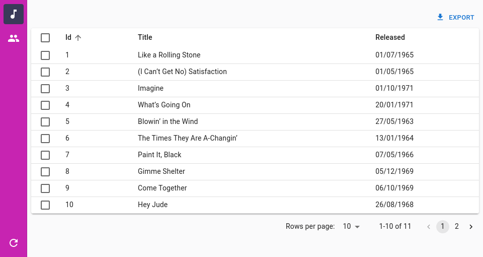
For instance, here is how to change the background color of the menu:
import { Admin, Resource, ListGuesser } from 'react-admin';
import {
    SolarLayoutProps,
    SolarLayout,
    SolarMenu,
    SolarMenuProps,
} from '@react-admin/ra-navigation';

const CustomMenu = (props: SolarMenuProps) => (
    <SolarMenu
        sx={{
            '& .RaSolarPrimarySidebar-root .MuiDrawer-paper': {
                backgroundColor: '#C724B1',

                '& .MuiButtonBase-root': {
                    color: '#ffffff',
                },
                '& .MuiButtonBase-root.Mui-selected': {
                    backgroundColor: '#3A3A59',
                    color: '#ffffff',
                },
            },
        }}
        {...props}
    />
);

const CustomLayout = (props: SolarLayoutProps) => (
    <SolarLayout {...props} menu={CustomMenu} />
);

export const App = () => (
    <Admin layout={CustomLayout}>
        <Resource name="songs" list={ListGuesser} />
        <Resource name="artists" list={ListGuesser} />
    </Admin>
);
import { Admin, Resource, ListGuesser } from "react-admin";
import { SolarLayout, SolarMenu } from "@react-admin/ra-navigation";

const CustomMenu = (props) => (
    <SolarMenu
        sx={{
            "& .RaSolarPrimarySidebar-root .MuiDrawer-paper": {
                backgroundColor: "#C724B1",

                "& .MuiButtonBase-root": {
                    color: "#ffffff",
                },
                "& .MuiButtonBase-root.Mui-selected": {
                    backgroundColor: "#3A3A59",
                    color: "#ffffff",
                },
            },
        }}
        {...props}
    />
);

const CustomLayout = (props) => <SolarLayout {...props} menu={CustomMenu} />;

export const App = () => (
    <Admin layout={CustomLayout}>
        <Resource name="songs" list={ListGuesser} />
        <Resource name="artists" list={ListGuesser} />
    </Admin>
);
The <SolarMenu> component accepts the usual className prop. You can also override the styles of the inner components thanks to the sx property. This property accepts the following subclasses:
| Rule name | Description |
|---|---|
RaSolarMenu |
Applied to the root component |
& .RaSolarMenu-topToolbar |
Applied to the upper section of the menu |
& .RaSolarMenu-bottomToolbar |
Applied to the lower section of the menu |
& .RaSolarPrimarySidebar-root |
Applied to the primary sidebar |
& .RaSolarSecondarySidebar-root |
Applied to the secondary sidebar |
<SolarMenu.Item>
An item for the <SolarMenu> component. <SolarMenu.Item> components require an icon and a label, as well as a name to determine if they match the current app location.
There are two types of item components:
- Those that render a link to a resource or a custom page, and contain a
toprop:
<SolarMenu.Item
    label="Customers"
    icon={<PeopleOutlined />}
    name="customers"
    to="/customers"
/>
- Those that render a sub menu when clicked, and contain a
subMenuprop:
<SolarMenu.Item
    label="Reports"
    icon={<ReportsIcon />}
    name="reports"
    subMenu={
        <SolarMenu.List dense disablePadding sx={{ gap: 0 }}>
            <Typography variant="h6" sx={{ px: 1, my: 1 }}>
                Reports
            </Typography>
            <SolarMenu.Item
                name="reports.password_reports"
                to="/reports/password_reports"
                label="Password Reports"
            />
            <SolarMenu.Item
                name="reports.user_reports"
                to="/reports/user_reports"
                label="User Reports"
            />
            <SolarMenu.Item
                name="reports.general_reports"
                to="/reports/general_reports"
                label="General Reports"
            />
            <SolarMenu.Item
                name="reports.compliance_reports"
                to="/reports/compliance_reports"
                label="Compliance Reports"
            />
            <SolarMenu.Item
                name="reports.custom_reports"
                to="/reports/custom_reports"
                label="Custom Reports"
            />
            <SolarMenu.Item
                name="reports.certificate_reports"
                to="/reports/certificate_reports"
                label="Certificate Reports"
            />
            <SolarMenu.Item
                name="reports.ssh_key_reports"
                to="/reports/ssh_key_reports"
                label="SSH Key Reports"
            />
        </SolarMenu.List>
    }
/>
Notice how sub menus are also collections of <SolarMenu.Item> components.
Props
| Prop | Required | Type | Default | Description |
|---|---|---|---|---|
children |
Optional | ReactNode | The content to render inside the secondary sliding sidebar when this item is clicked. | |
icon |
Optional | ReactNode | The icon. Required for the primary sidebar, optional for the secondary sliding sidebar | |
label |
Optional | string | The text to display as a tooltip inside the primary sidebar or in plain inside the secondary sliding sidebar. | |
subMenu |
Optional | ReactNode | The content to display inside the secondary sliding sidebar when this item is clicked. | |
to |
Optional | string or To |
The path to which users must be redirected when clicking this item. | |
tooltipProps |
Optional | object | The props for the Tooltip component. |
Additional props are passed to the underlying Material-UI <ListItem> component.
<SolarMenu.ResourceItem>
An item for the <SolarMenu> component. Its children will be rendered inside the secondary sliding sidebar.
It automatically applies access control if your authProvider implements canAccess by calling it with the following parameters:
{
    resource: "posts",
    action: "list",
}
It accepts the same props as <SolarMenu.Item>.
| Prop | Required | Type | Default | Description |
|---|---|---|---|---|
name |
Required | string | The name of the resource this item represents or the path of the AppLocation. | |
resource |
Optional | string | The name of the resource this item represents. Same as name if not provided |
If you provided an icon on the <Resource> component, it will be used by default. It sets the <SolarMenuItem> to prop to the resource list page and the label prop to the resource label.
<SolarMenu.DashboardItem>
An item for the <SolarMenu> component. Its children will be rendered inside the secondary sliding sidebar.
It accepts the same props as <SolarMenu.Item>. It sets the <SolarMenuItem> to prop to the root page and the label prop to the ra.page.dashboard. You can override its default icon by either passing the logo prop to the <SolarMenu> component or setting the icon prop on this component directly.
<SolarMenu.UserItem>
A <SolarMenu> item that displays a user menu item when an authProvider is available or a settings menu item when no authProvider is available but the <Admin> has a darkTheme set or the i18nProvider supports multiple locales.
It accepts the same props as the <SolarMenuItem> component.
<SolarMenu.LocalesItem>
Language selector. Changes the locale in the app and persists it in the store so that the app opens with the right locale in the future.
Uses i18nProvider.getLocales() to get the list of available locales.
Enabled by default in the <SolarMenu> when the <i18nProvider.getLocales()> returns multiple locales.
Meant to be used in the secondary sidebar of the <SolarMenu> component.
It accepts the same props as MUI's <ListItem> component.
import { SolarMenu } from '@react-admin/navigation';

const MyMenu = () => (
    <SolarMenu>
        <SolarMenu.LocalesItem />
    </SolarMenu>
);
import { SolarMenu } from "@react-admin/navigation";

const MyMenu = () => (
    <SolarMenu>
        <SolarMenu.LocalesItem />
    </SolarMenu>
);
<SolarMenu.ToggleThemeItem>
Button toggling the theme (light or dark).
Enabled by default in the <SolarMenu> when the <Admin> component has a darkMode.
It accepts the same props as MUI's <ListItem> component.
import { SolarMenu } from '@react-admin/navigation';

const MyMenu = () => (
    <SolarMenu>
        <SolarMenu.ToggleThemeItem />
    </SolarMenu>
);
import { SolarMenu } from "@react-admin/navigation";

const MyMenu = () => (
    <SolarMenu>
        <SolarMenu.ToggleThemeItem />
    </SolarMenu>
);
<SolarMenu.UserProfileItem>
This <SolarMenu> item displays the user name from the authProvider.getIdentity if available and a logout button.
Meant to be used in the secondary sidebar of the <SolarMenu> component.
Used by default in the <SolarMenu.UserItem> component.
It accepts the same props as MUI's <ListItem> component.
| Prop | Required | Type | Default | Description |
|---|---|---|---|---|
| redirectTo | Optional | string | false | The location to redirect the user to when clicking on the logout button. Defaults to '/'. Set to false to disable redirection. |
<SolarAppBar>
An AppBar alternative for the SolarLayout that is only shown on small devices. It displays the app title if provided and the button allowing to open the sidebar.
Usage
You can customize it by passing children:
import { Admin, AppBarProps, Resource, LoadingIndicator } from 'react-admin';
import {
    SolarAppBar,
    SolarLayout,
    SolarLayoutProps,
} from '@react-admin/ra-navigation';
import { Search } from '@react-admin/ra-search';

const CustomAppBar = () => (
    <SolarAppBar>
        <Search />
        <LoadingIndicator />
    </SolarAppBar>
);

export const CustomLayout = (props: SolarLayoutProps) => (
    <SolarLayout {...props} appBar={CustomAppBar} />
);

export const App = () => (
    <Admin dataProvider={dataProvider} layout={CustomLayout}>
        <Resource name="songs" list={SongList} />
        <Resource name="artists" list={ArtistList} />
    </Admin>
);
import { Admin, Resource, LoadingIndicator } from "react-admin";
import { SolarAppBar, SolarLayout } from "@react-admin/ra-navigation";
import { Search } from "@react-admin/ra-search";

const CustomAppBar = () => (
    <SolarAppBar>
        <Search />
        <LoadingIndicator />
    </SolarAppBar>
);

export const CustomLayout = (props) => <SolarLayout {...props} appBar={CustomAppBar} />;

export const App = () => (
    <Admin dataProvider={dataProvider} layout={CustomLayout}>
        <Resource name="songs" list={SongList} />
        <Resource name="artists" list={ArtistList} />
    </Admin>
);
Props
| Prop | Required | Type | Default | Description |
|---|---|---|---|---|
alwaysOn |
Optional | boolean | false | This prop is injected by Layout. You should not use it directly unless you are using a custom layout. If you are using the default layout, use <Layout appBarAlwaysOn> instead. On small devices, this prop make the AppBar always visible. |
children |
Optional | ReactNode | The content to render inside the AppBar. | |
className |
Optional | string | A class name to apply to the AppBar container. | |
color |
Optional | string | 'secondary' | The color of the AppBar. Can be primary, secondary, or inherit. Defaults to secondary. |
container |
Optional | ElementType | HideOnScroll | The component used for the root node. |
<AppLocationContext>
To define or retrieve the current App Location, your React components must be located inside an <AppLocationContext>. This component creates a React context dedicated to the App Location. It must be contained in the <Admin> component (in order to read the registered resources), but it must also wrap up all the UI components (that may require access to the app location). So the best place to put it is as a wrapper to the Layout.
import { AppLocationContext } from '@react-admin/ra-navigation';
import { Admin, Resource, Layout } from 'react-admin';

const MyLayout = ({ children }) => (
    <AppLocationContext>
        <Layout>
            {children}
        </Layout>
    </AppLocationContext>
);

const App = () => (
    <Admin dataProvider={dataProvider} layout={MyLayout}>
        <Resource name="posts" list={PostList} />
    </Admin>
);
import { AppLocationContext } from "@react-admin/ra-navigation";
import { Admin, Resource, Layout } from "react-admin";

const MyLayout = ({ children }) => (
    <AppLocationContext>
        <Layout>{children}</Layout>
    </AppLocationContext>
);

const App = () => (
    <Admin dataProvider={dataProvider} layout={MyLayout}>
        <Resource name="posts" list={PostList} />
    </Admin>
);
useDefineAppLocation
Use useDefineAppLocation to set the app location from a page component.
In the following example, the <SongEditForArtist> component is a nested resource rendering at the /artists/:id/songs/:songId path. It uses useDefineAppLocation to define the app location as artists.edit.songs.edit, and passes the record and song objects as parameters to let the breadcrumb component render the record and song names.
import { useParams } from 'react-router-dom';
import { Edit, SimpleForm, TextInput, DateInput, useGetOne } from 'react-admin';
import { useDefineAppLocation } from '@react-admin/ra-navigation';

const SongEditForArtist = () => {
    const { id, songId } = useParams<{ id: string; songId: string }>();
    const { data: record } = useGetOne('artists', { id });
    const { data: song } = useGetOne('songs', { id: songId });
    useDefineAppLocation('artists.edit.songs.edit', { record, song });
    return (
        <Edit resource="songs" id={songId} redirect={`/artists/${id}/songs`}>
            <SimpleForm>
                <TextInput source="title" />
                <DateInput source="released" />
                <TextInput source="writer" />
                <TextInput source="producer" />
                <TextInput source="recordCompany" label="Label" />
            </SimpleForm>
        </Edit>
    );
};
import { useParams } from "react-router-dom";
import { Edit, SimpleForm, TextInput, DateInput, useGetOne } from "react-admin";
import { useDefineAppLocation } from "@react-admin/ra-navigation";

const SongEditForArtist = () => {
    const { id, songId } = useParams();
    const { data: record } = useGetOne("artists", { id });
    const { data: song } = useGetOne("songs", { id: songId });
    useDefineAppLocation("artists.edit.songs.edit", { record, song });
    return (
        <Edit resource="songs" id={songId} redirect={`/artists/${id}/songs`}>
            <SimpleForm>
                <TextInput source="title" />
                <DateInput source="released" />
                <TextInput source="writer" />
                <TextInput source="producer" />
                <TextInput source="recordCompany" label="Label" />
            </SimpleForm>
        </Edit>
    );
};
Tip: The <Edit> component will call dataProvider.getOne("songs", { id: songId }) to fetch the song record. Since the <SongEditForArtist> component makes the same request, React-admin will deduplicate the calls and only make one request to the dataProvider.
Tip: If you don't call useDefineAppLocation anywhere on a page, the AppLocationContext will deduce a resource app location from the current URL path (e.g. artists.edit for the /artists/:id path).
Here is how a custom Breadcrumb would use location values to render the record and song names:
const MyBreadcrumb = () => (
    <Breadcrumb>
      <Breadcrumb.ListItem resource="artists" label="Artists">
            <Breadcrumb.EditItem resource="artists">
                <Breadcrumb.Item
                    name="songs"
                    label="Songs"
                    to={({ record }: { record?: Artist }) =>
                        `/artists/${record?.id}/songs`
                    }
                >
                    <Breadcrumb.Item
                        name="edit"
                        label={({ song }: { song?: Song }) => song?.title}
                        to={({ song }: { song?: Song }) =>
                            `/artists/${song?.artist_id}/songs/${song?.id}`
                        }
                    />
                </Breadcrumb.Item>
            </Breadcrumb.EditItem>
            <Breadcrumb.CreateItem resource="artists" />
        </Breadcrumb.ListItem>
    </Breadcrumb>
);
const MyBreadcrumb = () => (
    <Breadcrumb>
        <Breadcrumb.ListItem resource="artists" label="Artists">
            <Breadcrumb.EditItem resource="artists">
                <Breadcrumb.Item name="songs" label="Songs" to={({ record }) => `/artists/${record?.id}/songs`}>
                    <Breadcrumb.Item
                        name="edit"
                        label={({ song }) => song?.title}
                        to={({ song }) => `/artists/${song?.artist_id}/songs/${song?.id}`}
                    />
                </Breadcrumb.Item>
            </Breadcrumb.EditItem>
            <Breadcrumb.CreateItem resource="artists" />
        </Breadcrumb.ListItem>
    </Breadcrumb>
);
useAppLocationState
The useAppLocationState hook lets you read and write the current App Location. It's a low-level hook that you should use only when:
- You build a custom navigation component that needs to read the current app location
- You need to set the current app location in reaction to a user action (e.g. a click on a menu item).
For any other use case, use useDefineAppLocation instead.
Its API is similar to that of the React.useState() hook:
const [location, setLocation] = useAppLocationState();
const [location, setLocation] = useAppLocationState();
Here is how to read the current app location:
import { useAppLocationState } from '@react-admin/ra-navigation';

const MySubComponent = props => {
    const [location] = useAppLocationState();

    return <span>{`Hey! You're on the ${location.path} location!`}</span>;
};
import { useAppLocationState } from "@react-admin/ra-navigation";

const MySubComponent = (props) => {
    const [location] = useAppLocationState();

    return <span>{`Hey! You're on the ${location.path} location!`}</span>;
};
To define the current app location:
const DensityTab = () => {
    const [_, setLocation] = useAppLocationState();

    useEffect(() => {
        setLocation('experiences.parameters.density');
        return () => setLocation();
    }, []);

    // return (/* ... */);
};
const DensityTab = () => {
    const [_, setLocation] = useAppLocationState();

    useEffect(() => {
        setLocation("experiences.parameters.density");
        return () => setLocation();
    }, []);

    // return (/* ... */);
};
Notice that the useEffect callback must return a function that resets the app location. This is necessary to let the AppLocationContext deduce the location from the current URL path for pages with no location.
You can also pass a context object as the second argument to setLocation. This can be useful e.g to display the label of the current resource in a breadcrumb path.
const DensityTab = ({ density }) => {
    const [_, setLocation] = useAppLocationState();

    useEffect(() => {
        setLocation('experiences.parameters.density', { density });
        return () => setLocation();
    }, [density]);

    // return (/* ... */);
};
const DensityTab = ({ density }) => {
    const [_, setLocation] = useAppLocationState();

    useEffect(() => {
        setLocation("experiences.parameters.density", { density });
        return () => setLocation();
    }, [density]);

    // return (/* ... */);
};
The values passed as second parameter of setLocation are available in location.values:
const Breadcrumb = () => {
    const [location] = useAppLocationState();
    // location = { path: 'experiences.parameters.density', values: { density: 0.1 } }

    // return (/* ... */);
};
const Breadcrumb = () => {
    const [location] = useAppLocationState();
    // location = { path: 'experiences.parameters.density', values: { density: 0.1 } }

    // return (/* ... */);
};
Warning: The dashboard location is a reserved word used for the Dashboard page when it exists.
useAppLocationMatcher
The useAppLocationMatcher hook returns a function that checks if the path that is passed as an argument matches the current location path.
If the path matches, the match function returns the current location. If not, it returns null. This can be useful to build custom breadcrumb components.
import { useAppLocationMatcher } from '@react-admin/ra-navigation';

function PostBreadcrumbItem() {
    const matcher = useAppLocationMatcher();
    const match = matcher('post.edit');
    if (!match) return null;
    return <>Post "{match.record.title}"</>;
}
import { useAppLocationMatcher } from "@react-admin/ra-navigation";

function PostBreadcrumbItem() {
    const matcher = useAppLocationMatcher();
    const match = matcher("post.edit");
    if (!match) return null;
    return <>Post "{match.record.title}"</>;
}
Access Control
If your authProvider supports Access Control, the menu component of your choice will use it to only render the ResourceItem (e.g. <SolarMenu.ResourceItem> or <HorizontalMenu.ResourceItem>) for which the user has the list permission. In other words, canAccess of your authProvider will be called with the following parameters:
{
    resource: "posts",
    action: "list",
}
If you want to add access control to custom menu items, use <CanAccess> around your menu item(s).
This menu only displays the items if the user has access to the specified action and resource.
import { CanAccess } from 'react-admin';
import { SolarMenu } from '@react-admin/ra-navigation';

export const Menu = () => (
    <SolarMenu>
        {/* automatically checks { "resource": "products", "action": "list" } to display */}
        <SolarMenu.ResourceItem
            name="products"
            resource="products"
            icon={<ProductIcon />}
            label="resources.products.name"
        />

        <CanAccess resource="events" action="list">
            <SolarMenu.Item
                name="events"
                to="/events?filter={}"
                icon={<EventNoteIcon />}
                label="resources.events.name"
            />
        </CanAccess>

        <CanAccess resource="events" action="custom">
            <SolarMenu.Item
                name="events.customAction"
                to="/events/custom"
                icon={<ReceiptIcon />}
                label="resources.events.customAction"
            />
        </CanAccess>
    </SolarMenu>
);
import { CanAccess } from "react-admin";
import { SolarMenu } from "@react-admin/ra-navigation";

export const Menu = () => (
    <SolarMenu>
        {/* automatically checks { "resource": "products", "action": "list" } to display */}
        <SolarMenu.ResourceItem
            name="products"
            resource="products"
            icon={<ProductIcon />}
            label="resources.products.name"
        />

        <CanAccess resource="events" action="list">
            <SolarMenu.Item
                name="events"
                to="/events?filter={}"
                icon={<EventNoteIcon />}
                label="resources.events.name"
            />
        </CanAccess>

        <CanAccess resource="events" action="custom">
            <SolarMenu.Item
                name="events.customAction"
                to="/events/custom"
                icon={<ReceiptIcon />}
                label="resources.events.customAction"
            />
        </CanAccess>
    </SolarMenu>
);
CHANGELOG
v7.0.1
2025-10-23
- Fix
<Breadcrumb.RecordItem>,<Breadcrumb.EditItem>and<Breadcrumb.ShowItem>does not allow to override thetoandlabelprops correctly.
v7.0.0
2025-10-07
Breaking change:
useResourceAppLocation no longer fetches the record nor returns it. It now returns the resource, type (create|show|edit|list) and recordId.
As a result, the useAppLocationMatcher hook no longer returns the record either if you didn't set it explicitly by calling useDefineAppLocation. In that case it's the consumer responsibility to fetch it if needed. This allows you to provide meta if needed.
import { useAppLocationMatcher } from '@react-admin/ra-navigation';
+import { useGetOne } from 'react-admin';

function PostBreadcrumbItem() {
    const matcher = useAppLocationMatcher();
    const match = matcher('posts.edit');
-    const data = match?.record;
+   const { data } = useGetOne('posts', { id: match?.recordId, meta: { myMeta: true } }, { enabled: !!match });
    if (!match) return null;
    return <>Post "{data?.title}"</>;
}
Another consequence it that the <Breadcrumb.Item> component no longer passes the record prop to the to and label props. You should use the <Breadcrumb.RecordItem>, <Breadcrumb.EditItem> and <Breadcrumb.ShowItem> instead:
export const MyBreadcrumb = () => (
    <Breadcrumb>
        <Breadcrumb.Item name="posts" label="Posts" to="/posts">
-            <Breadcrumb.Item
-                name="edit"
-                label={({ record }) => `Edit #${record.id}`}
-                to={({ record }) => `/posts/${record.id}`}
-            />
+            <Breadcrumb.EditItem
+                resource="posts"
+                label={({ record }) => `Edit #${record.id}`}
+            />
-            <Breadcrumb.Item
-                name="show"
-                label={({ record }) => `Show #${record.id}`}
-                to={({ record }) => `/posts/${record.id}/show`}
-            />
+            <Breadcrumb.ShowItem
+                resource="posts"
+                label={({ record }) => `Show #${record.id}`}
+            />
            <Breadcrumb.Item name="create" label="Create" to="/posts/create" />
        </Breadcrumb.Item>
    </Breadcrumb>
);
- Introduce
<ListBreadcrumbItem>,<CreateBreadcrumbItem>,<EditBreadcrumbItem>and<ShowBreadcrumbItem>components.
v6.1.0
2025-06-16
- Make components compatible with Material UI v7
6.0.0
2025-04-14
Breaking change
<BreacrumbItem>no longer clone its children
If you implemented your own BreadcrumbItem component, you should now get the parent path by calling the useBreadcrumbItemPath hook:
import {
    BreadcrumbItem,
    BreadcrumbItemProps,
+    useBreadcrumbItemPath
} from `@react-admin/ra-navigation';

const MyBreadcrumbItem = (props: BreadcrumbItemProps) => {
-    const { path } = props;
+    const path = useBreadcrumbItemPath(props);
    const myPath = `${path}.myValue`;

    return (
        <BreadcrumbItem {...props} path={myPath} />
    )
}
5.2.0
2025-03-06
- Add access control support to
<SolarMenu.ResourceItem> - Add
<HorizontalMenu.ResourceItem>with access control support - Add
<Icon.ResourceItem>with access control support - Add
<Icon.DashboardItem> - Add
<MultiLevelMenu.ResourceItem>with access control support - Add
<MultiLevelMenu.DashboardItem>
5.1.0
2025-02-18
- Allow
<HorizontalMenu.Item>to be used as a child of another<HorizontalMenu.Item>to create submenus - Add
<HorizontalMenu.DashboardItem>
v5.0.3
2025-01-31
- Fix
SolarLayoutcompatibility with React 19 - Fix
useHasHorizontalScrollbarhook type
v5.0.2
2025-01-29
- Support React 19 and MUI v6
v5.0.1
2024-11-19
- Fix
<SolarLayout>RTL support
v5.0.0
2024-07-25
- Update to react-admin v5
- Include
<Inspector />in<ContainerLayout> - Include
<ToggleThemeButton />in<HorizontalMenu> <Breadcrumb>no longer clones its children- Remove
ra-navigation's (unused)TitleContextanduseTitleContext - Remove deprecated
<Breadcrumb variant>prop - Added
scrollToTopby default on the<SolarMenuItem> - Removed the
useResourcesBreadcrumbPathsanduseBuildResourceBreadcrumbPathshooks useResourceBreadcrumbPathsno longer return thehasList,hasEdit,hasCreateandhasShowproperties. Use either theuseResourceDefinitionoruseResourceDefinitionshooks to get those.<Breacrumb>will now use the smarter record representation from React Admin- Fix:
<SolarAppBar>now returns null on medium width and larger screen, allowing to have a<TitlePortal>in the layout.
Breaking Changes
<Breadcrumb.ResourceItems> no longer includes a <Breadcrumb.DashboardItem>
<Breadcrumb.ResourceItems> no longer includes a <Breadcrumb.DashboardItem>. It is now the responsibility of <Breadcrumb> to include it. It will be added automatically when <Breadcrumb> has no children (and <Admin> has a dashboard).
If you were using <Breadcrumb /> with no children, you don't need to change anything.
If you were using <Breadcrumb.ResourceItems> and have a dashboard, you will need to wrap it with a <Breadcrumb.DashboardItem>:
const MyBreadcrumb = () => (
    <Breadcrumb>
+     <Breadcrumb.DashboardItem>
        <Breadcrumb.ResourceItems resources={['songs', 'artists']} />
+     </Breadcrumb.DashboardItem>
    </Breadcrumb>
);
hasDashboard And dashboard Props Were Removed From AppLocationContext, Breadcrumb And Layout Components
The following props were removed:
<AppLocationContext hasDashboard><Breadcrumb hasDashboard><Breadcrumb dashboard><Breadcrumb.ResourceItems hasDashboard><IconMenuResources hasDashboard><SolarMenu hasDashboard>
You no longer need to specify these props, as the <Breadcrumb> component will automatically detect if a dashboard is present and display a link to it accordingly, thanks to react-admin's useHasDashboard hook.
ra-navigation's useHasDashboard Hook Was Removed
ra-navigation's useHasDashboard hook was removed in favor of react-admin's useHasDashboard hook.
Custom Layout No Longer Receives Props
React Admin Custom Layout No Longer Receives Props. So if you were passing a custom layout with custom props, you need to change it like so:
  export const Menu = () => (
      <Admin
          dataProvider={dataProvider}
-         layout={(props: LayoutProps) => (
-             <ContainerLayout {...props} menu={<CustomMenu />} />
-         )}
+         layout={({ children }) => (
+             <ContainerLayout menu={<CustomMenu />}>
+                 {children}
+             </ContainerLayout>
+         )}
      >
          <Resource name="songs" list={ListGuesser} edit={EditGuesser} />
      </Admin>
  );
v4.9.6
2024-04-03
- Fix
<SolarMenu>width on large screens
v4.9.5
2024-04-03
- Fix
<SubMenu>width for mobile screen
v4.9.4
2024-02-19
- Fix missing dependency declaration on
react-error-boundary
v4.9.3
2023-12-19
- Fix
<IconMenu>clickable zone does not cover the whole item
v4.9.2
2023-12-15
- Fix
<SolarMenuUserProfileItem>may not display the logout button if the user identity fullName is falsy
v4.9.1
2023-12-12
- Fix
<SolarMenu>stays open on page load
v4.9.0
2023-11-27
- Add ability to use a React component as label in
<Breadcrumb.Item> - Use a 🏠️ icon instead of the text 'Dashboard' for the breadcrumb home item
- [Doc] Reorganize the documentation to put the important items first, and add more examples for the
<Breadcrumb>component
v4.8.7
2023-11-24
- Fix
<SolarMenuItem>tooltipPropsprop type. <SolarMenu>now accept props for its root component (aHTMLDivElement)
v4.8.6
2023-11-23
- Fix
<SolarMenu>icons are not vertically centered. - Fix
<SolarMenuUserProfileItem>icons are not vertically aligned.
v4.8.5
2023-11-07
- Fix
<SolarMenuResourceItem>crashes the app when no matching Resource is found. Throw an explicit error to explain why.
v4.8.4
2023-11-06
- Fix
<ContainerLayout><Header>doesn't use basename to generate routes - Fix
<ContainerLayout><HorizontalMenu>doesn't use basename to generate routes
v4.8.3
2023-11-03
- Fix
<SolarMenu.ResourceItem>doesn't use basename to generate routes - Fix
<SolarMenu.DashboardItem>doesn't use basename to generate routes
v4.8.2
2023-10-23
- Add the
resourceprop to<SolarMenu.ResourceItem>allowing to customize thenamefor theAppLocation
v4.8.1
2023-10-20
- Fix
<SolarMenu>childrenprop to acceptReactNodeallowing to conditionally set some children tonull, for instance when usingcanAccess.
v4.8.0
2023-10-10
- Add support for
classNameandsxprops to<SolarMenu>
v4.7.4
2023-10-04
- Fix
useResourceAppLocationdoes not URI decode the id when callinggetOne(fixes compatibility with Api Platform)
v4.7.3
2023-09-13
- Fix
<Breadcrumb.ResourceItem>cannot be used within another<Breadcrumb.Item>
v4.7.2
2023-09-11
- Fix
<SolarMenu.ResourceItem>invalid JSX. - Fix
<SolarMenu.ToggleThemeItem>and<SolarMenu.ResourceItem>don't forward refs
v4.7.1
2023-09-10
- Add
SolarMenu dense>prop. - Add
<LoadingIndicator>to the<SolarAppBar>. - Simplify
<SolarMenu>and<SolarAppBar>APIs. - Rename
<SolarMenu.Item primaryText>prop to<SolarMenu.Item label>. - Fix
<SolarMenu>UI glitches.
v4.7.0
2023-08-30
- Introduce the new Solar layout, an alternative layout that has no AppBar and displays a thin menu as a sidebar with a secondary sliding menu.
v4.6.0
2023-08-22
- (feat) Add ability to use
<Breadcrumb>with no children. It will render a<Breadcrumb.ResourceItems>by default. - (feat) Introduce
<Breadcrumb.ResourceItem>. - (feat) Use the recordRepresentation in
<Breadcrumb.ResourceItems>and<Breadcrumb.ResourceItem>by default.
v4.5.0
2023-05-24
- Upgraded to react-admin
4.10.6
v4.4.3
2023-04-13
- Fix
<MultiLevelMenu.Item>ignores theonClickprop.
v4.4.2
2023-03-23
- Fix
<MenuItemNode>clickable surface. The whole node is now clickable.
v4.4.1
2023-03-17
- Fix usage of
cloneElementby ensuring children are React elements.
v4.4.0
2023-02-08
- Expose
<BreadcrumbItem>as<Breadcrumb.Item> - Expose
<ResourceBreadcrumbItems>as<Breadcrumb.ResourceItems> - Expose
<DashboardBreadcrumbItem>as<Breadcrumb.DashboardItem> - Fix
<Breadcrumb>for nested views
Breaking Change
If you use useAppLocationState to set the location in a useEffect hook, you must now return a cleanup function that returns an empty location on unmount:
const DensityTab = () => {
    const [_, setLocation] = useAppLocationState();

    useEffect(() => {
        setLocation('experiences.parameters.density');
+       return () => setLocation();
    }, []);

    // return (/* ... */);
};
useAppLocationState is considered a low-level hook and should not be used often - that's why we decided to publish this change in a minor version.
v4.3.5
2023-01-05
- Fix
<ContainerLayout>declares<ScopedCssBaseline>twice
v4.3.4
2023-01-04
- Fix
<ContainerLayout>ignoressxprop.
v4.3.3
2022-12-13
- (fix) Fix
<AppLocationContext>ignore location changes in development mode
v4.3.2
2022-11-03
- (fix) Fix
<BreadcrumbItem>link not correcly set using<Admin basename>
v4.3.1
2022-11-02
- (fix) Fix
<Breadcrumb>does not support<Admin basename>
v4.3.0
2022-11-02
- (feat) Add the
<ContainerLayout>and<HorizontalMenu>components
v4.2.0
2022-08-05
- (feat) Add the
openItemListprop on the<MultiLevelMenu>. Defines which menu items should be open by default. - (feat) Add ability to omit the
<MultiLevelMenu.Item to>prop
v4.1.2
2022-07-19
- (fix) Add support for
sxprop in<IconMenu.Item> - (doc) Fix documentation still referring to 3.x
Breadcrumbintegration methods
v4.1.1
2022-07-05
- Doc: Fix wrong imports in some examples.
v4.1.0
2022-07-01
- Add
<IconMenu>and<IconMenu.Item>components. - Add
<MultiLevelMenu.Item>component - Fix
<MenuItemNode>component left arrows appear too close to the menu items
v4.0.7
2022-06-29
- Fix: Replace
classnameswithclsx
v4.0.6
2022-06-20
- (fix) Fix missing export
<DashboardBreadcrumbItem>
v4.0.5
2022-06-14
- (fix) Fix
<MenuItemCategory>slider doesn't use the theme transitions duration
v4.0.4
2022-06-10
- (fix) Fix navigating to a record page redirects to the list page after a few seconds.
v4.0.3
2022-06-08
- (fix) Update peer dependencies ranges (support React 18)
v4.0.2
2022-06-08
- Fix
<MenuItemCategory>sub items popup backdrop prevents navigating when open
v4.0.1
2022-06-07
- Fix user defined locations are sometime ignored
v4.0.0
2022-06-07
- Upgrade to react-admin v4
Breaking Changes
<MenuItem>was renamed to<MenuItemNode>, to avoid conflicts with<MenuItem>fromreact-admin
-import { MultiLevelMenu, MenuItem } from '@react-admin/ra-navigation';
+import { MultiLevelMenu, MenuItemNode } from '@react-admin/ra-navigation';
const MyMenu = () => (
<MultiLevelMenu>
- <MenuItem name="dashboard" to="/" exact label="Dashboard" />
+ <MenuItemNode name="dashboard" to="/" exact label="Dashboard" />
- <MenuItem name="songs" to="/songs" label="Songs" />
+ <MenuItemNode name="songs" to="/songs" label="Songs" />
</MultiLevelMenu>
);
<Menu>was renamed to<MenuItemList>, to avoid conflicts with<Menu>fromreact-admin
const MyMenu = () => (
<MultiLevelMenu variant="categories">
<MenuItemCategory name="dashboard" to="/" exact label="Dashboard" icon={<DashboardIcon />} />
<MenuItemCategory name="songs" icon={<MusicIcon />} to="/songs" label="Songs" />
<MenuItemCategory
name="artists"
{/* The empty filter is required to avoid falling back to the previously set filter */}
to={'/artists?filter={}'}
label="Artists"
icon={<PeopleIcon />}
>
<CardContent> {/* to get consistent spacing */}
<Typography variant="h3" gutterBottom>Artist Categories</Typography>
{/* Note that we must wrap our MenuItemNode components in a MenuItemList */}
- <Menu>
- <MenuItem name="artists.rock" to={'/artists?filter={"type":"rock"}'} label="Rock" />
- <MenuItem name="artists.jazz" to={'/artists?filter={"type":"jazz"}'} label="Jazz" />
- <MenuItem name="artists.classical" to={'/artists?filter={"type":"classical"}'} label="Rock" />
- </Menu>
+ <MenuItemList>
+ <MenuItemNode name="artists.rock" to={'/artists?filter={"type":"rock"}'} label="Rock" />
+ <MenuItemNode name="artists.jazz" to={'/artists?filter={"type":"jazz"}'} label="Jazz" />
+ <MenuItemNode name="artists.classical" to={'/artists?filter={"type":"classical"}'} label="Rock" />
+ </MenuItemList>
</CardContent>
</MenuItemCategory>
<MenuItemCategory
name="configuration"
to="/"
exact
label="Configuration"
icon={<SettingsIcon />}
sx={{ marginTop: 'auto' }}
/>
</MultiLevelMenu>
);
v3.0.1
2021-09-13
- (fix) Fix breadcrumb does not match paths correctly when there is a dashboard
v3.0.0
2021-09-08
- (fix) Breaking change: Following the upgrade to react-admin 3.18, we now have to specify the width of the sidebar with an arbitrary default value. You might have to adjust it with a custom theme.
import { defaultTheme } from 'react-admin';
import { ThemeOptions } from '@react-admin/ra-navigation';
export const theme: ThemeOptions = {
...defaultTheme,
overrides: {
RaSidebar: {
drawerPaper: {
width: 96,
},
fixed: {
zIndex: 1200,
},
},
},
};
import { defaultTheme } from "react-admin";
export const theme = {
...defaultTheme,
overrides: {
RaSidebar: {
drawerPaper: {
width: 96,
},
fixed: {
zIndex: 1200,
},
},
},
};
v2.3.5
2021-09-03
- (fix) Fix
useAppLocationMatchershould not confuse resources with names starting with the same characters (productandproductCatalogfor instance)
v2.3.4
2021-07-16
- (fix) Fix "cannot read prop style of undefined" error in
<MenuItem>
v2.3.3
2021-07-07
- (fix) Fix resource path resolution to support TabbedForm and TabbedShowLayout tabs with path
- (fix) Fix resource path resolution to support multiple resources which have names starting with the same characters
v2.3.2
2021-06-29
- (fix) Update peer dependencies ranges (support react 17)
v2.3.1
2021-06-21
- (doc) Update the documentation
v2.3.0
2021-06-16
- (feat) Add translation key support on
<BreadcrumbItem>
v2.2.4
2021-06-15
- (fix) Fix custom routes for a resource might be inferred as the edit view for that resource
v2.2.3
2021-05-06
- (fix) Fix Breadcrumb resource items for details views are not translated
v2.2.2
2021-05-03
- (fix) Fix Breadcrumb Dark Mode Support
v2.2.1
2021-04-27
- (fix) Fix split on undefined in
getDeepestLocation
v2.2.0
2021-04-22
- (feat) Add the
initialOpenprop on the<MultiLevelMenu>. Defines whether the menu items with sub menus should be open initialy.
v2.1.0
2021-04-08
-
(feat) Add the
hasDashboardprop on the<AppLocationContext>This allows to avoid specifying this prop on the<Breacrumb>itself. It's used inra-enterpriseto set up the breadcrumb automatically regarding the dashboard. -
(feat) Introduce the
useHasDashboardhook to check if a dashboard has been defined. -
(fix) Ensure the AppLocation and breadcrumb behave correctly when views are included in other views (Create/Edit/Show in aside for example).
v2.0.0
2021-04-01
Breaking change
- (feat) Introduce variant prop on
<Breadcrumb>.
import * as React from "react";
import { TopToolbar, ShowButton } from 'react-admin';
-import { BreadcrumbForActions } from '@react-admin/ra-navigation';
+import { Breadcrumb } from '@react-admin/ra-navigation';
const PostEditActions = ({ basePath, data, resource }) => (
<TopToolbar>
- <BreadcrumbForActions />
+ <Breadcrumb variant="actions" />
<ShowButton basePath={basePath} record={data} />
</TopToolbar>
);
export const PostEdit = (props) => (
<Edit actions={<PostEditActions />} {...props}>
...
</Edit>
);
v1.3.3
2021-03-23
- (fix) Allow to Override BreadcrumbForActions className
v1.3.2
2021-03-22
- (fix) Fix BreacrumbForActions props interface
v1.3.1
2021-03-19
- (fix) Fix Breacrumb Styles
- (fix) Move Breadcrumb out of Layout
v1.3.0
2021-03-18
- (feat) Added
<BreadcrumbForActions>, aBreadcrumbvariation with custom styles to make it fit inside an actions toolbar.
import * as React from 'react';
import { TopToolbar, ShowButton } from 'react-admin';
import { BreadcrumbForActions } from '@react-admin/ra-navigation';
const PostEditActions = ({ basePath, data, resource }) => (
<TopToolbar>
<BreadcrumbForActions />
<ShowButton basePath={basePath} record={data} />
</TopToolbar>
);
export const PostEdit = props => (
<Edit actions={<PostEditActions />} {...props}>
...
</Edit>
);
import * as React from "react";
import { TopToolbar, ShowButton } from "react-admin";
import { BreadcrumbForActions } from "@react-admin/ra-navigation";
const PostEditActions = ({ basePath, data, resource }) => (
<TopToolbar>
<BreadcrumbForActions />
<ShowButton basePath={basePath} record={data} />
</TopToolbar>
);
export const PostEdit = (props) => (
<Edit actions={<PostEditActions />} {...props}>
...
</Edit>
);
v1.2.5
2021-03-17
- (fix) Fix MenuItemCategory popover is always at the page top
v1.2.4
2020-11-27
- (fix) Fix
MenuIteminside<MenuItemCategory>do not display their label when sidebar is collapsed - (fix) Fix custom menu cannot be collapsed in ra-enterprise by upgrading react-admin
v1.2.3
2020-11-03
- (fix) Fix
<MenuItemCategory>blocks scroll
v1.2.2
2020-10-23
- (fix) Fix
<MenuItemCategory>sometimes hidden by the<AppBar>
v1.2.1
2020-10-15
- (feat) Show by default which
<MenuItem>is hovered by using a grey background - (fix) Clicking on
<MenuItem>borders wasn't possible
v1.2.0
2020-10-05
- Upgrade to react-admin
3.9
v1.1.5
2020-10-01
- (fix) Fix menu overlapping when passing from a
<MenuItemCtagory />to another one
v1.1.4
2020-09-30
- Update Readme
v1.1.3
2020-09-29
- (fix) Export breadcrumb types
v1.1.2
2020-09-25
- (fix) Render the
<BreadcrumbItem>using material-ui<Typography>and<Link>
v1.1.1
2020-09-17
- (fix) Fix
<MenuItemCategory>props types
v1.1.0
2020-09-17
- (feat) Replace
homebydashboard - (fix) Ensure the label of the dashboard
<BreadcrumbItem>is translatable and uses react-admin defaults
v1.0.5
2020-09-16
- (feat) Add a hover effect for the
<MenuItemCategory> - (fix) Fix the dark mode for the
<MultiLevelMenu> - (deps) Upgrade dependencies
v1.0.4
2020-09-03
- (feat) Add a home link to the
<Breadcrumb> - (feat) Allow to design the
<Breadcrumb - (fix) Fix the breadcrumbs when used in the home page
- (deps) Upgrade dependencies
v1.0.3
2020-08-21
- (fix) Fix the
<MenuItemCategory>blur
v1.0.2
2020-08-21
- (feat) Allow the
<MenuItemCategory>customization
v1.0.1
2020-08-20
- (feat) Introduce the
<MultiLevelMenu> - (doc) Improve the documentation
- (deps) Upgrade dependencies
v1.0.0
2020-07-31
- First release