ra-tree
Tree hooks and components for react-admin. Allows to display, edit, and rearrange tree structures like directories, categories, etc.
This module is agnostic as to how you store the tree structure in the backend side. Whether you use an array of children, a parent_id field, materialized paths or nested sets, this module will work. You'll just have to map the data structure expected by react-admin by the one returned by your API in your dataProvider.
Test it live in the Enterprise Edition Storybook and in the e-commerce demo.
Installation
npm install --save @react-admin/ra-tree
# or
yarn add @react-admin/ra-tree
Tip: ra-tree is part of the React-Admin Enterprise Edition, and hosted in a private npm registry. You need to subscribe to one of the Enterprise Edition plans to access this package.
Usage
dataProvider
The dataProvider used by the <Admin> must support tree-specific methods:
Read methods
To read tree data, the data provider must implement getTree, getRootNodes, getParentNode, and getChildNodes methods:
const dataProvider = {
    // ...
    getTree: async (resource, params) => {/*...*/} as GetTreeFunction,
    getRootNodes: async (resource, params) => {/*...*/} as GetRootNodesFunction,
    getParentNode: async (resource, params) => {/*...*/} as GetParentNodeFunction,
    getChildNodes: async (resource, params) => {/*...*/} as GetChildNodesFunction,
};

type GetTreeFunction = (resource: string, params?: GetTreeParams) => Promise<GetTreeResult>;
type GetTreeParams = { filter?: any, meta?: any }
type GetTreeResult = { data: TreeRecord[] };

type GetRootNodesFunction = (resource: string, params?: GetRootNodesParams) => Promise<GetRootNodesResult>;
type GetRootNodesParams = { filter?: any, meta?: any }
type GetRootNodesResult = { data: TreeRecord[] };

type GetParentNodeFunction = (resource: string, params: GetParentNodeParams) => Promise<GetParentNodeResult>;
type GetParentNodeParams = { childId: Identifier, meta?: any }
type GetParentNodeResult = { data: TreeRecord };

type GetChildNodesFunction = (resource: string, params: GetChildNodesParams) => Promise<GetChildNodesResult>;
type GetChildNodesParams = { parentId: Identifier, meta?: any }
type GetChildNodesResult = { data: TreeRecord[] };
const dataProvider = {
    // ...
    getTree: async (resource, params) => {},
    as,
    GetTreeFunction,
    getRootNodes: async (resource, params) => {},
    as,
    GetRootNodesFunction,
    getParentNode: async (resource, params) => {},
    as,
    GetParentNodeFunction,
    getChildNodes: async (resource, params) => {},
    as,
    GetChildNodesFunction,
};
These methods should return Promises for TreeRecord objects. A TreeRecord contains at least an id field and a children field (an array of child ids). For instance:
dataProvider.getTree('posts')
    .then(({ data }) => console.log(data));
// [
//   { id: 1, title: 'foo1', children: [3, 4] },
//   { id: 2, title: 'foo2', children: [] },
//   { id: 3, title: 'foo3', children: [5] },
//   { id: 4, title: 'foo4', children: [] },
//   { id: 5, title: 'foo5', children: [] },
// ]
Write methods
To write tree data, the data provider must implement moveAsNthChildOf, moveAsNthSiblingOf, addRootNode, addChildNode, and deleteBranch methods:
const dataProvider = {
    // ...
    moveAsNthChildOf: async (resource, params) => {/*...*/} as MoveAsNthChildOfFunction,
    moveAsNthSiblingOf: async (resource, params) => {/*...*/} as MoveAsNthSiblingOfFunction,
    addRootNode: async (resource, params) => {/*...*/} as AddRootNodeFunction,
    addChildNode: async (resource, params) => {/*...*/} as AddChildNodeFunction,
    deleteBranch: async (resource, params) => {/*...*/} as DeleteBranchFunction,
};

type MoveAsNthChildOfFunction = (resource: string, params: MoveAsNthChildOfParams) => Promise<MoveAsNthChildOfResult>;
type MoveAsNthChildOfParams = { source: TreeRecord, destination: TreeRecord, position: number, meta?: any }
type MoveAsNthChildOfResult = { data: TreeRecord };

type MoveAsNthSiblingOfFunction = (resource: string, params: MoveAsNthSiblingOfParams) => Promise<MoveAsNthSiblingOfResult>;
type MoveAsNthSiblingOfParams = { source: TreeRecord, destination: TreeRecord, position: number, meta?: any }
type MoveAsNthSiblingOfResult = { data: TreeRecord };

type AddRootNodeFunction = (resource: string, params: AddRootNodeParams) => Promise<AddRootNodeResult>;
type AddRootNodeParams = { data: TreeRecord, meta?: any }
type AddRootNodeResult = { data: TreeRecord };

type AddChildNodeFunction = (resource: string, params: AddChildNodeParams) => Promise<AddChildNodeResult>;
type AddChildNodeParams = { parentId: Identifier, data: TreeRecord, position?: number, meta?: any }
type AddChildNodeResult = { data: TreeRecord };

type DeleteBranchFunction = (resource: string, params: DeleteBranchParams) => Promise<DeleteBranchResult>;
type DeleteBranchParams = { id: any, data: TreeRecord, meta?: any }
type DeleteBranchResult = { data: TreeRecord };
const dataProvider = {
    // ...
    moveAsNthChildOf: async (resource, params) => {},
    as,
    MoveAsNthChildOfFunction,
    moveAsNthSiblingOf: async (resource, params) => {},
    as,
    MoveAsNthSiblingOfFunction,
    addRootNode: async (resource, params) => {},
    as,
    AddRootNodeFunction,
    addChildNode: async (resource, params) => {},
    as,
    AddChildNodeFunction,
    deleteBranch: async (resource, params) => {},
    as,
    DeleteBranchFunction,
};
Tip: All ra-tree dataProvider methods accept a meta parameter. it’s a good way to pass custom arguments or metadata to an API call.
Tip: moveAsNthChildOf is called when you drag and drop a node onto another node. The dragged node will then be inserted as the first child of the destination node. moveAsNthSiblingOf, on the other hand, is called when you drag and drop a node inbetween other existing nodes (not necessarily from the same branch). The dragged node will then be inserted right below the destination node.
Tip: The position parameter in moveAsNthChildOf, moveAsNthSiblingOf, and addChildNode is a zero-based integer representing the target position in the destination branch.
Tip: With moveAsNthSiblingOf, the position parameter represents the target position in the destination branch before the move has been performed. This means that the final position may not be equal to the position parameter, in case you are moving a node on the same branch with the source position being above the destination position. For instance, moving the first node of a branch under the second node will call moveAsNthSiblingOf with position=2, however its final position after the move has been performed will be position=1 (remember it's zero-based).
Here is an example of the expected syntax for the additional dataProvider methods:
const { data } = await dataProvider
    .getTree('posts');
// [
//   { id: 1, title: 'foo1', children: [3, 4] },
//   { id: 2, title: 'foo2', children: [] },
//   { id: 3, title: 'foo3', children: [5] },
//   { id: 4, title: 'foo4', children: [] },
//   { id: 5, title: 'foo5', children: [] },
// ]

// getTree accepts an an optional filter parameter to fetch subtrees
const { data } = await dataProvider
    .getTree('posts', { filter: { color: 'red' } });
// [
//   { id: 1, title: 'element1', color: 'red', children: [2, 3] },
//   { id: 2, title: 'element2', color: 'red', children: [] },
//   { id: 3, title: 'element3', color: 'red', children: [] },
// ]

const { data } = await dataProvider
    .getRootNodes('posts');
// [
//   { id: 1, title: 'foo1', children: [3, 4] },
//   { id: 2, title: 'foo2', children: [] },
// ]

// getRootNodes accepts an an optional filter parameter to fetch only the roots of subtrees
const { data } = await dataProvider
    .getRootNodes('posts', { filter: { color: 'red' } });
// [
//   { id: 2, title: 'element2', color: 'red', children: [5] },
// ]

const { data } = await dataProvider
    .getParentNode('posts', { childId: 5 });
// { id: 3, title: 'foo3', children: [5] }

const { data } = await dataProvider
    .getChildNodes('posts', { parentId: 1 });
// [
//   { id: 3, title: 'foo3', children: [5] },
//   { id: 4, title: 'foo4', children: [] },
// ]

const { data } = await dataProvider
    .moveAsNthChildOf('posts', {
        source: { id: 5, title: 'foo5', children: [] },
        destination: { id: 1, title: 'foo1', children: [3, 4] },
        position: 2,
    })
// {}

const { data } = await dataProvider
    .moveAsNthSiblingOf('posts', {
        source: { id: 5, title: 'foo5', children: [] },
        destination: { id: 4, title: 'foo4', children: [] },
        position: 1,
    })
// {}

const { data } = await dataProvider
    .addRootNode('posts', { data: { title: 'hello' } })
// { id: 6, title: 'hello', children: [] }

const { data } = await dataProvider
    .addChildNode('posts', { parentId: 2, data: { title: 'hello' } })
// { id: 6, title: 'hello', children: [] }

const { data } = await dataProvider
    .deleteBranch('posts', {
        id: 1,
        data: { id: 1, title: 'foo1', children: [3, 4] },
    })
// { id: 1, title: 'foo1', children: [3, 4] }
ra-tree expects the dataProvider to return tree structures based on a children field, but chances are your API stores the tree in another data structure. In that case, you'll need to map the API data structure to the ra-tree data structure in your dataProvider (see below).
dataProvider Builders
ra-tree provides helper functions to create a ra-tree-compatible dataProvider based on a regular react-admin dataProvider - provided the API returns the tree in any of the supported data structures. These helpers add the tree-specific methods described above (getTree(), getRootNodes(), etc.) by calling the regular methods (getList(), getOne(), etc.).
Be aware that these builders will call the regular dataProvider several times for each tree method call. We don't recommend using them in production - instead, you should modify your API to support the tree methods, and return data structures in the format expected by ra-tree.
addTreeMethodsBasedOnChildren
If the records returned by your API contain an array of children identifiers, use the addTreeMethodsBasedOnChildren builder.
Your API should return records with this format:
{
    id: 1234,
    name: 'hello',
    isRoot: false,
    children: [45, 356, 1],
}
Example:
import simpleRestProvider from 'ra-data-simple-rest';
import { addTreeMethodsBasedOnChildren } from '@react-admin/ra-tree';

const dataProvider = simpleRestProvider('http://path.to.my.api/');

const dataProviderWithTree = addTreeMethodsBasedOnChildren(
    dataProvider,
    'children',
    'isRoot',
    false
);
The builder accepts the following arguments:
dataProvider: The dataProvider to augment.childrenField: The name of the field containing the children identifiers. Defaults tochildren.isRootField: The name of the field containing the root status. Defaults toisRootapiSupportBranchDeletion: Indicates whether the API will handle children deletion when deleting a node as well as the parent update. If false, the dataProvider will handle it by making multiple requests in the right order. Defaults tofalse.
addTreeMethodsBasedOnParentAndPosition
If the records returned by your API contain a parent identifier and a position field, use the addTreeMethodsBasedOnParentAndPosition builder.
Your API should return records with this format:
{
    id: 1234,
    name: 'hello',
    parent_id: 35,
    position: 4, // zero-based
}
Example:
import simpleRestProvider from 'ra-data-simple-rest';
import { addTreeMethodsBasedOnParentAndPosition } from '@react-admin/ra-tree';

const dataProvider = simpleRestProvider('http://path.to.my.api/');

const dataProviderWithTree = addTreeMethodsBasedOnParentAndPosition(
    dataProvider,
    'parent_id',
    'position',
    false
);
The builder accepts the following arguments:
dataProvider: The dataProvider to augment.parentIdField: The name of the field containing the parent identifier. Defaults to 'parent_id'positionField: The name of the field containing the position of a node inside its parent. Defaults to 'position'apiSupportBranchDeletion: Indicates whether the API will handle children deletion when deleting a node as well as the siblings update. If false, the dataProvider will handle it by making multiple requests in the right order. Defaults tofalse.
<Admin> Setup
This module comes with additional messages, as well as their translations in English and French. To use these messages, add them to your i18nProvider.
This means a typical ra-tree application begins like this:
// in src/App.js
import React from 'react';
import { Admin, Resource, mergeTranslations } from 'react-admin';
import polyglotI18nProvider from 'ra-i18n-polyglot';
import englishMessages from 'ra-language-english';
import { raTreeLanguageEnglish } from '@react-admin/ra-tree';

import dataProvider from './dataProvider';

const i18nProvider = polyglotI18nProvider(locale => {
    // Always fallback on english
    return mergeTranslations(englishMessages, raTreeLanguageEnglish);
}, 'en');

const App = () => (
    <Admin dataProvider={dataProvider} i18nProvider={i18nProvider} locale="en">
        ...
    </Admin>
);
<TreeWithDetails>
The <TreeWithDetails> component offers a replacement for the <List> component when the records form tree structures like directories, categories, etc. <TreeWithDetails> renders a tree structure and the show view/edition form in the same page.
This component allows users to browse, edit, and rearrange trees.
Usage
// in src/category.js
import {
    Admin,
    Resource,
    Create,
    Edit,
    SimpleForm,
    TextInput,
} from 'react-admin';
import {
    CreateNode,
    EditNode,
    EditNodeToolbar,
    TreeWithDetails,
} from '@react-admin/ra-tree';

// a Create view for a tree uses <CreateNode> instead of the standard <Create>
const CategoriesCreate = () => (
    <CreateNode>
        <SimpleForm>
            <TextInput source="name" />
        </SimpleForm>
    </CreateNode>
);

// an Edit view for a tree uses <EditNode> instead of the standard <Edit>
const CategoriesEdit = () => (
    <EditNode>
        <SimpleForm toolbar={<EditNodeToolbar />}>
            <TextInput source="title" />
        </SimpleForm>
    </EditNode>
);

// a List view for a tree uses <TreeWithDetails>
export const CategoriesList = () => (
    <TreeWithDetails create={CategoriesCreate} edit={CategoriesEdit} />
);

// in src/App.js
import { CategoriesList } from './category';

const App = () => (
    <Admin dataProvider={dataProvider}>
        <Resource list={CategoriesList} />
    </Admin>
);
Props
| Prop | Required | Type | Default | Description |
|---|---|---|---|---|
addRootButton |
Optional | ReactNode or false |
- | The create button to add a root node |
allowMultipleRoots |
Optional | boolean |
false |
To allow trees with multiple roots |
create |
Optional | ReactNode |
- | The create form of your resource |
draggable |
Optional | boolean |
false |
To allow user to reorder nodes |
edit |
Optional | ReactNode |
- | The edit form of your resource |
filter |
Optional | object |
- | The permanent filter values |
hideRootNodes |
Optional | boolean |
false |
To hide all root nodes |
lazy |
Optional | boolean |
false |
To load children only when they are expanded |
motion |
Optional | boolean |
false |
To enable rc-tree's <Tree> transitions |
mutationMode |
Optional | string | undoable |
The mutationMode (undoable, optimistic or pessimistic) to use for drag & drop operations |
nodeActions |
Optional | ReactNode |
- | To customize the default dropdown action |
show |
Optional | ReactNode |
- | The show view of your resource |
showLine |
Optional | boolean |
false |
Shows a connecting line |
sx |
Optional | SxProps |
- | Material UI shortcut for defining custom styles |
title |
Optional | string |
- | The title to display in the <AppBar> |
titleField |
Optional | string |
- | Set the record field to display in the tree |
<TreeWithDetails> also accepts the <Tree> props.
create / edit / show
If you want to give users access to the create, edit and/or show view. You can create and add them to your <TreeWithDetails>
import {
    EditButton,
    Labeled,
    SimpleForm,
    TextField,
    TextInput,
    TopToolbar,
} from 'react-admin';
import {
    AddChildButton,
    CreateNode,
    EditNode,
    EditNodeToolbar,
    ShowNode,
    TreeWithDetails,
} from '@react-admin/ra-tree';

const NodeShowAction = () => (
    <TopToolbar>
        <EditButton />
        <AddChildButton />
    </TopToolbar>
);

const CategoriesShow = () => (
    <ShowNode actions={<NodeShowAction />}>
        <SimpleForm>
            <Labeled label="Id">
                <TextField source="id" />
            </Labeled>
            <Labeled label="Title">
                <TextField source="title" />
            </Labeled>
        </SimpleForm>
    </ShowNode>
);

const CategoriesEdit = () => (
    <EditNode>
        <SimpleForm toolbar={<EditNodeToolbar />}>
            <TextField source="id" label="id" />
            <TextInput source="title" />
        </SimpleForm>
    </EditNode>
);

const CategoriesCreate = () => (
    <CreateNode>
        <SimpleForm>
            <TextInput source="title" />
        </SimpleForm>
    </CreateNode>
);

export const CategoriesList = () => (
    <TreeWithDetails
        linkTo="show"
        show={CategoriesShow}
        edit={CategoriesEdit}
        create={CategoriesCreate}
    />
);
import { EditButton, Labeled, SimpleForm, TextField, TextInput, TopToolbar } from "react-admin";
import { AddChildButton, CreateNode, EditNode, EditNodeToolbar, ShowNode, TreeWithDetails } from "@react-admin/ra-tree";

const NodeShowAction = () => (
    <TopToolbar>
        <EditButton />
        <AddChildButton />
    </TopToolbar>
);

const CategoriesShow = () => (
    <ShowNode actions={<NodeShowAction />}>
        <SimpleForm>
            <Labeled label="Id">
                <TextField source="id" />
            </Labeled>
            <Labeled label="Title">
                <TextField source="title" />
            </Labeled>
        </SimpleForm>
    </ShowNode>
);

const CategoriesEdit = () => (
    <EditNode>
        <SimpleForm toolbar={<EditNodeToolbar />}>
            <TextField source="id" label="id" />
            <TextInput source="title" />
        </SimpleForm>
    </EditNode>
);

const CategoriesCreate = () => (
    <CreateNode>
        <SimpleForm>
            <TextInput source="title" />
        </SimpleForm>
    </CreateNode>
);

export const CategoriesList = () => (
    <TreeWithDetails linkTo="show" show={CategoriesShow} edit={CategoriesEdit} create={CategoriesCreate} />
);
IMPORTANT: Note that in the Edition view, the <SimpleForm> must use the <EditNodeToolbar>. This toolbar replaces react-admin's default <DeleteButton> with a ra-tree version that deletes a branch instead of a record.
This also means that if you need to customize the Toolbar and includes a Delete Button, you must import the aternative button from @react-admin/ra-tree:
import { Toolbar, ToolbarProps } from 'react-admin';
import { DeleteBranchButton } from '@react-admin/ra-tree';

import MyCustomButton from './MyCustomButton';

export const MyToolbar = (props: ToolbarProps) => (
    <Toolbar>
        <MyCustomButton />
        <DeleteBranchButton />
    </Toolbar>
);
import { Toolbar } from "react-admin";
import { DeleteBranchButton } from "@react-admin/ra-tree";

import MyCustomButton from "./MyCustomButton";

export const MyToolbar = (props) => (
    <Toolbar>
        <MyCustomButton />
        <DeleteBranchButton />
    </Toolbar>
);
Tip: CreateNode and EditNode components accept a mutationOptions prop. So you can override the mutationOptions of the main mutation query.
const CategoriesCreate = () => (
    <CreateNode
        mutationOptions={{
            onSuccess: () => {
                console.log('Success!');
            },
            onError: () => {
                console.log('Error');
            },
            meta: { foo: 'bar' }, // The 'meta' object will be passed to the dataProvider methods
        }}
    >
        <SimpleForm>
            <TextInput source="name" />
        </SimpleForm>
    </CreateNode>
);
allowMultipleRoots
By default, this package allows only one root per tree. You can allow trees with multiple roots by setting the allowMultipleRoots prop:
export const CategoriesList = (props: ListProps) => (
    <TreeWithDetails
        create={CategoriesCreate}
        edit={CategoriesEdit}
        allowMultipleRoots
        {...props}
    />
);
export const CategoriesList = (props) => (
    <TreeWithDetails create={CategoriesCreate} edit={CategoriesEdit} allowMultipleRoots {...props} />
);
addRootButton
When allowMultipleRoots is set to true or there are no root nodes in the tree, a button is displayed to allow the user to add root nodes. You can pass your own button component using addRootButton prop:
// in src/posts.js
import { CreateButton } from 'react-admin';

export const CategoriesList = () => (
    <TreeWithDetails allowMultipleRoots addRootButton={<CreateButton label="Add Categories!" />}>
        ...
    </TreeWithDetails>
);
// in src/posts.js
import { CreateButton } from "react-admin";

export const CategoriesList = () => (
    <TreeWithDetails allowMultipleRoots addRootButton={<CreateButton label="Add Categories!" />}>
        ...
    </TreeWithDetails>
);
Tip: You can hide the add root button completely by passing false to addRootButton prop
draggable
If you want to allow user to reorder nodes in the tree, simply add the draggable prop to the <TreeWithDetails> component:
export const CategoriesList = () => <TreeWithDetails draggable />;
export const CategoriesList = () => <TreeWithDetails draggable />;
Note: if you use undoable (the default) or pessimistic mutation mode, note that nodes data might be out of date after a drag & drop operation until the mutation is settled (when it has called your dataProvider). This is because although React-Admin can optimistically re-order the nodes, it cannot apply the required changes on your nodes data that depends on your implementation.
filter
You can choose to permanently filter the tree to display only a sub tree.
For instance, imagine you have one employees resource with a department field, and you want to display a tree for the Finance department. Use the filter prop to filter the tree:
export const EmployeeList = () => <TreeWithDetails filter={{ department: 'finance' }} />;
Note: This only works if the filter field allows to extract a subtree with its own root node. If you use the filter prop to display a sparse selection of nodes (e.g. only the male employees), dragging nodes in this tree will not work as expected.
hideRootNodes
Sometimes, a tree only has one root node for technical reasons and users should probably not see it at all. Use the hideRootNodes prop to hide all root nodes.
export const CategoriesList = () => <TreeWithDetails hideRootNodes />;
export const CategoriesList = () => <TreeWithDetails hideRootNodes />;
lazy
If you have a tree with a lot of nodes, you may want to only load the root nodes at first and their children when they are expanded. To enable this mode, set the lazy prop to true.
IMPORTANT: When using the lazy mode, you cannot use the 'undoable' mutation mode. Hence, you need to set the mutationMode prop to 'pessimistic' or 'optimistic' on <EditNode>.
import React from 'react';
import { Admin, Resource, SimpleForm, TextField, TextInput } from 'react-admin';

import { EditNode, EditNodeToolbar, TreeWithDetails } from '@react-admin/ra-tree';
import CategoriesCreate from '../CategoriesCreate';
import i18nProvider from '../i18nProvider';
import dataProvider from './dataProvider';

const CategoriesEdit = () => (
    <EditNode mutationMode="pessimistic">
        <SimpleForm toolbar={<EditNodeToolbar />}>
            <TextField source="id" />
            <TextInput source="name" />
        </SimpleForm>
    </EditNode>
);

const CategoriesList = () => (
    <TreeWithDetails
        titleField="name"
        edit={CategoriesEdit}
        create={CategoriesCreate}
        lazy
    />
);

export const App = () => (
    <Admin dataProvider={dataProvider} i18nProvider={i18nProvider}>
        <Resource name="categories" list={CategoriesList} />
    </Admin>
);
import React from "react";
import { Admin, Resource, SimpleForm, TextField, TextInput } from "react-admin";

import { EditNode, EditNodeToolbar, TreeWithDetails } from "@react-admin/ra-tree";
import CategoriesCreate from "../CategoriesCreate";
import i18nProvider from "../i18nProvider";
import dataProvider from "./dataProvider";

const CategoriesEdit = () => (
    <EditNode mutationMode="pessimistic">
        <SimpleForm toolbar={<EditNodeToolbar />}>
            <TextField source="id" />
            <TextInput source="name" />
        </SimpleForm>
    </EditNode>
);

const CategoriesList = () => <TreeWithDetails titleField="name" edit={CategoriesEdit} create={CategoriesCreate} lazy />;

export const App = () => (
    <Admin dataProvider={dataProvider} i18nProvider={i18nProvider}>
        <Resource name="categories" list={CategoriesList} />
    </Admin>
);
mutationMode
The mutationMode (undoable, optimistic or pessimistic) to use for drag & drop operations:
<TreeWithDetails mutationMode="pessimistic" />
<TreeWithDetails mutationMode="pessimistic" />;
Note: if you use undoable (the default) or pessimistic mode, note that nodes data might be out of date after a drag & drop operation until the mutation is settled (when it has called your dataProvider). This is because although React-Admin can optimistically re-order the nodes, it cannot apply the required changes on your nodes data that depends on your implementation.
motion
rc-tree's <Tree> allows to customize the transition effect used when expanding or collapsing a node. However, by default, these transition effects are disabled in react-admin, because they are known to cause issues with the expand on click feature.
If you want to enable them, you can pass the motion prop to the <TreeWithDetails> component:
export const CategoriesList = () => <TreeWithDetails motion />;
export const CategoriesList = () => <TreeWithDetails motion />;
The motion prop also accepts a transition object, allowing you to customize the transition effect:
import { TreeWithDetails } from '@react-admin/ra-tree';
import { CSSProperties } from 'react';

const myMotion = {
    motionName: 'node-motion',
    motionAppear: false,
    onAppearStart: (): CSSProperties => ({ height: 0, width: 0 }),
    onAppearActive: (node: HTMLElement): CSSProperties => ({
        height: node.scrollHeight,
        width: node.scrollWidth,
    }),
    onLeaveStart: (node: HTMLElement): CSSProperties => ({
        height: node.offsetHeight,
        width: node.scrollWidth,
    }),
    onLeaveActive: (): CSSProperties => ({ height: 0, width: 0 }),
};

export const CategoriesList = () => (
    <TreeWithDetails
        motion={myMotion}
        sx={{
            '& .node-motion': {
                transition: 'all .7s',
                overflowX: 'hidden',
                overflowY: 'hidden',
            },
        }}
    />
);
import { TreeWithDetails } from "@react-admin/ra-tree";

const myMotion = {
    motionName: "node-motion",
    motionAppear: false,
    onAppearStart: () => ({ height: 0, width: 0 }),
    onAppearActive: (node) => ({
        height: node.scrollHeight,
        width: node.scrollWidth,
    }),
    onLeaveStart: (node) => ({
        height: node.offsetHeight,
        width: node.scrollWidth,
    }),
    onLeaveActive: () => ({ height: 0, width: 0 }),
};

export const CategoriesList = () => (
    <TreeWithDetails
        motion={myMotion}
        sx={{
            "& .node-motion": {
                transition: "all .7s",
                overflowX: "hidden",
                overflowY: "hidden",
            },
        }}
    />
);
nodeActions
By default, every node has an action dropdown menu displayed after its name when hovered.
While this menu only has a delete action by default, it's possible to customize it.
import {
    NodeActions,
    DeleteMenuItem,
    TreeWithDetails,
} from '@react-admin/ra-tree';

const MyCustomActionMenuItem = forwardRef(
    ({ record, resource, parentId }, ref) => {
        const handleClick = () => {
            // Do something with dataProvider ?
        };
        return (
            <MenuItem ref={ref} onClick={handleClick}>
                Do something
            </MenuItem>
        );
    }
);

const MyActions = (props: NodeActionsProps) => (
    <NodeActions {...props}>
        <MyCustomActionMenuItem />
        <DeleteMenuItem />
    </NodeActions>
);

const CategoriesList = () => (
    <TreeWithDetails
        titleField="name"
        edit={CategoriesEdit}
        draggable
        showLine
        nodeActions={<MyActions />}
    />
);
import { NodeActions, DeleteMenuItem, TreeWithDetails } from "@react-admin/ra-tree";

const MyCustomActionMenuItem = forwardRef(({ record, resource, parentId }, ref) => {
    const handleClick = () => {
        // Do something with dataProvider ?
    };
    return (
        <MenuItem ref={ref} onClick={handleClick}>
            Do something
        </MenuItem>
    );
});

const MyActions = (props) => (
    <NodeActions {...props}>
        <MyCustomActionMenuItem />
        <DeleteMenuItem />
    </NodeActions>
);

const CategoriesList = () => (
    <TreeWithDetails titleField="name" edit={CategoriesEdit} draggable showLine nodeActions={<MyActions />} />
);
The menu item will receive the current record and the resource.
showLine
By default ra-tree applies the react-admin's style. Setting showLine to true will keep the native icons as follows:
title
The default title for a tree view is “[resource] list” (e.g. “Posts list”). Use the title prop to customize the Tree view title:
// in src/posts.js
export const CategoriesList = () => (
    <TreeWithDetails title="List of categories">...</TreeWithDetails>
);
// in src/posts.js
export const CategoriesList = () => <TreeWithDetails title="List of categories">...</TreeWithDetails>;
The title can be either a string or an element of your own.
titleField
The default node title uses the recordRepresentation of the resource. Use the titleField prop to specify the name of the field holding the node title:
// in src/posts.js
export const CategoriesList = () => (
    <TreeWithDetails titleField="name">...</TreeWithDetails>
);
// in src/posts.js
export const CategoriesList = () => <TreeWithDetails titleField="name">...</TreeWithDetails>;
Selecting a Node
If you need to let users select a node in a tree, use the <TreeInput> component.
import { Edit, SimpleForm, TextInput } from 'react-admin';
import { TreeInput } from '@react-admin/ra-tree';
export const ProductEdit = () => (
<Edit>
<SimpleForm>
<TextInput source="id" disabled />
<TextInput source="name" />
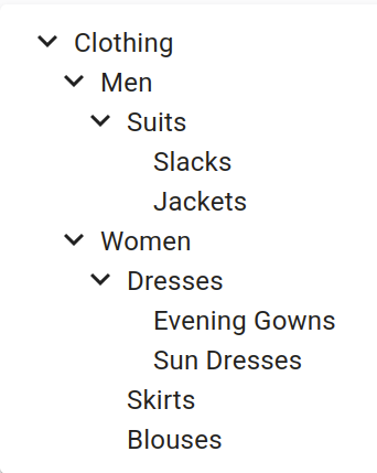
<TreeInput source="category" data={[
{ id: 1, title: 'Clothing', isRoot: true, children: [2, 6] },
{ id: 2, title: 'Men', children: [3] },
{ id: 3, title: 'Suits', children: [4, 5] },
{ id: 4, title: 'Slacks', children: [] },
{ id: 5, title: 'Jackets', children: [] },
{ id: 6, title: 'Women', children: [7, 10, 11] },
{ id: 7, title: 'Dresses', children: [8, 9] },
{ id: 8, title: 'Evening Gowns', children: [] },
{ id: 9, title: 'Sun Dresses', children: [] },
{ id: 10, title: 'Skirts', children: [] },
{ id: 11, title: 'Blouses', children: [] },
]} />
</SimpleForm>
</Edit>
);
import { Edit, SimpleForm, TextInput } from "react-admin";
import { TreeInput } from "@react-admin/ra-tree";

export const ProductEdit = () => (
    <Edit>
        <SimpleForm>
            <TextInput source="id" disabled />
            <TextInput source="name" />
            <TreeInput
                source="category"
                data={[
                    { id: 1, title: "Clothing", isRoot: true, children: [2, 6] },
                    { id: 2, title: "Men", children: [3] },
                    { id: 3, title: "Suits", children: [4, 5] },
                    { id: 4, title: "Slacks", children: [] },
                    { id: 5, title: "Jackets", children: [] },
                    { id: 6, title: "Women", children: [7, 10, 11] },
                    { id: 7, title: "Dresses", children: [8, 9] },
                    { id: 8, title: "Evening Gowns", children: [] },
                    { id: 9, title: "Sun Dresses", children: [] },
                    { id: 10, title: "Skirts", children: [] },
                    { id: 11, title: "Blouses", children: [] },
                ]}
            />
        </SimpleForm>
    </Edit>
);
Insert as first child
By default, when users add a new child to a node, the child is inserted as the last child of the parent node. You can force new children to be added as first child instead, by setting the insertAsFirstChild prop in the <AddChildButton>, as follows:
// in src/posts.js
import { TopToolbar } from 'react-admin';
import {
    AddChildButton,
    EditNode,
    TreeWithDetails,
} from '@react-admin/ra-tree';

const NodeEditActions = () => (
    <TopToolbar>
        <AddChildButton label="Add child at top" insertAsFirstChild />
    </TopToolbar>
);

const CategoriesEdit = () => (
    <EditNode actions={<NodeEditActions />}>...</EditNode>
);

export const CategoriesList = () => (
    <TreeWithDetails edit={CategoriesEdit}>...</TreeWithDetails>
);
// in src/posts.js
import { TopToolbar } from "react-admin";
import { AddChildButton, EditNode, TreeWithDetails } from "@react-admin/ra-tree";

const NodeEditActions = () => (
    <TopToolbar>
        <AddChildButton label="Add child at top" insertAsFirstChild />
    </TopToolbar>
);

const CategoriesEdit = () => <EditNode actions={<NodeEditActions />}>...</EditNode>;

export const CategoriesList = () => <TreeWithDetails edit={CategoriesEdit}>...</TreeWithDetails>;
Note: dataProvider.addChildNode() must support the position param for this feature to work. See the dataProvider section for details.
<Tree>
The <Tree> component is a wrapper for rc-tree's <Tree>, with Material Design style.
It expects a data prop containing a tree of nodes as returned by the dataProvider tree methods.
import { Tree } from '@react-admin/ra-tree';

// tree data format
const data = [
    { id: 1, name: 'Clothing', children: [2, 6] },
    { id: 2, name: 'Men', children: [3] },
    { id: 3, name: 'Suits', children: [4, 5] },
    { id: 4, name: 'Slacks', children: [] },
    { id: 5, name: 'Jackets', children: [] },
    { id: 6, name: 'Women', children: [7, 10, 11] },
    { id: 7, name: 'Dresses', children: [8, 9] },
    { id: 8, name: 'Evening Gowns', children: [] },
    { id: 9, name: 'Sun Dresses', children: [] },
    { id: 10, name: 'Skirts', children: [] },
    { id: 11, name: 'Blouses', children: [] },
];

// example usage
export const SimpleTree = () => <Tree data={data} titleField="name" />;
import { Tree } from "@react-admin/ra-tree";

// tree data format
const data = [
    { id: 1, name: "Clothing", children: [2, 6] },
    { id: 2, name: "Men", children: [3] },
    { id: 3, name: "Suits", children: [4, 5] },
    { id: 4, name: "Slacks", children: [] },
    { id: 5, name: "Jackets", children: [] },
    { id: 6, name: "Women", children: [7, 10, 11] },
    { id: 7, name: "Dresses", children: [8, 9] },
    { id: 8, name: "Evening Gowns", children: [] },
    { id: 9, name: "Sun Dresses", children: [] },
    { id: 10, name: "Skirts", children: [] },
    { id: 11, name: "Blouses", children: [] },
];

// example usage
export const SimpleTree = () => <Tree data={data} titleField="name" />;
Props
The <Tree> component accepts the rc-tree's <Tree> props but a few of them differ from the original.
| Prop | Required | Type | Default | Description |
|---|---|---|---|---|
data |
Required | TreeRecord[] |
- | The tree data to display in the format returned by the dataProvider. |
className |
Optional | string |
- | The CSS class name to apply on the Root component. |
defaultExpandedKeys |
Optional | Identifier[] |
- | An array of identifiers defining the records that should be expanded by default. |
defaultSelectedKeys |
Optional | Identifier[] |
- | An array of identifiers defining the records that should be selected by default. |
expandedKeys |
Optional | Identifier[] |
- | An array of identifiers defining the records that should be expanded (controlled mode). |
hideRootNodes |
Optional | boolean |
false |
A boolean indicating whether the root nodes should be hidden. |
motion |
Optional | boolean |
false |
To enable rc-tree's <Tree> transitions |
nodeActions |
Optional | ReactNode |
- | The React node to display at the end of each node. |
onCheck |
Optional | function |
- | The function to execute when a node is checked or unchecked. |
onClick |
Optional | function |
- | The function to execute when a node is clicked. |
onDrop |
Optional | function |
- | The function to execute when a node is dropped on another. |
onExpand |
Optional | function |
- | The function to execute when a node is expanded or collapsed. |
onSelect |
Optional | function |
- | The function to execute when a node is selected. |
resource |
Optional | string |
- | The resource from which this tree data comes from |
selectedKeys |
Optional | Identifier[] |
- | An array of identifiers defining the records that should be selected (controlled mode). |
sx |
Optional | SxProps |
- | Material UI shortcut for defining custom styles. |
titleField |
Optional | string |
- | Set the record field to display in the tree. |
className
The CSS class name to apply on the Root component.
import { Tree } from '@react-admin/ra-tree';
import { data } from './data';

export const SimpleTree = () => <Tree data={data} className="my-class" />;
import { Tree } from "@react-admin/ra-tree";
import { data } from "./data";

export const SimpleTree = () => <Tree data={data} className="my-class" />;
data
The tree data to display in the format returned by the dataProvider.
import { Tree } from '@react-admin/ra-tree';

// tree data format
const data = [
    { id: 1, name: 'Clothing', children: [2, 6] },
    { id: 2, name: 'Men', children: [3] },
    { id: 3, name: 'Suits', children: [4, 5] },
    { id: 4, name: 'Slacks', children: [] },
    { id: 5, name: 'Jackets', children: [] },
    { id: 6, name: 'Women', children: [7, 10, 11] },
    { id: 7, name: 'Dresses', children: [8, 9] },
    { id: 8, name: 'Evening Gowns', children: [] },
    { id: 9, name: 'Sun Dresses', children: [] },
    { id: 10, name: 'Skirts', children: [] },
    { id: 11, name: 'Blouses', children: [] },
];

export const SimpleTree = () => <Tree data={data} />;
import { Tree } from "@react-admin/ra-tree";

// tree data format
const data = [
    { id: 1, name: "Clothing", children: [2, 6] },
    { id: 2, name: "Men", children: [3] },
    { id: 3, name: "Suits", children: [4, 5] },
    { id: 4, name: "Slacks", children: [] },
    { id: 5, name: "Jackets", children: [] },
    { id: 6, name: "Women", children: [7, 10, 11] },
    { id: 7, name: "Dresses", children: [8, 9] },
    { id: 8, name: "Evening Gowns", children: [] },
    { id: 9, name: "Sun Dresses", children: [] },
    { id: 10, name: "Skirts", children: [] },
    { id: 11, name: "Blouses", children: [] },
];

export const SimpleTree = () => <Tree data={data} />;
defaultExpandedKeys
An array of identifiers defining the records that should be expanded by default.
import { Tree } from '@react-admin/ra-tree';
import { data } from './data';

export const SimpleTree = () => <Tree data={data} defaultExpandedKeys={[0, 1]} />;
import { Tree } from "@react-admin/ra-tree";
import { data } from "./data";

export const SimpleTree = () => <Tree data={data} defaultExpandedKeys={[0, 1]} />;
defaultSelectedKeys
An array of identifiers defining the records that should be selected by default.
import { Tree } from '@react-admin/ra-tree';
import { data } from './data';

export const SimpleTree = () => <Tree data={data} defaultSelectedKeys={[0, 1]} />;
import { Tree } from "@react-admin/ra-tree";
import { data } from "./data";

export const SimpleTree = () => <Tree data={data} defaultSelectedKeys={[0, 1]} />;
hideRootNodes
A boolean indicating whether the root nodes should be hidden.
import { Tree } from '@react-admin/ra-tree';
import { data } from './data';

export const SimpleTree = () => <Tree data={data} hideRootNodes />;
import { Tree } from "@react-admin/ra-tree";
import { data } from "./data";

export const SimpleTree = () => <Tree data={data} hideRootNodes />;
motion
A boolean indicating whether to enable rc-tree's <Tree> transitions.
import { Tree } from '@react-admin/ra-tree';
import { data } from './data';

export const SimpleTree = () => <Tree data={data} motion />;
import { Tree } from "@react-admin/ra-tree";
import { data } from "./data";

export const SimpleTree = () => <Tree data={data} motion />;
With a custom motion:
import { Tree } from '@react-admin/ra-tree';
import { data } from './data';

const motion = {
  motionName: 'node-motion',
  motionAppear: false,
  onAppearStart: node => {
    console.log('Start Motion:', node);
    return { height: 0 };
  },
  onAppearActive: node => ({ height: node.scrollHeight }),
  onLeaveStart: node => ({ height: node.offsetHeight }),
  onLeaveActive: () => ({ height: 0 }),
};

export const SimpleTree = () => (
    <Tree data={data} motion={motion} sx={{
        '& .rc-tree-child-tree': {
            display: 'block'
        }

        '& .node-motion' {
            transition: 'all .3s',
            overflowY: 'hidden',
        }
    }} />
);
import { Tree } from "@react-admin/ra-tree";
import { data } from "./data";

const motion = {
    motionName: "node-motion",
    motionAppear: false,
    onAppearStart: (node) => {
        console.log("Start Motion:", node);
        return { height: 0 };
    },
    onAppearActive: (node) => ({ height: node.scrollHeight }),
    onLeaveStart: (node) => ({ height: node.offsetHeight }),
    onLeaveActive: () => ({ height: 0 }),
};

export const SimpleTree = () => (
    <Tree
        data={data}
        motion={motion}
        sx={{
            "& .rc-tree-child-tree": {
                display: "block",
            },

            "& .node-motion": {
                transition: "all .3s",
                overflowY: "hidden",
            },
        }}
    />
);
nodeActions
The React node to display at the end of each node.
import { DeleteMenuItem, NodeActions, Tree } from '@react-admin/ra-tree';
import { data } from './data';

const MyCustomActionMenuItem = forwardRef(
    ({ record, resource, parentId }, ref) => {
        const handleClick = () => {
            // Do something with dataProvider ?
        };
        return (
            <MenuItem ref={ref} onClick={handleClick}>
                Do something
            </MenuItem>
        );
    }
);

const MyActions = () => (
    <NodeActions>
        <MyCustomActionMenuItem />
        <DeleteMenuItem />
    </NodeActions>
);

export const SimpleTree = () => <Tree data={data} nodeActions={<MyActions />} />;
import { DeleteMenuItem, NodeActions, Tree } from "@react-admin/ra-tree";
import { data } from "./data";

const MyCustomActionMenuItem = forwardRef(({ record, resource, parentId }, ref) => {
    const handleClick = () => {
        // Do something with dataProvider ?
    };
    return (
        <MenuItem ref={ref} onClick={handleClick}>
            Do something
        </MenuItem>
    );
});

const MyActions = () => (
    <NodeActions>
        <MyCustomActionMenuItem />
        <DeleteMenuItem />
    </NodeActions>
);

export const SimpleTree = () => <Tree data={data} nodeActions={<MyActions />} />;
onCheck
The function to execute when a node is checked. It receives the event and an array of the checked TreeRecord.
It receives the following parameters:
event: the originalMouseEventselectedRecords: an array of the currently selectedTreeRecordobjectsrecord: theTreeRecordthat has just been selected or unselectedisSelected: a boolean indicating whether therecordis now selected or not
import { Tree } from '@react-admin/ra-tree';
import { data } from './data';

export const SimpleTree = () => (
    <Tree
        data={data}
        onCheck={(event, selectedRecords, record, isSelected) => console.log({ selectedRecords })}
    />
);
import { Tree } from "@react-admin/ra-tree";
import { data } from "./data";

export const SimpleTree = () => (
    <Tree data={data} onCheck={(event, selectedRecords, record, isSelected) => console.log({ selectedRecords })} />
);
onClick
The function to execute when a node is clicked. It receives the event and the clicked TreeRecord.
import { Tree } from '@react-admin/ra-tree';
import { data } from './data';

export const SimpleTree = () => <Tree data={data} onClick={(event, record) => console.log({ record })} />;
import { Tree } from "@react-admin/ra-tree";
import { data } from "./data";

export const SimpleTree = () => <Tree data={data} onClick={(event, record) => console.log({ record })} />;
onDrop
The function to execute when a node is dropped on another. It receives the event and an object with the following properties:
source: theTreeRecordthat has been droppeddestination: theTreeRecordonto which the node has been droppedposition: the position at which the node has been droppedtype: a value indicating whether the node should be moved as asiblingor achildof theTreeRecordindestination.
import { Tree } from '@react-admin/ra-tree';
import { data } from './data';

export const SimpleTree = () => (
    <Tree
        data={data}
        onDrop={(event, { source, destination, position, type }) => {
            console.log(`Node ${source.id} has been moved as a ${type} of node ${destination.id} at position ${position}`)
        }}
    />
);
import { Tree } from "@react-admin/ra-tree";
import { data } from "./data";

export const SimpleTree = () => (
    <Tree
        data={data}
        onDrop={(event, { source, destination, position, type }) => {
            console.log(
                `Node ${source.id} has been moved as a ${type} of node ${destination.id} at position ${position}`
            );
        }}
    />
);
onExpand
The function to execute when a node is expanded or collapsed. It receives the event and an array of the expanded TreeRecord.
It receives the following parameters:
event: the originalMouseEventexpandedRecords: an array of the currently expandedTreeRecordobjectsrecord: theTreeRecordthat has just been expanded or collapsedisExpanded: a boolean indicating whether therecordis now expanded or collapsed
import { Tree } from '@react-admin/ra-tree';
import { data } from './data';

export const SimpleTree = () => (
    <Tree
        data={data}
        onExpand={(event, expandedRecords, record, isExpanded) => console.log({ expandedRecords })}
    />
);
import { Tree } from "@react-admin/ra-tree";
import { data } from "./data";

export const SimpleTree = () => (
    <Tree data={data} onExpand={(event, expandedRecords, record, isExpanded) => console.log({ expandedRecords })} />
);
onSelect
The function to execute when a node is expanded or collapsed. It receives the event and the selected TreeRecord.
It receives the following parameters:
event: the originalMouseEventselectedRecord: The currently selectedTreeRecordorundefinedrecord: theTreeRecordthat has just been selected or unselectedisSelected: a boolean indicating whether therecordis now selected or not
import { Tree } from '@react-admin/ra-tree';
import { data } from './data';

export const SimpleTree = () => (
    <Tree
        data={data}
        onSelect={(event, selectedRecord, record, isSelected) => console.log({ record })}
    />
);
import { Tree } from "@react-admin/ra-tree";
import { data } from "./data";

export const SimpleTree = () => (
    <Tree data={data} onSelect={(event, selectedRecord, record, isSelected) => console.log({ record })} />
);
resource
By default, the resource is read from the closest ResourceContext. You can override it by passing a resource prop:
import { Tree } from '@react-admin/ra-tree';

const data = [
    { id: 1, name: 'Clothing', children: [2, 6] },
    { id: 2, name: 'Men', children: [3] },
    { id: 3, name: 'Suits', children: [4, 5] },
    { id: 4, name: 'Slacks', children: [] },
    { id: 5, name: 'Jackets', children: [] },
    { id: 6, name: 'Women', children: [7, 10, 11] },
    { id: 7, name: 'Dresses', children: [8, 9] },
    { id: 8, name: 'Evening Gowns', children: [] },
    { id: 9, name: 'Sun Dresses', children: [] },
    { id: 10, name: 'Skirts', children: [] },
    { id: 11, name: 'Blouses', children: [] },
];

export const SimpleTree = () => <Tree data={data} resource="categories" />;
import { Tree } from "@react-admin/ra-tree";

const data = [
    { id: 1, name: "Clothing", children: [2, 6] },
    { id: 2, name: "Men", children: [3] },
    { id: 3, name: "Suits", children: [4, 5] },
    { id: 4, name: "Slacks", children: [] },
    { id: 5, name: "Jackets", children: [] },
    { id: 6, name: "Women", children: [7, 10, 11] },
    { id: 7, name: "Dresses", children: [8, 9] },
    { id: 8, name: "Evening Gowns", children: [] },
    { id: 9, name: "Sun Dresses", children: [] },
    { id: 10, name: "Skirts", children: [] },
    { id: 11, name: "Blouses", children: [] },
];

export const SimpleTree = () => <Tree data={data} resource="categories" />;
selectedKeys
An array of identifiers defining the records that should be selected (controlled mode).
import { Tree } from '@react-admin/ra-tree';
import { data } from './data';

export const SimpleTree = () => <Tree data={data} selectedKeys={[0, 1]} />;
import { Tree } from "@react-admin/ra-tree";
import { data } from "./data";

export const SimpleTree = () => <Tree data={data} selectedKeys={[0, 1]} />;
sx
Material UI shortcut for defining custom styles.
import { Tree } from '@react-admin/ra-tree';
import { data } from './data';

export const SimpleTree = () => (
    <Tree data={data} sx={{
        '&': {
            border: 'solid 1px red'
        }
    }} />
);
import { Tree } from "@react-admin/ra-tree";
import { data } from "./data";

export const SimpleTree = () => (
    <Tree
        data={data}
        sx={{
            "&": {
                border: "solid 1px red",
            },
        }}
    />
);
titleField
The default node title uses the recordRepresentation of the resource. Use the titleField prop to specify the name of the field holding the node title:
import { Tree } from '@react-admin/ra-tree';

const data = [
    { id: 1, name: 'Clothing', children: [2, 6] },
    { id: 2, name: 'Men', children: [3] },
    { id: 3, name: 'Suits', children: [4, 5] },
    { id: 4, name: 'Slacks', children: [] },
    { id: 5, name: 'Jackets', children: [] },
    { id: 6, name: 'Women', children: [7, 10, 11] },
    { id: 7, name: 'Dresses', children: [8, 9] },
    { id: 8, name: 'Evening Gowns', children: [] },
    { id: 9, name: 'Sun Dresses', children: [] },
    { id: 10, name: 'Skirts', children: [] },
    { id: 11, name: 'Blouses', children: [] },
];

export const SimpleTree = () => <Tree data={data} titleField="name" />;
import { Tree } from "@react-admin/ra-tree";

const data = [
    { id: 1, name: "Clothing", children: [2, 6] },
    { id: 2, name: "Men", children: [3] },
    { id: 3, name: "Suits", children: [4, 5] },
    { id: 4, name: "Slacks", children: [] },
    { id: 5, name: "Jackets", children: [] },
    { id: 6, name: "Women", children: [7, 10, 11] },
    { id: 7, name: "Dresses", children: [8, 9] },
    { id: 8, name: "Evening Gowns", children: [] },
    { id: 9, name: "Sun Dresses", children: [] },
    { id: 10, name: "Skirts", children: [] },
    { id: 11, name: "Blouses", children: [] },
];

export const SimpleTree = () => <Tree data={data} titleField="name" />;
<TreeInput>
The <TreeInput> component allows to select one or several nodes from a tree.
Usage
Use <TreeInput> in a react-admin form, and pass the possible choices as the data prop in the format of the data returned by dataProvider.getTree() (i.e. an array of nodes with a children field).
import { TreeInput } from '@react-admin/ra-tree';
import { SimpleForm } from 'react-admin';

export const SimpleTreeForm = () => (
    <SimpleForm>
        <TreeInput source="category" data={[
            { id: 1, title: 'Clothing', isRoot: true, children: [2, 6] },
            { id: 2, title: 'Men', children: [3] },
            { id: 3, title: 'Suits', children: [4, 5] },
            { id: 4, title: 'Slacks', children: [] },
            { id: 5, title: 'Jackets', children: [] },
            { id: 6, title: 'Women', children: [7, 10, 11] },
            { id: 7, title: 'Dresses', children: [8, 9] },
            { id: 8, title: 'Evening Gowns', children: [] },
            { id: 9, title: 'Sun Dresses', children: [] },
            { id: 10, title: 'Skirts', children: [] },
            { id: 11, title: 'Blouses', children: [] },
        ]} />
    </SimpleForm>
);
import { TreeInput } from "@react-admin/ra-tree";
import { SimpleForm } from "react-admin";

export const SimpleTreeForm = () => (
    <SimpleForm>
        <TreeInput
            source="category"
            data={[
                { id: 1, title: "Clothing", isRoot: true, children: [2, 6] },
                { id: 2, title: "Men", children: [3] },
                { id: 3, title: "Suits", children: [4, 5] },
                { id: 4, title: "Slacks", children: [] },
                { id: 5, title: "Jackets", children: [] },
                { id: 6, title: "Women", children: [7, 10, 11] },
                { id: 7, title: "Dresses", children: [8, 9] },
                { id: 8, title: "Evening Gowns", children: [] },
                { id: 9, title: "Sun Dresses", children: [] },
                { id: 10, title: "Skirts", children: [] },
                { id: 11, title: "Blouses", children: [] },
            ]}
        />
    </SimpleForm>
);
Tip: You can use the <TreeInput> component in a <ReferenceNodeInput> to automatically fetch the data from a reference resource.
Props
| Prop | Required | Type | Default | Description |
|---|---|---|---|---|
source |
Required (*) | string | - | The name of the source field - (*) Can be omitted when used inside <ReferenceNodeInput> |
checkStrictly |
Optional | boolena | true |
Check node precisely, parent and children nodes are not associated |
data |
Optional | array of objects | - | The tree data |
id |
Optional | string | - | The input id |
hideRootNodes |
Optional | boolean | false |
Set to true to hide all root nodes |
margin |
Optional | string | dense |
The margin of the input, can be none, dense or normal (see MUI Input margins) |
multiple |
Optional | boolean | false |
Set to true to allow selecting multiple nodes |
size |
Optional | string | small |
The size of the input, can be small, medium or large (see MUI Input sizes) |
titleField |
Optional | string | - | The name of the field holding the node title |
variant |
Optional | string | filled |
The variant to use, e.g. standard, outlined or filled (see MUI Input variants) |
<TreeInput> also accepts the same props as <Tree>, as well as the common input props.
checkStrictly
By default, <TreeInput> uses the checkStrictly prop from rc-tree's <Tree> component to allow selecting leaf and parent nodes independently. If you want to disable this feature, you can set the checkStrictly prop to false:
<TreeInput
    source="category"
    data={treeData}
    multiple
    checkStrictly={false}
/>
<TreeInput source="category" data={treeData} multiple checkStrictly={false} />;
data
The list of possible choices must be passed as the data prop. It must be an array of nodes with a children field.
<TreeInput source="category" data={[
    { id: 1, title: 'Clothing', isRoot: true, children: [2, 6] },
    { id: 2, title: 'Men', children: [3] },
    { id: 3, title: 'Suits', children: [4, 5] },
    { id: 4, title: 'Slacks', children: [] },
    { id: 5, title: 'Jackets', children: [] },
    { id: 6, title: 'Women', children: [7, 10, 11] },
    { id: 7, title: 'Dresses', children: [8, 9] },
    { id: 8, title: 'Evening Gowns', children: [] },
    { id: 9, title: 'Sun Dresses', children: [] },
    { id: 10, title: 'Skirts', children: [] },
    { id: 11, title: 'Blouses', children: [] },
]} />
<TreeInput
    source="category"
    data={[
        { id: 1, title: "Clothing", isRoot: true, children: [2, 6] },
        { id: 2, title: "Men", children: [3] },
        { id: 3, title: "Suits", children: [4, 5] },
        { id: 4, title: "Slacks", children: [] },
        { id: 5, title: "Jackets", children: [] },
        { id: 6, title: "Women", children: [7, 10, 11] },
        { id: 7, title: "Dresses", children: [8, 9] },
        { id: 8, title: "Evening Gowns", children: [] },
        { id: 9, title: "Sun Dresses", children: [] },
        { id: 10, title: "Skirts", children: [] },
        { id: 11, title: "Blouses", children: [] },
    ]}
/>;
If you need to fetch the data, you're probably editing a relationship. In that case, you should use the <ReferenceNodeInput> component, which fetches the data from a reference resource on mount .
hideRootNodes
Use the hideRootNodes prop to hide all root nodes:
<TreeInput
    source="category"
    data={treeData}
    hideRootNodes
/>
<TreeInput source="category" data={treeData} hideRootNodes />;
id
Use the id prop to specify a custom input id. It defaults to the source prop value:
<TreeInput
    source="category"
    data={treeData}
    id="category1"
/>
<TreeInput source="category" data={treeData} id="category1" />;
multiple
Use the multiple prop to allow selecting multiple nodes:
import { TreeInput } from '@react-admin/ra-tree';
import { SimpleForm } from 'react-admin';
import treeData from './treeData';

export const SimpleTreeForm = () => (
    <SimpleForm>
        <TreeInput source="category" data={treeData} multiple />
    </SimpleForm>
);
import { TreeInput } from "@react-admin/ra-tree";
import { SimpleForm } from "react-admin";
import treeData from "./treeData";

export const SimpleTreeForm = () => (
    <SimpleForm>
        <TreeInput source="category" data={treeData} multiple />
    </SimpleForm>
);
titleField
The default node title uses the recordRepresentation of the resource. Use the titleField prop to specify the name of the field holding the node title:
<TreeInput
    source="category"
    data={treeData}
    titleField="name"
/>
<TreeInput source="category" data={treeData} titleField="name" />;
<ReferenceNodeInput>
Use the <ReferenceNodeInput> component to select one or several nodes from a tree of a reference resource. For instance, this is useful to select a category for a product.
Usage
Use <ReferenceNodeInput> in a react-admin form, and set the reference and source props just like for a <ReferenceInput>.
import { ReferenceNodeInput } from '@react-admin/ra-tree';
import { Edit, SimpleForm, TextInput } from 'react-admin';

const ProductEdit = () => (
    <Edit>
        <SimpleForm>
            <TextInput source="name" />
            <ReferenceNodeInput
                source="category_id"
                reference="categories"
            />
        </SimpleForm>
    </Edit>
);
import { ReferenceNodeInput } from "@react-admin/ra-tree";
import { Edit, SimpleForm, TextInput } from "react-admin";

const ProductEdit = () => (
    <Edit>
        <SimpleForm>
            <TextInput source="name" />
            <ReferenceNodeInput source="category_id" reference="categories" />
        </SimpleForm>
    </Edit>
);
<ReferenceNodeInput> is a controller component, i.e. it fetches the tree from the reference resource, creates a tree choices context, and renders its child component.
By default <ReferenceNodeInput> will render a simple <TreeInput> as its child. If you need to customize the <TreeInput> props, e.g. set the multiple prop, you will need to pass the child explicitly:
import { ReferenceNodeInput, TreeInput } from '@react-admin/ra-tree';
import { Edit, SimpleForm, TextInput } from 'react-admin';

const ProductEdit = () => (
    <Edit>
        <SimpleForm>
            <TextInput source="name" />
            <ReferenceNodeInput
                source="category_id"
                reference="categories"
            >
                <TreeInput multiple />
            </ReferenceNodeInput>
        </SimpleForm>
    </Edit>
);
import { ReferenceNodeInput, TreeInput } from "@react-admin/ra-tree";
import { Edit, SimpleForm, TextInput } from "react-admin";

const ProductEdit = () => (
    <Edit>
        <SimpleForm>
            <TextInput source="name" />
            <ReferenceNodeInput source="category_id" reference="categories">
                <TreeInput multiple />
            </ReferenceNodeInput>
        </SimpleForm>
    </Edit>
);
Props
| Prop | Required | Type | Default | Description |
|---|---|---|---|---|
children |
- | React Element | <TreeInput /> |
The child component responsible for rendering the input |
reference |
Required | string | - | The reference resource |
source |
Required | string | - | The name of the source field |
meta |
- | object | - | An object containing metadata to be passed when calling the dataProvider |
children
<ReferenceNodeInput> accepts only one child, which is responsible for rendering the input. By default, it renders a simple <TreeInput> with no props. If you need to pass additional props to <TreeInput>, you will need to pass them explicitely:
<ReferenceNodeInput
    source="category_id"
    reference="categories"
>
    <TreeInput multiple checkStrictly={false} />
</ReferenceNodeInput>
<ReferenceNodeInput source="category_id" reference="categories">
    <TreeInput multiple checkStrictly={false} />
</ReferenceNodeInput>;
meta
Use the meta prop to pass metadata to the dataProvider when calling getTree():
<ReferenceNodeInput
    source="category_id"
    reference="categories"
    meta={{ foo: 'bar' }}
/>
<ReferenceNodeInput source="category_id" reference="categories" meta={{ foo: "bar" }} />;
reference
Use the reference prop to specify the reference resource:
<ReferenceNodeInput source="category_id" reference="categories" />
<ReferenceNodeInput source="category_id" reference="categories" />;
source
Use the source prop to specify the name of the source field:
<ReferenceNodeInput source="category_id" reference="categories" />
<ReferenceNodeInput source="category_id" reference="categories" />;
Customizing Translation Messages
This module uses specific translations for displaying buttons and other texts. As for all translations in react-admin, it's possible to customize the messages.
To create your own translations, you can use the TypeScript types to see the structure and see which keys are overridable.
Here is an example of how to customize translations in your app:
import polyglotI18nProvider from 'ra-i18n-polyglot';
import englishMessages from 'ra-language-english';
import frenchMessages from 'ra-language-french';
import {
    TranslationMessages as BaseTranslationMessages,
    raTreeEnglishMessages,
    raTreeFrenchMessages,
    RaTreeTranslationMessages,
} from '@react-admin/ra-tree';

/* TranslationMessages extends the defaut translation
 * Type from react-admin (BaseTranslationMessages)
 * and the ra-tree translation Type (RaTreeTranslationMessages)
 */
interface TranslationMessages
    extends RaTreeTranslationMessages,
        BaseTranslationMessages {}

const customEnglishMessages: TranslationMessages = mergeTranslations(
    englishMessages,
    raTreeEnglishMessages,
    {
        'ra-tree': {
            action: {
                add_child: 'Add a daughter',
                add_root: 'Add a god',
            },
        },
    }
);

const i18nCustomProvider = polyglotI18nProvider(locale => {
    if (locale === 'fr') {
        return mergeTranslations(frenchMessages, raTreeFrenchMessages);
    }
    return customEnglishMessages;
}, 'en');

export const MyApp = () => (
    <Admin
        dataProvider={myDataprovider}
        layout={myLayout}
        i18nProvider={i18nCustomProvider}
    >
        ...
    </Admin>
);
import polyglotI18nProvider from "ra-i18n-polyglot";
import englishMessages from "ra-language-english";
import frenchMessages from "ra-language-french";
import { raTreeEnglishMessages, raTreeFrenchMessages } from "@react-admin/ra-tree";

const customEnglishMessages = mergeTranslations(englishMessages, raTreeEnglishMessages, {
    "ra-tree": {
        action: {
            add_child: "Add a daughter",
            add_root: "Add a god",
        },
    },
});

const i18nCustomProvider = polyglotI18nProvider((locale) => {
    if (locale === "fr") {
        return mergeTranslations(frenchMessages, raTreeFrenchMessages);
    }
    return customEnglishMessages;
}, "en");

export const MyApp = () => (
    <Admin dataProvider={myDataprovider} layout={myLayout} i18nProvider={i18nCustomProvider}>
        ...
    </Admin>
);
CHANGELOG
v7.0.4
2025-12-18
- Fix
<TreeWithDetails>closes nodes that shouldn't be closed after one has been selected
v7.0.3
2025-12-15
- Fix
<TreeWithDetails>does not close children of collapsed nodes
v7.0.2
2025-07-30
- Fix
<Tree>does not expand parents of selected/expanded nodes.
v7.0.1
2025-07-28
- Fix
<TreeWithDetails>does not work when using a basename.
v7.0.0
2025-07-22
- Refactor
<TreeInput>so that is displays the tree in a MUI Popover element.
Note: This should not break your forms but may change your form design.
v6.3.2
2025-07-01
- Fix
<TreeInput>does not properly expand parents of initial value
v6.3.1
2025-06-18
EditNodeController: Fix middleware implementation does not handle optimistic cases
v6.3.0
2025-06-16
- Make components compatible with Material UI v7
6.2.1
2025-06-10
- Fix
<Tree allowDrop>does not have the same signature as thehandleDropprop. - Fix
addTreeMethodsBasedOnChildrendoes not allow to drop a node as the first item of its parent.
6.2.0
2025-05-06
<Tree>,<TreeWithDetails>and<TreeInput>now supportrecordRepresentationdefined at resource level for node title
6.1.0
2025-04-11
<TreeWithDetails>now infers itslinkToprop from available views (showoredit)
6.0.2
2025-03-24
- Fix
<TreeWithDetails>does not allow deep paths such as when using a<TabbedForm> - Fix double encoding issues in
useEditNodeControllerand<ShowNode>
6.0.1
2025-03-13
- Fix
<TreeWithDetails>create,editandshowtypes - Fix
<Tree>tries to convert all identifiers to numbers
6.0.0
2025-02-21
Breaking Changes
- React-admin now calls
<Tree onClick>handler with the event as the first parameter and the clickedTreeRecordas second parameter instead of the rc-treeTreeNode. <Tree onExpand>signature changed to:(event: MouseEvent, expandedRecords: TreeRecord[], record: TreeRecord, isExpanded: boolean) => void<Tree onSelect>signature changed to:(event: MouseEvent, selectedRecord: TreeRecord | undefined, record: TreeRecord, isSelected: boolean) => void<Tree onCheck>signature changed to:(event: MouseEvent, selectedRecords: TreeRecord[], record: TreeRecord, isSelected: boolean) => void<Tree onDrop>signature changed to:(event: MouseEvent, dropData: { source: TreeRecord; destination: TreeRecord; position: number; type: 'child' | 'sibling'; }) => void<TreeWithDetails>now support multiplemutationModelikeuseTreeControllerthat will be applied to drag & drop operations mutations.
v5.1.1
2024-12-20
- Fix Dragging a node triggers a rerender that cancels the operation
- Fix:
onExpandandonSelectnow always return the records identifiers, preserving their types - Update
rc-treeto 5.10.1
v5.1.0
2024-11-26
- (feat) Add support for a
filterparam ingetTreeandgetRootNodes - (feat) Add support for
<TreeWithDetails filter>
v5.0.1
2024-10-15
- Fix
moveAsNthSiblingOfis sometimes called withposition: NaN
v5.0.0
2024-07-25
- Upgrade to react-admin v5
- Remove
PropTypes - The
useEditNodeControllerstate additionally returnsisPending - Fix
inflectionimports
Breaking Changes
- The
useDeleteBranchWithConfirmControllerstate returnsisPendinginstead ofisLoading - The
useDeleteBranchWithUndoControllerstate returnsisPendinginstead ofisLoading - The
useEditNodeControllerstate no longer returns deprecateddata. It returnsrecordinstead - NodeActions are no longer cloned and must get the current record through
useRecordContext - The record available to NodeAction is now the one returned from the dataProvider without any additional properties from rc-tree
<TreeWithDetails>no longer merge the data from the dataProvider with the properties required by rc-tree. The dataProvider data is available via the noderecordproperty- The
<Tree>component now requires adataprop which is an array ofTreeNodeas returned by the dataProvider tree related methods. - The
useTreeInputController,useReferenceNodeInputController,useTreeControlleranduseTreeContextno longer return atreeDataproperty.
4.5.0
2024-05-20
- (feat) Expose the
<AddChildButton>component - (feat) Add
createPositionprop to the<AddChildButton>component - (feat) Add
positionprop to theaddChildNodemethod of builders
v4.4.9
2023-10-25
- Update lazy tree loading icon from hourglass to circular progress
v4.4.8
2023-09-21
- Fix expanded child nodes automatically expand their parent on mount
- Fix re-expanding a previously expanded then closed node in lazy mode put its children at root
- TreeWithDetails now set the
expandActionprop tofalseby default to prevent closing the children of an opened node when selecting it. If you need to, you can restore the previous behavior by settingexpandAction="click".
v4.4.7
2023-09-05
- Fix cannot exit node creation
v4.4.6
2023-09-01
- Fix double loading icon in lazy mode
v4.4.5
2023-09-01
- Fix
TreeInputselected value is converted to string
v4.4.4
2023-08-29
- (fix) Lazy mode: Fix tree renders incorrectly after adding a new node
- (fix) Lazy mode: Fix tree is not updated after editing a node
- (fix) Lazy mode: Tree data can contain duplicates after expanding the same node multiple times
- (fix) Lazy mode: Don't offer to expand nodes when we already know they have no children
v4.4.3
2023-08-25
- (fix) Lazy mode: Fix
<Tree>should not load expanded nodes if their parent is collapsed - (fix) Lazy mode: Fix
<Tree>should load all expanded nodes even when parent nodes are already cached
v4.4.2
2023-08-21
- (fix) Fix missing
useEditNodeControllerexport
v4.4.1
2023-07-17
- (fix) Fix usage of es2023 feature.
v4.4.0
2023-06-02
- (feat) Introduce
<TreeInput>and<ReferenceNodeInput>components - Reduce tree margins to improve information density and match material-ui default margins
v4.3.0
2023-05-24
- Upgraded to react-admin
4.10.6
v4.2.0
2023-04-03
- (fix) Fix
<TreeWithDetails>can sometimes freeze collapsing/expanding of nodes after clicking on a leaf node
Breaking Change
CSS animations are now disabled by default. To re-enable them, you must pass the motion prop to the <TreeWithDetails> component.
export const CategoriesList = () => <TreeWithDetails motion />;
export const CategoriesList = () => <TreeWithDetails motion />;
v4.1.6
2023-01-25
- Update
rc-treedependency
v4.1.5
2022-12-14
- (feat) Add
metatoTreeWithDetailsprops - (fix) Fix
<TreeWithDetails>lazy loading with previously set expanded keys - (fix) Fix
addTreeMethodsBasedOnChildrenmethods did not passmetato alldataProvidermethods - (fix) Fix
addTreeMethodsBasedOnParentAndPositionmethods did not passmetato alldataProvidermethods
v4.1.4
2022-11-21
- (fix) Fix default success side effect when creating a new node causes an error with RA version 4.4.0 and above
- (fix) Fix
<NodeActions>should stop propagating the click event on close
v4.1.3
2022-09-29
- (fix) Fix moving child outside its parent with
addTreeMethodsBasedOnChildren
v4.1.2
2022-09-26
- (fix) Fix
addTreeMethodsBasedOnChildrenandaddTreeMethodsBasedOnParentAndPositionnot allowingmetato be omitted ingetTreeandgetRootNodes
v4.1.1
2022-09-19
- (fix) Fix
useMoveAsNthSiblingOfquery cache update when moving an item from top to bottom on the same branch
v4.1.0
2022-09-15
- (feat) Add support for meta in
ra-treehooks and components
v4.0.5
2022-09-08
- (fix) Fix
useEditNodeControlleris not usingrecordRepresentation - (fix) Fix
moveAsNthSiblingOfreordering is wrong when source is below target inaddTreeMethodsBasedOnParentAndPosition - (fix) Fix
moveAsNthSiblingOfreordering is wrong when source is below target inaddTreeMethodsBasedOnChildren - (fix) Fix moving at top position of the current branch with
moveAsNthChildOfinaddTreeMethodsBasedOnChildren - (doc) Improve documentation about
moveAsNthChildOfandmoveAsNthSiblingOf
v4.0.4
2022-07-01
- (fix) UI corrections (alignement, width)
v4.0.3
2022-06-29
- Fix: Replace
classnameswithclsx
v4.0.2
2022-06-08
- (fix) Update peer dependencies ranges (support React 18)
v4.0.1
2022-06-08
- (fix)
<EditNode>form child must take a custom toolbar to have the<DeleteButton>delete a branch
v4.0.0
2022-06-07
- Upgraded to react-admin v4
- Upgraded to rc-tree v5.6.1
Breaking changes
The Signatures of all the DataProvider Hooks Have Changed
First, all hooks signatures now reflect their matching dataProvider method signature (so every hook now takes 3 arguments, resource, params and options). The params can also contain the newly supported meta property. This property could be used to pass additional parameters not supported by default by our hooks and default dataProviders.
import { useGetTree } from '@react-admin/ra-tree';

const Categories = () => {
-  const { data: tree, loading, loaded, error } = useGetTree('categories', options);
+    const { data: tree, isLoading, error } = useGetTree('categories', options);
-  if (!loaded) { return <Loading />; }
+    if (isLoading) { return <Loading />; }
    if (error) { return <p>ERROR</p>; }
    return <Tree tree={data} />;
};
Second, the loading property returned by these hooks has been renamed to isLoading. The loaded property has been removed.
import { useGetTree } from '@react-admin/ra-tree';

const Categories = () => {
-  const { data: tree, loading, loaded, error } = useGetTree('categories');
+    const { data: tree, isLoading, error } = useGetTree('categories');
-  if (!loaded) { return <Loading />; }
+    if (isLoading) { return <Loading />; }
    if (error) { return <p>ERROR</p>; }
    return <Tree tree={data} />;
};
Finally, these hooks are now powered by react-query, so the state argument contains way more than just isLoading (reset, status, refetch, etc.). Check the useQuery and the useMutation documentation on the react-query website for more details.
onSuccess And onFailure Props Have Moved
If you need to override the success or failure side effects of a component, you now have to use the queryOptions (for query side effects) or mutationOptions (for mutation side effects).
For instance, here is how to customize the side effects on the deleteBranch mutation in <DeleteMenuItem>:
const MyDeleteMenuItem = () => {
    const onSuccess = () => {
        // do something
    };
    const onFailure = () => {
        // do something
    };
    return (
        <DeleteMenuItem
-         onSuccess={onSuccess}
-         onFailure={onFailure}
+           mutationOptions={{
+               onSuccess: onSuccess,
+               onError: onFailure
+           }}
        />
    );
};
Note that the onFailure prop was renamed to onError in the options, to match the react-query convention.
The change concerns the following components:
useGetTreeuseGetTreeCallbackuseGetRootNodesuseGetChildNodesCallbackuseAddRootNodeuseAddChildNodeuseDeleteBranchuseMoveAsNthChildOfuseMoveAsNthSiblingOfuseDeleteBranchWithConfirmControlleruseDeleteBranchWithUndoController
It also affects the save callback returned by the useSaveContext hook:
const MyButton = () => {
    const { save, saving } = useSaveContext();
    const notify = useNotify();

    const handleClick = () => {
        save({ value: 123 }, {
-          onFailure: (error) => {
+            onError: (error) => {
                notify(error.message, { type: 'error' });
            },
        });
    };

    return <button onClick={handleClick}>Save</button>
}
onSuccess Callback On DataProvider Hooks And Components Has A New Signature
The onSuccess callback used to receive the response from the dataProvider. On specialized hooks, it now receives the data property of the response instead.
const [deleteBranch] = useDeleteBranch();
const DeleteBranchButton = () => {
    const handleClick = () => {
        deleteBranch(
            'categories',
            { id: 123, data: { title: 'abc' } },
            {
-             onSuccess: ({ data }) => {
+               onSuccess: (data) => {
                    // do something with data
                }
            }
        );
    }
};
The change concerns the following components:
useGetTreeuseGetTreeCallbackuseGetRootNodesuseGetChildNodesCallbackuseAddRootNodeuseAddChildNodeuseDeleteBranchuseMoveAsNthChildOfuseMoveAsNthSiblingOfuseDeleteBranchWithConfirmControlleruseDeleteBranchWithUndoController
<SimpleForm> Isn't Exported Anymore, Use <EditNodeToolbar> instead
In edition views, the previous version adised using an alternative <SimpleForm> to replace the <DeleteButton> by a version that deletes the current branch rather than the current node. In the new version, you have to use react-amin's <SimpleForm> and pass a custom toolbar instead:
import {
    Admin,
    Resource,
    Create,
    Edit,
+   SimpleForm,
    TextInput,
} from 'react-admin';
import {
    CreateNode,
    EditNode,
+   EditNodeToolbar,
- SimpleForm,
    TreeWithDetails,
} from '@react-admin/ra-tree';

const CategoriesEdit = () => (
    <EditNode>
-     <SimpleForm>
+       <SimpleForm toolbar={<EditNodeToolbar />}>
            <TextInput source="title" />
        </SimpleForm>
    </EditNode>
);
<DeleteButton> Was Renamed to <DeleteBranchButton>
To avoid conflicts, ra-tree no longer exports a <DeleteButton> commponent. Use <DeleteBranchButton> instead.
import { Toolbar, ToolbarProps } from 'react-admin';
-import { DeleteButton } from '@react-admin/ra-tree';
+import { DeleteBranchButton } from '@react-admin/ra-tree';

import MyCustomButton from './MyCustomButton';

export const MyToolbar = (props: ToolbarProps) => (
    <Toolbar>
        <MyCustomButton />
-     <DeleteButton />
+       <DeleteBranchButton />
    </Toolbar>
);
v1.6.14
2021-12-22
- (feat) Add
addRootButtontoTreeWithDetailsto customize the add root button.
v1.6.13
2021-12-22
- (fix)
useGetRootNodesdoesn't return root nodes in the right order.
v1.6.12
2021-12-09
- (fix) allow Toolbar to override its children.
- (fix) deprecated material-ui symbols
v1.6.11
2021-11-10
- (fix) pass all props in every view from TreeWithDetails.
- (fix) ensure TreeWithDetails styles are overridable.
- (fix) ensure EditNode actions are overridable.
v1.6.10
2021-10-26
- (fix) builders now correctly apply their options (
childrenField,parentField, etc.)
v1.6.9
2021-10-18
- Update dataProvider usage for react-admin 3.19.0
v1.6.8
2021-09-21
- (fix) Fix TreeWithDetails props type doesn't include
classes
v1.6.7
2021-07-20
- (fix) Fix nodeActions are invisible
v1.6.6
2021-07-20
- (fix) Fix lazy loading support which required nodes to have their children identifiers populated
v1.6.5
2021-06-29
- (fix) Update peer dependencies ranges (support react 17)
v1.6.4
2021-06-15
- (fix) Fix
useGetRootNodesanduseGetTreeare disabled by default.
v1.6.3
2021-05-03
- (fix) Fix scrollbars appearing when expanding nodes
v1.6.2
2021-05-03
- (fix) Fix reordering in the dataProviders builders.
v1.6.1
2021-04-26
- (performances) Replace MUI boxes by div with styles.
v1.6.0
2021-04-22
- (feat) Add lazy load mode on
<TreeWithDetails>with thelazyprop which accept a boolean.
In lazy mode, the tree will only load the root nodes on mount and will load the child nodes of a node when it expands.
v1.5.0
2021-04-02
- (feat) Allow to easily hide root nodes on
<TreeWithDetails>with thehideRootNodesprops.
v1.4.1
2021-04-01
- (fix) Fix TreeWithDetails displays multiple titles after selecting a node
v1.4.0
2021-03-31
- (feat) Add support for title in
<TreeWithDetails> - (feat) Fix and export more component props interfaces
v1.3.4
2021-03-17
- (fix) Fix moving a root node fails when using the addTreeMethodsBasedOnChildren builder
v1.3.3
2021-02-16
- (fix) Update for react-admin 3.12
v1.3.2
2020-12-14
- Remove unnecessary dependencies
v1.3.1
2020-11-18
- Upgrade to react-admin
3.10
v1.3.0
2020-10-05
- Upgrade to react-admin
3.9
v1.2.6
2020-09-30
- (fix) Ensure we don't prevent non tree records from being deleted
v1.2.5
2020-09-30
- Update Readme
v1.2.4
2020-09-28
- (fix) Fix warnings regarding React refs
- (fix) Fix warnings about unknown props in Toolbar
v1.2.3
2020-09-28
- (fix) Fix redirection side effect for DeleteMenuItem components
v1.2.2
2020-09-25
- (fix) Fix default redirect for DeleteMenuItem components
v1.2.1
2020-09-23
- (fix) Fix the style of the default
Toolbar.
v1.2.0
2020-09-18
- (feat) Provides
SimpleForm,TabbedForm,ToolbarandDeleteButtoncomponents for use inside a view (EditandShowfor example).
v1.1.1
2020-09-17
- (fix) Fix Deletion components are not exported
- (fix) Fix TypeScript types for Deletion components props
- (fix) Fix Deletion components should have their redirect prop set to false by default
v1.1.0
2020-09-17
- (feat) Add support for branch deletion
v1.0.2
2020-09-16
- (deps) Upgrade dependencies
v1.0.1
2020-08-27
- (fix) Fix dark mode support
v1.0.0
2020-08-03
- First release